
 I had intended to get on with the south-central-east Africa postal history overview, but suddenly I have been distracted by … la belle France. I promise to get back straightaway to the Africa overview. Indeed, I have a delectable presentation on Zanzibar all ready to go. Might as well start with the “Z”s, right?
The Syracuse Stamp Club is really to blame for this digression. It was there that I “won” at auction a tasty selection of old French stamps. (I won’t tell you how little I paid for them — their catalogue value surely was a few dollars at least.) On examining them later at home, I realized I had acquired many values that were missing from sets in my limited collection. I started out by picking one set of definitives, from the 1930s, featuring a female allegorical figure representing Peace. I combined the new stamps from the  auction with those already in my stock book. (see right and below) The result was a pleasing display of many values in myriad hues, all bearing the classic design of “la France feminine” —
 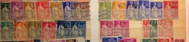 Peace bearing an olive branch. Good luck with that in the 1930s …
This fun little exercise gave me an idea. I noticed how all my early French stamps were bunched up in the front of my display in the stock book that mainly featured the gorgeous engraved landscapes, paintings and other multi-color stamp designs that make France so seductive to collectors. Some mint French stamps I swear are good enough to eat. Take a bite! Like an exotic leaf, a delicate fruit, or a sweetly etched wafer …
But these early French stamps aren’t beautiful, are they? What is it about them? They are just small rectangles, all featuring the same some allegorical figure. They seem to go on and on. Bo-r-r-ing …
Stop right there! That’s one of the pleasures of stamp collecting, after all — to assemble these related items in order, then display them in their various colors and ascending values, as a harmonious whole — that is, if you are lucky enough to have the set complete. These French stamps often came in long sets, which offer the advantage of a pleasing display, but also the challenge of trying for completeness. I’ve never tried that hard with the early French stamps, because it’s not really my main collecting interest.
However, now I am seized with a passing desire to assemble these sets from various places in my collection, and display them to advantage. I have a little stock book that is currently empty, so I’ll use it. Accordingly, I fill its pages with a special display of these early “French feminine” sets — not particularly valuable, but nevertheless historic, and colorful, elegant, inspirational …
I hope you enjoy looking at these sets, which I present toward the end of this essay. Let them soothe your eyes with their harmonious colors. Enjoy the orderly rows of stamps, all sharing the same design, marching across the page as they rise in numerical value. Consider how many of these stamps were used for letters mailed more than a century ago. Share the quiet pleasure of the stamp collector, taking in this colorful pageant.
 There is at least one other area I would like to explore sometime, involving French stamps. It’s about those wonderful landscape engravings that France has been issuing since the 1930s. The artists and engravers
 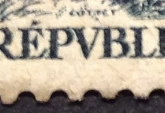 behind these small masterpieces of line, color and composition deserve attention, and no doubt there are stories to tell … (For example, I believe in every one of these landscape designs you will find the name of the artist/engraver in teeny-tiny letters along one side. In this example, it’s M. Cottet. See it in the enlargement at right?)
I gathered much of my French collection while I lived in Germany in my teen years. In the summer, my parents took us on driving tours of France, including Paris and environs, but mostly elsewhere. They charted circuitous routes through cities and towns and into the countryside — Joinville, Troyes, Avignon, Chateau-Neuf, Arbois, Mont St. Michel, Cahors, les Eyzees… Grenoble, Montpellier, Cognac, Vannes, Chartres, Reims … Cherbourg, Val de Saire, Angouleme, Libourne, La Rochelle …
One village and town was as pretty as the last, and I spent happy times sketching houses on winding streets, church spires and village angles and arbors of one sort or another. Now that I think of it, I may have been communing with the stamp artists whose beautiful landscape engravings of these same villages were on stamps I was 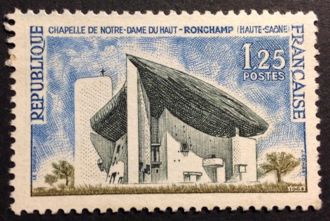 buying at the local post office. Indeed, I remember visiting Notre Dame du Haut, the church designed by Le Corbusier in Ronchamp, and buying the stamp, with the splendid engraving of the church, that had been issued months before. (right)
Q. Can you spot the artist’s name in the design abovet? Hint: It’s J. Combet.
NOTE: Believe it or not, there is much more detail available on all of this in the Fiske annals. One rich source is JMF’s travel notebooks, in the archive at the University of Iowa. Another is FMF’s diary, which continued into the 1960s, and which I am beginning to review for more details about these wonderful, meandering jaunts through France in the summers of 1960, 1962 and 1965 …
 DIARY EXCERPT: August 15, 1962 … Got to border at 2 p.m. without big incident. Looked for place to eat, but couldn’t get out of cities! Finally at 3:05 had picnic at Joinville. Are now in Troyes after big dinner. Bed 9:45. FRANCE IS WONDERFUL! … August 16, 1962 … Stopped at Cheateau-Neuf for stuff for lunch. Got going at 12:15. Stopped near Clery for lunch (picnic). Was fun. Stopped at
  Blois and saw chateau. Got to Tours at 4. Walked around and saw cathedral til 6. Then went to the Blairs’ house for supper. Was great fun, cause there were so many there. Bed 12. …
We stayed at picturesque inns, shopped for bread and cheese, then had picnics in the countryside, stopping by a stream, a shady spot or just a field, avoiding the cow paddies to spread a checkered cloth on the ground.

Could it really be that JMF (above) is actually checking for cow paddies while JRF looks on? 
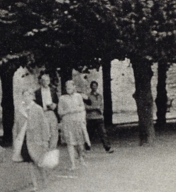
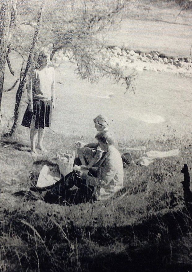
JMF served lunch — maybe pickles, always vienna sausage, cheese, bread, meats or other extras, limonade (or wine?), cookies … there was lounging on the tall grass, wading in the stream, a languorous ball game, perhaps a little accordion or guitar…
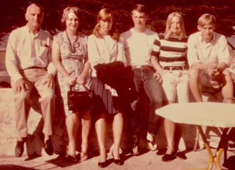 All three times we visited France, we made it to Ile d’Oleron, an island off the coast of Aquitaine that you could reach only by ferry in those days. Oleron was very French, but in a way Fellini would have enjoyed. We stayed for a week or more at a
pension, dining in a small central courtyard with a cast of characters out of a Tintin cartoon book. Every lunch and dinner included bottles of red and white local Clapotis wine in the middle of our table. My parents saved a copy of the Priere D’Oleron, which runs as follo
Mon Dieu! / Donnez-moi la santé pour longtemps … / De l’amour de temps en temps … / Du boulot pas trop souvent … / Mais du CLAPOTIS … tout le temps
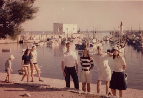 Oleron had it all — wild waves for body surfing at Vertbois (la cote sauvage), shopping in St. Denis, St. Pierre and Domino, and the quaint harbor of La Cotiniere, with fishing boats, the waffle maker (moule a gauffre!) and music and clowning around and oh! The aromas of sea and sugar and fried dough!
 DIARY EXCERPTS:
August 28, 1962 …then we hurried to Vertbois for an hour, then to la Cotiniere, where I painted a quick picture and ate a crepe, all in time to be back for supper. ….
August 22, 1960 … In the morning went down to the beach. It was at low tide. Then we saw the water zoom up over us. After lunch went swimming, and there were huge breakers. At night we all went to a circus!! What fun!!! August 23, 1960 … After lunch had a bad headache and went to sleep. Then others went to the lighthouse while mother read to me. Then my headache went away and went to beach. Got cotton-candy, and made an indestructible fort. Came home and had ARTICHOKES for supper!!! August 25, 1960 … In the morning went down to the beach and started an indestructible fort. Then came home and had lunch, and came back to the beach and finished my fort, then built protective wall and all that stuff. Then I watched the fort. Johnny made a pyramid that stayed, but mine was gone. August 26, 1960 … In the morning went to the beach, played in the sand, and then made a dam. Came home for lunch, then went around the island, then we went to Vertbois. It was damn fun with all the breakers. Came home, had dinner, and went to beach in dark. On second trip stopped at the “cassino” and had a high old time with the games. August 27, 1960 … In the morning went to the beach. I made a Cathedral, but somebody jumped on it. Went for swim, then helped Jonny with a dam (PARDON ME, LADIES). Had lunch, then went and played at the amusement house. On the way home got some cotton candy. Then went to Domino. At night went to amusement house. …
After Europe, I lived two years in francophone Congo, so I’m fairly well acclimated to the French language and outlook. As a teenaged philatelist visiting Paris in the 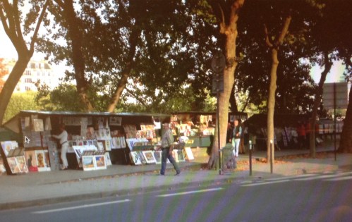 1960s, I managed to discover and revisit the open-air stalls along the Seine, les bouquinistes, who featured stamps along with books, posters, maps and other artworks and esoterica. The stamps were displayed on big boards under plastic sheeting gripped by clothespins in case of rain. The gypsies, brokers and sellers seemed ready to make a deal. There was a whiff in the air that anything could happen. Is that accordion music wafting through the elms? C’est magnifique! I don’t think I could afford to buy much, but I still had lots of fun looking.
My parents had strong connections to France. JMF wrote her masters thesis on Sasha Guitry, and lived in France after college, where she taught at a girls school just before WWII. When we returned to France in the 1960s, we had dinner with a M. Dupuy, who apparently had a crush on JMF back in the day. He went on to become a successful commercant of some kind — possibly a wine merchant — with a fine house and great family we had fun with on our visit. In the afternoon the teenage children took us to the piscine where we splashed about with cosmopolitan hilarity. Dinner was a grand affair, three hours long, with at least a half-dozen courses and accompanying wines, including one at the end our host said was 100 years old. I took a sip. Sweet.
My father’s great-grandmother, Anne MacMaster Codman, died in France and is buried in Pere LaChaise cemetery, in Paris. (LaFayette sent a condolence letter.) Pa first visited France in the 1930s, when he stayed with his cousin Ogden Codman, the decorator and builder and notorious queen, outside Paris. My father wrote a book-length manuscript about French language and culture, which I’m sure would have been well-received, had it been published. Seems another fellow came along with a similar ms. a little ahead of Pa … Anyway, let’s not get sidetracked by unpublished manuscripts …
What does any of this have to do with stamps? Let me get back to the subject of la belle France and its feminine symbol. Did this start with the women who marched on Versailles in 1789? Who was la Marsellaise? Who was Marianne? France always has depicted strong women on its stamps as aspirational emblems of the nation. As Goethe would say, das endlich Weibliche zieht uns hinan. (Notice how I use a learned quotation to get out of having to look up any of the answers to those questions. If you want answers, look them up yourselves!)
Here, then, are the sets depicting la Marseillaise, la Semeuse (the sower), la Liberte … The illustrated sets that follow are ones that I assembled from three sources: My original, limited collection; then, stamps added from the Syracuse Stamp Club auction lot; and finally, additions from my father’s collection, which I seem to have inherited. (lucky me!)
NOTE: Please carry on through the gallery that follows. At the end, there is more to the story!
GALLERY

 This set, which started in 1900, depicts various feminine allegories — for liberty, equality, fraternity the rights of man, more liberty, and peace. I have included a number of color varieties, which are noticeable. Note also the subtle bi-color designs on the higher-value, wider rectangles. A couple of them are a bit rare.
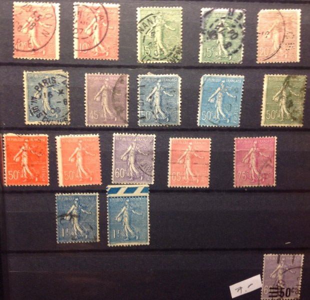 La semeuse, the sower, is the female allegory in this early design. The set started coming out in 1903, with new values released up to 1938. This classic design coexisted with another long set — of roughly the same design — which you will find
  on the next page. Why the two sets with the same design? Je ne sais pas, monsieurs-dames! I only ask that you agree with me that this allegory is an altogether pleasing figure. It is modeled after a medallion designed by Oscar Roty for the Department of Agriculture in the 1880s. The image appeared on French coins until 2001. An old Stampex pamphlet provides this “La Boheme”-worthy footnote: “The maiden who posed for the original of ‘The Sower’ on this stamp died in abject poverty in later years — a story with a tear drop at the end.”
 T
T his set (left) is an exception to the rule of the feminine — a depiction of Mercury on a definitive series. This one came out in 1938. After the Nazis invaded and occupied France in 1940, the collaborationist Vichy regime put out new stamps with a subtle change in the name — from “Republique Francaise” to “Postes Francaises.” (see enlargement below)

Suddenly Mercury
begins to look like Satan with a pitchfork, don’t you think?
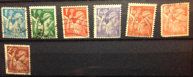 This set, depicting Iris, the Greek goddess of the rainbow and messenger of the gods, was issued in 1939. My catalogue says the stamps were in circulation until 1944, which means they were used during the German occupation. Hmm.
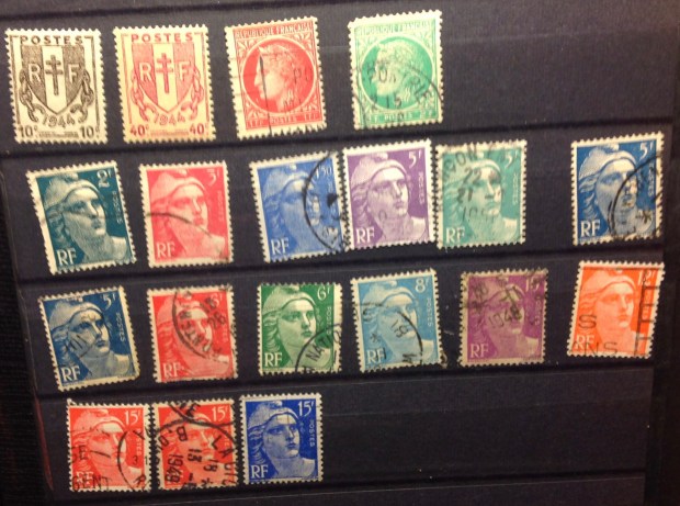
 These stamps, with the bust of a helmeted Marianne (or is it Joan of Arc?), were issued in London during World War II by direction of the Free French government. Apparently they were never used for postage. There seem to be wild fluctuations in value for these stamps — I suspect mine are at the low end, but some varieties are priced in the hundreds.
 H
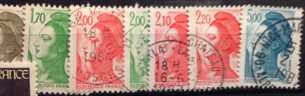
H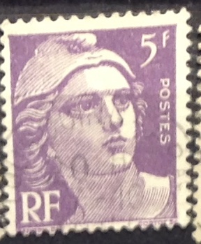 ere is the familiar postwar definitive set (1945-7), once again depicting Marianne. This beauty has a wholly Gallic expression — confident, alert, focused, slightly pouty lips, prominent nose, wary eyes on the future. Notice, too, the low-value designs (enlarged below) that incorporate the Ceres profile from the first French stamp of 1849 — about which more, shortly.


Without dwelling on them, I offer more examples of La Belle France on stamps over recent decades (see above and below)
 E
E
E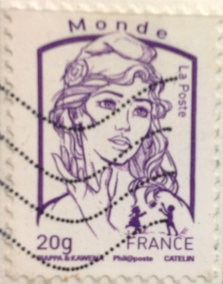 xcept now, qu’est que c’est? What is this? Is it really Marianne, the emblem of France? She looks like a cross between Bardot and Barbarella, a Victoria’s Secret model with tresses casually arranged and sculpted eyebrows under her chic Phrygian cap. Is she really going to lead the next revolution?
 I mentioned Ceres a little earlier — another feminine allegory, the goddess of Earth and fertility. I invite you now to the very beginning of French stamps. The first one had a profile of Ceres, and came out in 1849, a very awkward moment in French history. The Second Republic was in the second year of its short existence, having ousted Louis Philippe, France’s last king, after the confusing revolution of 1848. (I majored in French and German intellectual history at Harvard, and I still can’t explain it to you.) By 1852, the Second Republic had morphed into the French Empire under Napoleon III, who would soldier on until 1870 and the birth of the Third Republic, which endured until 1940.
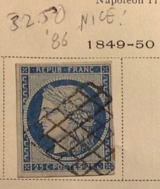
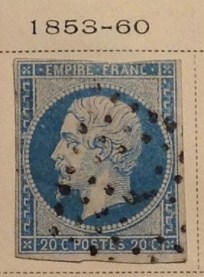 This explains why the first French stamps, in 1849, depicted Ceres, an allegory, rather than a king, and why the design changed to a profile of the “president” Louis Napoleon in 1852, and after that “emperor” Napoleon III (the same guy). After 1870, there was no more empire, so the Ceres design was used again. These stamps, seen at the bottom of the page below, are the so-called “Bordeaux issue,” named for the Republicans’ provisional capital as they laid siege to Paris and prepared to overthrow the tottering empire.

My father’s French collection was in his Scott album, printed in 1928. The first and second pages featured mint and used stamps from early France — including one from the first pair in 1849! As a reference point, Victor Hugo’s novel “Les Miserables,” was published in 1860. (By the way, the 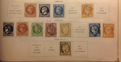 “uprising” referenced in that novel was a pretty minor skirmish in 1832.) 1860 was one year before the U.S. Civil War, the same year Abraham Lincoln was elected to his first term.
 This next design, launched in 1876 and lasting until the turn of the century, depicts two more allegories — in this case, one male, one female. On the left in the design is Peace, and to the right of the value tablet is Commerce. Pictured above is the set in
  my father’s collection, with enlargements to the right. Some of these stamps are quite valuable: The 5f mint stamp from the 1870s catalogues at $400! Wife Chris agrees with the suggestion to sell it.
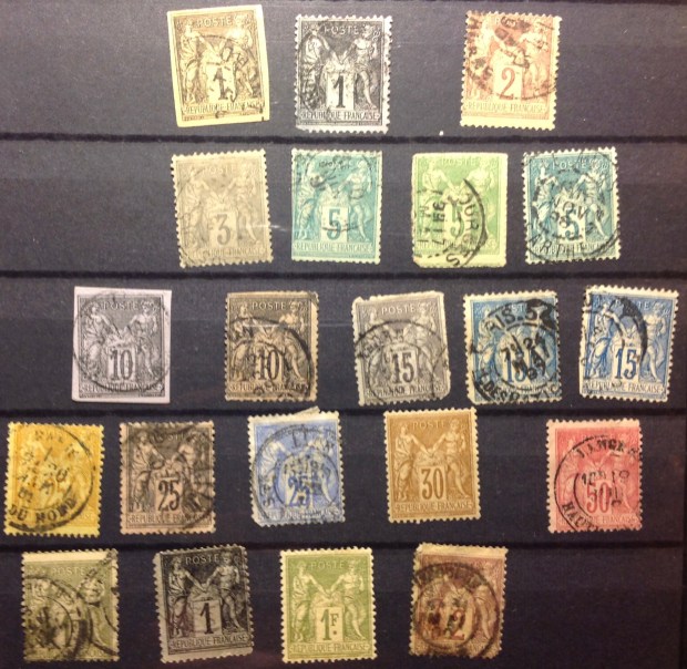
Above is the set I collected on my own, with recent additions from the Stamp Club auction. I was going to add the ones from my father, but decided to leave his precious stamps be for the time being. I like the way they look in the Scott album, which itself is nearly 100 years old. I expect I could sell some of the more valuable stamps on eBay, though I don’t really need extra cash …Maybe I’ll just keep enjoying them a while longer. TO BE CONTINUED

 from religious persecution at home. Likewise, among the Dutch and German adventurers who landed near the tip of southern Africa in the same century were French Huguenots, fleeing persecution for their faith. Dutch navigators Jan van Riebeeck sailed to the Cape of Good Hope, found safe harbor for his ships in Table Bay in 1652 and went on to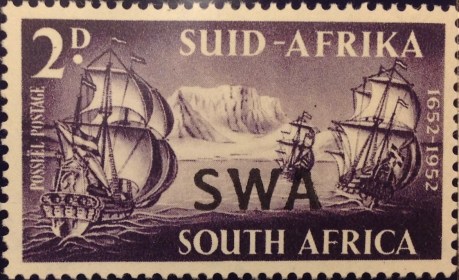


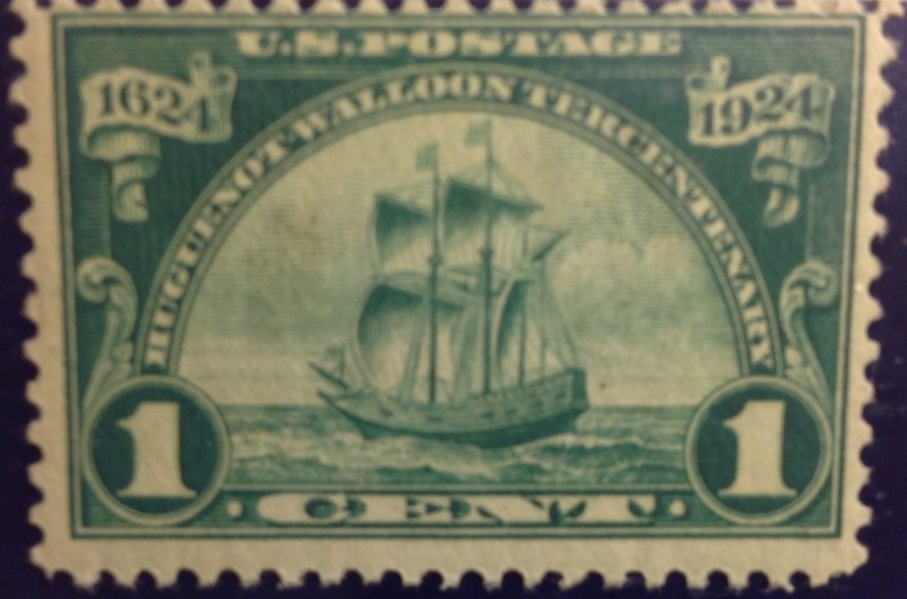


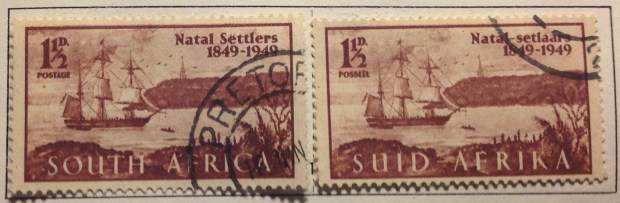


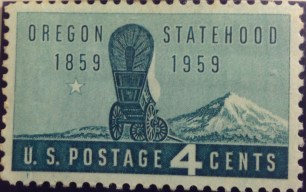

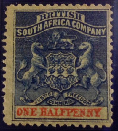 In the end, I would simply offer this rationale for my leap into these deep waters with the FMF Stamp Project; it is the justification for all historical study: to know how we got here. How did the “British South Africa Company” become Zimbabwe? How did the Cape of Good Hope turn into the Republic of South Africa? What happened to Transvaal, Natal, Zululand, the Orange Free State, the New Republic, Stellaland, Griqualand West? (Not to mention Griqualand East?) Why did Bechuanaland split apart? Answering these
 colonialism combine much of today’s conventional wisdom with another possibility. I agree the colonial enterprise in Africa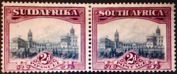
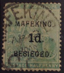
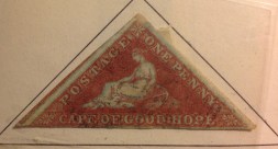 from the 1850s, and a hand-stamped emergency issue of 1900 from the Cape of Good Hope, overprinted “Mafeking Besieged.” So please —
  read on!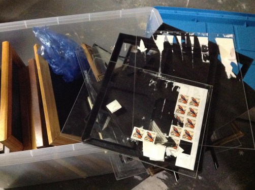
 nothing can ruin the value of a mint stamp quicker than a drop of water.
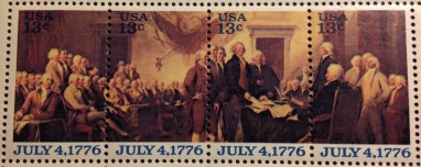 its wisdom to issue a four-stamp set July 4, displaying a wider view of the same painting that appeared on one of the souvenir sheets — signing of the Declaration — with the inscription, “July 4, 1776.” (see right). I took advantage of the situation by affixing that set, along with the souvenir sheet containing a detail of the same design, to an oversize envelope bearing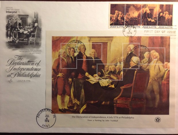
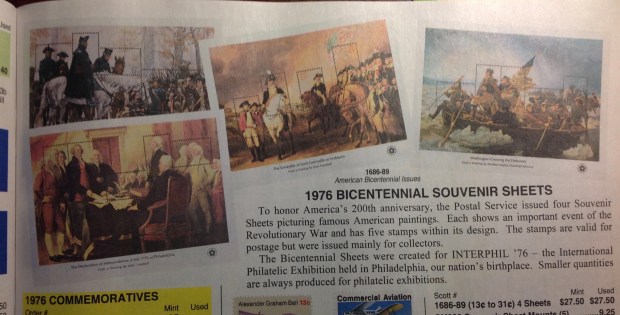
 I concocted back in May 1976, when the Bicentennial souvenir sheets were issued (see right). First I broke up one of the “Yorktown” sheets, and must have used three of the five embedded stamps for postage on letters. The other two stamps, still intact with the sheet remnant, I stuck to a commemorative envelope, put my address on it and had it sent to me across town through the mail, complete with the first-day cancel. Any idea what a partial first-day cover is worth?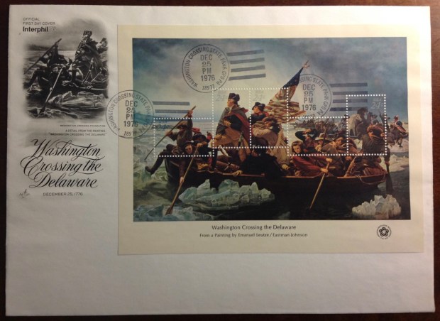
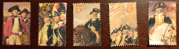
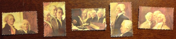
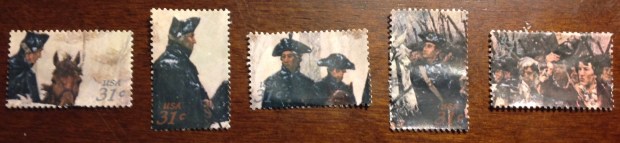
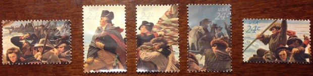 Now consider: I have recovered each of the five stamps on the bicentennial sheets (pictured above). Removed from their surroundings in the damaged sheets, they take on a whole different aspect. If you examine them one by one, you may conclude, as I do,
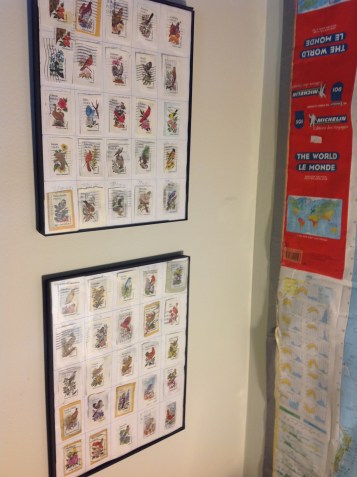
 The last two frames I offer for your inspection, at right, represent a considerable labor of love on my part. I patiently accumulated cancelled copies of each one of the 50 values in the 20-cent state-birds-and-flowers series of 1982. (Back then I was a newspaperman and had access to tons of mail.) Then I mounted the set, in alphabetical order of the states, on two grids and framed them. Cute, eh? At first the frames didn’t appear to have suffered damage, but when I started to lift the glass out of one frame, some of the stamps stuck and
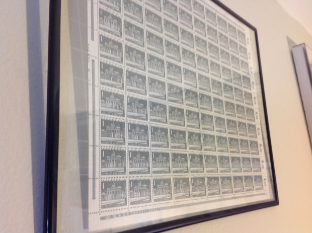
 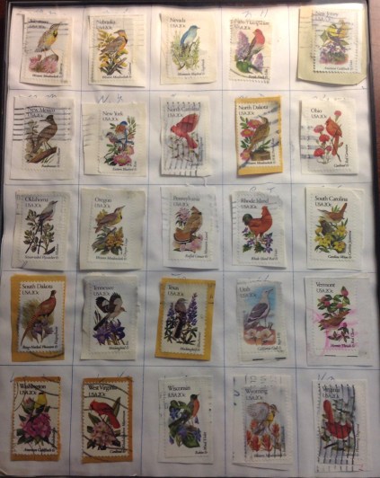 started to come apart. I stopped immediately, returned the glass to the frame and let it be. What to do now? Since these are used stamps, I suppose I could soak them off in water (!) and even assemble another two-frame display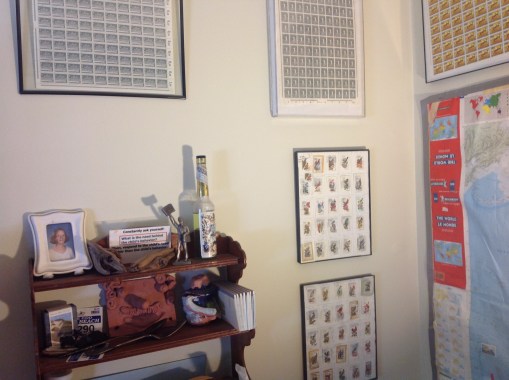
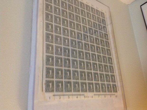
 My first memorable encounter with philately came when I was about six, in 1954, at The Pigeon House, a drafty converted coop-barn that my family stayed in for several summers near the south shore in Marshfield, Mass. It was part of the “farm” on Pudding Hill Lane that
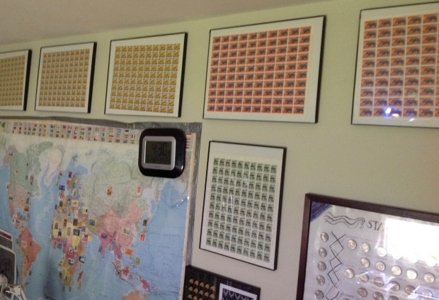
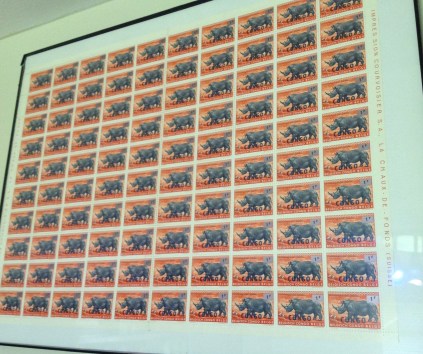
 The image at right is from the line-up of framed stamp sheets from Congo on the wall of my study (see above). The stamps originally were issued for the Belgian Congo, overprinted at independence — then overprinted again in subsequent years. This stamp started out as the 1f50 value from the flowers series of 1953, which was overprinted “CONGO” and became the first definitive set of independent Congo in 1960. In 1964 it was surcharged in black on silver, as Congo lurched toward ruin in the hands of Mobutu Sese Seko.
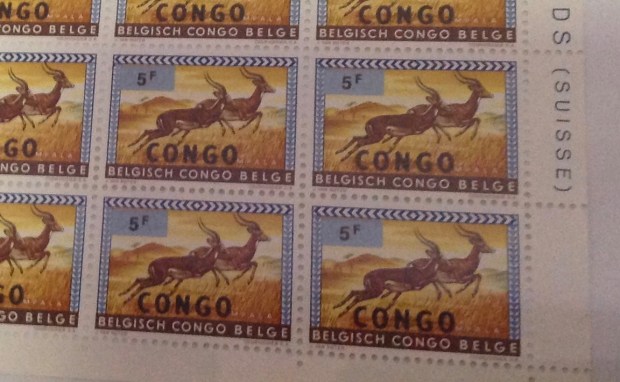
 In this pair of images and the next pair you will find two examples of what was once the 20 centime stamp from the Belgian Congo 1959 animal series, overprinted “Congo” in the second definitive set after independence in 1960. Here the original 1959 stamp carries a silver overlay
 This
This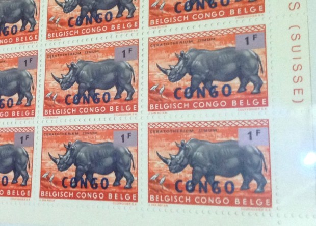
 OK, let’s really get into it. If you like, run quickly through this pair of images and the next two pairs., then come back…. On first glance, all the stamps look alike, right? Well, they started out being the same — the 6f50



 Above my desk you will find a Stamp Map (above) — the world laid out before me, with stamps from many nations attached to their country of origin. Seems like it’s always been there on the wall … a bit like that bathroom at The Pigeon House, eh?


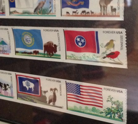 This series (above and rifght) confirms the wisdom of my decision to frame and display my stamps. There’s just no other good way to handle these stamps! It’s from just a few years ago, an issue with 60 values, one for each state and a number of “generic” USA stamps.
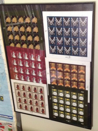 Here is another enchanting exhibit. A few years ago, the USPS issued a series of low-value definitive stamps featuring vintage designs — jewelry and household furnishings. The charming, full-color vignettes had colorful backgrounds and common design features for each value — 1c, 2c, 3c, 4c, 5c and 10c.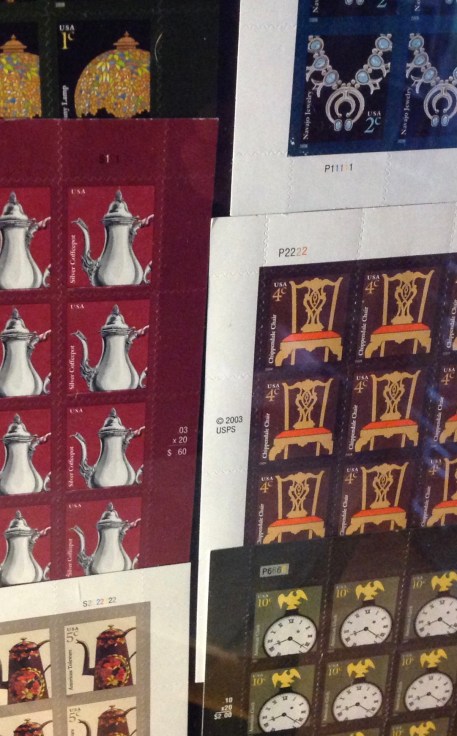
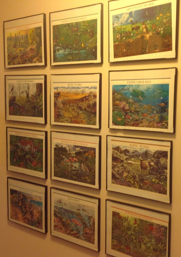 These beautiful landscape paintings appeared in a series of 12 sheets under the heading, “Nature of America.” The sheets were designed and executed so that you could identify easily the essential information — “USA 33” — to locate the stamps within the sheet. You’d just peel off stamps as you needed them. If you look closely, each stamp has a design that stands on its own. Clever. Sort of like a loopy version of an advent calendar. Or a sticker book in reverse.
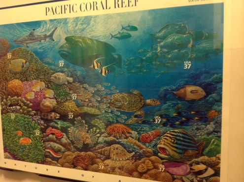 At left are enlarged versions of a couple of the sheets, one featuring a Pacific Coral Reef, the other the Sonoran Desert. All the sheets are worth a look, and they are not expensive — about 60 bucks for all 12. Other scenes depict the
  Pacific Rain Forest, the Great Plains Prairie, Southern Florida Wetland, Northeast Deciduous Forest, Alpine Tundra, Great Lakes Dunes, Kelp Forest, Hawaiian Rain Forest, Longleaf Pine Forest and Arctic Tundra.
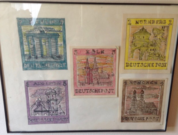
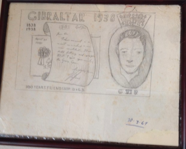
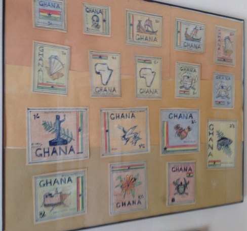 These final “stamps” on display aren’t really stamps at all, but rather my own fanciful designs for imaginary sets from exotic lands, concocted during my teenage years when I actually lived in exotic lands like Congo and Germany (but not Ghana or Australia).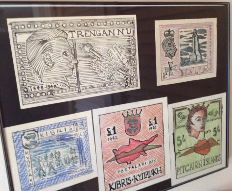


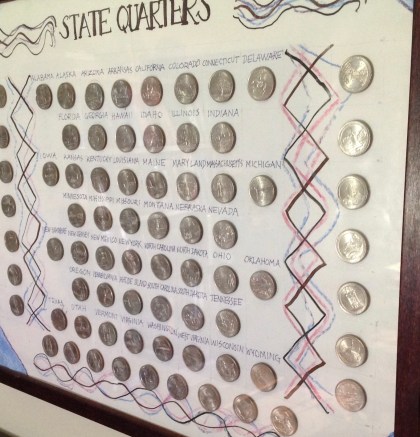 Finally, here is my display (right and below) of the “state quarters” that started appearing over the past decade. I had no idea, when daughter Tanika and I crafted this display, that the US Mint would keep issuing quarters for all sorts of monuments and moments. I have more than a dozen waiting to be added to my collection — but how will I fit them in? And will the practice of churning out new quarters never end?
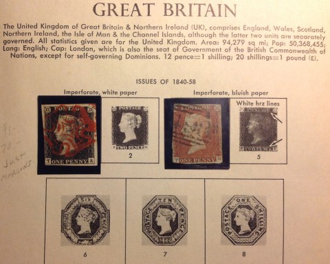 If you have paid close attention to my stamp blog, you know I have a nice copy of Great Britain No. 1 — the world’s first postage stamp, also known as the Penny Black. (see right)
 Take, for example, this early two-color British India stamp of 1854, featuring an imperforate octagonal frame with a portrait of Queen Victoria (right, from the Internet). A nice copy like this pretty stamp (grabbed from the Internet) will sell for up to $450.
 Here is an example, from the Internet, of the 4-anna stamp, cut to shape. It’s not cheap, but much below the cost of a rectangle. Get my point?
 For starters, take a look at this beauty (right). It’s the famous British Guiana one-cent black-on-magenta, a fabled one-of-a-kind variety. And as you’ll notice, it’s cut to shape. That doesn’t prevent it being sold and re-sold, every now and then, for millions.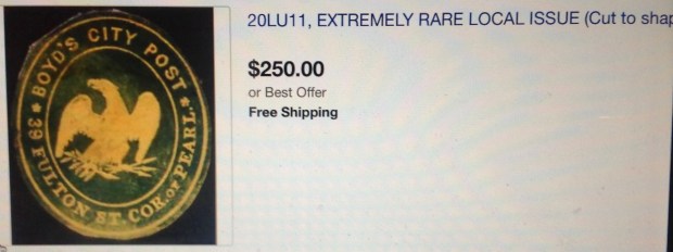
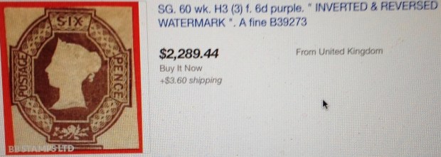
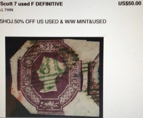
 More common are examples like these, also from the Internet. Notice the relatively low price for these ancient embossed beauties. They’d be worth a lot
  more if they were not cut to shape.
 Whatever value the medallion-shaped oddment here had was decimated by the lame-brained stamp fiend who cut it to shape. (Was it a younger me?)
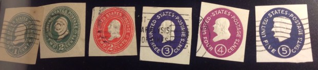 This is a cute enough collection, and they’re all nice rectangles. Not worth much, though.
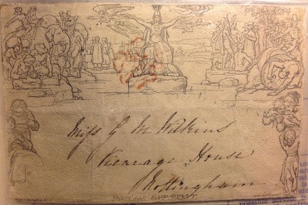 As I segue back to my quest for those early GB embossed stamps, I offer this: the world’s first “envelope stamp.” It’s from 1840 in Great Britain, and it’s known as the Mulready Cover — a one-penny foldable sheet you could write on, seal up and send through the mail. The idea never caught on. (This nice example is from my collection; I expect it’s worth at least the
  $40 I paid for it.)
 some kind of holographic horror representing the space program or something like that.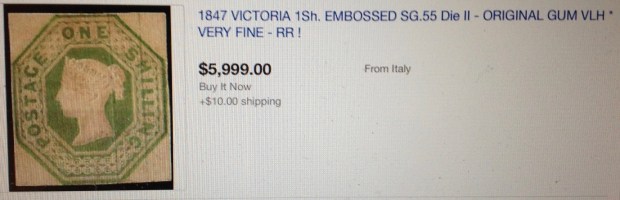
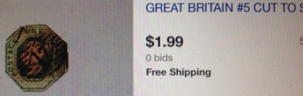


 It was growing clear to me that if I ever wanted to fill those empty spaces in my album, I would have to settle for cut-to-shape. But I didn’t just want a “space-filler,” a crudely mangled example that is essentially worthless. Over the years, the Scott catalogue has upgraded its price for Nos. 5-7, cut to
  shape, from $1.50 to $10 or so. I searched the Internet and began finding cut-to-shape offerings that were well within my price range. There were flaws, though.
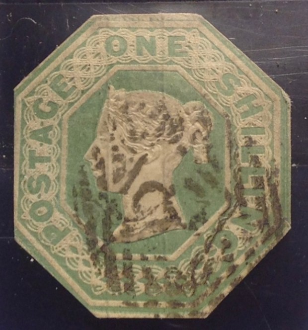 Finally I came across this cute little item: No. 5, carefully cut to shape, including nearly the entire design; no thins, tears or creases; offered for sale at $14.99.


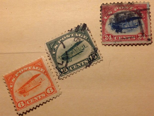
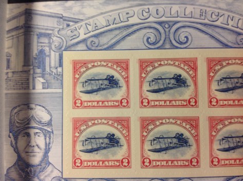 In 2013, the US Postal Service issued a souvenir sheet depicting the inverted Jenny — the same engraving and colors as the accidental error back in 1918, as far as I can tell, only with a $2 value instead of 24 cents. It’s a beautiful, interesting sheet, full of information on the back. The stamps showing the famous upside-down plane are worth at least, well, two dollars each.

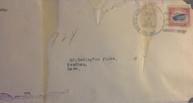 It bears the 24-cent “Jenny” airmail stamp, issued just three weeks before on May 13, 1918, cancelled with the message in the circular cancel: “Air Mail Service; New York; Jun 3, 1918; First Trip.” The return address is the “Aerial League of America,” 297 Madison Avenue. A rubber stamp in the lower left corner of the envelope announces: “VIA Aeroplane Mail.” Quaint! While the envelope isn’t in particularly good shape, a similar “first flight” cover was offered on eBay recently — for $250!
 Do you think it was magnanimous of the British to grant “internal self government” to its Bechuanaland territory in 1965
 Then an odd little set came out June 1, 1966, commemorating the Bechuanaland Pioneers and Gunners. These were African “recruits” in World War II, as many as 10,000 Tswana in all. Some volunteered, others were pressed into service as laborers, anti-aircraft gunners and drivers. African troops traveled as far as Italy and Lebanon. This set marked the 25th anniversary of the Bechuanaland pioneers, formed in 1941 and disbanded in 1946. The designs include a British Hasler smoke generator truck with Bechuana operators, and a
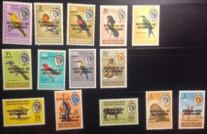 Three months later, a new nation was born — philatelically speaking. The first set from independent Botswana was issued Sept. 30, 1966, and was clearly a rush job: Instead of designing new stamps for the new country, postal authorities simply overprinted the 1962 definitive set with “Republic of Botswana.” OK, so it looks kind of weird to have Queen Elizabeth smiling out from under the overprint. But hey, the stamps are valid enough. Lots of emancipated colonies did the same thing, starting with Ghana, which overprinted the Gold Coast set of Queen Elizabeth definitives in 1956.
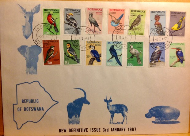 Above is the first definitive set designed specifically for Botswana. An earlier
 At right is a display in my stock album of stamps from several
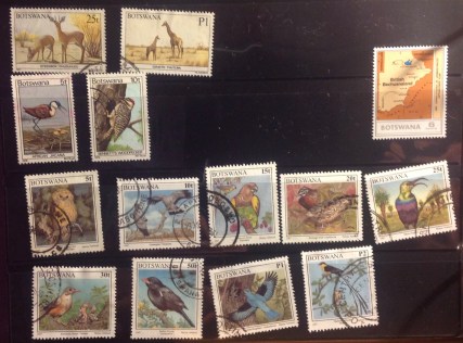 intent— when they come my way, I take them. I still enjoy putting sets together, noticing common features as well as the obvious and subtle differences. Somehow, it just makes life sweeter.
 I must pass along a blow-up of this unusual Botswana commemorative from 1975. It celebrates the 90th anniversary of the
 Above is what we in the philately racket call a “hodge-podge.” It’s a catch-all page in my stock album for post-colonial Africa, my last page for Botswana. You will see some attractive animal stamps, and a crudely-drawn portrait of two nearly naked
 The set at lower left above (enlarged at right) commemorates a century of Bechuanaland stamps, carrying us back to where we began. You can read much more about this set — and the stories the stamps tell — in my blog post of April 2018, Bechuanaland: Introduction. That is where my exploration of Bechuanaland/Botswana and its stamps began.
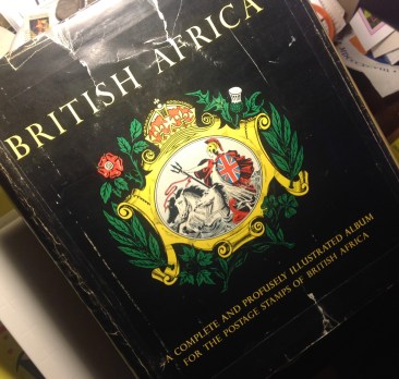 At last! A consummation devoutly to be wished. Or should I say, a resumption long overdue. I think it was about 500 pages and two years back that I temporarily abandoned my original mission in this FMF Stamp Project — which was a leisurely ramble through the storied landscape of my stamp collection, starting with British Africa. I got through my collection from the British Colony of Ascension Island, and also the small southern African territory of Basutoland (now Lesotho). Then I went my merry way, with long diversions to Congo, other precincts of that vast continent, and into various fjords and flights that led eventually to a 150-page examination of so-called “Cinderella” stamps (that is, stamps that are not real stamps). That topic, by the way, is far from exhausted, though I needed a breather!
 A word on the legend provided in my stamp album (see right). You may notice that it refers to British Bechuanaland as a “high commission territory” in 1960. This is nonsense. Bechuanaland Protectorate was indeed under British supervision in 1960 — independent Botswana was still six years off. But British Bechuanaland? It didn’t even exist after 1895, first merging with the Cape Colony, then the Union of South Africa.
 I believe I have rhapsodized
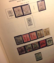 Bechuanaland, page two: Issues of 1888-98. Just a few comments on this page. There is always something to say!
 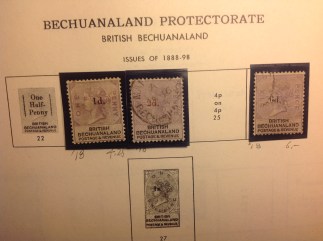 Notice at right how the earlier set has been surcharged — with the same value spelled out in the tablets flanking the portrait! I guess too many postal customers needed to see a number …
 At right, top row, is a remarkable sequence that captures all the wackiness of British Bechuanaland bureaucracy. Here we have the overprints running across top and bottom, sideways left, and sideways right. Whew! Make up your minds! (As you can see, from the pencil notations, I paid good bucks for these — $13 for the 1/2d, for example.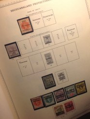
 changed from “British Bechuanaland” to “Bechuanaland Protectorate.” It took me years to collect all of these…
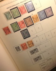 Bechuanaland, page four: Issues of 1904-27. By now “British Bechuanaland” was just a memory — but “Bechuanaland Protectorate” would last 80 years. For
  nearly three decades, postal authorities made do with these undistinguished overprints of British definitives — through the reign of Edward VII and well into that of George V. What a missed opportunity!
 Bechuanaland, page five: Issues of 1926-35. You
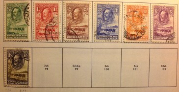 Sorry I don’t have the higher values (yet). They are quite dear.
  However, please enjoy the delicate artistry of the engraving of a pastoral Tswana landscape that features grazing cattle and a venerable baobab tree.
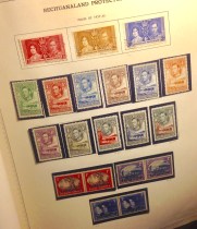 Bechuanaland, page six: 1937-45. The king is dead. Long live the king. That’s the way it was in the British Empire. George V expired Jan. 20, 1936, and after the business with Edward VIII, George VI was duly coronated in 1937. Without missing a beat, the engravers substituted a portrait of the young king for that of his late father, and the same beautiful design remained in use through the 15 years of his reign. Notice the exquisite color combinations for the upper values — black and olive green (1/-); black
 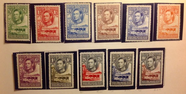 and carmine (2/6); black and ultramarine (5/-); black and red-brown (10/-). This complete set, mint, was selling today online for $42.50.
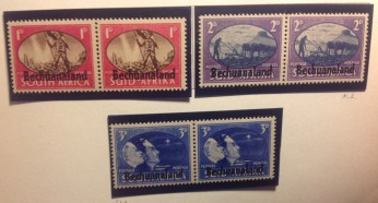 This set again! You may remember it from the Basutoland pages — same South Africa set, same patriotic themes, same white faces enjoying the end of World War II.
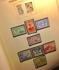 Bechuanaland, page seven: Issues of 1947-9. No need to dwell on this page, which features “omnibus” issues for the Royals’ 25th wedding anniversary (which I don’t have), the Royal Visit of 1947, and the Universal Postal Union issue of 1949. Why do I bother to collect these stamps, which aren’t valuable? I guess I just like to keep striving for completeness …
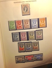 Bechuanaland, page eight: Issues of 1953-60. Guess what happened after 1953, when Elizabeth II was coronated? The same darn thing: The engravers substituted her portrait for her father’s and before that, her grandfather’s, and the splendid design had another run — right up into the 1960s.
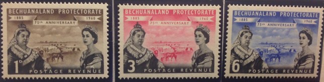 Here’s a little oddity (above). In 1960, British imperial powers took it upon themselves to issue this set of stamps congratulating the 75 years of their “protection racket” in Bechuanaland. They must have known by then that their time as colonial masters was rapidly drawing to a close — Ghana already was independent, Sierra Leone and the rest would follow quickly. Yet here we see the Dowager Queen Victoria of 1885, and the demure, fresh-faced Elizabeth of 1960, flanking a scene on the Tswana veld — as though everything were normal as could be, the past and present are of a piece, and the British “protectorate” is secure.
 Bechuanaland, page nine: Issues of 1961. Then bang! came decimal currency, a gift from South Africa. Postal authorities rushed to issue a set with decimal surcharges. When the news reached me, I was excited. These might be rare stamps. I quickly sent off a money order to Lusaka, asking the postmaster to send me a set. Then I sat back and waited … and waited …
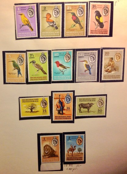 Bechuanaland, page 10, issues of 1962.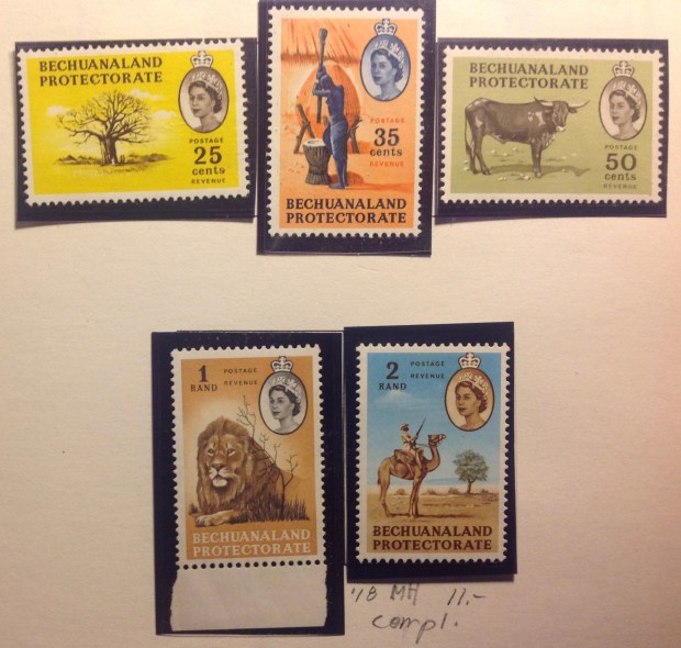
 Bechuanaland, page 11, issues of 1961-3. More postage due and “omnibus” stamps appear on my last album page for Bechuanaland — though it is not the end of my collection. (Stay tuned for next month’s installment.)

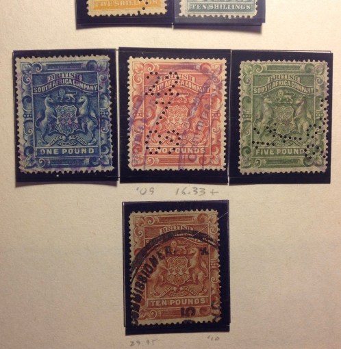
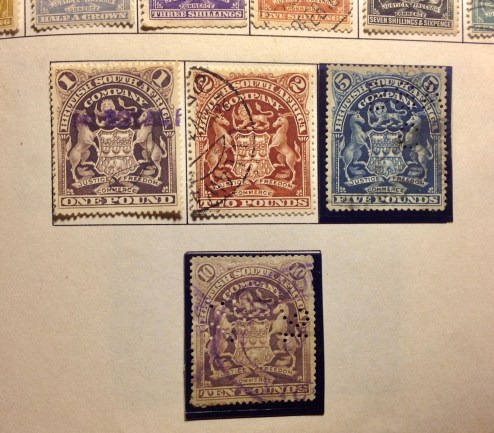
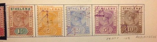
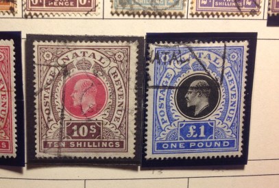 my collection from Natal and St. Helena. You can tell it’s a remainder by the oddly angular postal strike. The catalog value of the St. Helena stamps, in used condition, is in the $100 range. Yet I was able to buy them for under $20. Notice that I added the pencil note “remainders” as a reminder. Last words on the subject: Here is an odd remark from
  the Scott catalogue: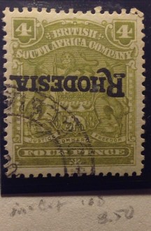
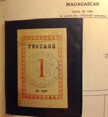
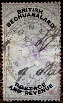 Good to Be True” blog post,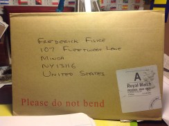
 The closer I looked, the more it appeared to be not a thin, but actually a confetti-like piece of off-white paper, a remnant somehow stuck to the surface of the stamp. i began to pick gingerly at the spot, using my stamp tongs and a magnifying class to keep track of my efforts. Sure enough, the tongs seemed to catch an edge of the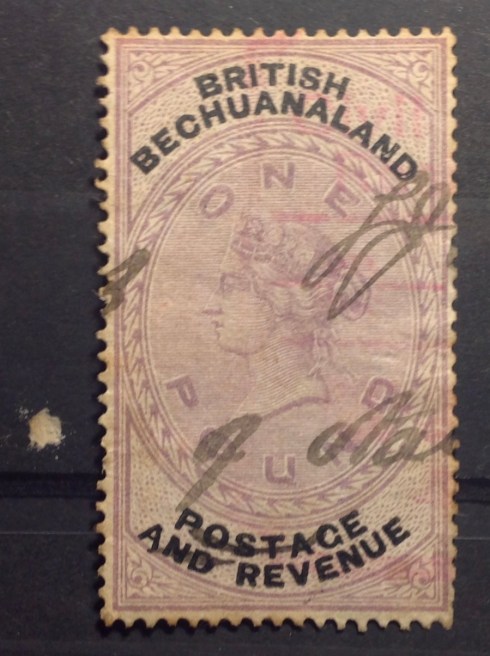
 This installment of the stamp blog may be a little too esoteric for the general reader —
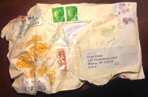 OK. Let’s take a look inside the envelope to see if any of the stamps inside survived this “mishap.”
 — waterlogged. The tattered remnants yielded a folded note — the receipt for my order from Du Wei in Shanghai, China — and a stout cardboard packing envelope, securely fastened with tape. A good sign! However, water worries continued. If the stamps had been soaked and ruined, I would be left with nothing from my $30.60 order.
 Another good sign!

 FMF STAMP PROJECT