
First Issue: 1868
Is anyone else tiring of my lengthy, meandering trek through the postal history of southern, central and east British Africa? Is it starting to feel like a slog, after three essays on ZAR/Transvaal? Although I count 21 separate stamp-issuing authorities between 1857 (Cape of Good Hope) and Basutoland (1933), I am certain I can cover the territory in just a few more chapters, combining postal upstarts like Stellaland, Griqualand West and the New Republic. In any case, I shall feel free to divert from this expedition, should another interesting topic draw the attention of the FMF Stamp Project.

I’ve traced the postal path from the first colonial stamps of southern Africa— the Cape of Good Hope triangles (1857) — onward, through hundreds of pages (profusely illustrated, to be sure), and we’ve only reached 1868. Well, riveting stories had to be told, and some of the stamps are downright cute, remarkable, certainly puzzling, even valuable! Of course, other stamps are quite dull — like those ZAR/Transvaal sets, all bearing the busy Boer coat of arms, varying only by size and rendering, color, printing quality, denomination and whether the occupying British had managed to stamp Queen Victoria’s initials on them. (Not to mention the counterfeiting conundrum.) OK, so they’re boring — which only makes the other stamps more interesting, right?
Wrong. The Orange Free State’s stamps are even duller than those of ZAR/Transvaal. At least the Boers across the Vaal River (Trans-Vaal, get it?) redesigned their coat-of-arms stamps over the years; they even issued one commemorative in 1896. Both ZAR/Transvaal and the Orange Free State began issuing its stamps at about the same time. But the smaller Boer republic to the south chose one design — an orange tree, the “tree of freedom” — and stuck with it for 32 years. (As an aside, this habit of keeping the same design going for years remained popular in the Union of South Africa after 1910. A definitive set first issued in 1926 went through several minor updates and printings, with the final stamps issued in 1954 — 28 years later.)

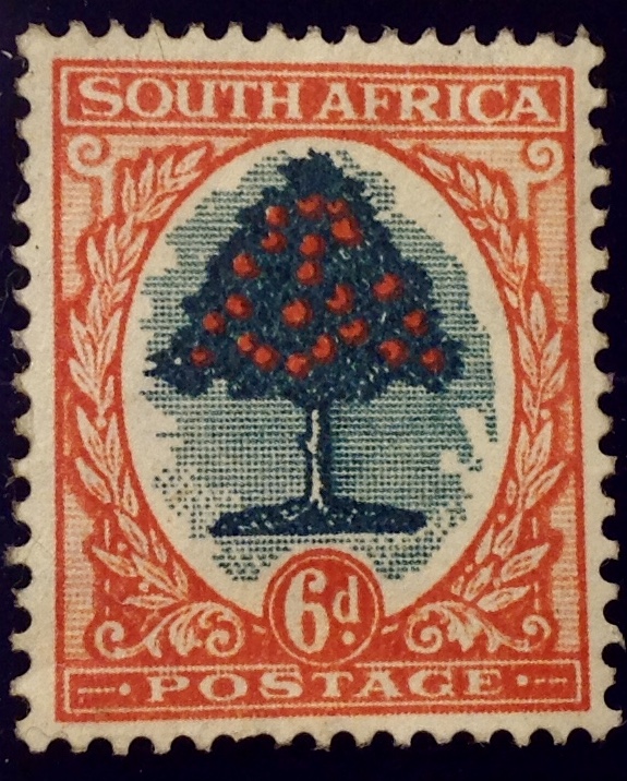
A word about that orange tree. Kind of makes you think the Orange Free State was named after the fruit, doesn’t it? Wrong. Tricked by a stamp! The name actually comes from the south African river Orange, named for the royal family of Holland, Valhalla of Boer legend. Incidentally, the coat of arms of the Orange Free State (left), similar to the badge of the House of Orange, includes bugle horns around a tree, like the stamp; NOT an orange tree. but a small tree with planed branches, like a cedar. On the stamp, however, there’s no doubt it’s an orange tree. For one thing, the Scott catalogue describes the design as “Orange tree.” For another, after the Boers and Brits formed the union of South Africa, the 6d definitive stamp featured the same orange tree — this one with full-color fruits. (see below)

Do you really want me to run through the long boring history of the Orange Free State? Well, maybe not so boring, but not that interesting to this stamp collector, anyway. There was lots of conflict — between Boers and Basothos, Boers and Brits, also occasional unease between the two neighboring Boer republics — Orange Free State and Transvaal/ZAR. After the British imperialists and Boer settlers reached their various agreements, they went their respective ways and pretty much prospered — that is, until they came to blows again. The discovery of diamonds in the rocky reefs of the high tableland contributed to the state’s fortunes — and tensions. The self-governing Orange Free State lasted from 1854 to 1902 — quite a record. A number of state presidents presided, of varying abilities. One of them was the son of Boer hero Andres Pretorius. Marthinus had the misfortune to have the Transvaal/ZAR capital city of Pretoria named after his dad. It was a tough act to follow, and he bombed. The guy who really pulled things together was Johannes Brand, who presided for a remarkable 24 years, during which he continued to be re-elected and achieved satisfactory economic growth. I have not made a close study of him. What I do now is that he seemed perfectly content to keep issuing the same set of stamps, over and over, year after year …
Over the years the Orange Free State and Transvaal/ZAR existed in harmony — most of the time. There were continuing efforts to unite them into a singular, powerful Boer republic to stand up to the Brits in Natal and the Cape Colony. The ZAR’s Paul Kruger was a Boer chauvinist who mistrusted the British. (Kruger created an international scandal in 1897 when he called Queen Victoria a kwaage Vrou — angry woman.) Orange Free Staters tended to be less anti-British — though by the time the test came in October 1899 with the Second Boer War, the two states were allied by treaty to do battle together. British Lord Roberts occupied Bloemfontein and claimed victory within four months, but Orange Free State Boers fought on — with the Volksraad meeting in the field as needed — until the Treaty of Vereniging was signed May 31, 1902. During the interval between the British annexation claim in 1900 and the signing in 1902, two parallel governments were operating, with occasional hostilities breaking out. It must have been a nightmare for the inhabitants, black and white; no to mention there were two sets of orange-tree stamps in circulation, one overprinted “V.R.I,” one not. Confound it!
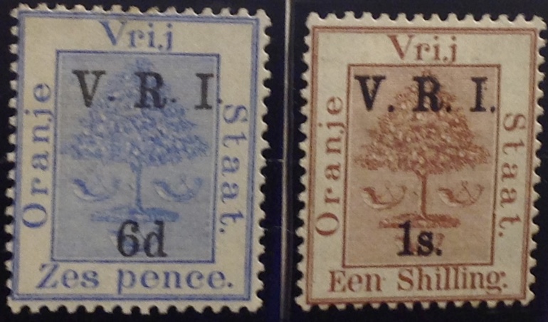
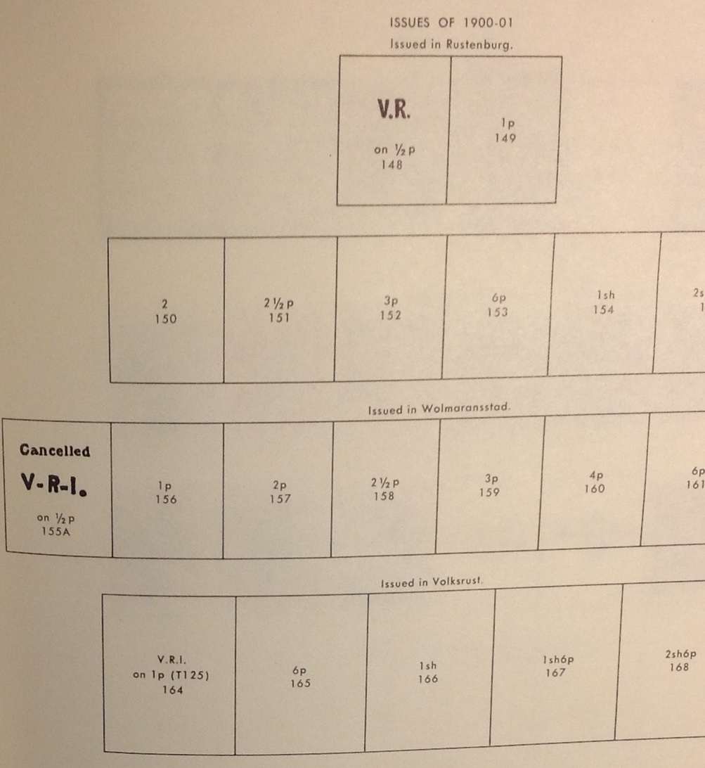
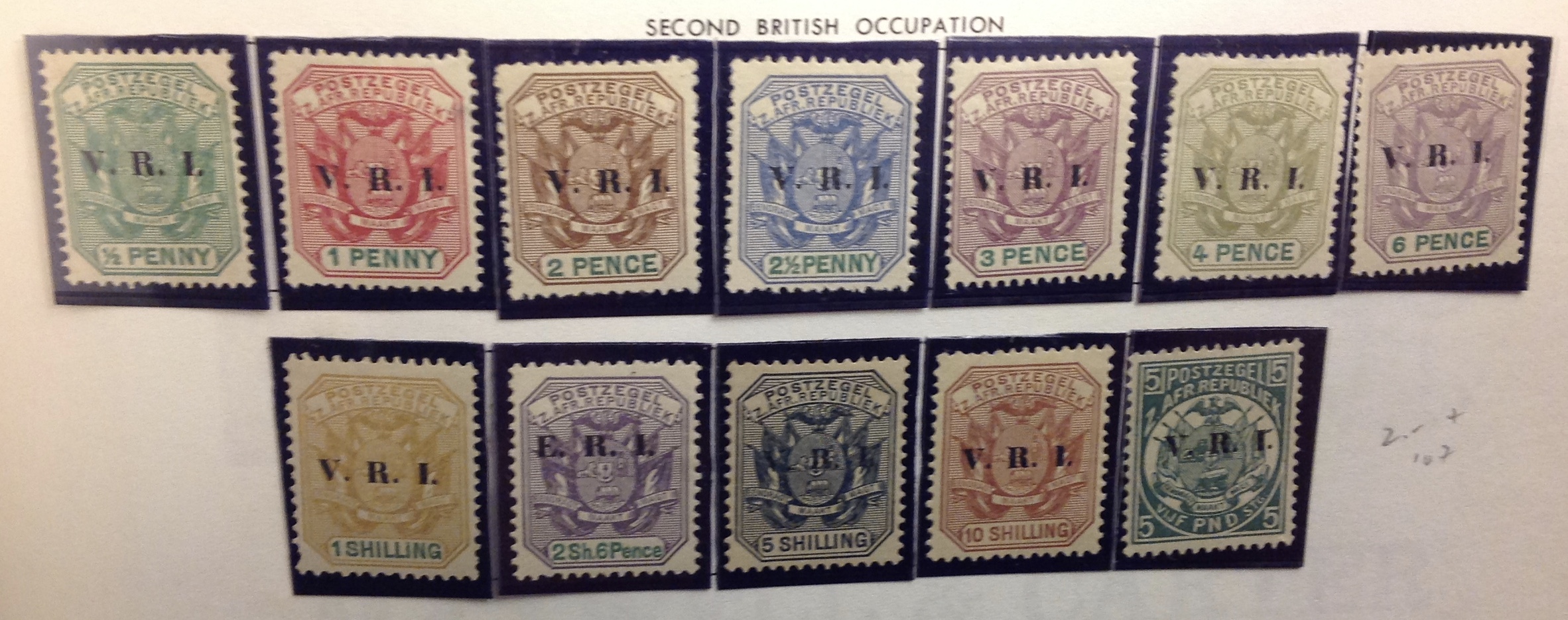
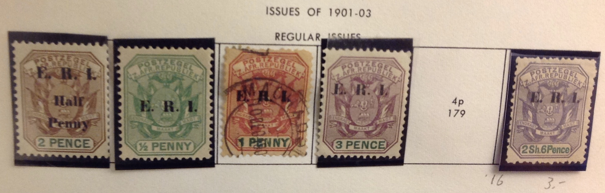
At first, the stamps issued under British occupation were no more interesting than the original Orange Tree set. The Brits simply added the overprint V.R.I. which stands for Victoria Regina Imperatrix — Victoria Queen Empress. Cute. The Scott catalogue lists two distinct sets of overprints, based on whether the periods between the initials are “Level with Bottoms of Letters” or “Raised Above Bottoms of Letters.” The set with “level” periods is scarcer than the set with “raised” periods, but it’s tricky. The catalogue lists many varieties, including “No period after V” … “Missed periods” … “Pair, one with level periods” … “Thick V” … You could spend a small fortune, accumulating a collection of these boring stamps and varieties. If you put the whole thing together, and explained it, would it be less boring?


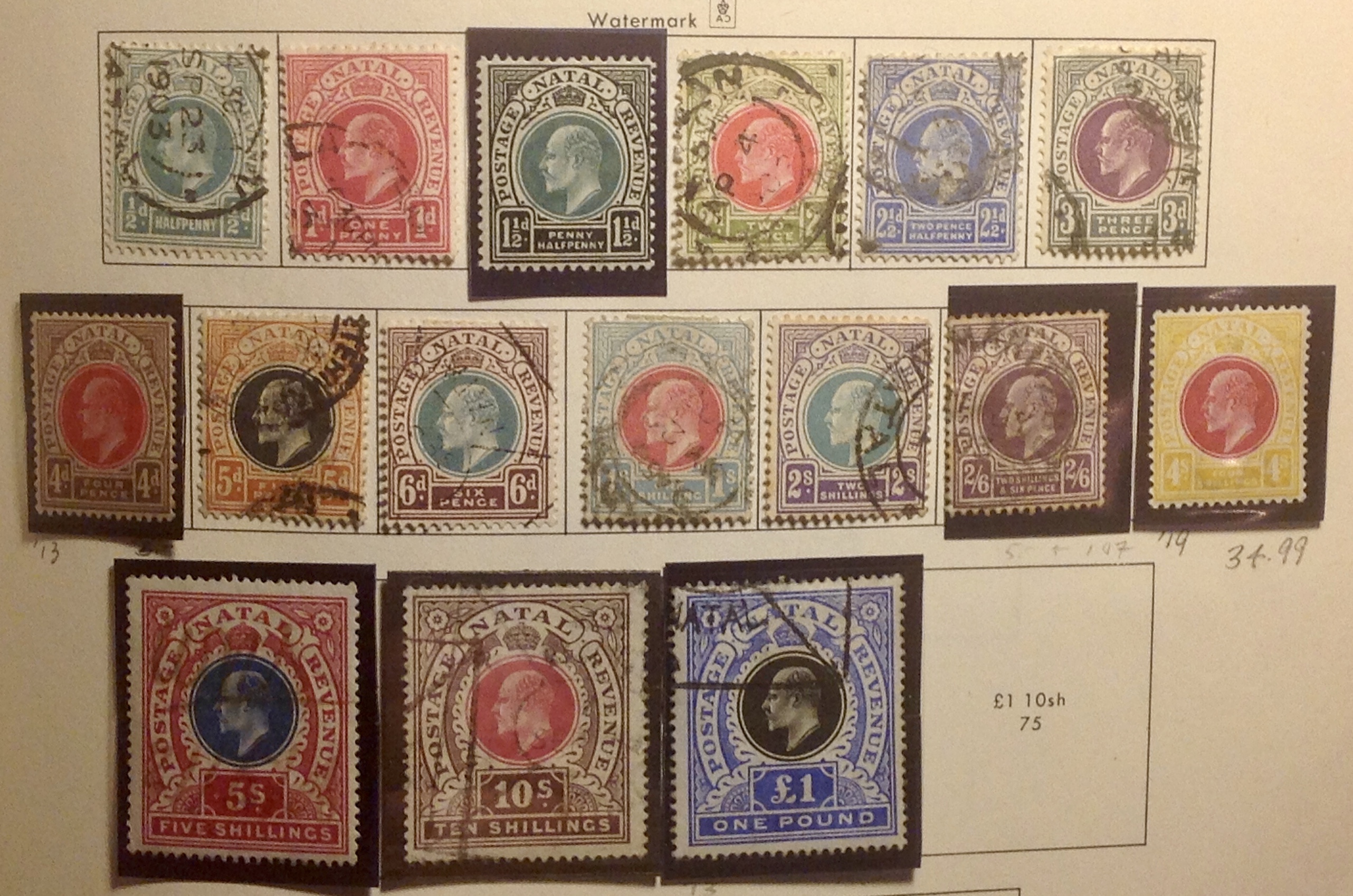
With the official launch of the Orange River Colony in 1902, postal authorities issued a n original, country-specific set, bearing a portrait of the new monarch, the late Victoria’s elderly son and heir, Edward VII. The small stamps were intricately designed with a springbok on one side and a wildebeest on the other. (I think I have those animals right.)

The stamps printed in two colors are attractive enough, if a bit garish. In any case, there wasn’t much time to complain: In 1910, South Africa took over.

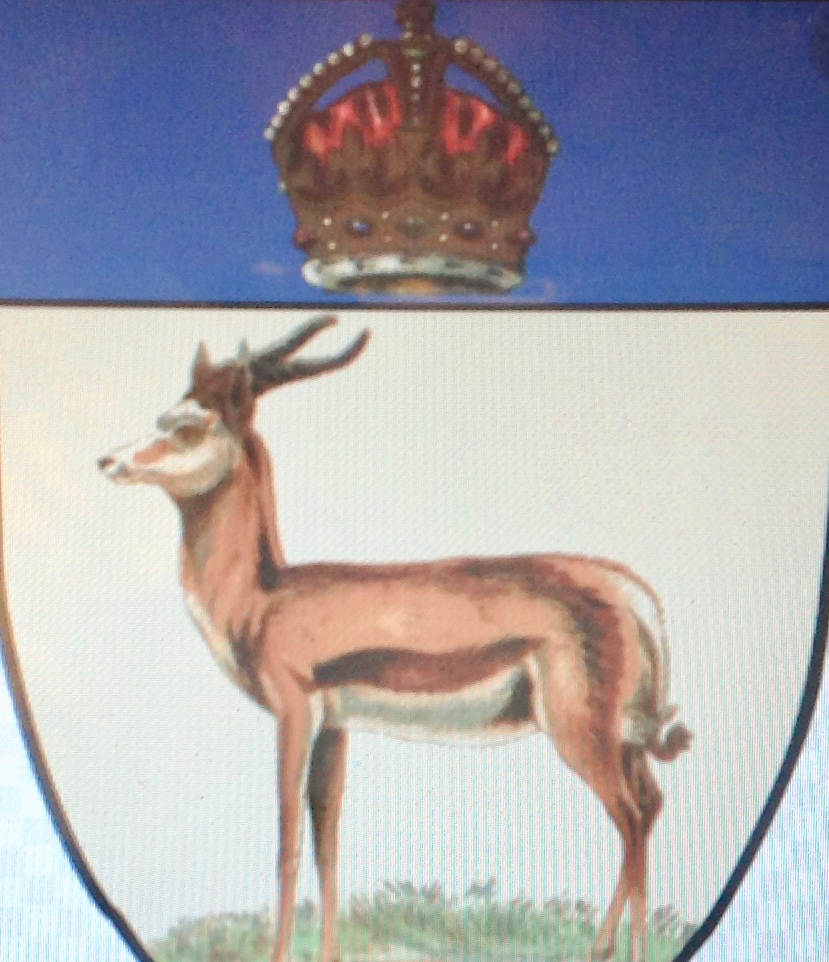
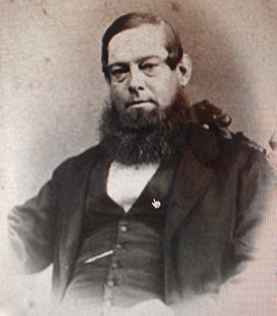
Back in 1902, as Viscount Milner assumed the post of governor of the Orange River Colony, he gathered around him the ablest of the executive and consular service, including Marthinus Steyn and Christiaan de Wet, respectively the last presidents of the Orange Free State. Another key adviser was Abraham Fischer (1850-1913), a Capetown-trained lawyer and skilled Boer statesman. Let’s stay with this suave, skilled, successful leader for a moment.
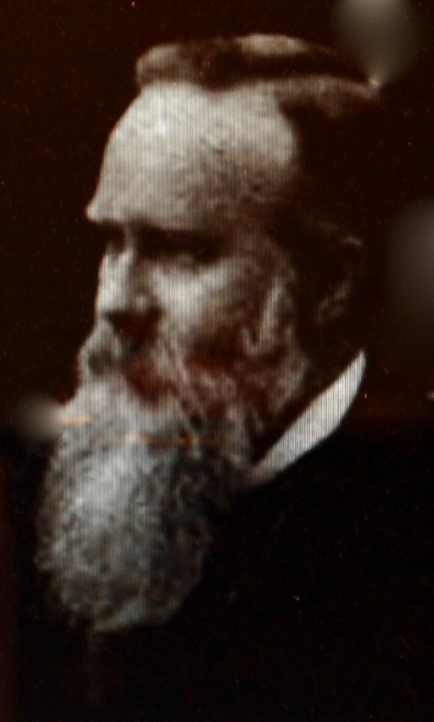
By the time the Orange Free State became the Orange River Colony, Abraham Fischer had become a key player in government. Both presidents Steyn of the Orange Free State and Kruger of neighboring Transvaal had relied on his counsel and judgment, and he was widely considered one of the Boers’ most adept strategists. When Lord Selbourne moved in 1905 to establish self-government in the Orange River Colony, the governor, by then Sir Hamilton Goold-Adams, asked Fischer to form a ministry. The self-governed Orange River Colony operated for only three years, from 1907 to 1910, and the colony itself existed for less than 10 years total; but they were years of peace, prosperity and effective governance. Despite having to cope with swings in business cycles, agricultural drought and political dissension, the regime and its diligent civil service managed to produce a surplus each year without raising taxes. (The diamond mines helped.) The railways expanded and schools (for whites) were improved. After the union, Fischer was appointed interior minister of the new South African government, though he only served three years before his death in 1913 at age 63.
As a Boer, Fischer could have been expected to harbor similar racist views as compatriots like Brand, Kruger and Smuts. Fischer and Smuts were suave diplomats who played a key role in reconciling Boers and Brits — no mean feat after a century of antagonism and occasional bloodletting that culminated in Cecil Rhodes’ failed Jameson Raid of 1896 and the confrontation between Kruger and Lord Kitchener in the Second Boer War of 1899-1902. By 1910, thanks to the efforts of Fischer, Smuts and others, the two “white tribes” of southern Africa had figured how to lay down their arms, make peace and enjoy the spoils in a new, bilingual state.
Fischer and Smuts helped bring Boers and Brits together, but they were less enthusiastic about reconciling whites and blacks. During Fischer’s short Orange River Colony mandate, he did manage to organize a Department of Native Affairs. Whether or not this was a promising development I don’t know. But blacks would never vote in the Orange River Colony, any more than they did in the Orange Free State.
The reason I pursue this matter of Abraham Fischer and black south Africans is because of his progeny. His son Percy became a judge, and I know little about him. However his grandson, Abraham Lewis (“Bram”) Fischer, was a horse of an entirely different hue. Get ready for this story.
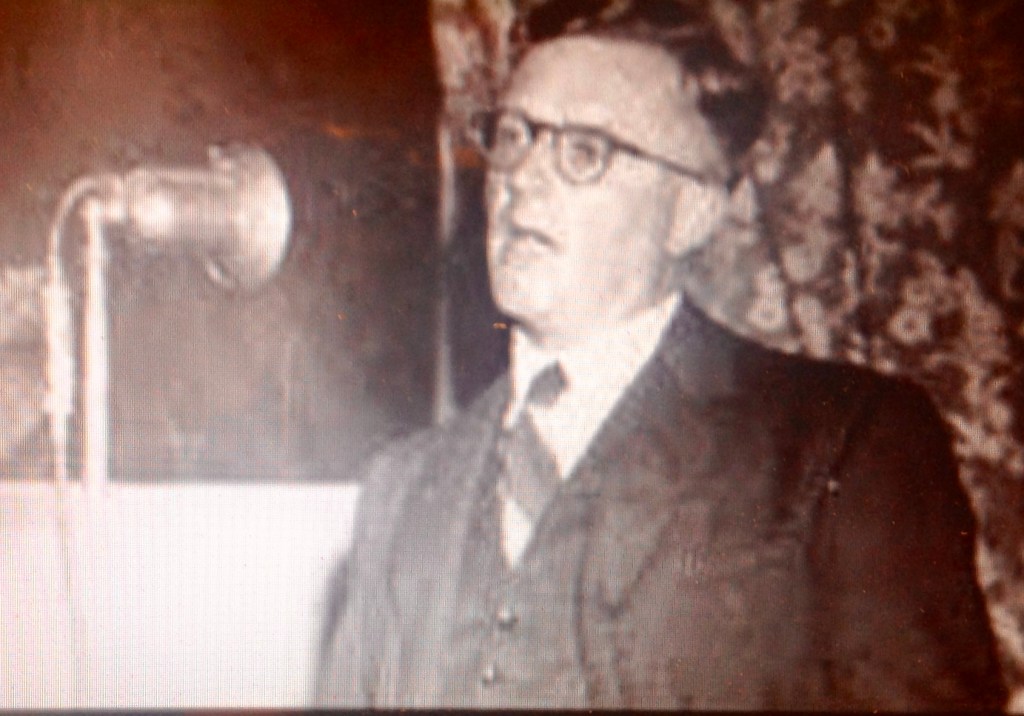
Bram Fischer was born in 1908, studied at Oxford and became a lawyer. During a trip to Europe in 1932 he visited Russia. The 24-year-old wrote to his father that he saw similarities between the abuses of Russian peasants and South Africa’s blacks. Now, here was a sentiment you would not expect to hear, coming from a scion of Boer aristocracy. Yet Bram Fischer would not be eterred. Somewhere along the line, he had picked up the idea that South Africa’s racism not only was wrong, but would destroy the nation unless it changed. (Remarkably similar views were expressed decades earlier by F.X. Merriman, aide to the Cape Colony Gov. Molteno, who warned: “The greatest danger to the future lies in the … vain hope of building up a state in a narrow, unenlightened minority.”) These convictions led Bram Fischer to join the South African Communist Party, where he became a leader and key strategist. He collaborated with a young man named Nelson Mandela of the African National Congress, a fellow graduate of the racially inclusive Witwatersrand University in Johannesburg. Fischer forswore the racist Boer ideology, was shunned by friends and colleagues, and continued to wage the good fight over the years. His proudest moments may have come in 1961, when he successfully defended Mandela and others against charges of treason; and In 1964, when the ANC leader was tried again, convicted and sentenced to life in prison — another victory for Fischer’s defense team, since the prosecution had called for the death penalty.
In saving the life of South Africa’s future president, Fischer sacrificed his own freedom. Soon after the trial, Fischer was arrested and put on trial for his activities with the South African Communist Party, long outlawed by the government. There was never any doubt about his “guilt” — the party was illegal, and Bram Fischer was one of its pillars. Somehow, Fischer had kept his ”subversive” activities out of view — up to now. As friends urged him to take Mandela’s case, Fischer knew the public spectacle of a treason trial would expose him. Nevertheless, he persisted. One friend who had urged him to take the case, not knowing of Fischer’s risk, said later: “He deserves the Victoria Cross.”
I know I should move on, but this story is just too good to leave at this point, so please bear with me. Before his trial, Fischer was allowed to travel to London to handle a patent case. The judge let him leave South Africa because upon his promise to return. “I am an Afrikaner,” Fischer said. “My home is South Africa. I will not leave my country because my political beliefs conflict with those of the Government.” Return he did — but not to sit in a courtroom. Instead, Fischer went underground to continue his fight against apartheid. He wrote to the judge:
“… (My) absence, though deliberate, is not intended in any way to be disrespectiful. Nor is it prompted by any fear of the punishment which might be inflicted on me. Indeed I realize fully that my eventual punishment may be increased by my present conduct …
“My decision was made only because I believe that it is the duty of every true opponent of this Government to remain in this country and to oppose its monstrous policy of apartheid with every means in his power. That is what I shall do for as long as I can. …”
Fischer was found guilty in 1965 in absentia and disbarred. Later that year he was arrested and put on trial again for trying to overthrow the government. He was convicted and received a life sentence. Before long the personable and dynamic inmate became a prison leader, popular even with the warden. While prisoners in South Africa at the time usually were released early, political prisoners were singled out for harsh treatment, compelled to serve every day. Fischer’s life sentence was shortened only by fate — he died of cancer in 1975. The authorities punished him to the end, neglecting his treatment. Only in his last weeks did the regime — pressed by the public and international outcry — allow him to die at his brother’s home in Bloemfontein. Unlike Mandela, Fischer would not see apartheid fall in 1991.
Since his death, Fischer’s reputation has been restored. In 2002, he became the first South African reinstated to the bar posthumously. The airport in Bloemfontein was renamed Bram Fischer International Airport in 2012. Oxford hosts an annual Bram Fischer Memorial Lecture.
Mandela counted Fischer among the “bravest and staunchest friends of the freedom struggle that I have ever known.” He noted that with his pedigree and talents, Fischer could have become South Africa’s prime minister. “As an Afrikaner whose conscience forced him to reject his own heritage and be ostracized by his own people, he showed a level of courage and sacrifice that was in a class by itself,” Mandela said. “No matter what I suffered in my pursuit of freedom, I always took strength from the fact that I was fighting with and for my own people. Bram was a free man who fought against his own people to ensure the freedom of others.”

I am left wondering — without answers as yet — whether the spark that led to Bram Fischer’s awakening was kindled somehow by the judicial integrity of his father, and before that by his grandfather Abraham Fischer, the one and only president of the Orange River Colony. (I wish someone would find out …)
I will end this tale with more from Bram Fischer, because I think his words resonate today as well as when they were written more than half-a-century ago. In his letter to the court, Fischer declared that he and his co-defendants were being punished “for holding the ideas today that will be universally accepted tomorrow.” More of his words:
“What is needed is for White South Africans to shake themselves out of their complacency, a complacency intensified by the present economic boom built upon racial discrimination. Unless this whole intolerable system is changed radically and rapidly, disaster must follow. Appalling bloodshed and civil war will become inevitable because, as long as there is oppression of a majority, such oppression will be fought with increasing hatred.
“… when the laws themselves become immoral and require the citizen to take part in an organized system of oppression — if only by his silence and apathy — then I believe that a higher duty arises. This compels one to refuse to recognize such laws.”
And: “All the conduct with which I have been charged has been directed towards maintaining contact and understanding between the races of this country. If one day it may help to establish a bridge across which white leaders and the real leaders of the non-white can meet to settle the destinies of all of us by negotiation, and not by force of arms, I shall be able to bear with fortitude any sentence which this court may impose on me. It will be a fortitude, my Lord, strengthened by this knowledge, at least, that for the past 25 years I have taken no part, not even by passive acceptance, in that hideous system of discrimination which we have erected in this country, and which has become a byword in the civilized world.”
Dear reader, we have wandered far indeed from the world of stamp collecting. Isn’t it marvelous? I searched in vain for a stamp commemorating Bram Fischer or his grandfather Abraham. Too bad. Bram Fischer surely ranks as one of history’s great champions of equality and freedom.
TO BE CONTINUED
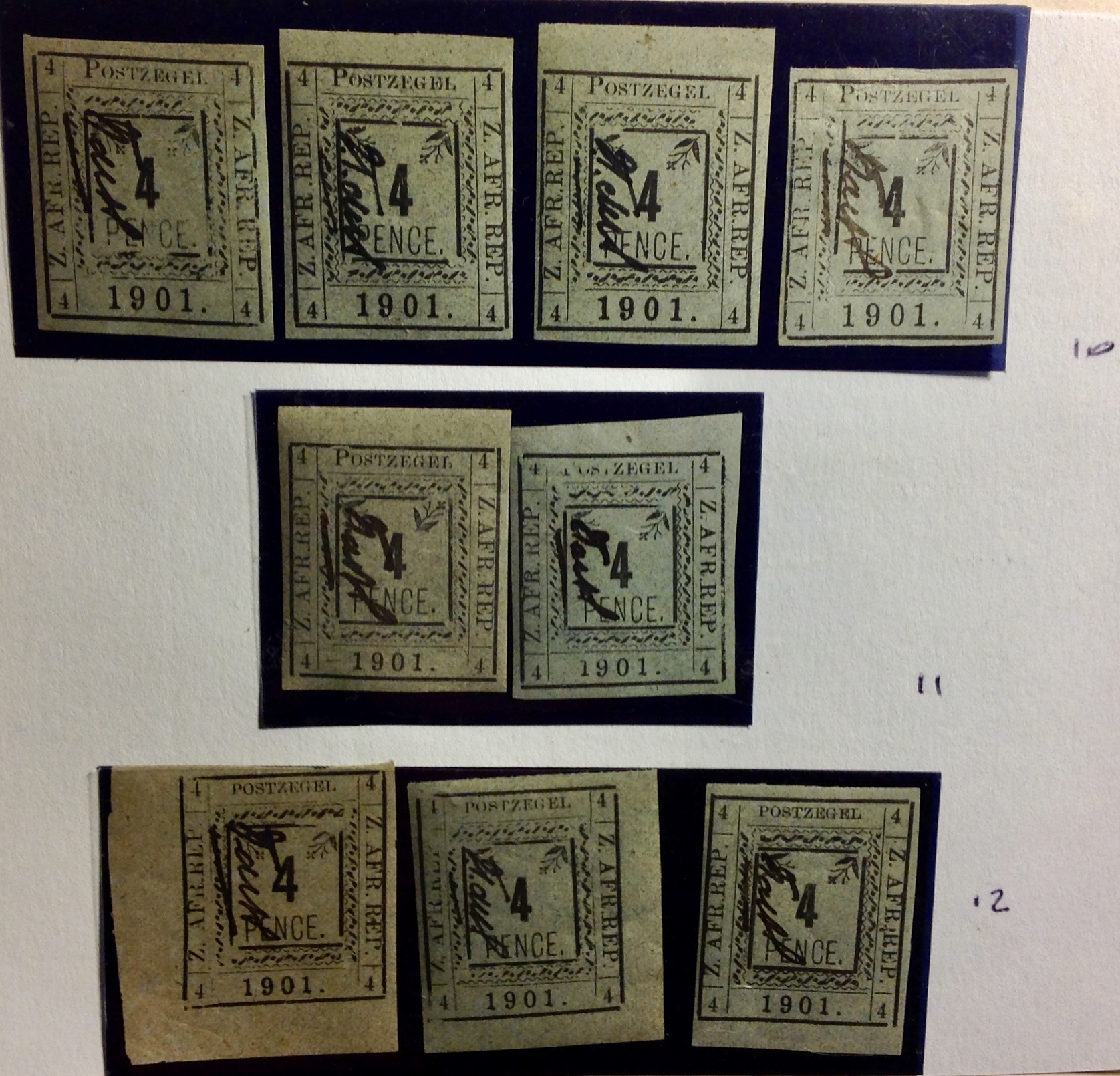 already left the country. The provisional government in Pietersburg was running low on stamps — a truly dire circumstance! — so the authorities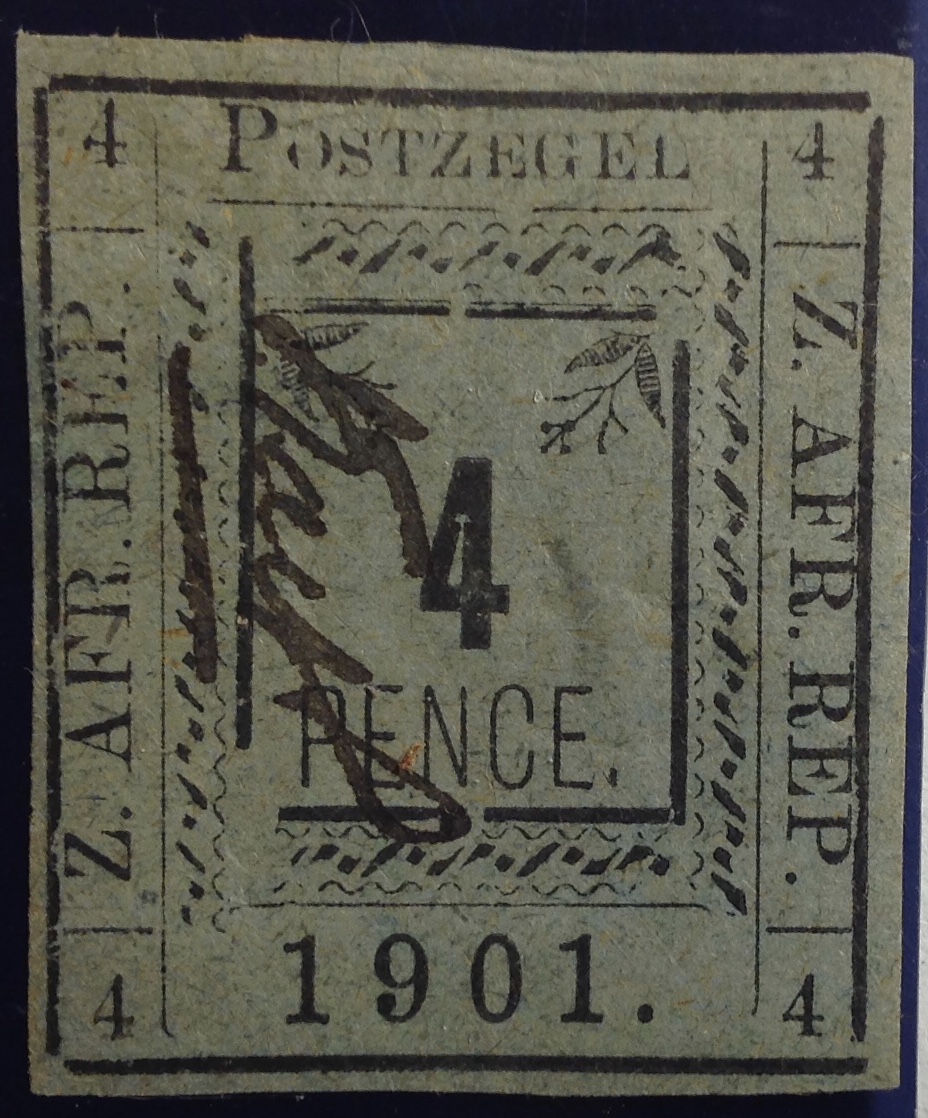
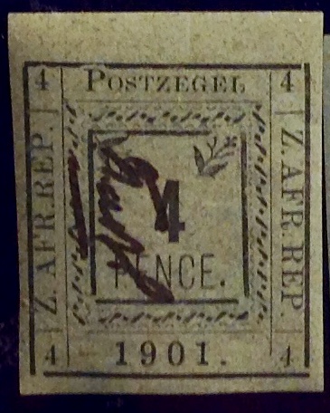
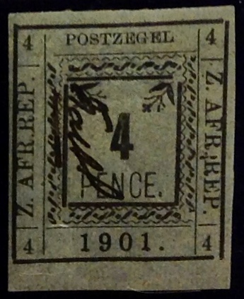
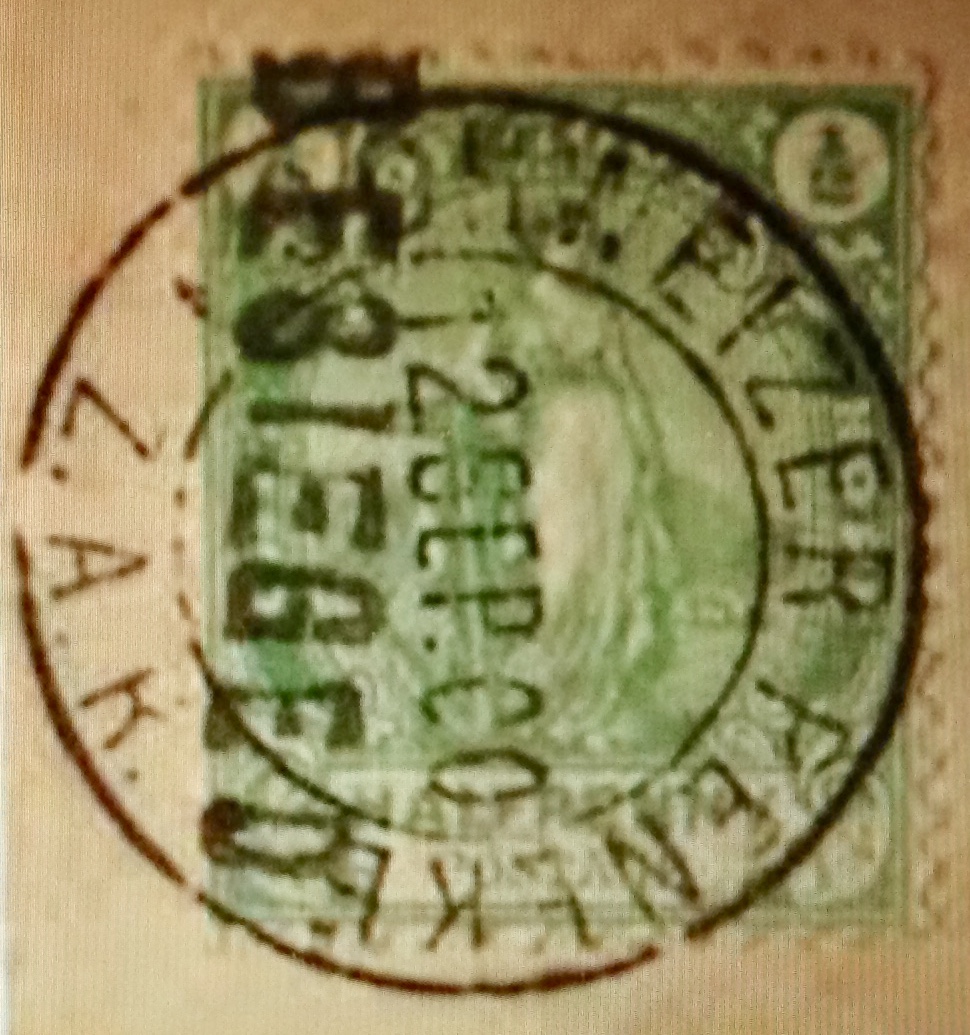
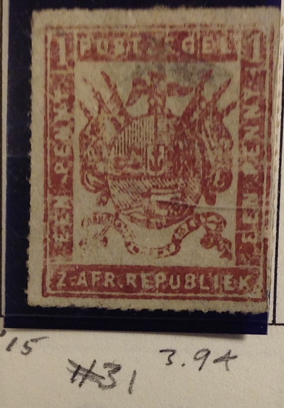
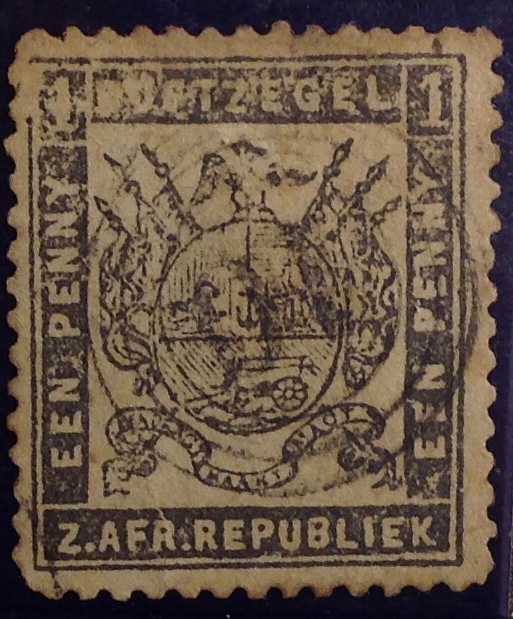 and 31, illustrated here. The Scott catalogue helped a lot in distinguishing tell-tale signs of forgery, leaving me fairly confident that the stamps I bought are the genuine article. Allow me to accompany you a bit further into the philatelic weeds while we pick our way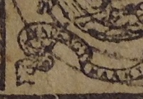
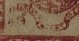
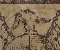
 prepared to pursue.)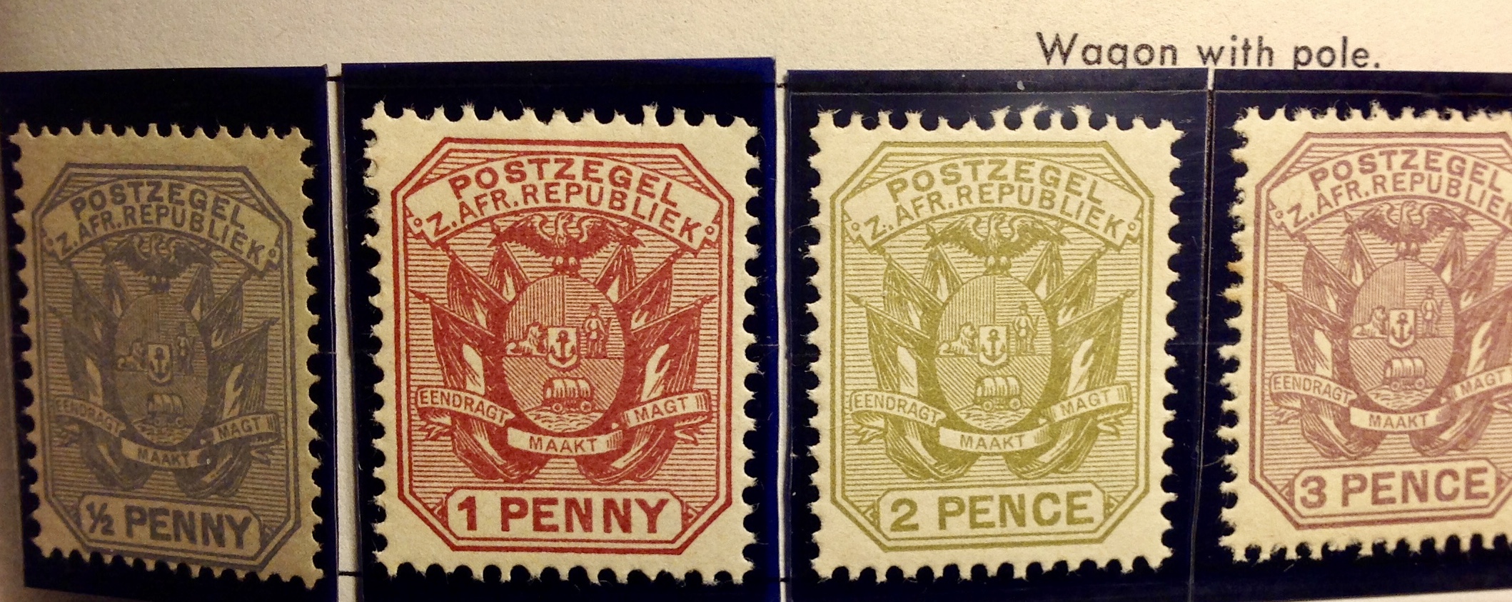
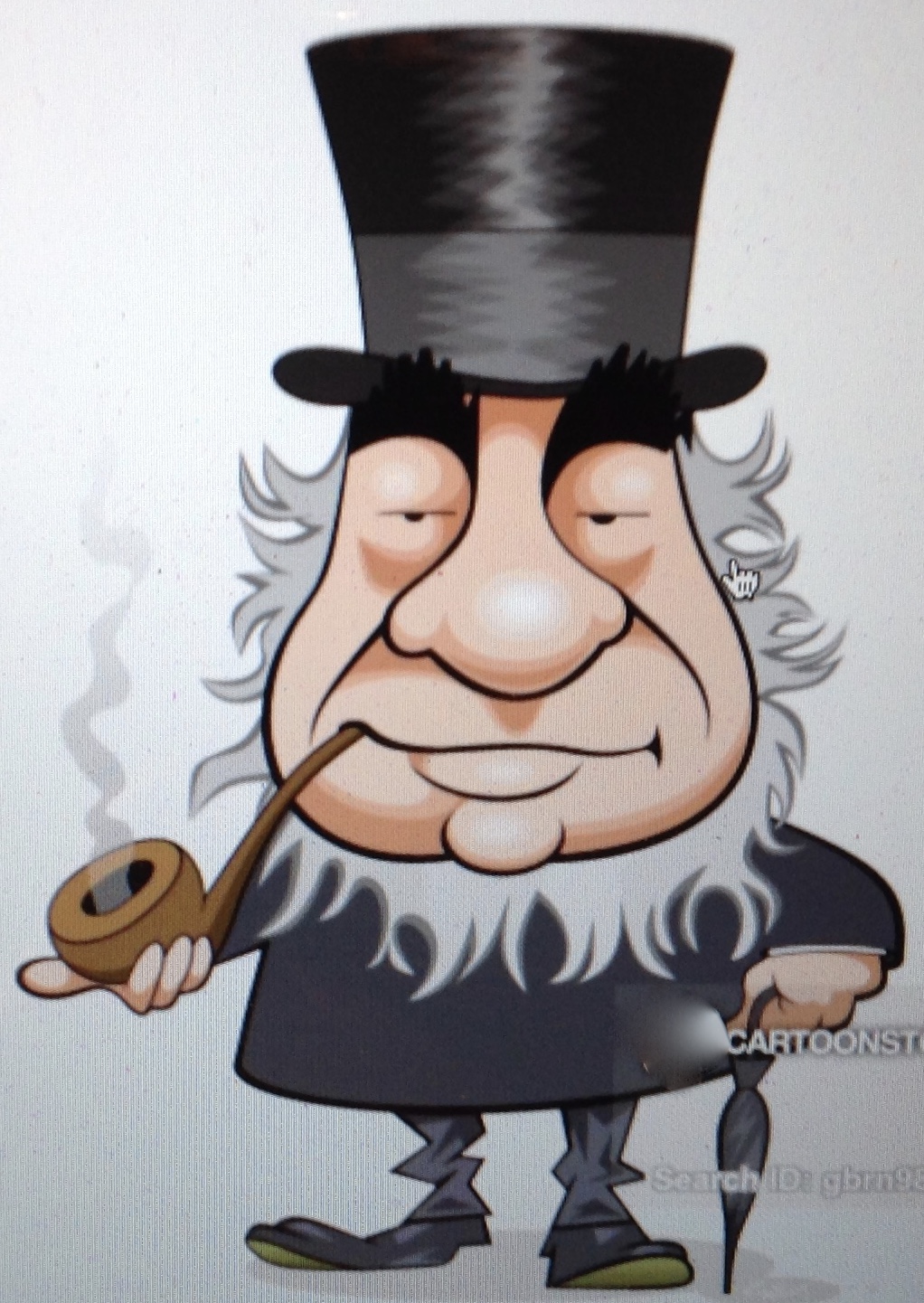 Anecdotes and legends swirl around Paul Kruger, celebrated in his day as “Oom Paul” — Uncle Paul. He was the immovable cornerstone of Boer aspirations late-19th-century southern Africa, the Keeper of the Vow, even as he was reviled as a racist, obstructionist rube. Kruger was born on the eastern edge of the Cape Colony in 1825. His family had lived in south Africa since 1668. The Krugers moved across the Orange River in 1836 as part of the Great Trek. He had little or no formal education outside of the Bible. He grew up fast amid skirmishing Boers, Brits and Bantus. By his teenage years, Kruger was already an accomplished frontiersman, horseman and guerrilla
 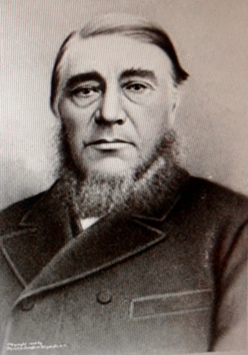 fighter. In his memoirs he said he shot his first lion at 16, though others say he was 14, or perhaps 11. After breaking a leg in an accident, the story goes, Kruger repaired his wagon and drove it to safety — though one leg was shorter than the other thereafter. He spoke Dutch, basic English and several African languages — and believed all his life that the Earth was flat.
 But Kruger’s capacity for leadership, his zeal for autonomy and his unshakable faith set him apart. He caught the eye of Andries Pretorius, the Boer leader who founded the short-lived Republic of Natalia. Biographer Johannes Meintjes observed that Pretorius saw in Kruger a man behind whose “tough exterior was a most insular person with an intellect all the more remarkable for being almost entirely self-developed.” Later on, a discerning Lady Phillips was said to have commented on the president’s comings and goings in Pretoria in his
 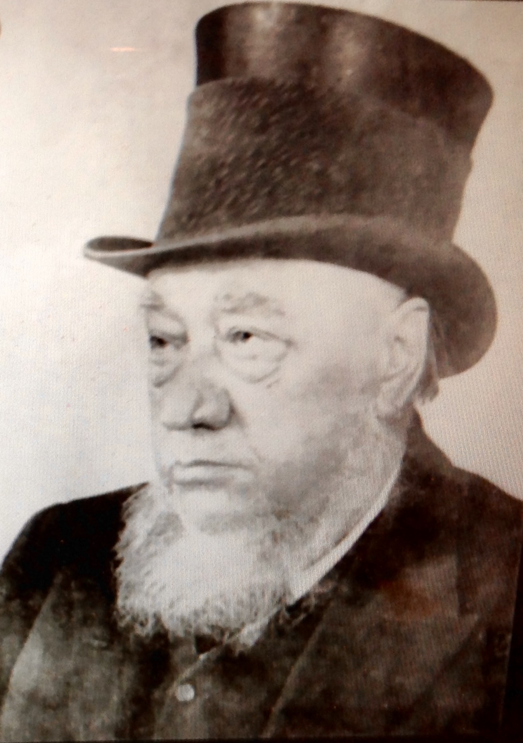 stained frock coat and tall hat: “I think his character is clearly to be read in his face — strength of character and cunning.”
 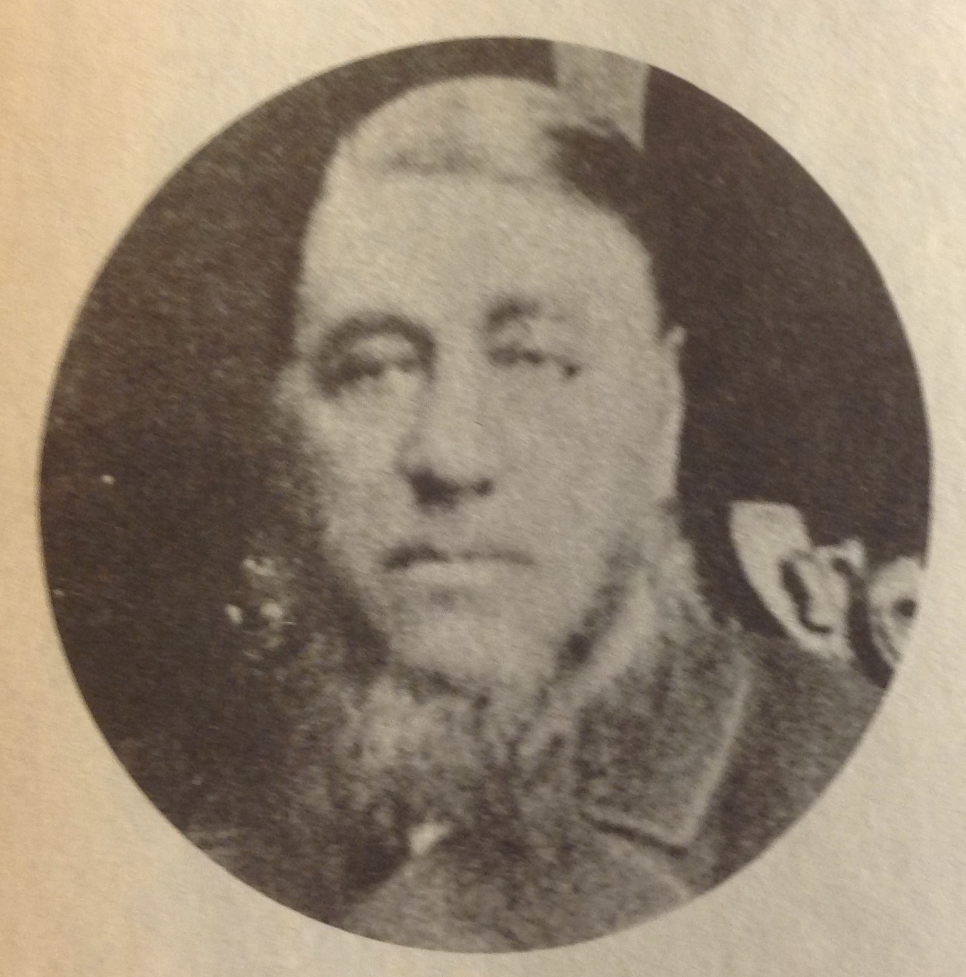 ZAR/Transvaal in 1878, it didn’t take long for Kruger to begin agitating for new arrangements with the Crown. In 1880 Kruger, Martinhus Pretorius and Joet Joubert were called to confer with the British overlords, and on December 16 the Boer leaders declared renewed independence for the ZAR. Shooting and bloodshed followed, with the Boers prevailing at Laing’s Nek, Ingogo and beyond. Rather than pressing imperial interests, British Prime Minister William Gladstone chose to negotiate, granting the Boers local autonomy and in the London Convention of 1884, full independence under a new president — Paul Kruger.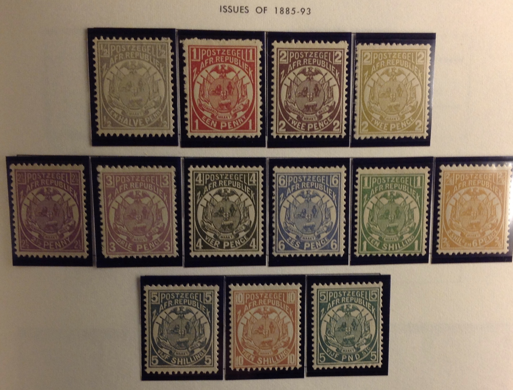
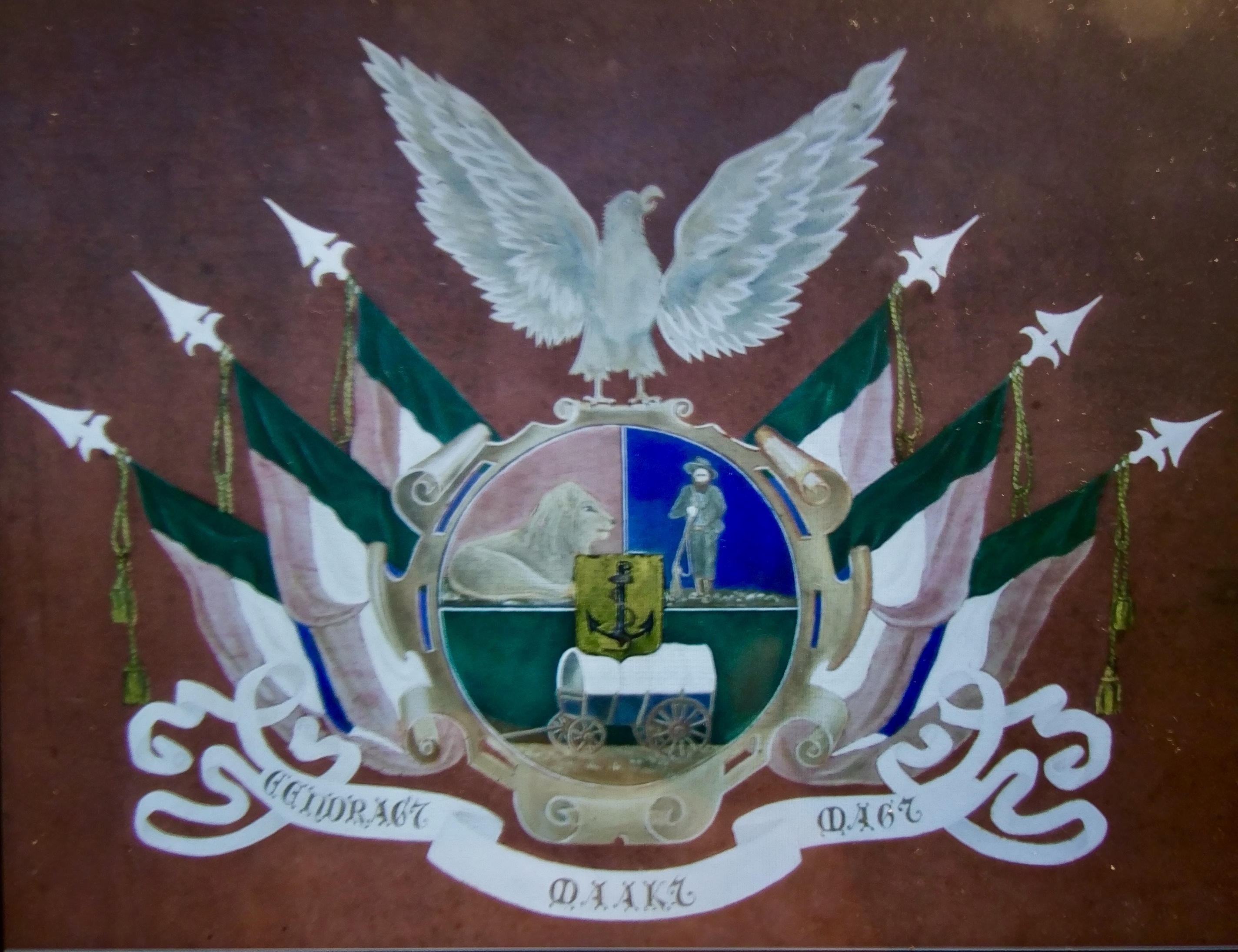
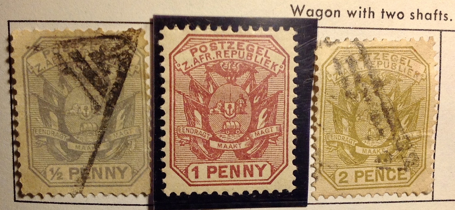
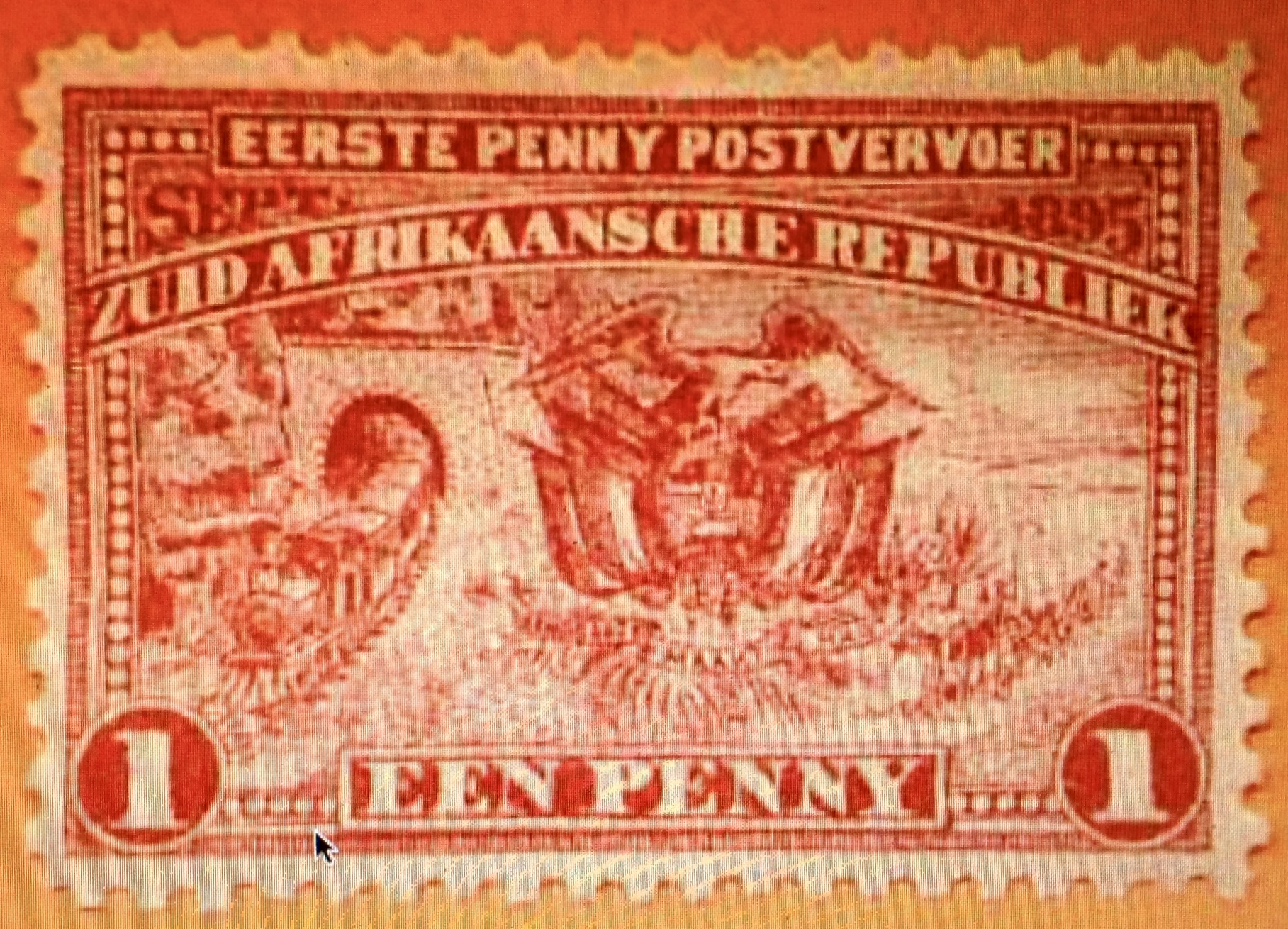
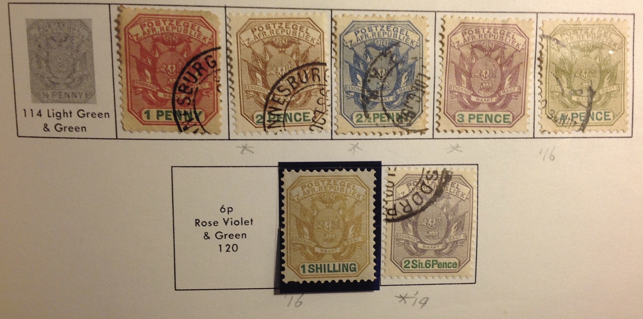 The British continued to call the region Transvaal, though the stamps issued after 1884 all carried the name “Z.Afr.Republiek,” in line with a postal convention between ZAR, the Orange Free State and Cape Colony. In what looks like a cheeky maneuver, the Boers also took the 4d. stamp from the Queen Victoria series of 1878 and surcharged it “Een Penny” — simultaneously asserting their Afrikaner supremacy and devaluing a British artifact from four pence to one penny. Cute! Other than that, all the new ZAR stamps, as before, had the same design: the Boer coat of arms.
  ZAR increased their pressure for full citizenship rights and privileges. Paul Kruger with his plain politics, his biblical certainty and stubborn commitment to Boer supremacy, was ill-suited to the task of guiding his sturdy wagon of state through the economic expansions and upheavals of the century’s end.
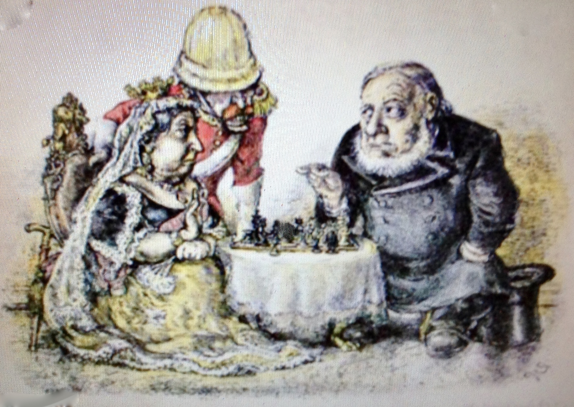
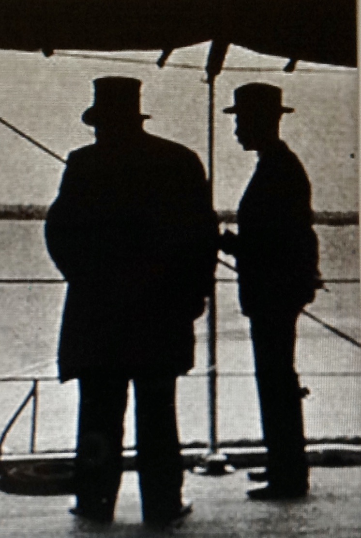
  bigger than Cape Town. The uitlanders and their British surrogates, including Cecil Rhodes, had been humiliated by the failed Jameson Raid of 1896, and Kruger had a strong ally and protege in his bright young state attorney, Jan Smuts.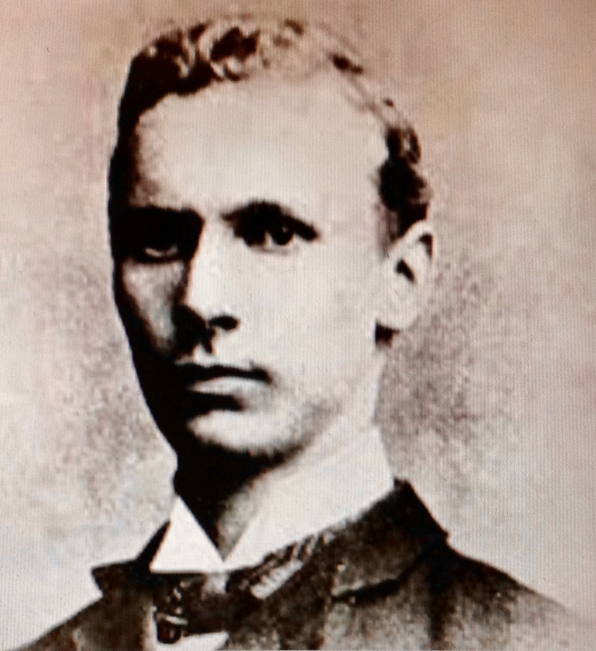
 This “stamp,” or Cinderella label, at left is quite a puzzler. (The image is from the Internet.) It pays tribute to Paul Kruger — in Spanish and Latin. (“Glory to Kruger — The Transvaal for the Boers”) The best I can figure is that this was a propaganda label put out around the time of the Second Boer War. A number of settlers from the Transvaal had relocated to Argentina. There they formed a close-knit farming community and outpost that has lasted to this day.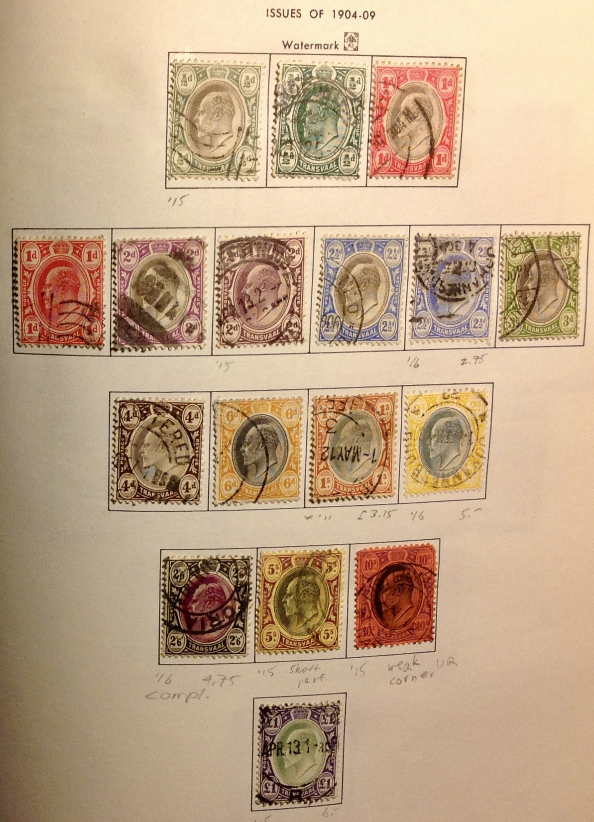
 philatelic proclivities, only occasionally sighing or intervening when my spending habits start to deplete the family treasury.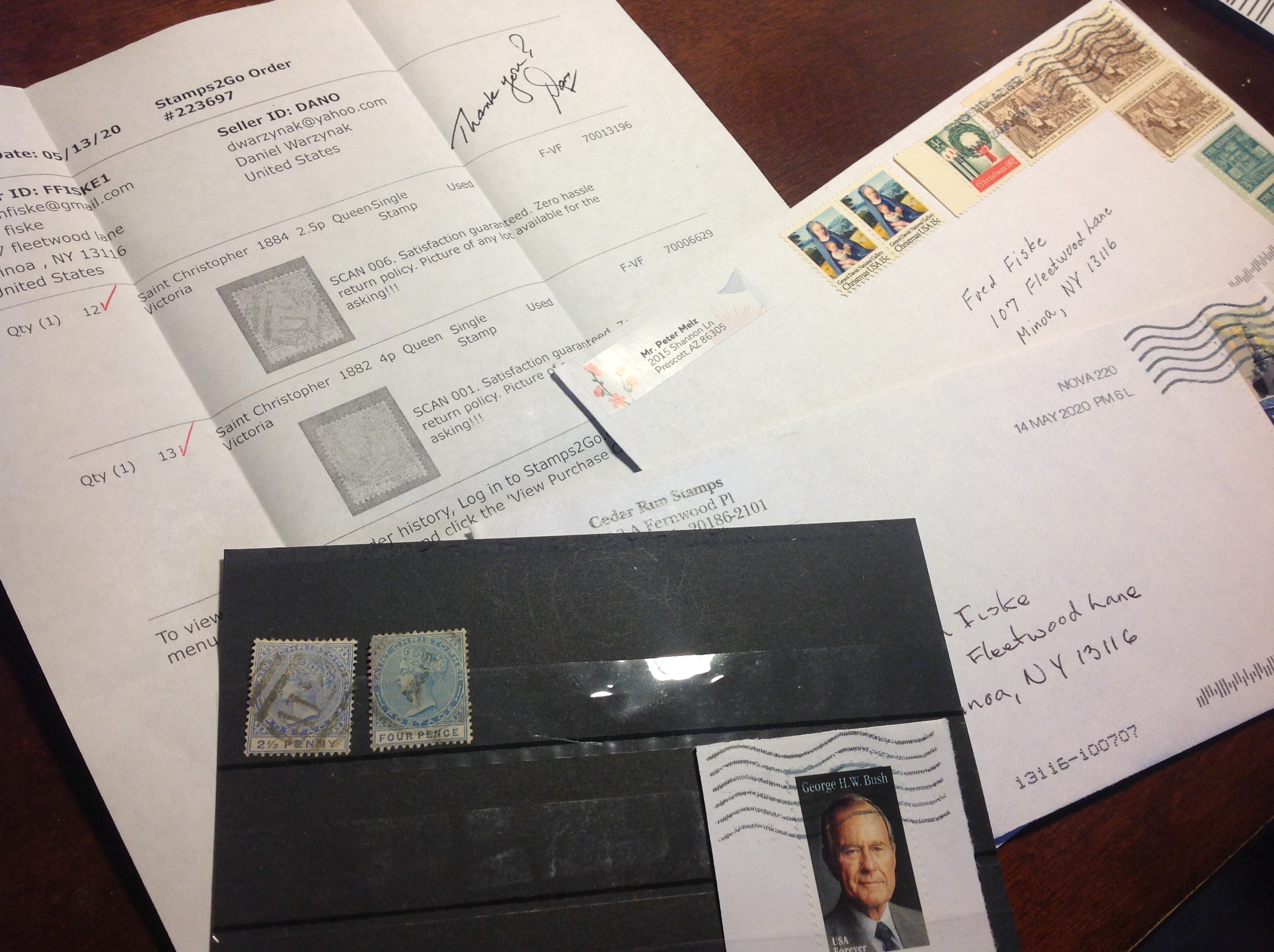
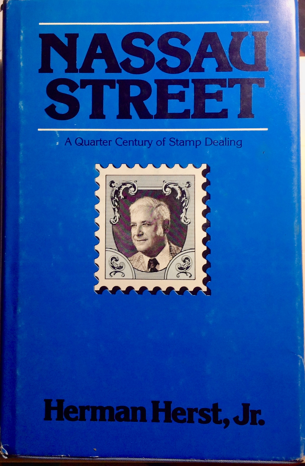 Quarter Century of Stamp Dealing,” by Herman Herst Jr. One copy was a signed first edition, the other a standard hardcover reprint. (I think George
 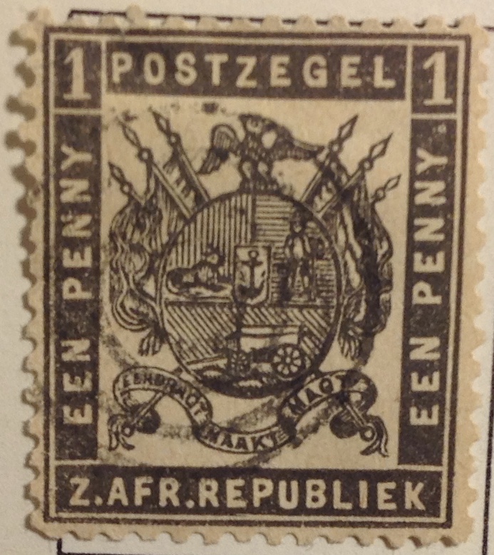 EDITOR’S NOTE: The third stamp-issuing authority in British South and Central-East Africa, in 1869 (after Cape of Good Hope in 1853 and Natal in 1857) was not in British territory. The ZAR — Zuid Afrikaansche Republiek — was into its 14h year as an independent Boer republic. Today there is no map reference to the ZAR, or Transvaal. Much of the high veld territory comprises the province of Gauteng in the Republic of South Africa. The postal history of ZAR/Transvaal is such a rollicking tale that it will take three installments to get it all out …
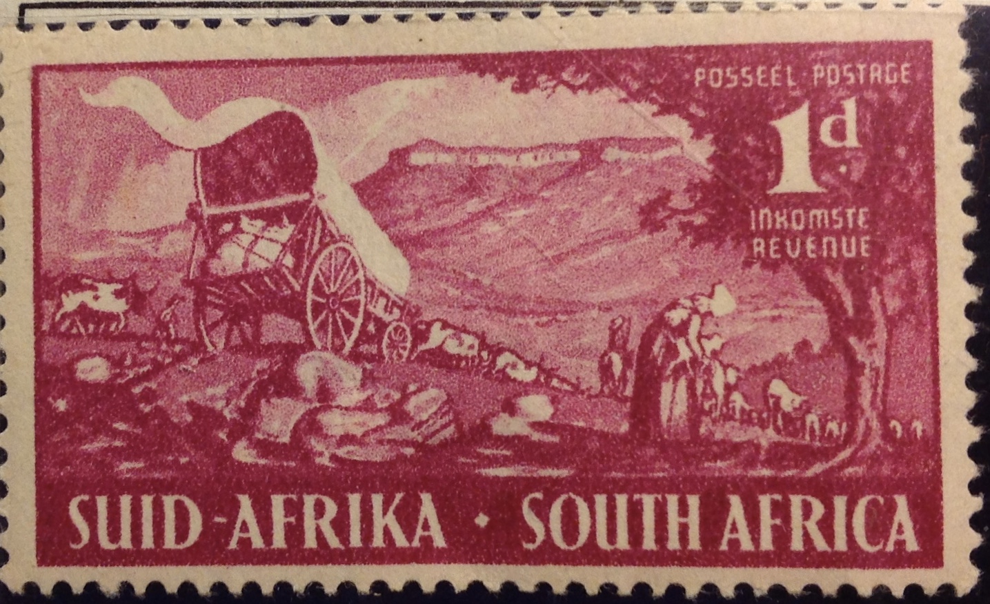 intothe tribal frontier. “Trans-Vaal,” or Transvaal, is another name for the territory that became a battleground between imperial Britain and the indigenous “tribe” of Boers. When the fighting was over in 1902, the carnage was considerable. The Boer death toll was about 25,000, while the British lost
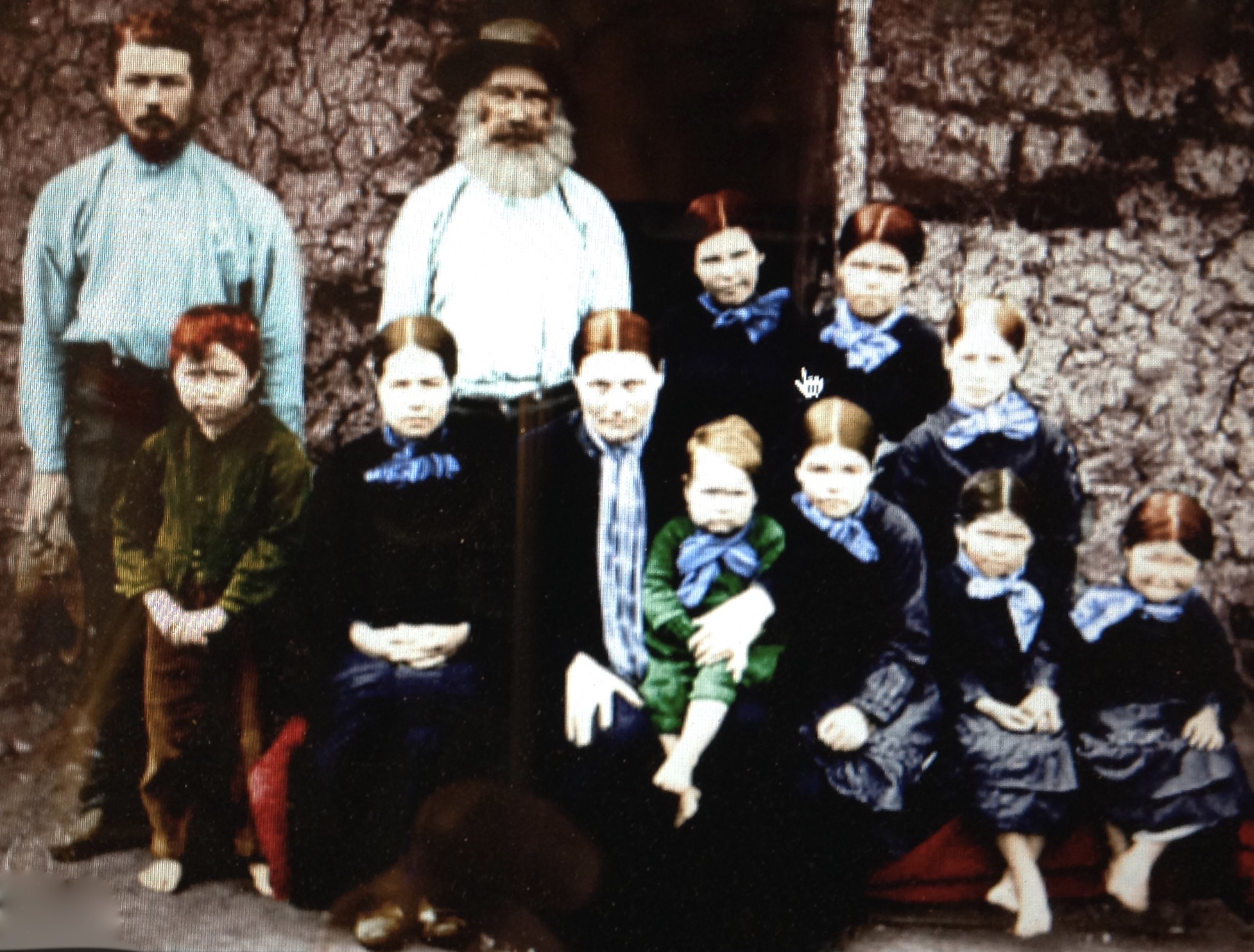 the sweet life — lekker lewe. The settlers did make for themselves a
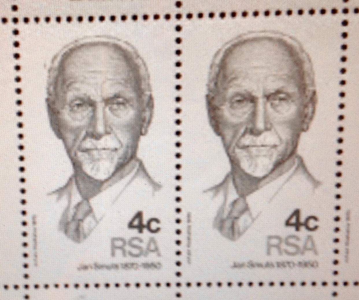 1870s.
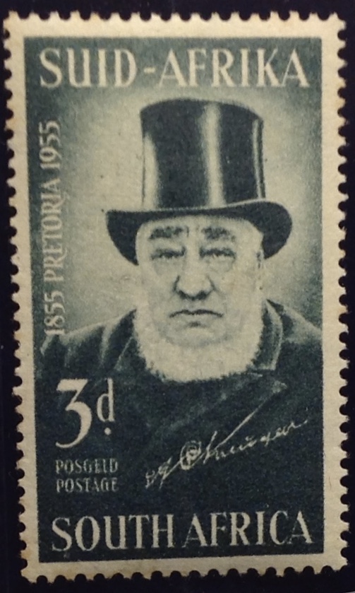 Among the early trekkers was Paul Kruger. Born in the eastern Cape Colony in 1825, he relocated with his family as a child in 1836.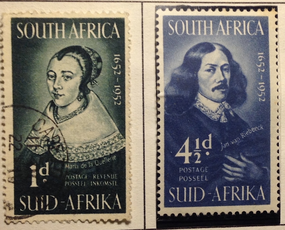
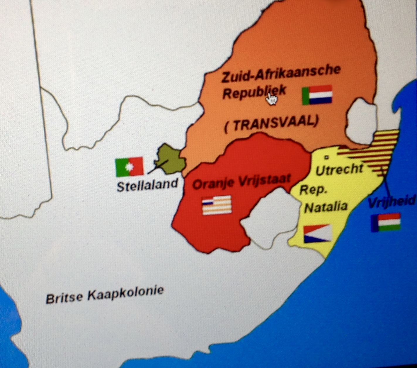 chauvinism led to all kinds of administrative and political problems through the years, not only in the ZAR, but in the neighboring Orange Free State and in smaller enclaves like Stellaland, Lijdenburg, Utrecht and Goosen (Goshen).
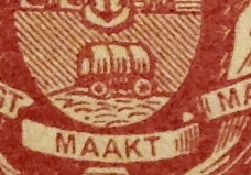
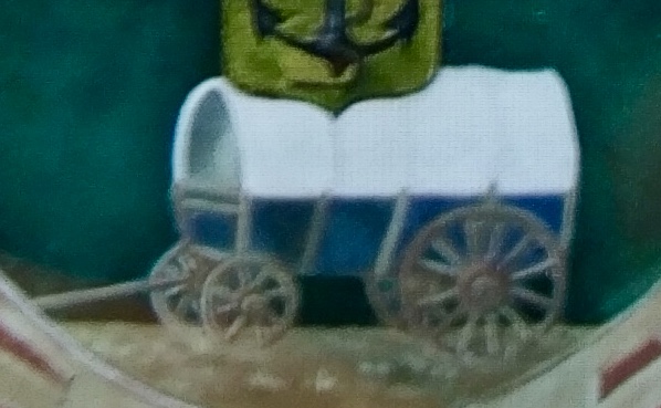
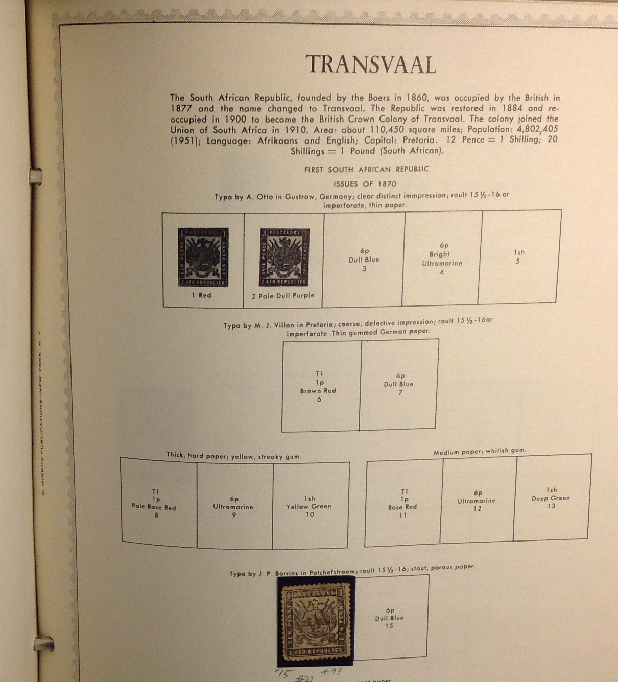 From the beginning, all ZAR stamps bore the same design — the ZAR’s coat of arms, official badge of the Boers. As you can see from the title page of my collection, I don’t have any of the costly first stamps from ZAR/Transvaal. There’s one down toward the bottom of the page — No. 21 — that I took a risk buying. (More about this later.)
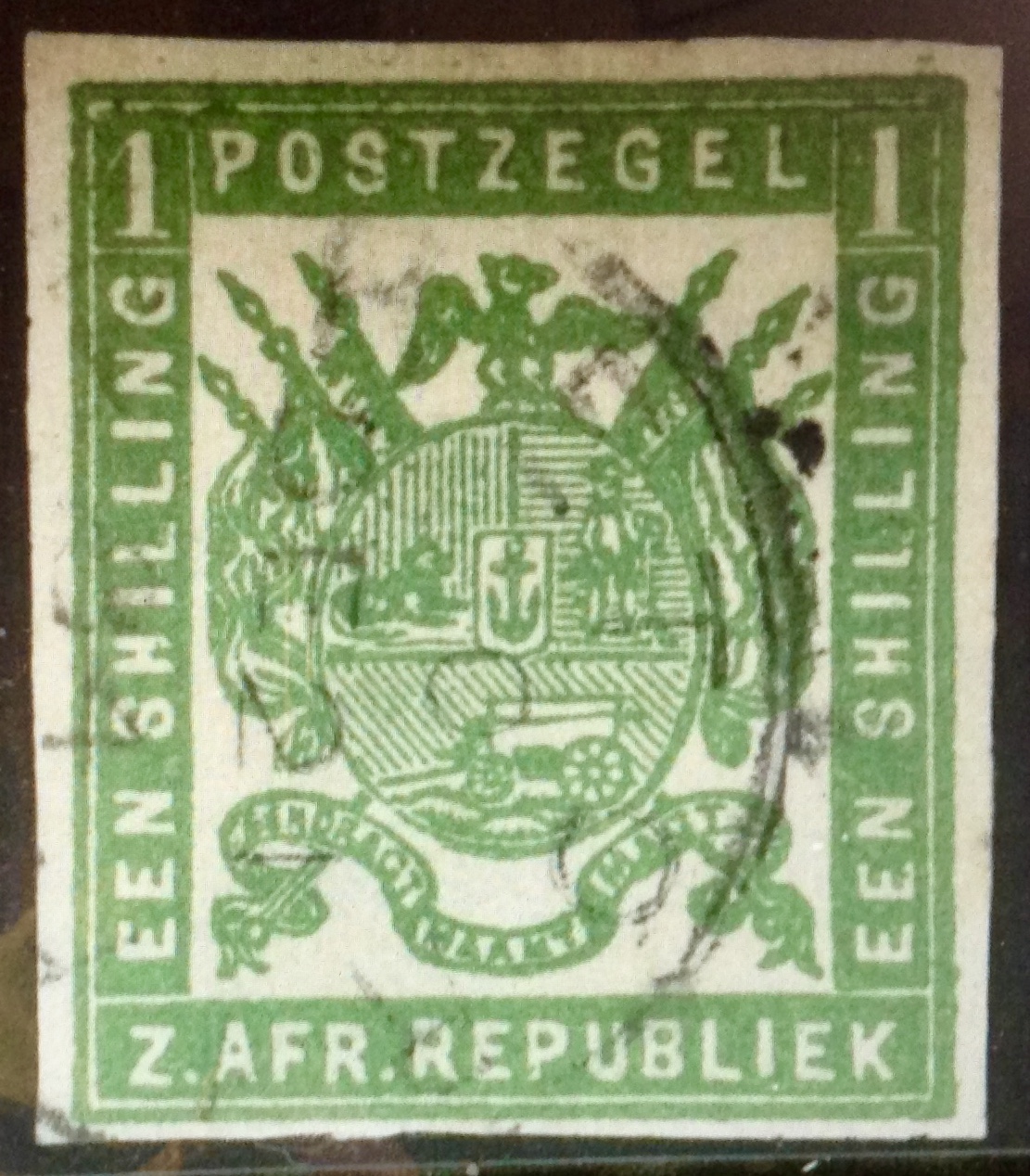 The first set, printed in Mecklenburg, Germany,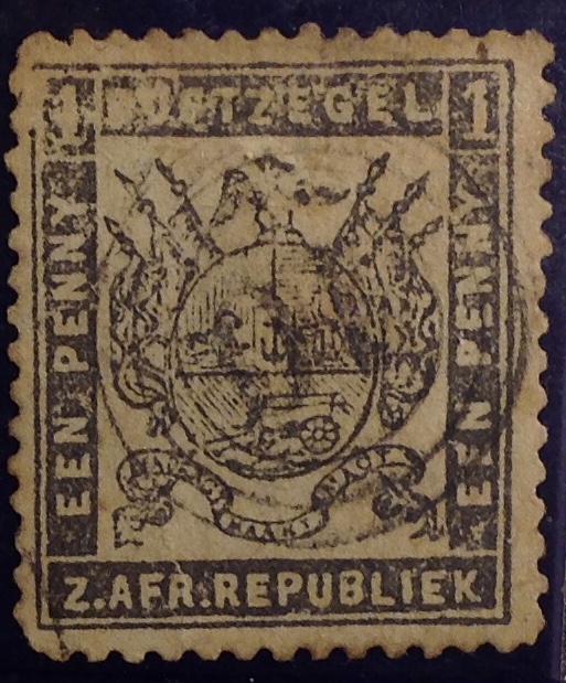
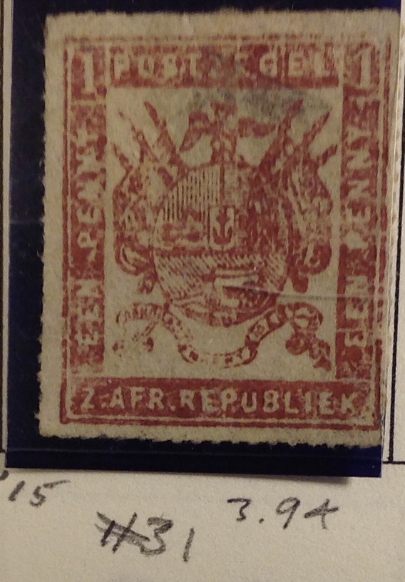 sure are curiosity items!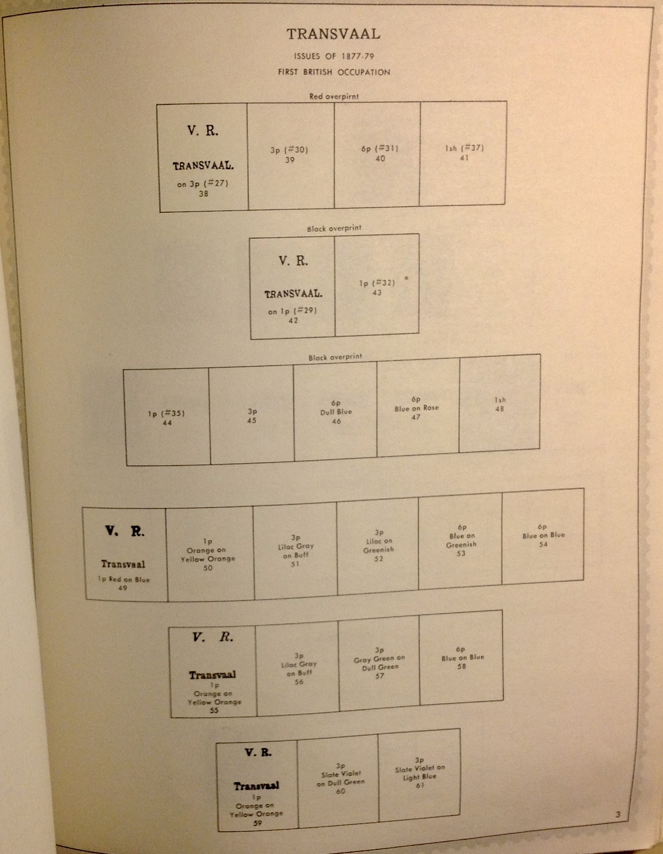
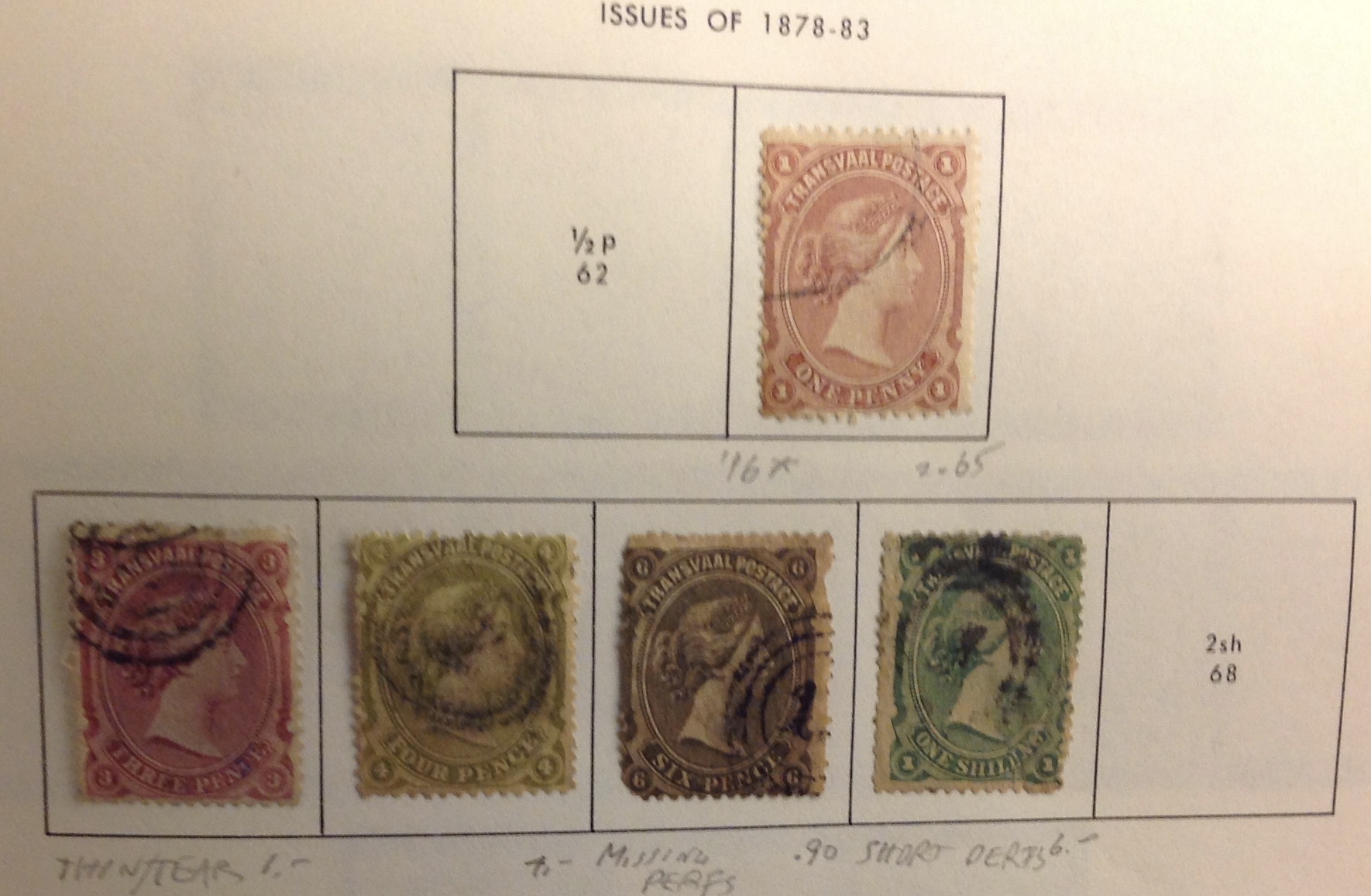 Isn’t this a handsome series? Yes, I’m missing the pricier 1/2d and 2 shilling values, but this late-Victorian set nevertheless resonates with subtle colors in its consistent design; a refreshing change after all those years of coats-of-arms. These
 Nowadays, I doubt you will be able to find a stamp in your local post office that has gum on the back that you must lick in order to produce a sticky surface so you can affix the stamp to your envelope. (Did I really have to use all those words to explain how one used to put on a stamp?) Instead, today’s stamps are
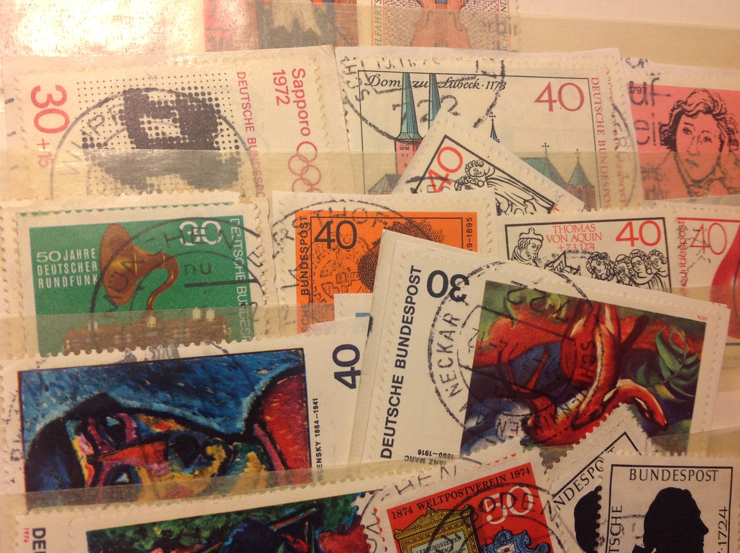
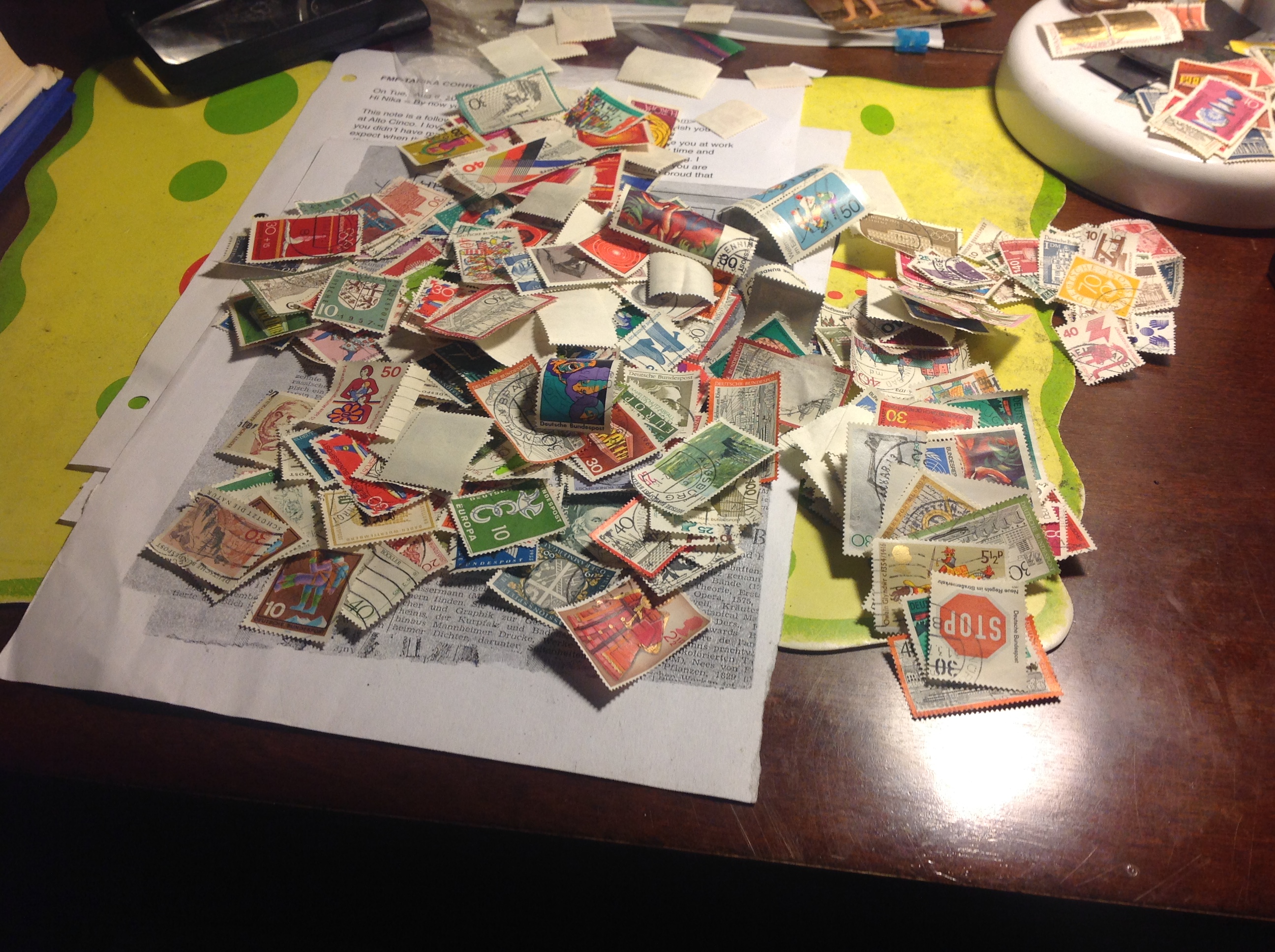
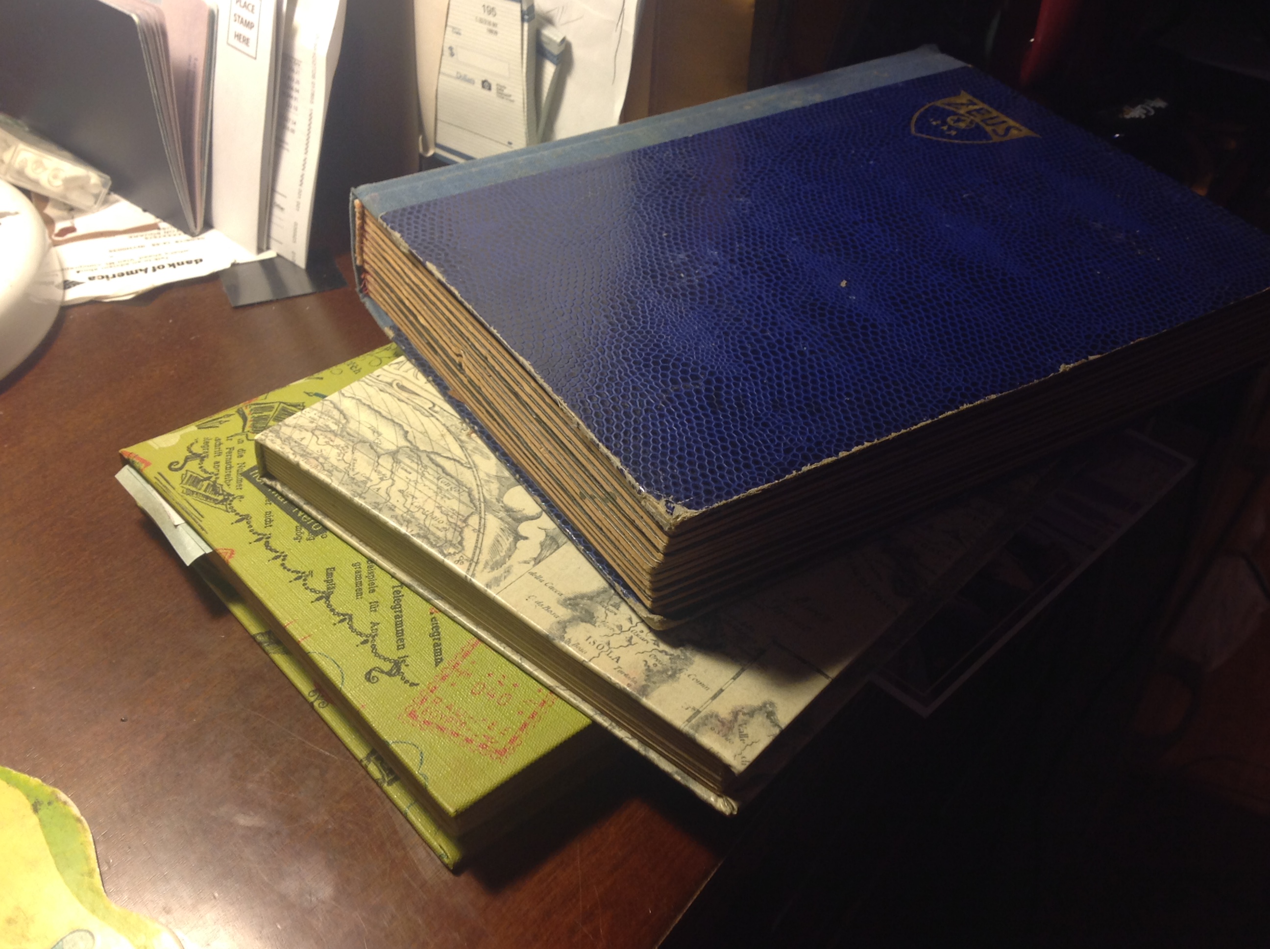 A while back I acquired a substantial accumulation of German stamps from my buddy George. They were in three stock books, and more than half of the stamps were “cut squares,” still on their paper backing (see illustration, top).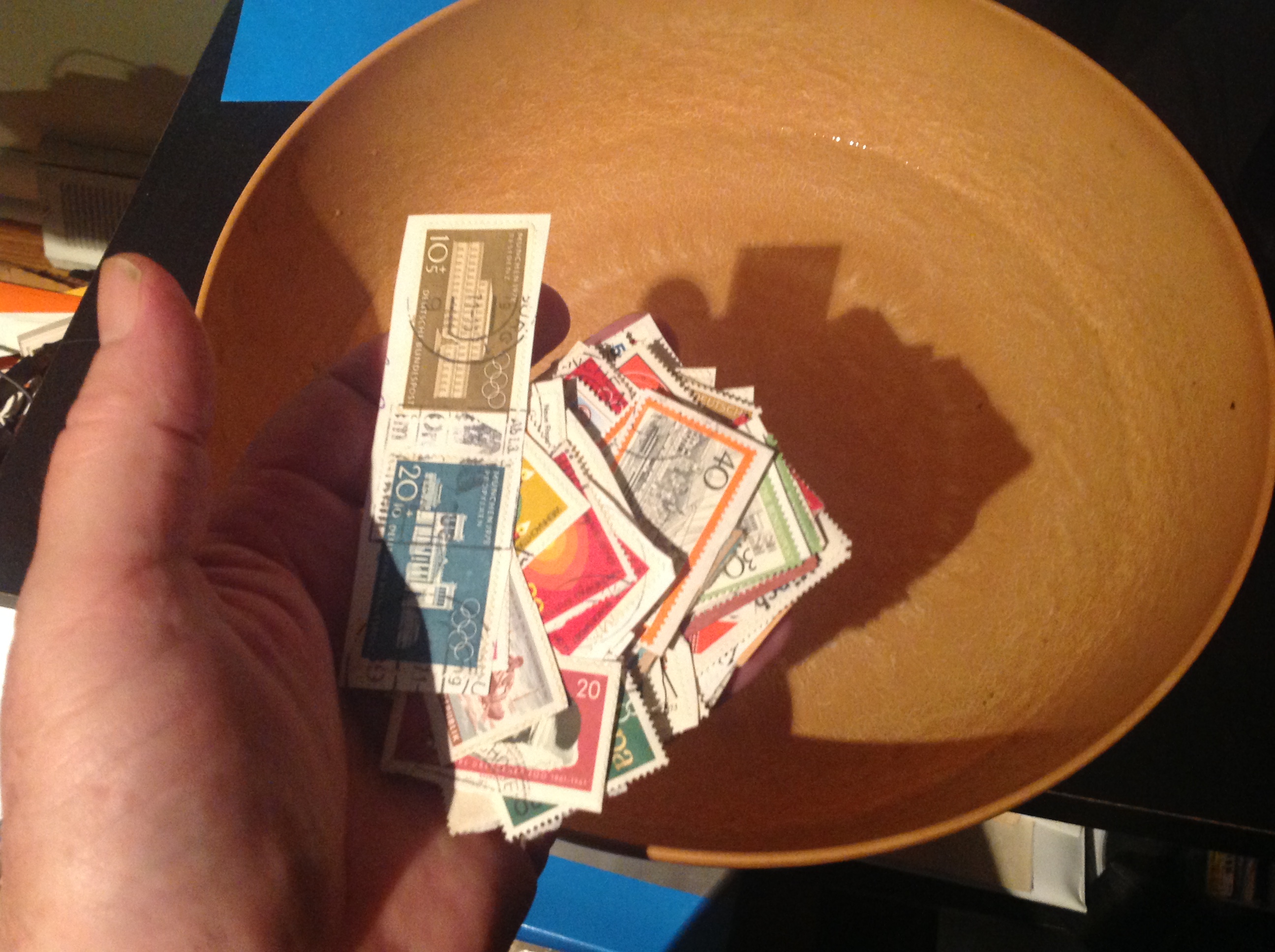
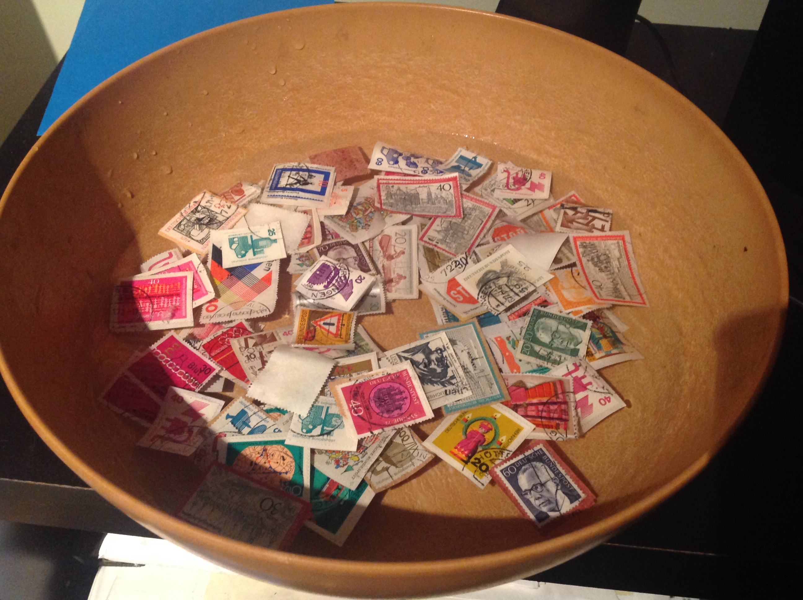 When it’s time, start picking the backing-free stamps out of the water. But where do you put them to dry? One suggestion is to use paper towels. Place the stamps face-
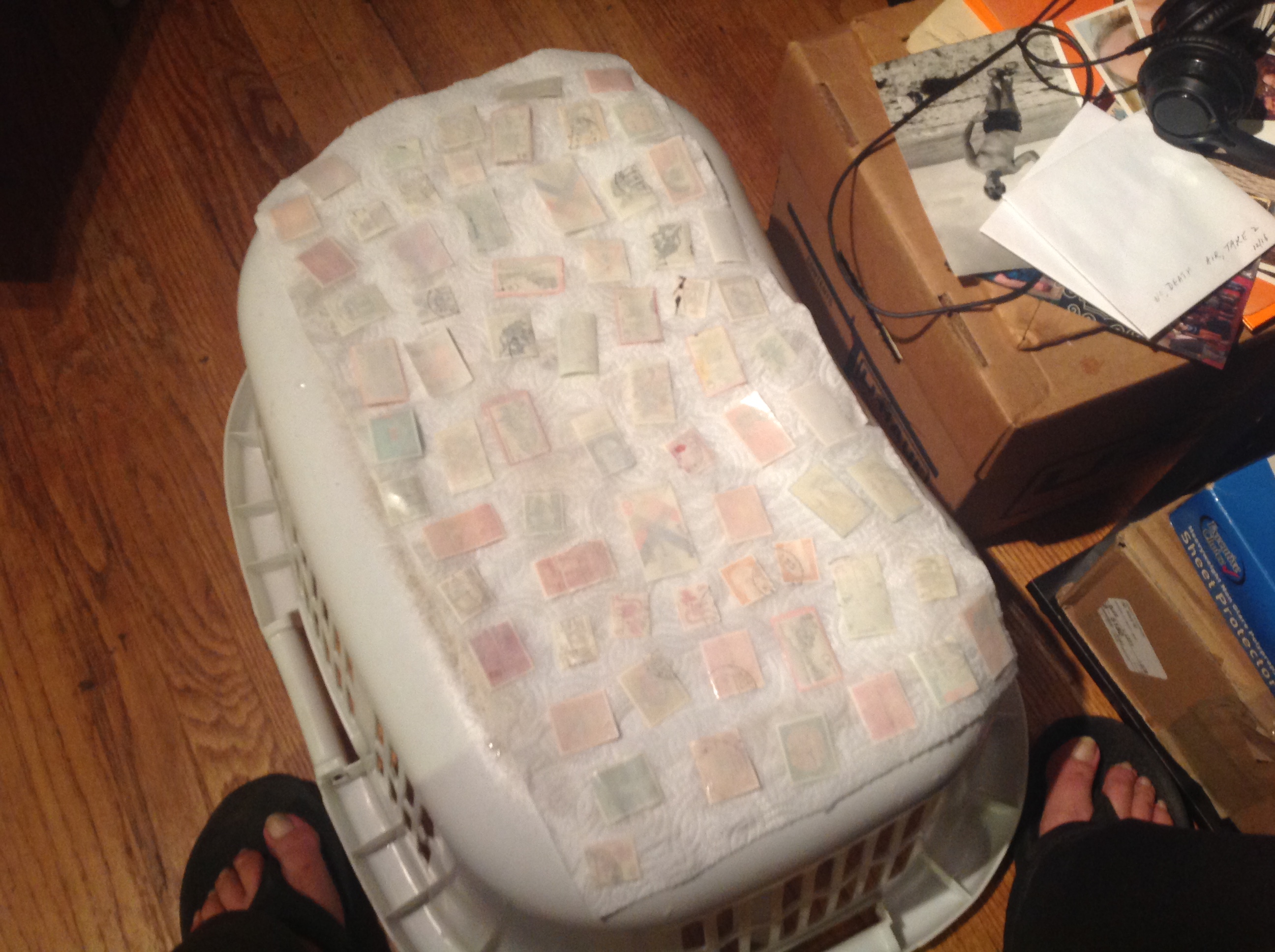 down, since some residual wet gum could stick to the paper towel, thus defeating your purpose. Don’t let any stamps touch each other or they may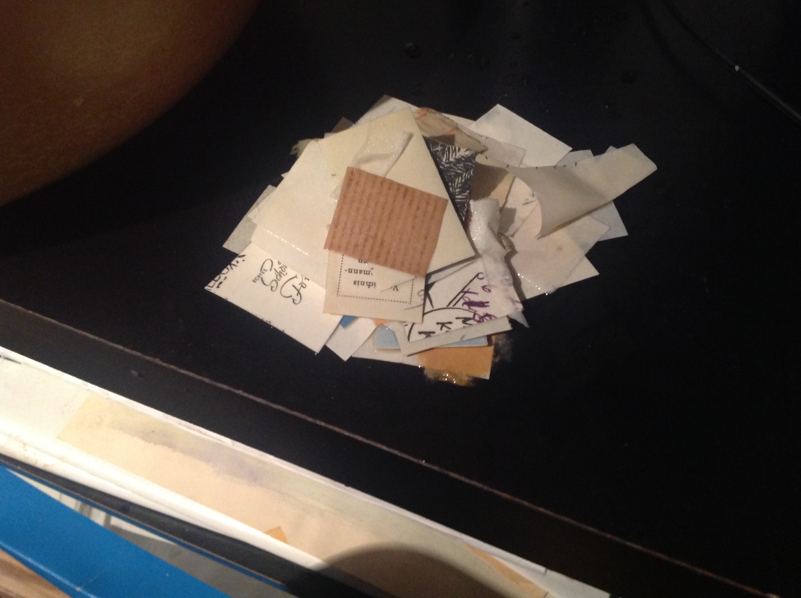
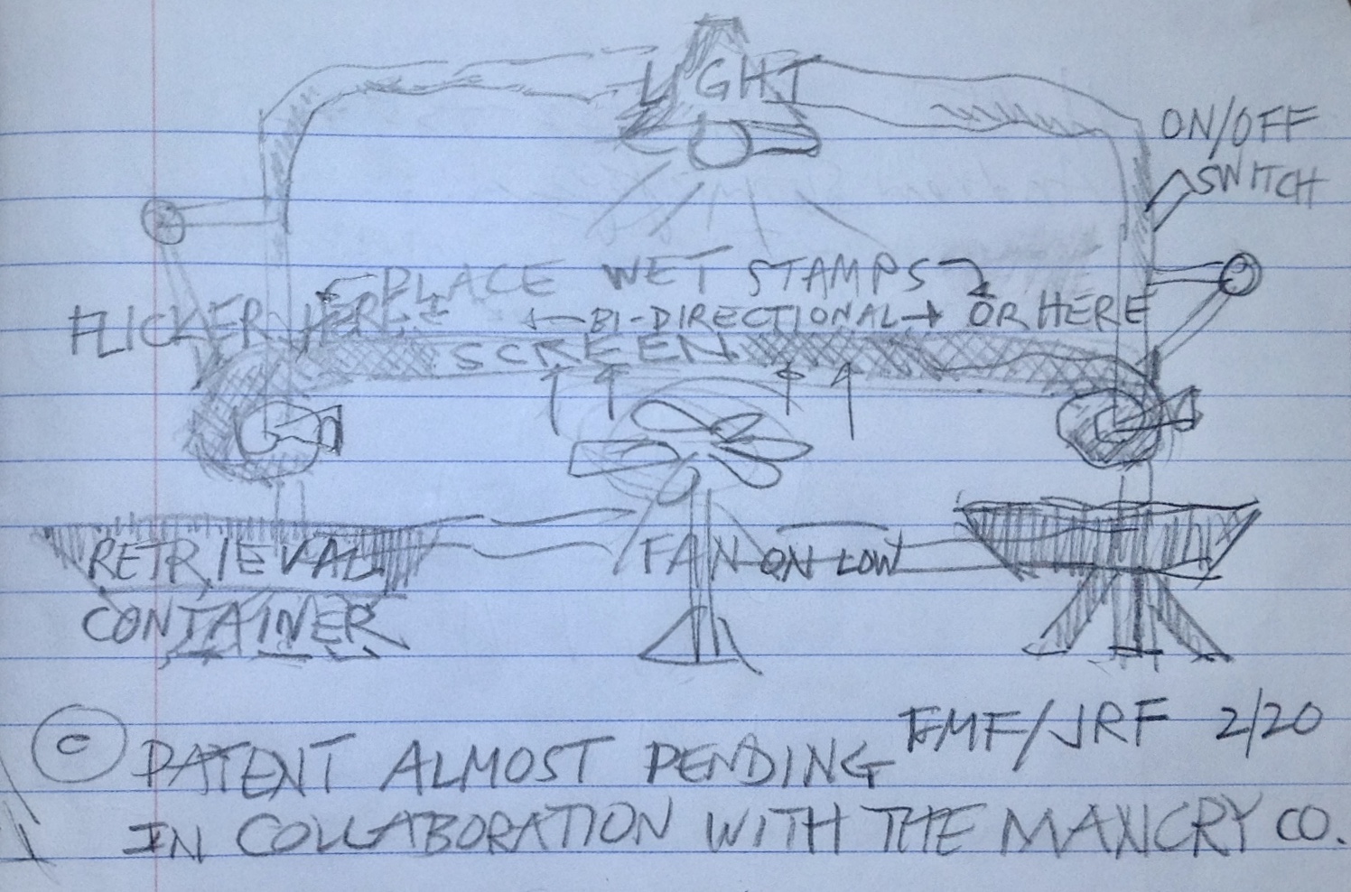
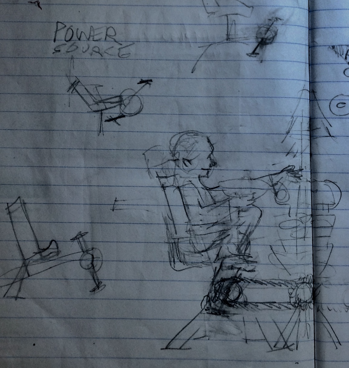
 Some collectors prefer special soaking books with porous paper that will dry stamps flat. It strikes me, however, that those books keep out the air, and thus it must take quite a bit longer to dry the stamps than using the en plein air method.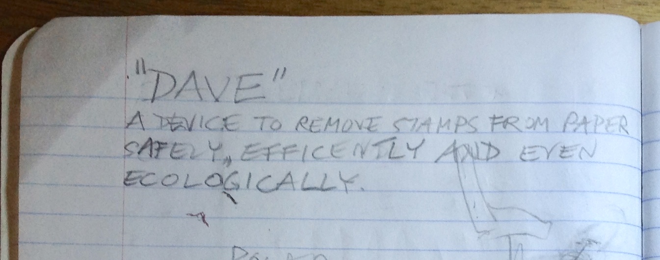

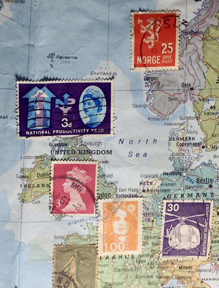 map is not in focus on the web page, but it seems the UK has a red Machin on England and if I am correct a 3d National Productivity stamp from 1962 above it which buries Scotland. Living in Wales, with the Celtic sensitivity that brings, I don’t think I can see an Irish stamp or any recognition that Wales, Scotland and Northern Ireland have their own definitive stamps. Please! This is by no means a criticism, just an observation, and I would be more than pleased (on receipt of postal address) to send you stamps to address this matter. I think Scotland is beyond help, but I can certainly offer you an Irish and Welsh stamp to enhance your wall map. …”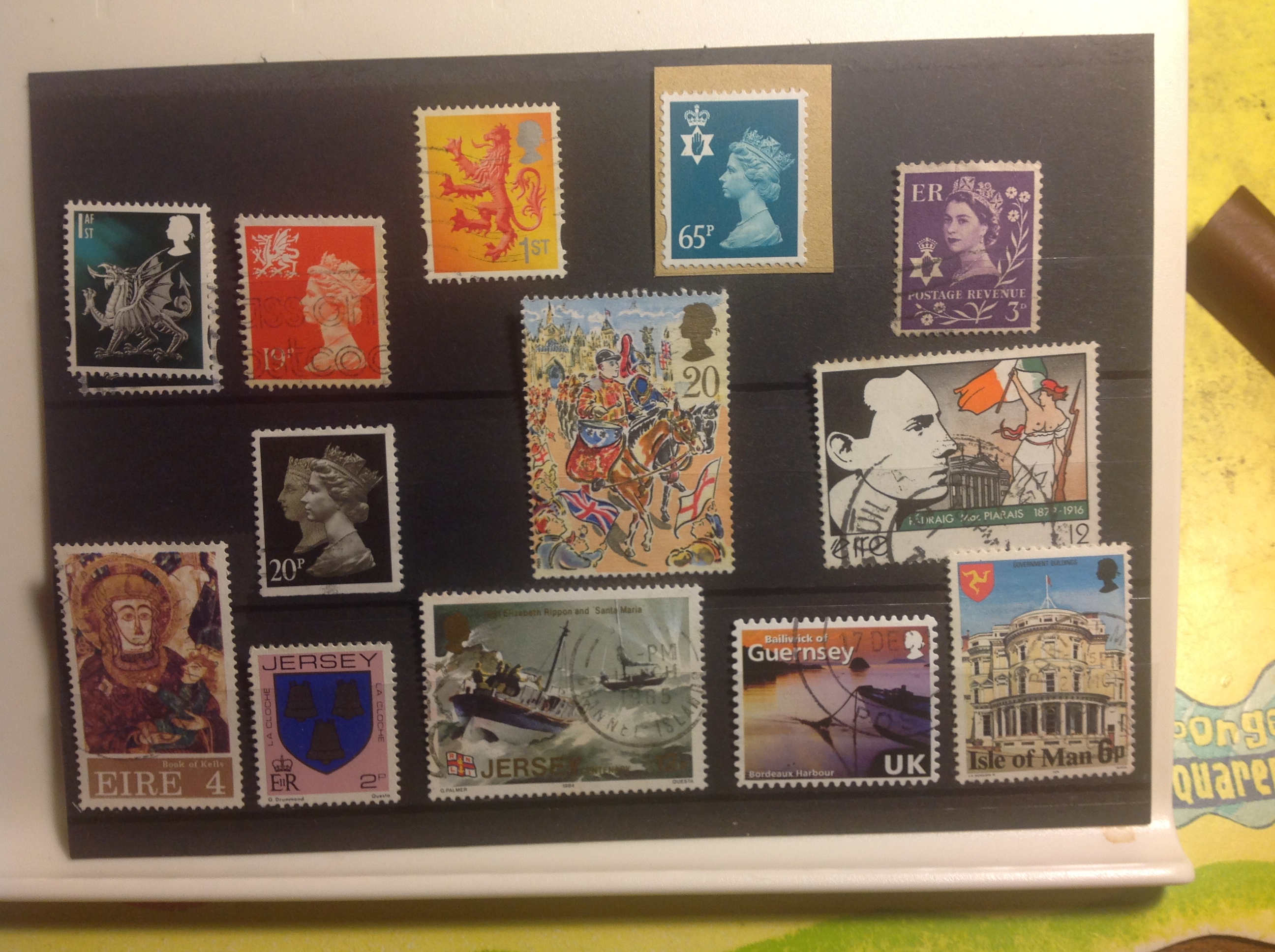
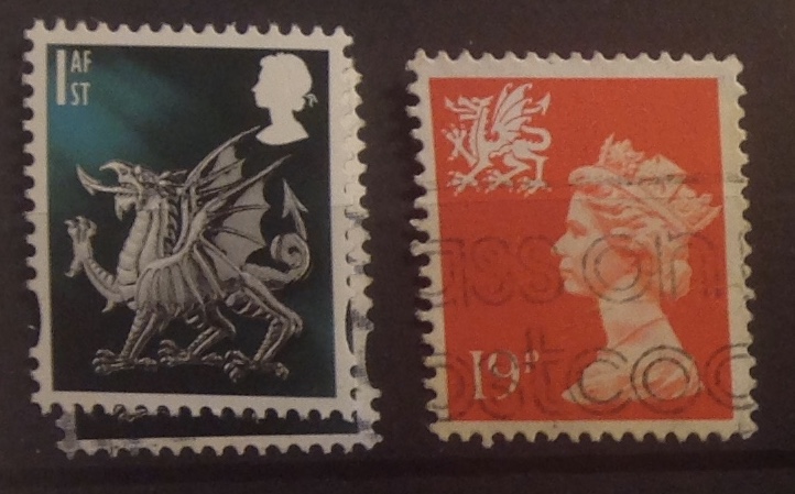
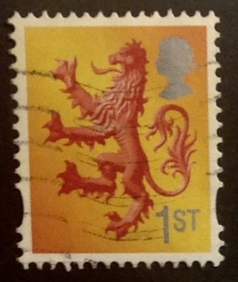
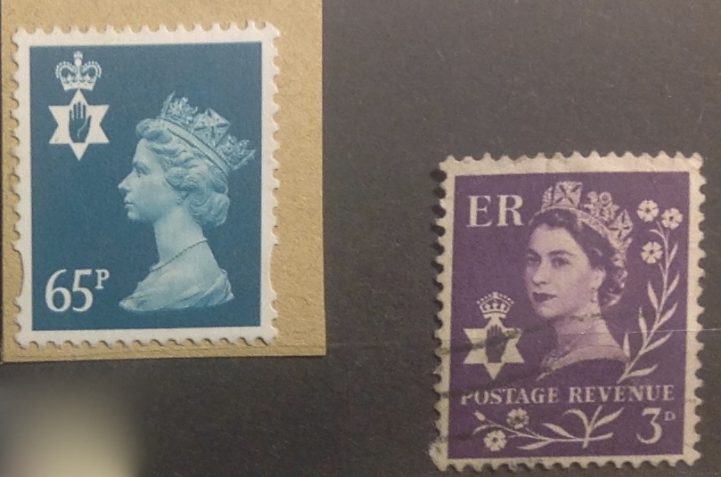

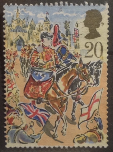

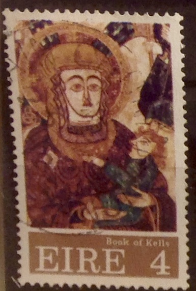
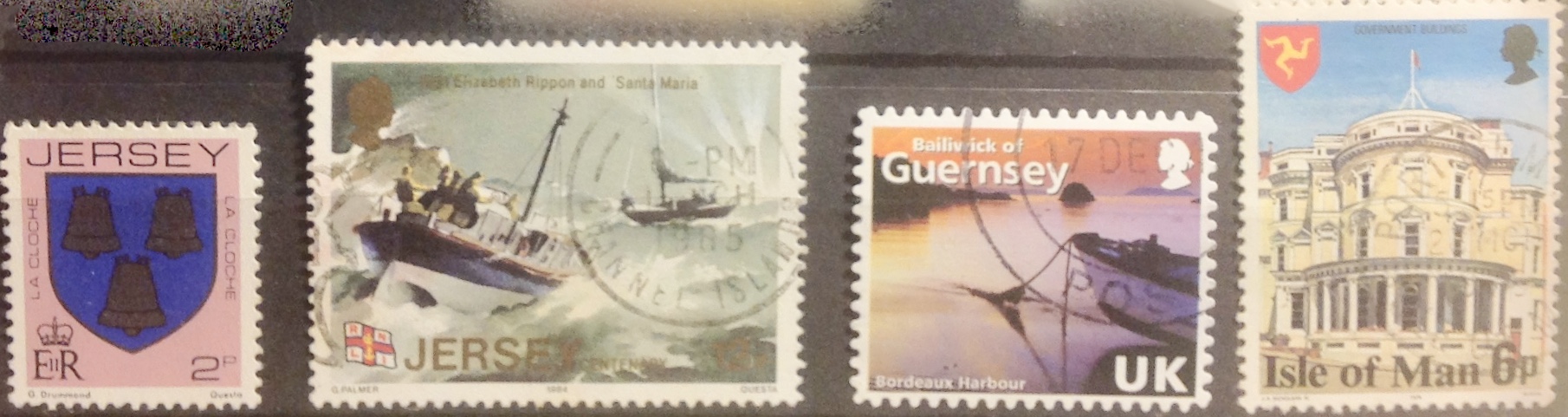
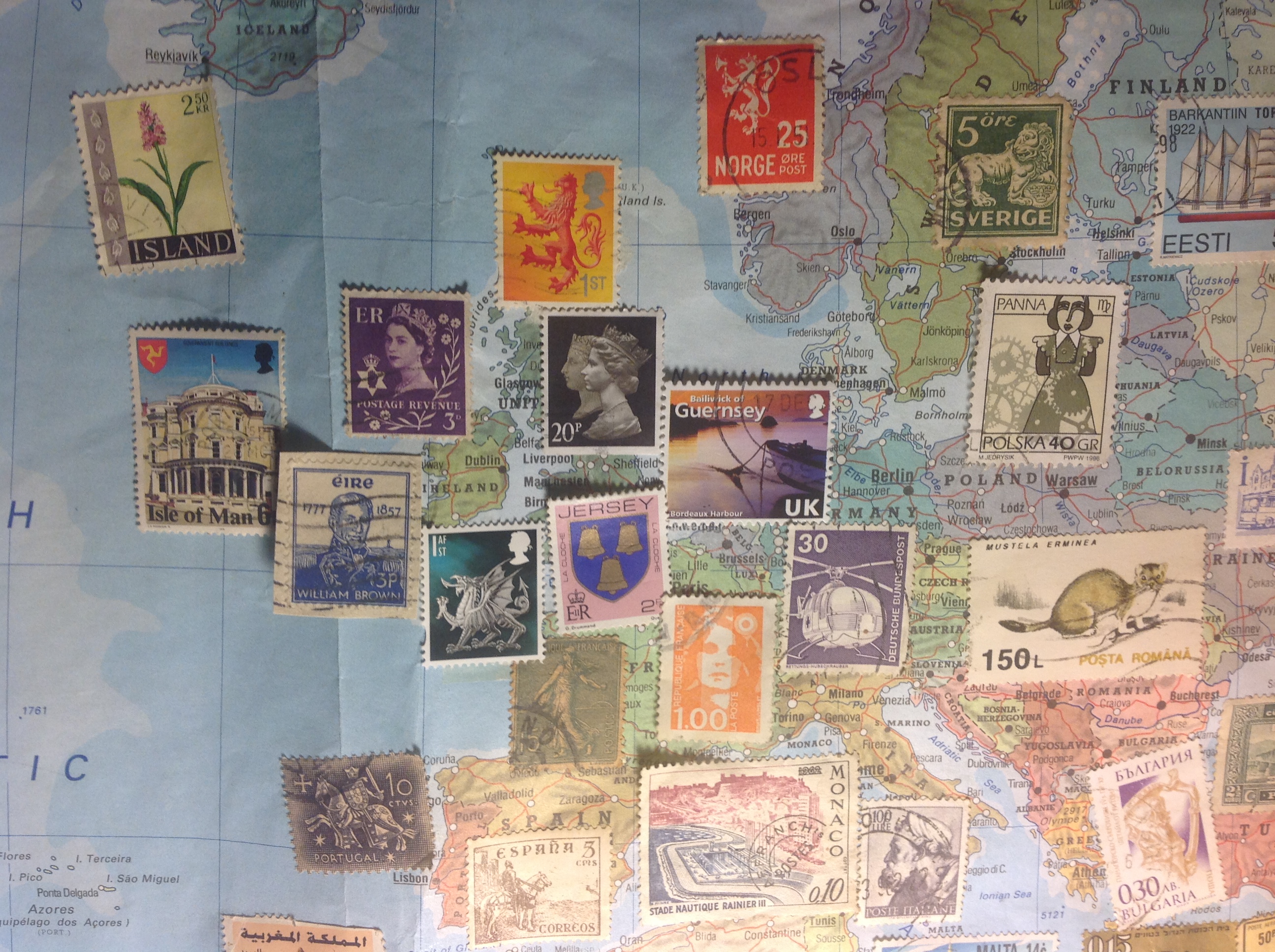 of Paul’s stamps — for Scotland, England, Wales, Ulster, as well as the Channel Islands Guernsey and Jersey, also the Isle of Man. Since things were really getting crowded (crikey!), I substituted a small Irish stamp from my own supply instead of using one of Paul’s offerings. Yes, it’s surely a busy corner of my stamp map today. Anything wrong with that?
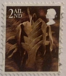 Let me just add a word about the charming stamps Paul used on his mailing envelope, which are reproduced here. At right is another Welsh definitive, this one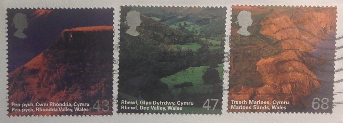
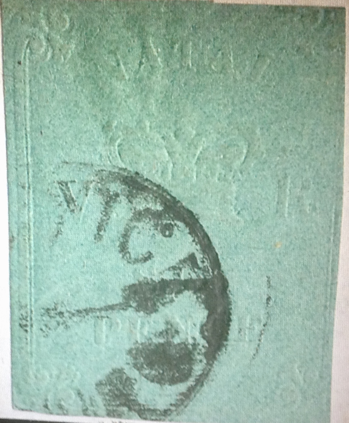
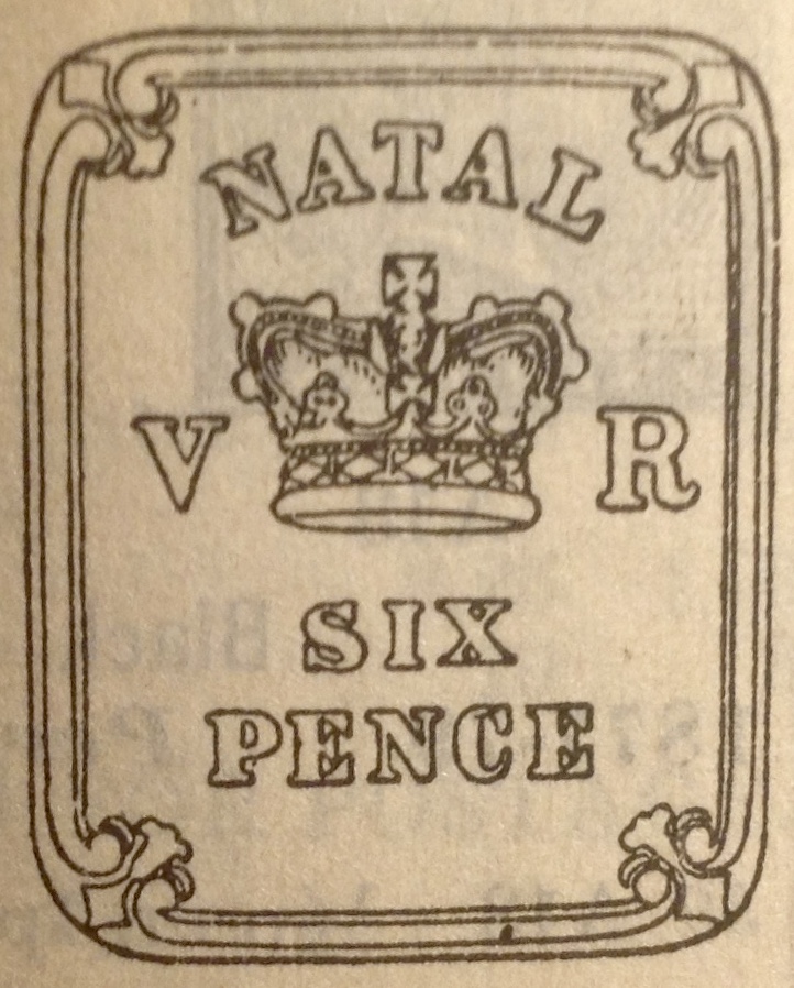
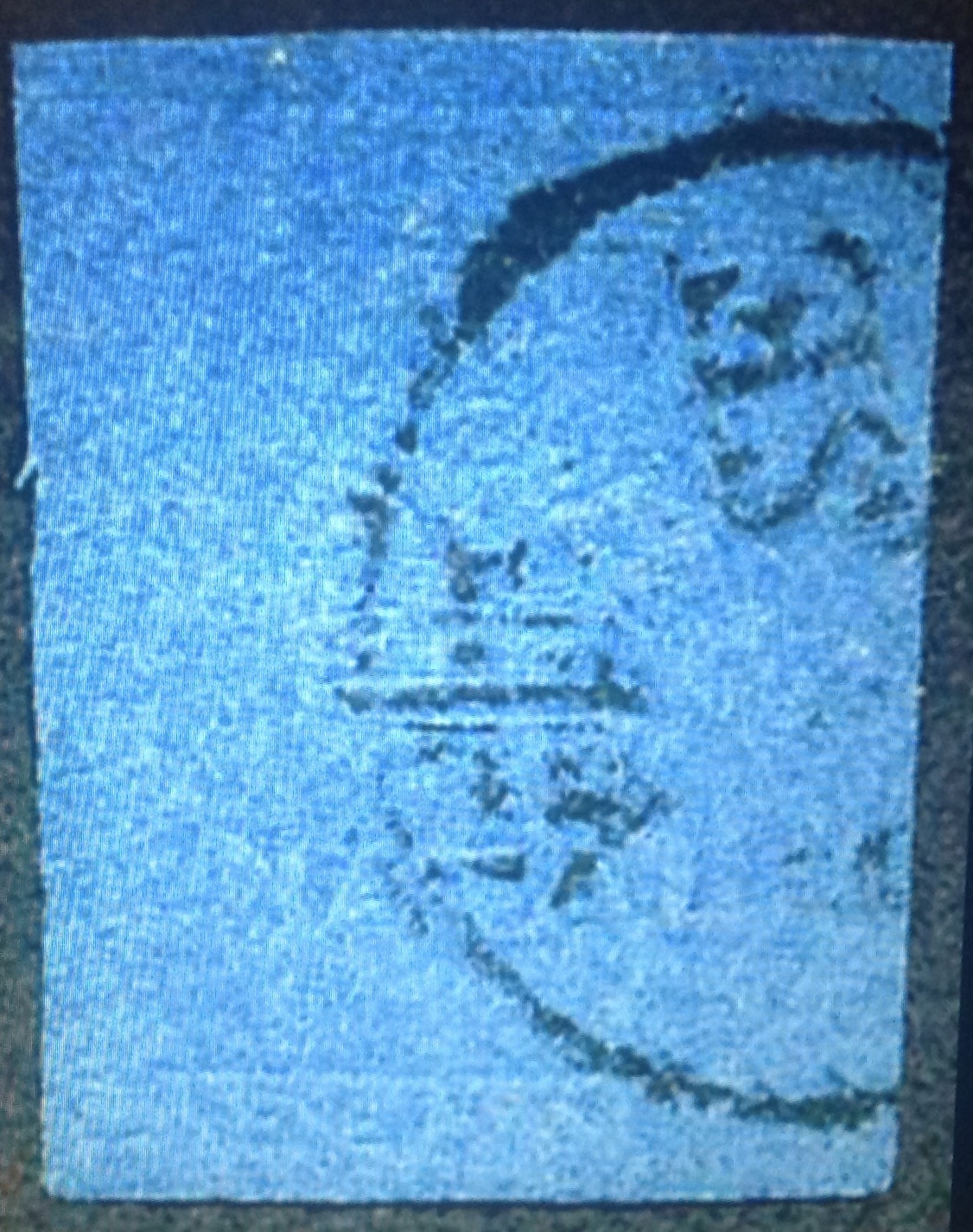 What were the local overseers or the poobahs in the British colonial office thinking when they decided on the first postage stamps for Natal, in 1857? Designs and values embossed into cream, blue-, pink-, green-, rose- and buff-colored paper? What if you didn’t speak English, or did not read at all? If you could “read” these embossed images in the first place, would you know what to do with them? Did customers have
 impressions were
 Mecklenburg, Wurtemberg, Hamburg, Hanover, Oldenburg and Thurn&Taxis. Switzerland’s first cantonal stamps and Brazil’s “bulls-eyes” came out in 1843, four years ahead of the United States. The world’s rarest stamp — the sole surviving one cent black-and-magenta from British Guiana — was issued in 1856.
 savagely caricatured in the public press (abetted by stationers who saw their market encroached on and threatened by the Post Office letter). India tried a semi-embossed stamp in 1854 and promptly abandoned the practice. The Cape of Good Hope’s triangle stamps, issued between 1853 and 1863, were a novelty few copied. Argentina’s first stamps in 1858 were so crude they looked like children’s drawings.
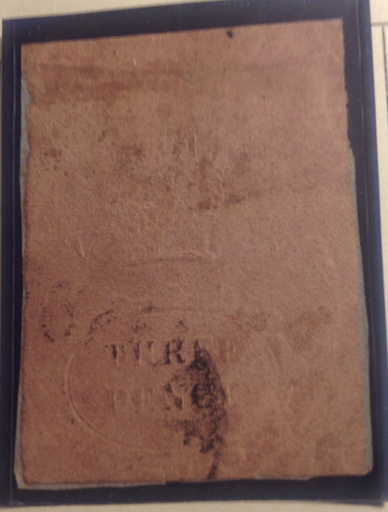 than actual size). The stamp has a catalog value of $500+, but that is for a copy with 4
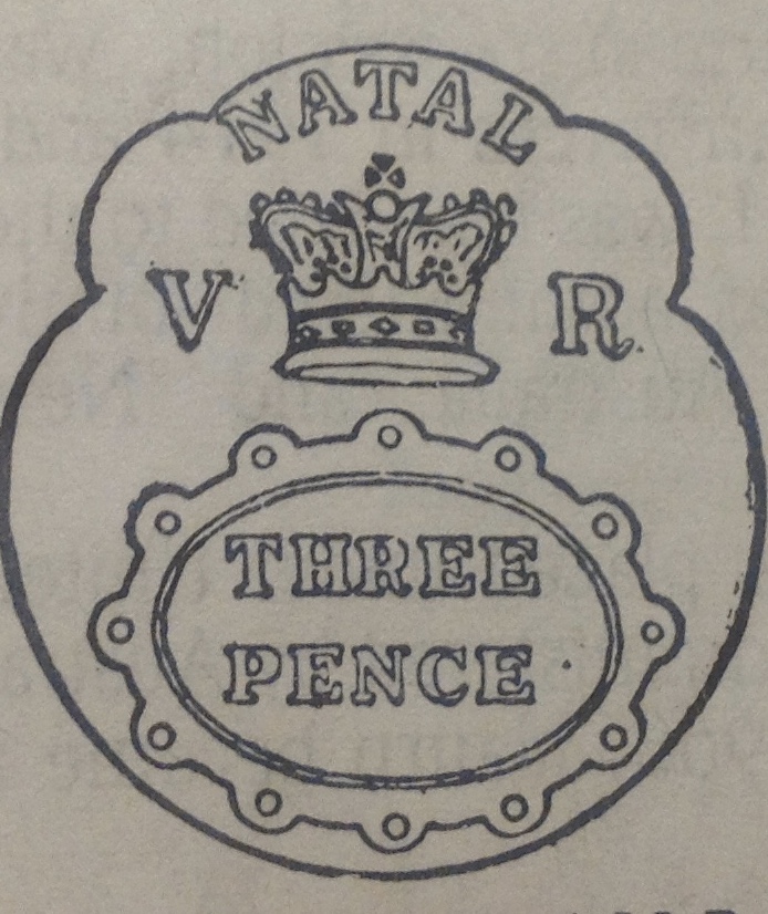 smudge of the cancellation. Actually, the margins are unusually large for this variety: just in at the bottom, clear the rest of the way around. Compare the faint embossing on the stamp with the design outline below it, as presented in the Scott catalogue, and see if you can discern these details on the original: 1) as stated, the number THREE PENCE is clear under the postal strike; 2) also visible are the circular border and the letter “A” from
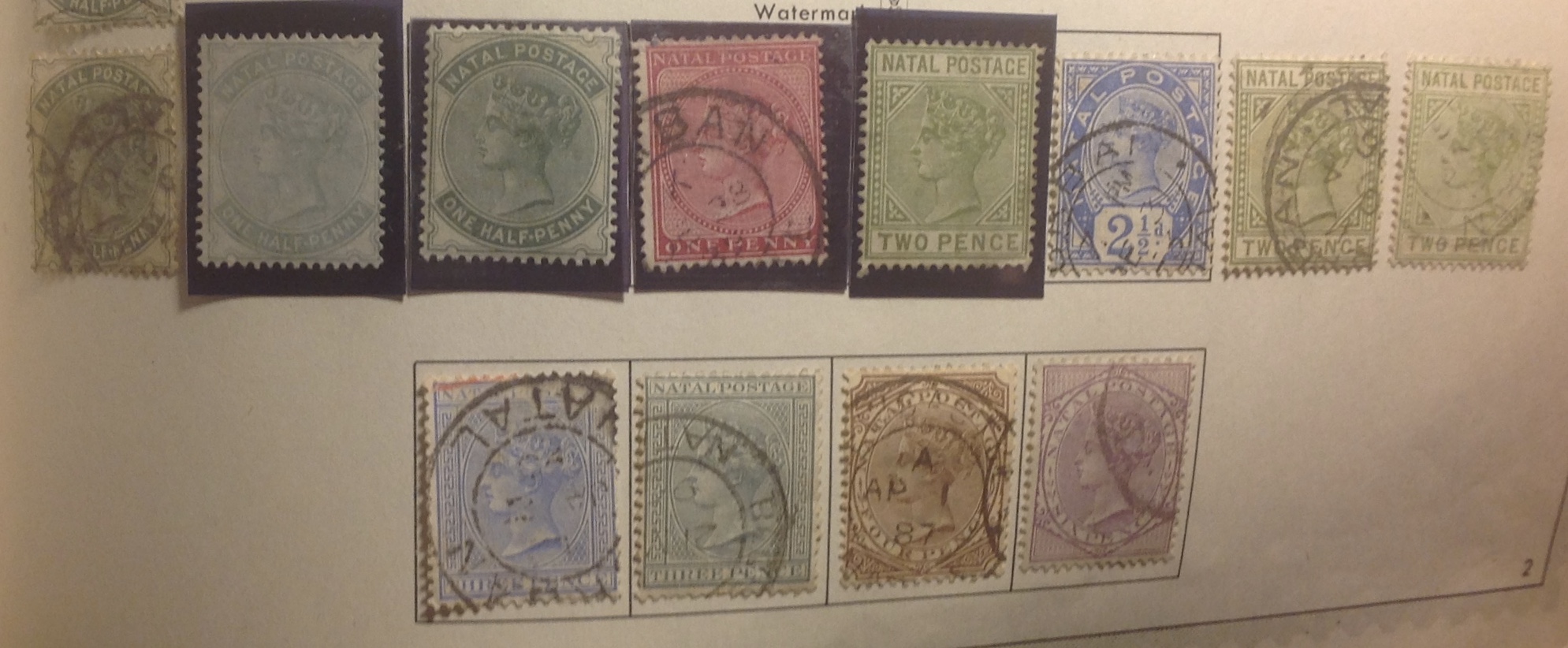
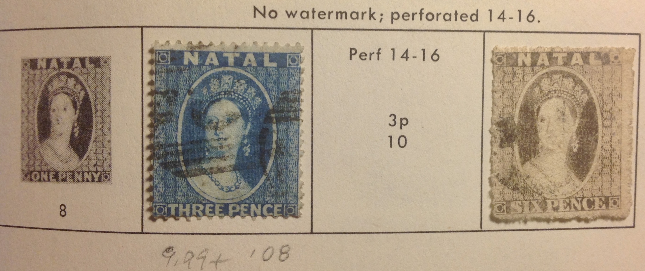 Sets of early Natal stamps carried the elegant (and flattering!) Chalon portrait of the young Queen Victoria.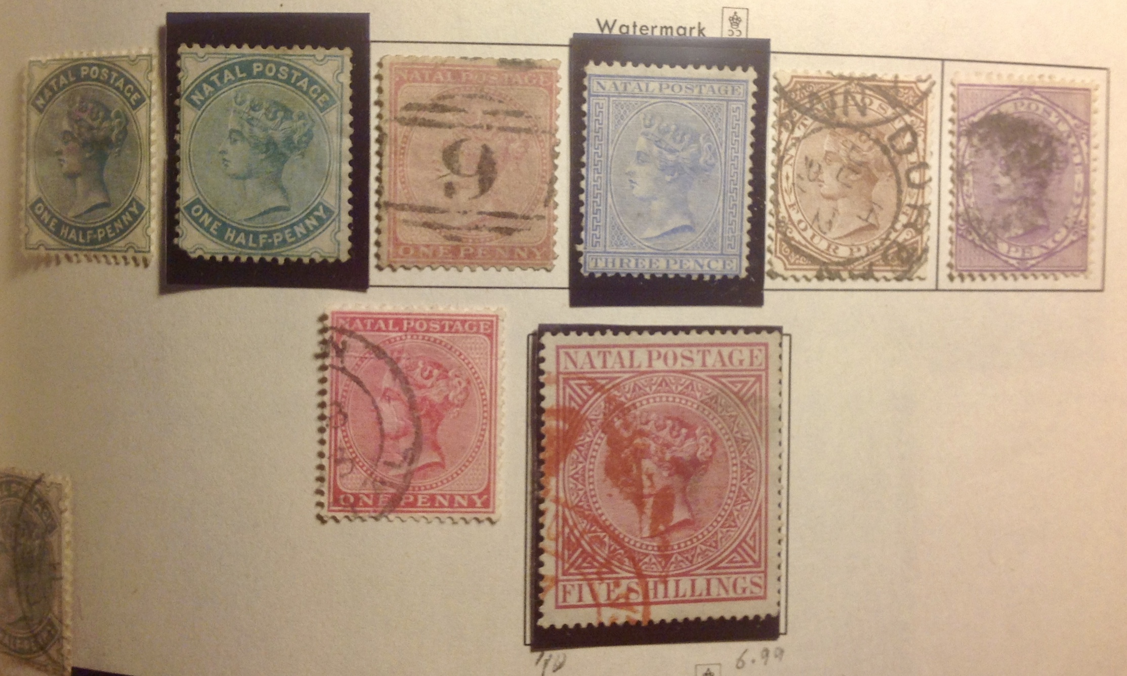
 in 1823. For years he lobbied the Cape Colony and Whitehall to make Natal a colony. After passive resistance from Capetown and London, the Boers took over and established the Natalia Republic, a regime so disorganized and incompetent — and oppressive of the indigenous people — that the British felt obliged to move in. By 1843, the Boers were out. After a final compromise on borders, many Boers trekked to neighboring Orange Free State or Transvaal. Over the years, Natal continued to play a role in regional affairs. In 1897 it annexed the Zululand protectorate, doubling its size. With gold and diamonds to be mined, the region thrived, and Natal’s port of Durban grew into an economic hub. In the 1890s, Natal won the right of “responsible government,” meaning local self-government. In contrast to the Cape Colony, where there was a historic commitment to universal suffrage, in Natal the voting laws were always skewed to exclude most black Africans and Indians. A 1904 census listed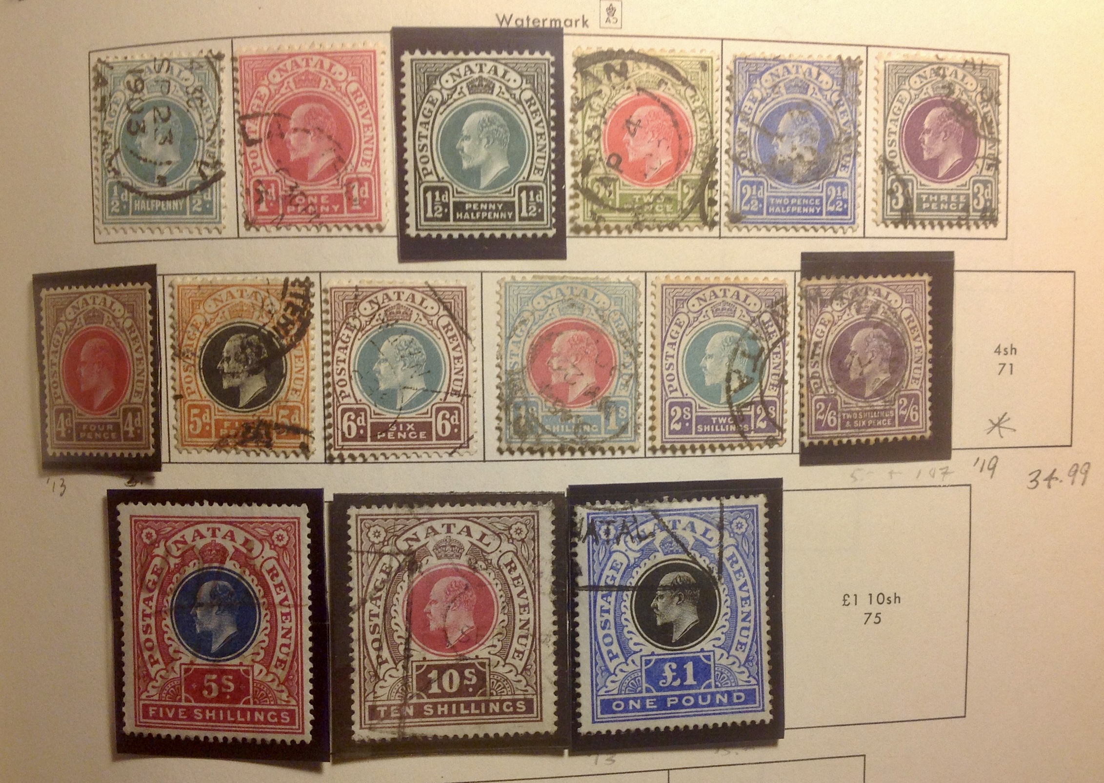
 militants left Natal for good. (Unlike the Siege of Mafeking, in the Cape Colony, which was going on at the same time, no stamps were issued from besieged
 Mafeking; for that story see December’s blog post, “Mafeking Besieged!”)
 Transvaal/Zuikafrikaansche Republiek and the Orange Free State/Orange River Colony were contested
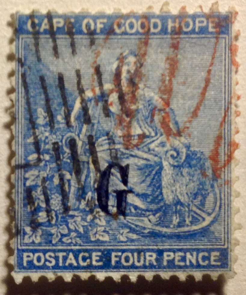
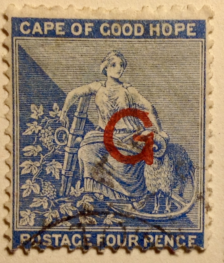
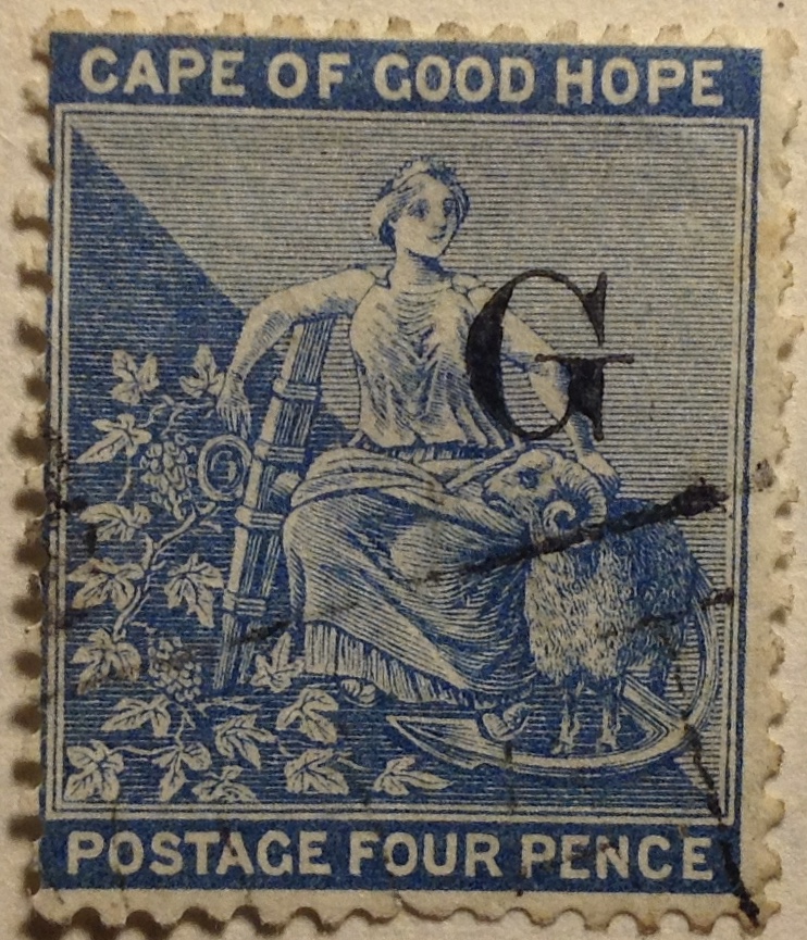
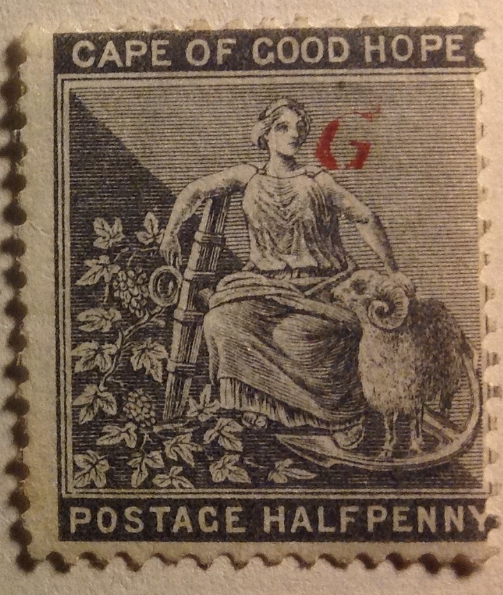 about a year, issued stamps. In the case of Griqualand, the stamps were simply Cape of Good Hope rectangles overprinted “G” in myriad ways. (See illustrations here from my collection). Stamp collectors beware: collecting all 102 Griqualand overprints could get expensive.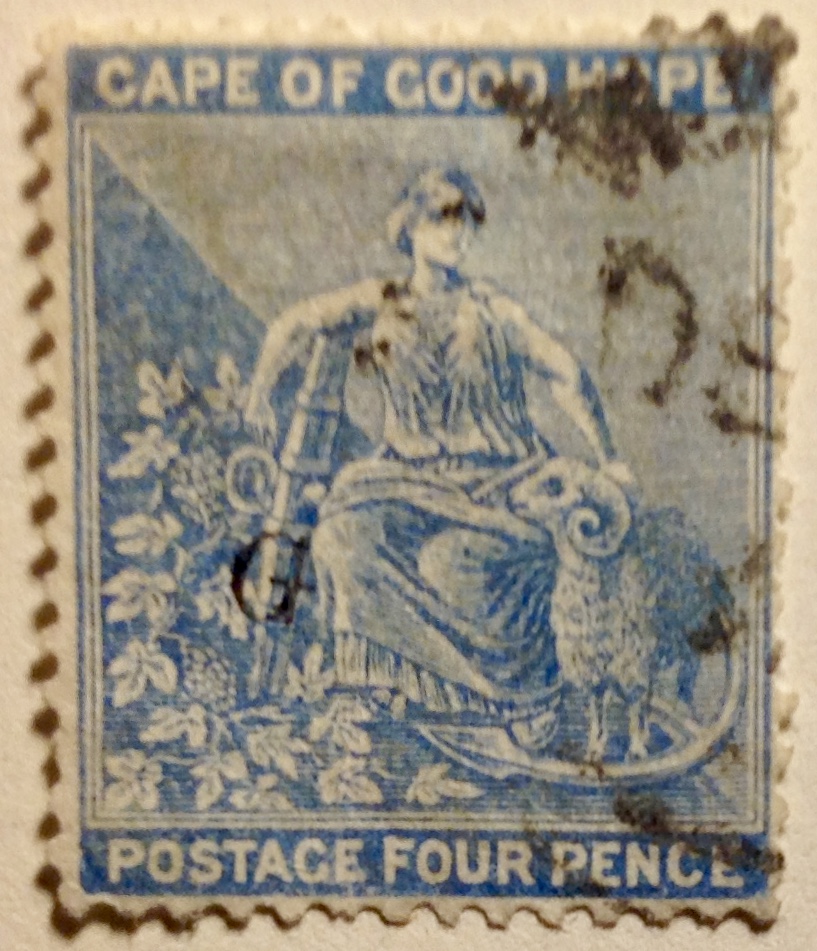
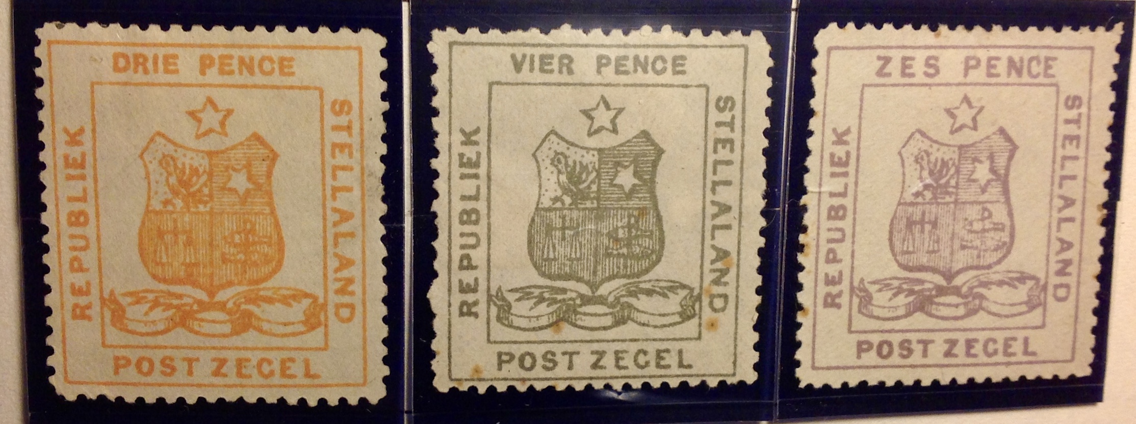
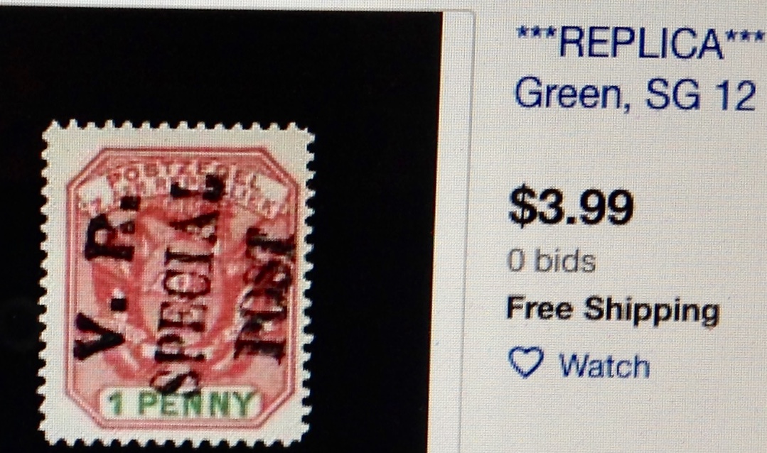 an extremely rare Boer stamp overprinted
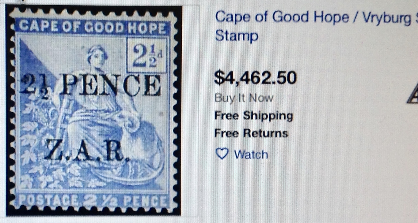 primacy by cancelling the stamp y of their enemy with the overprint of their own] side. Who was really in charge here? Did it matter as far as the local black population was concerned? It certainly mattered as far as it resulted in black lives lost during the fighting between the white “tribes” — the Boers and the Brits!
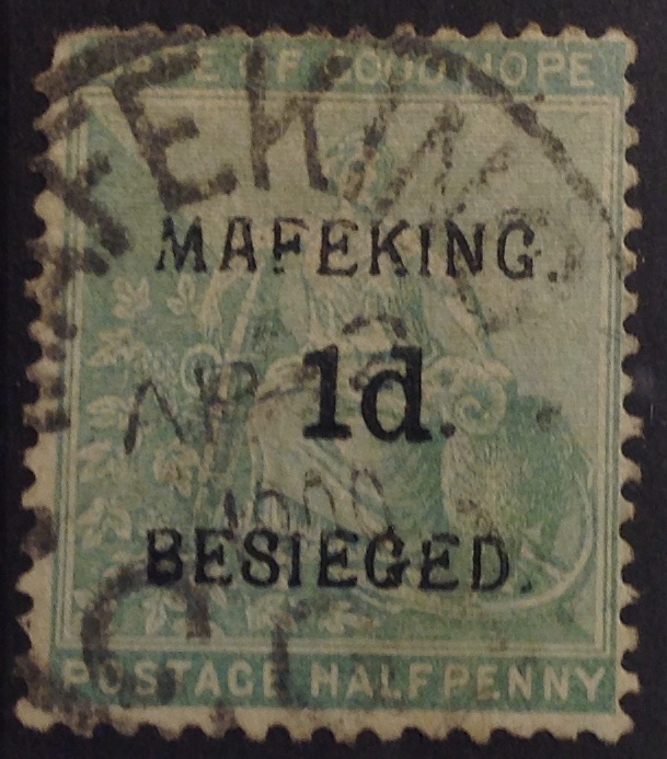 Now take a look at this stamp (right). It is quite extraordinary. The overprint “Mafeking Besieged” on the Cape of Good Hope half-penny stamp identifies the desperate straits faced by the inhabitants of the Cape Colony’s inland city and strategic railway town. Stamps with this Mafeking overprint sell for a premium — I bought this average-quality one for L19.25. Other Mafeking stamps are much more valuable. My example has a somewhat rounded corner, upper left. But really, considering what a rarity it is, I’d expect you to be on my side on this.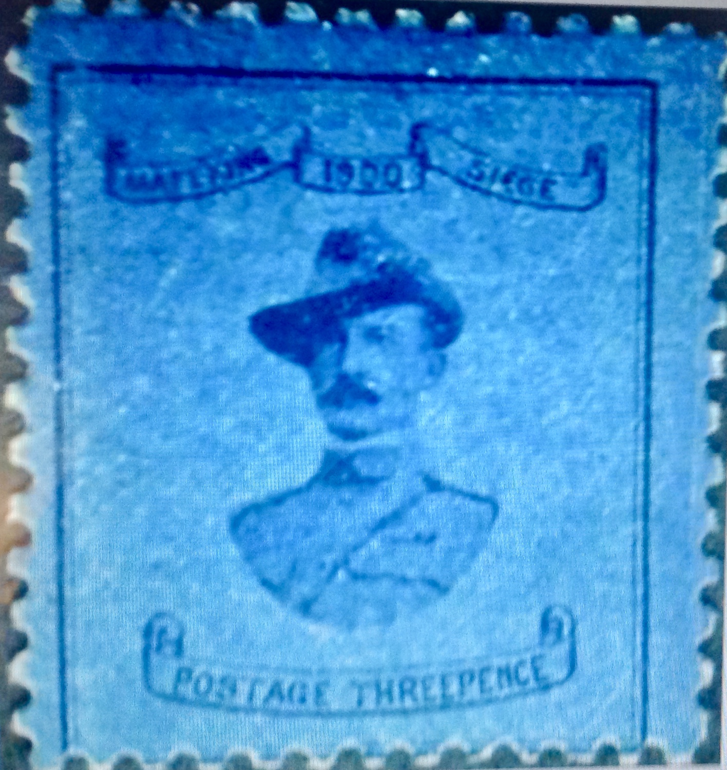
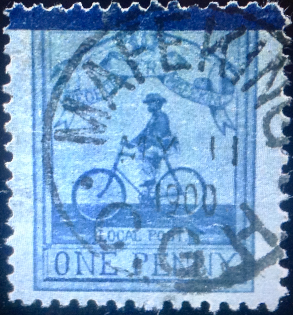
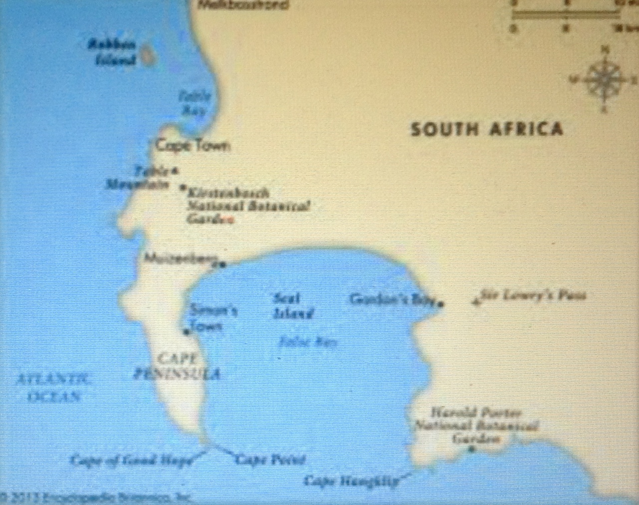 Behold! The Cape of Good Hope. Or should we use the name of the Portuguese who first rounded the point in the late 1400s, which they dubbed Cabo da Boa Esperanca? ….
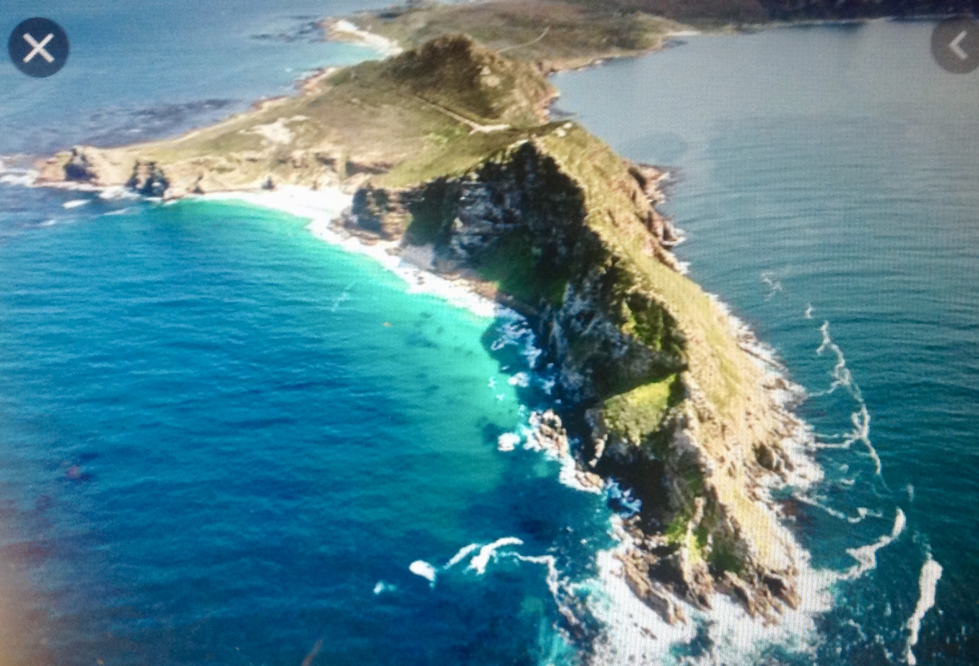 to found Cape Town (about 25 miles north of the cape on the map).
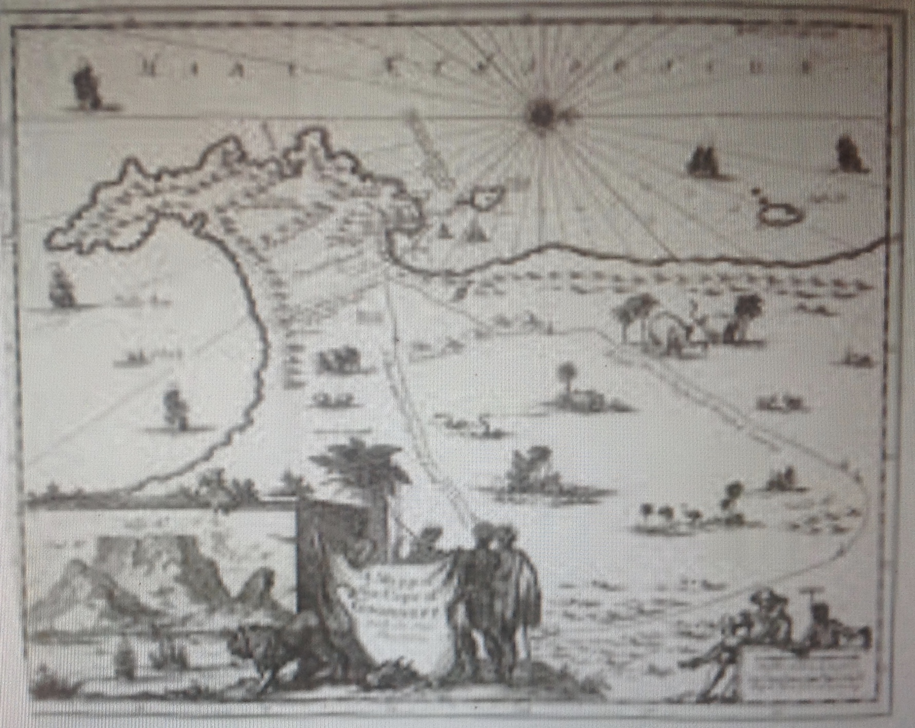 Here is an ancient map of the Cape of Good Hope, during a time when the Dutch and the Afrikaners and the Boers and the English lived as uneasy neighbors with each other — and the Xhosa and the Zulu. No one could have imagined what heartbreak and outrage would result from the transformational European incursion, starting at the Cape of Good Hope and spreading across southern Africa.
 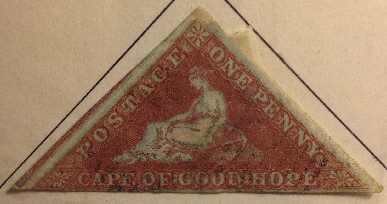 Above is my example of the first stamp issued for the Cape of Good Hope: No. 1, on bluish paper. It came out in 1853, just six years after the first U.S. stamp. The somewhat crude but elegant engraving depicts a seated figure — “Hope” — with an anchor as an appropriate nautical emblem. Hope’s image would grace COGH stamps for the rest of the century. The triangular shape must have been a sensation at the time; and imagine! For a British territory at the southern tip of Africa! How exotic. The shape of the stamp itself suggests a geographical cape, don’t you think?
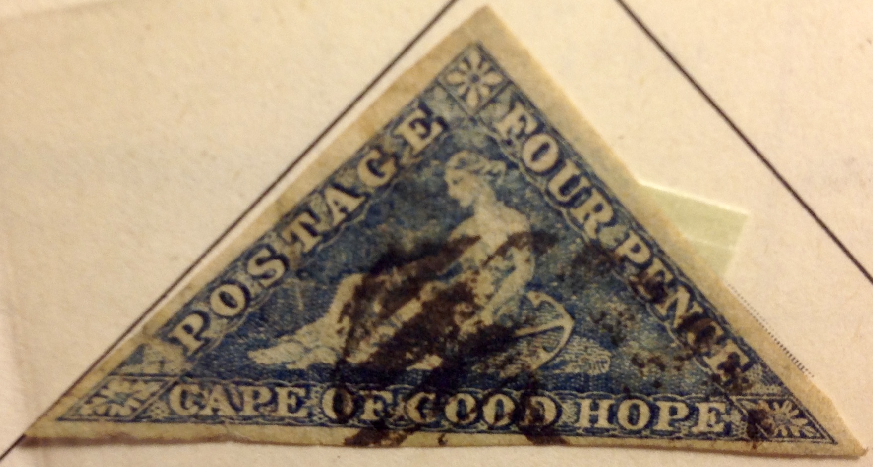 I also got these two (left and below left) from my father. The 4d above, also from 1853,
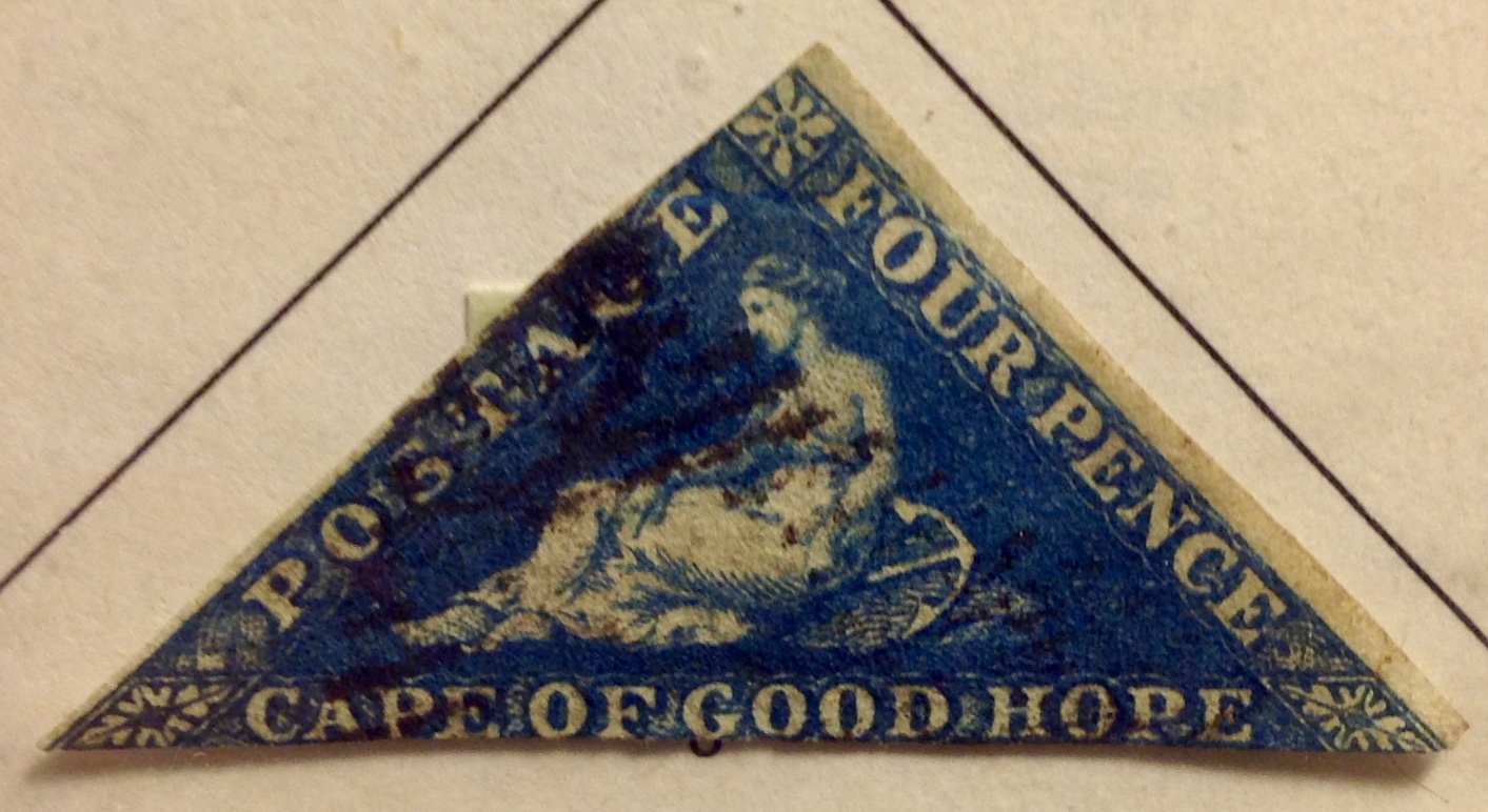 considerably off-center beat-up image. My Minkus album offers this notation: “Fine lines of background blurred or broken; printing less clear due to wear of plates …” This stamp is valued at $45, but mine is not a particularly well-cut example.
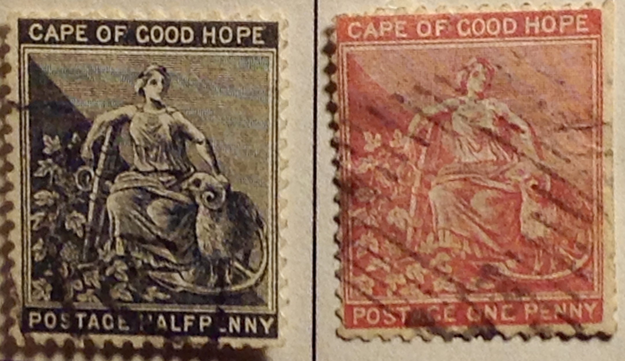
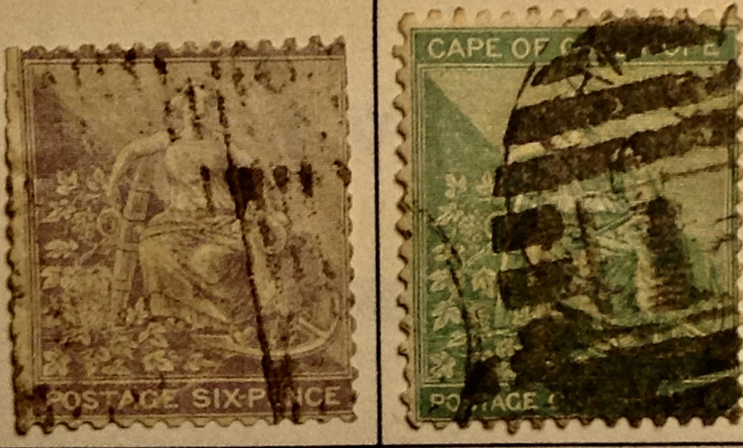 Above are two examples from the first set of the “Hope” rectangles. If you look closely at the outside border of each of these two stamps, you will notice that there is a thin frame line that extends around the entire stamp. This is the only set that would have frame lines around the outside. What explains this change in later issues? Take a look at the stamps below, and you may decide, like me, that it’s probably a wise design decision — to eliminate the frame around the entire stamp; it’s slightly simpler, more coherent and elegant.
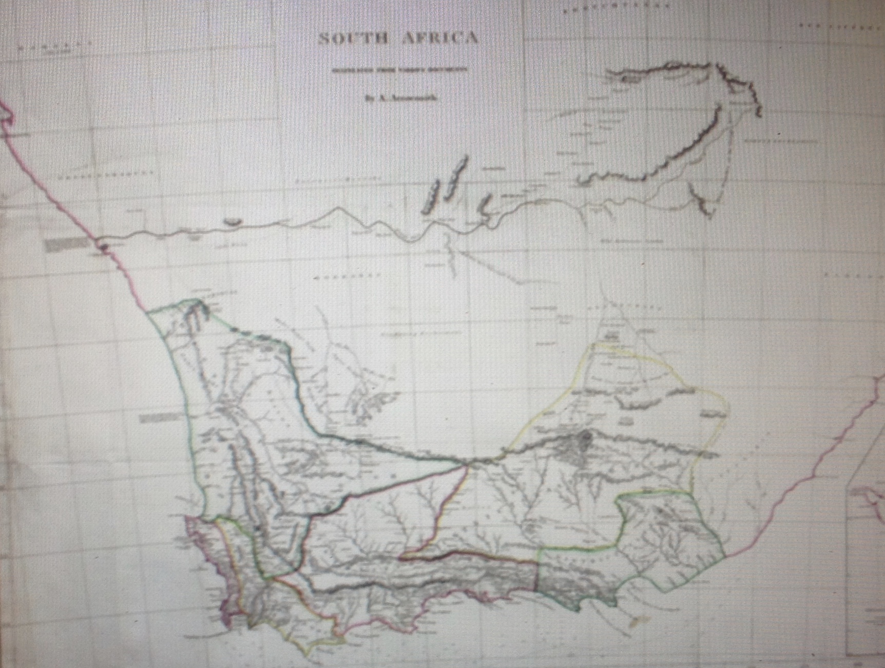 Well before the first “Cape of Good Hope” set was issued, the British territory had expanded far beyond the cape itself. The map at left is from the early 1800s, and shows clearly how “civilization” is spreading east and north from the cape.
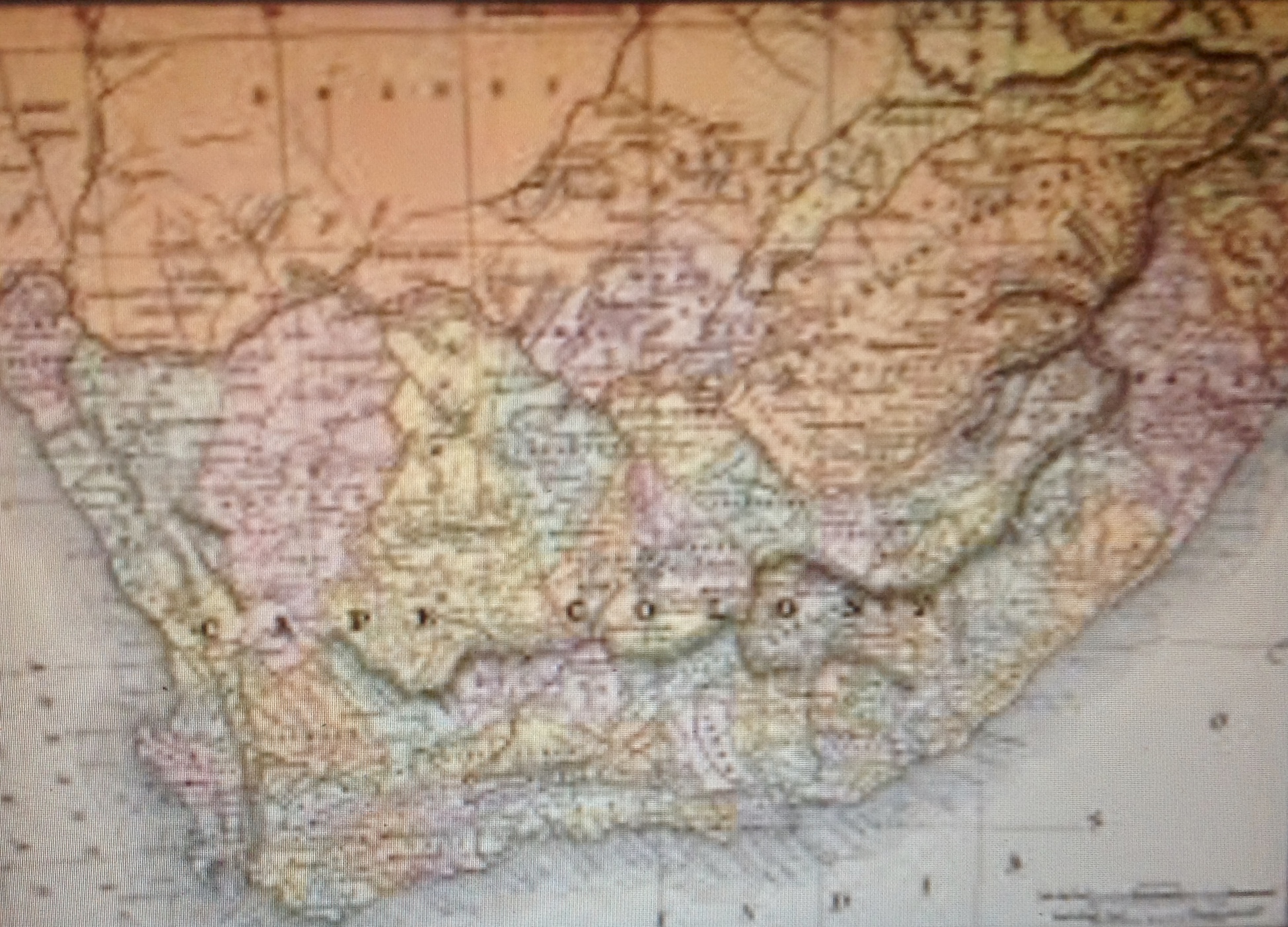 By the time this map appeared after mid-century, the burgeoning Cape Colony was beginning to look like a map of New Jersey with its intricate territorial divisions.
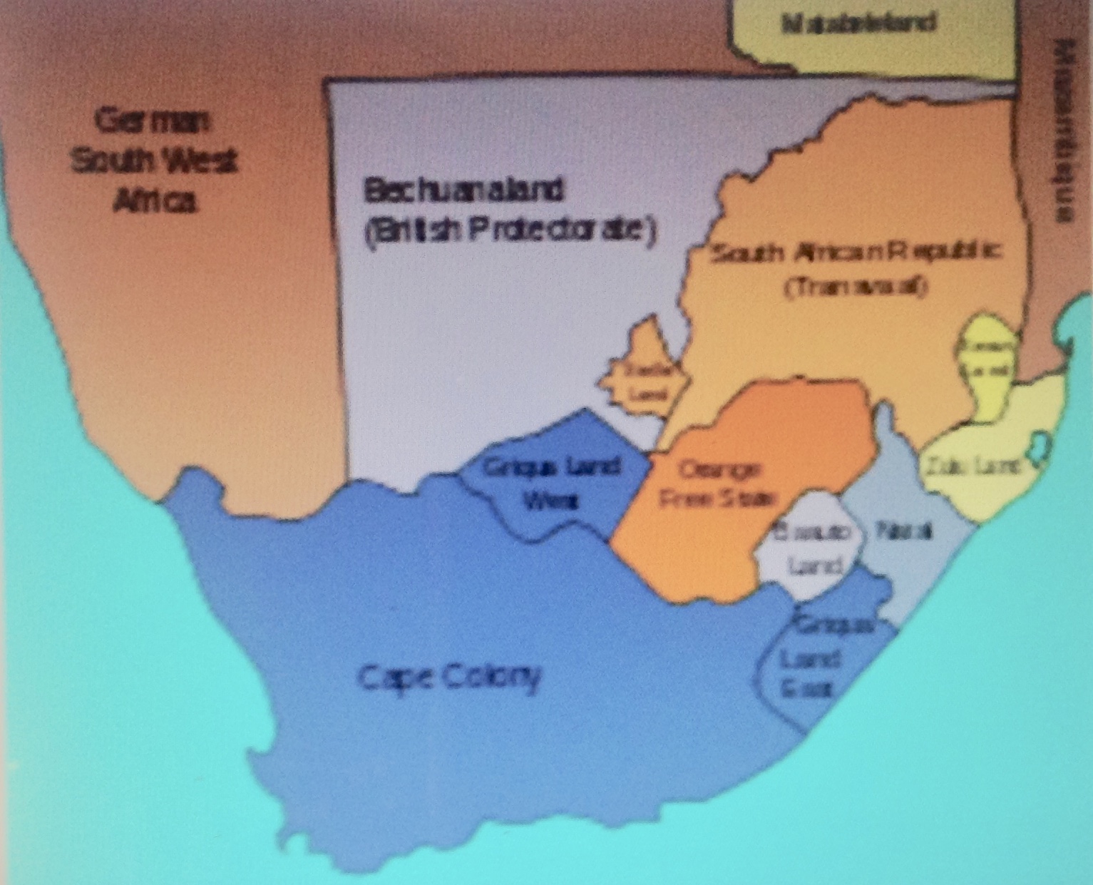 After 1872, the Cape Colony had the same rights within the British imperial system as Canada and Australia. It still issued stamps with the name “Cape of Good Hope,” but it was about to become the biggest baddest colony in Africa.
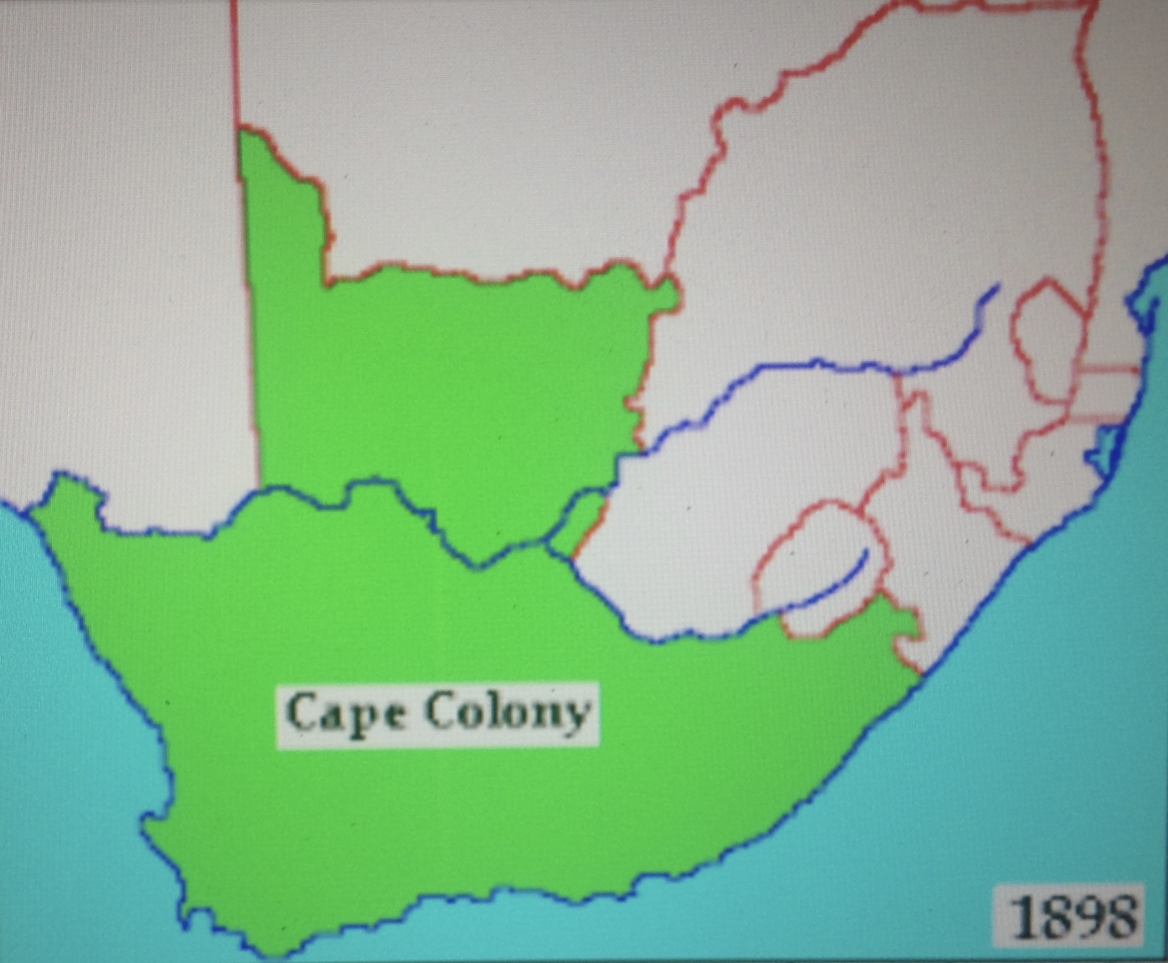 Here is a map of Cape Colony at its apex, in 1898. In the 1904 census, the population of the Cape Colony was 2.4 million. That included 1.4 million blacks and almost 580,000 whites. The land mass covered 219,700 square miles — four times the size of the UK — yet the stamps still bore the name, “Cape of Good Hope.” Go figure. (You can still see the COGH sticking out like an inverted thumb-down near Africa’s southwestern tip.)
 Before we go any further, let me share what I’ve learned about how well the Cape Colony was governed in its early years. From the start there was lots of restless energy among the motivated groups of Dutch and English settlers, and considerable curiosity among the indigenous Xhosa, Zulu and other Bantu peoples. As the English, Boers and Afrikaners migrated along the coast and into the interior, they confronted each other and the native population with varying degrees of tolerance and respect. The Boers of the Orange Free State and Central African Republic established a racist hierarchy that subjugated the black African populations that surrounded and outnumbered them. The British, too, favored a racist hierarchy in Natal, Transvaal and the Cape Colony.
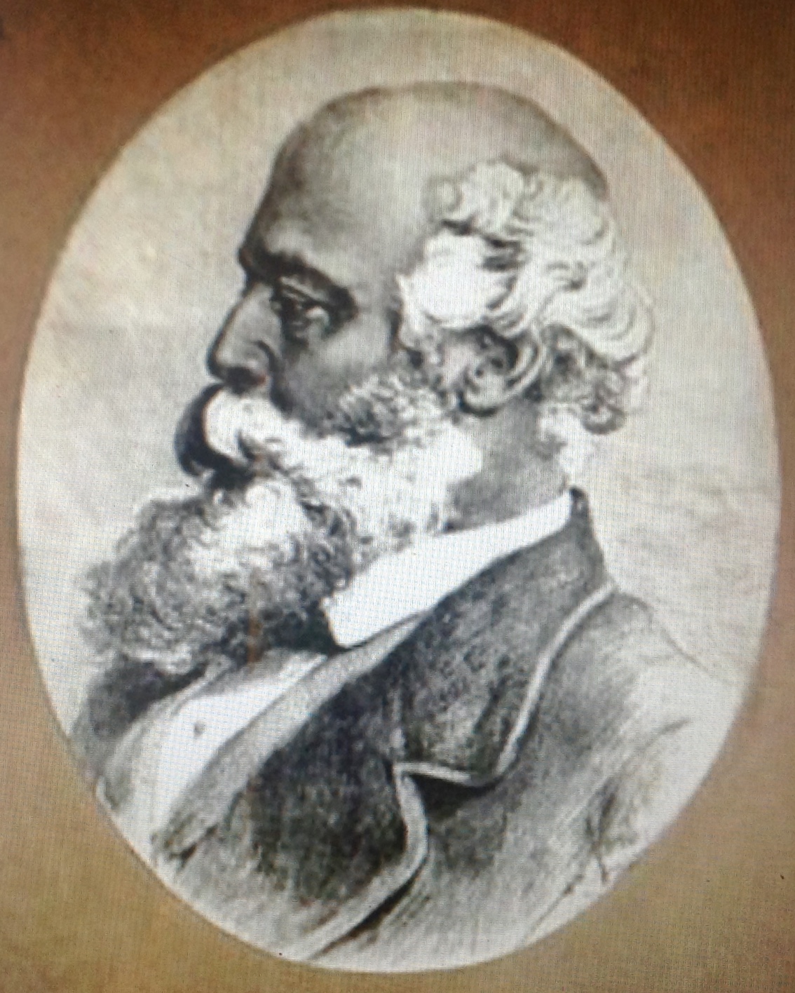 John Molteno (right) was born in 1814 in London, part of a large English-Italian family of modest means. He shipped out to the Cape Colony as a teenager, working as a library assistant. He rose rapidly through the ranks because of his keen intelligence, outgoing manner and manifest competence. He won support from the Boers early on when he joined them in the Xhosa wars. Unlike the Boers, he espoused a lifelong commitment to equal rights for whites and blacks. When the British pressed for consolidation with the racist Boer republics in southern Africa in 1878, Molteno objected, on the grounds that the Boers would not tolerate the Cape Colony’s universal franchise. He lost his fight, and he was right. Molteno married three times. His first wife was “coloured” and died in childbirth. He went on to have 19 children; among his many descendants were anti-apartheid activists.
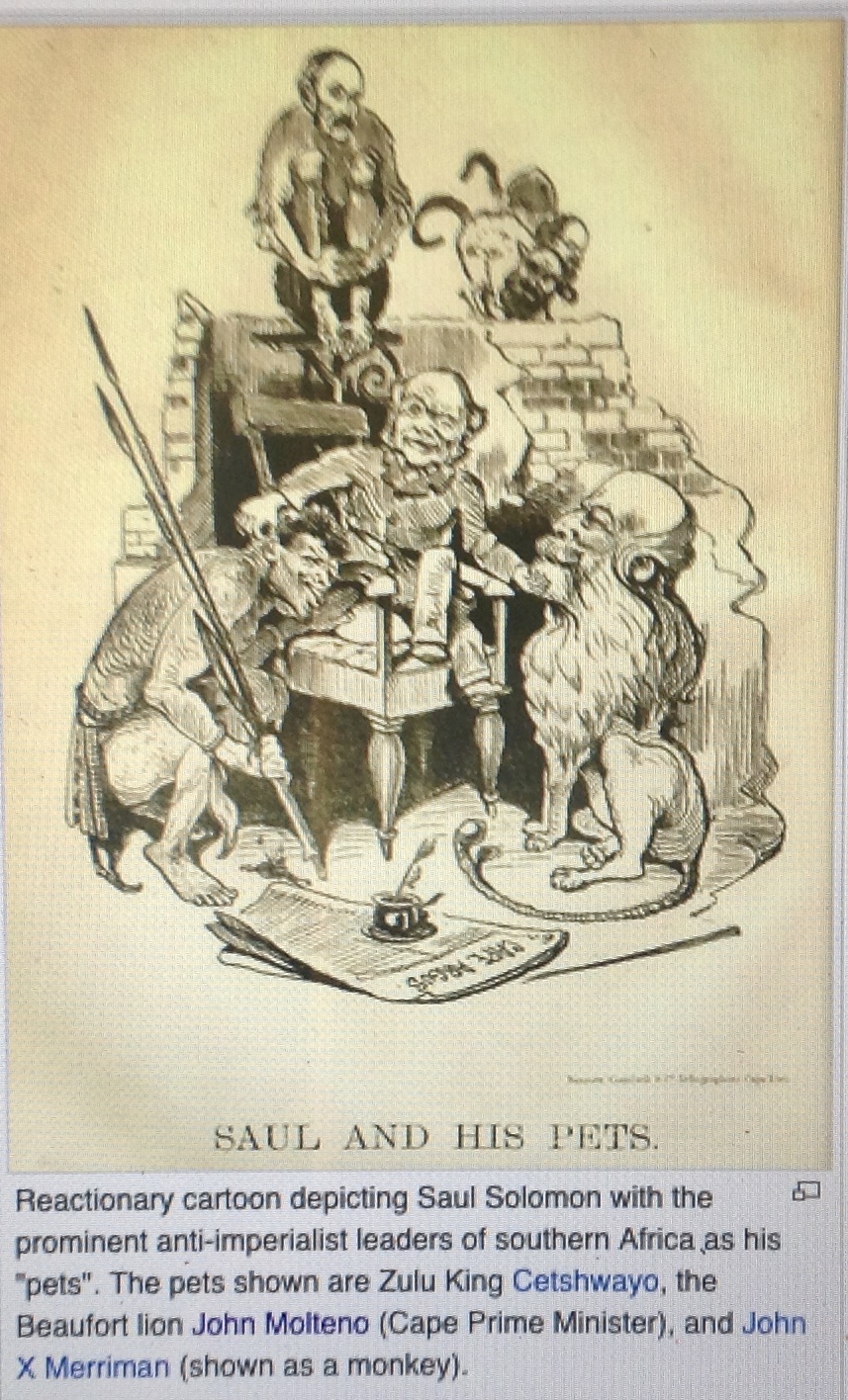 Molteno’s two key associates were John X. Merriman and Saul Solomon. Merriman’s extraordinary gift for administration helped build the Cape Colony into the economic engine that would power South Africa. Molteno persuaded Merriman of the importance of equal rights. At the end of the century, as the racist policies of Boer leader Paul Kruger became more dominant, Merriman presciently warned: “The greatest danger to the future lies in the attitude of President Kruger, and his vain hope of building up a state in a narrow, unenlightened minority.”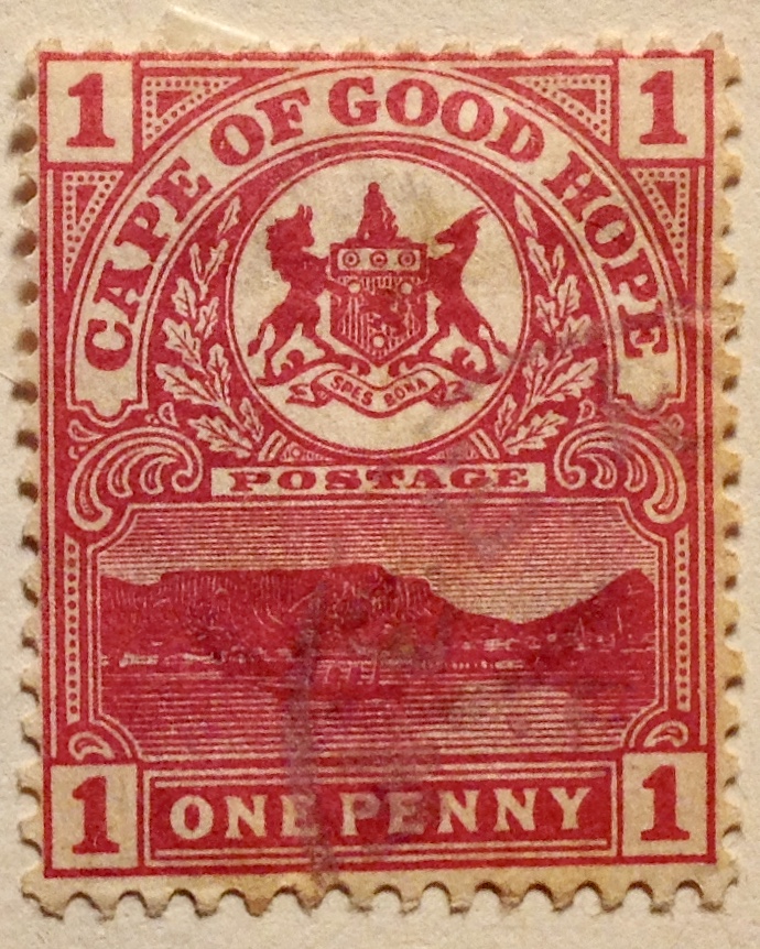
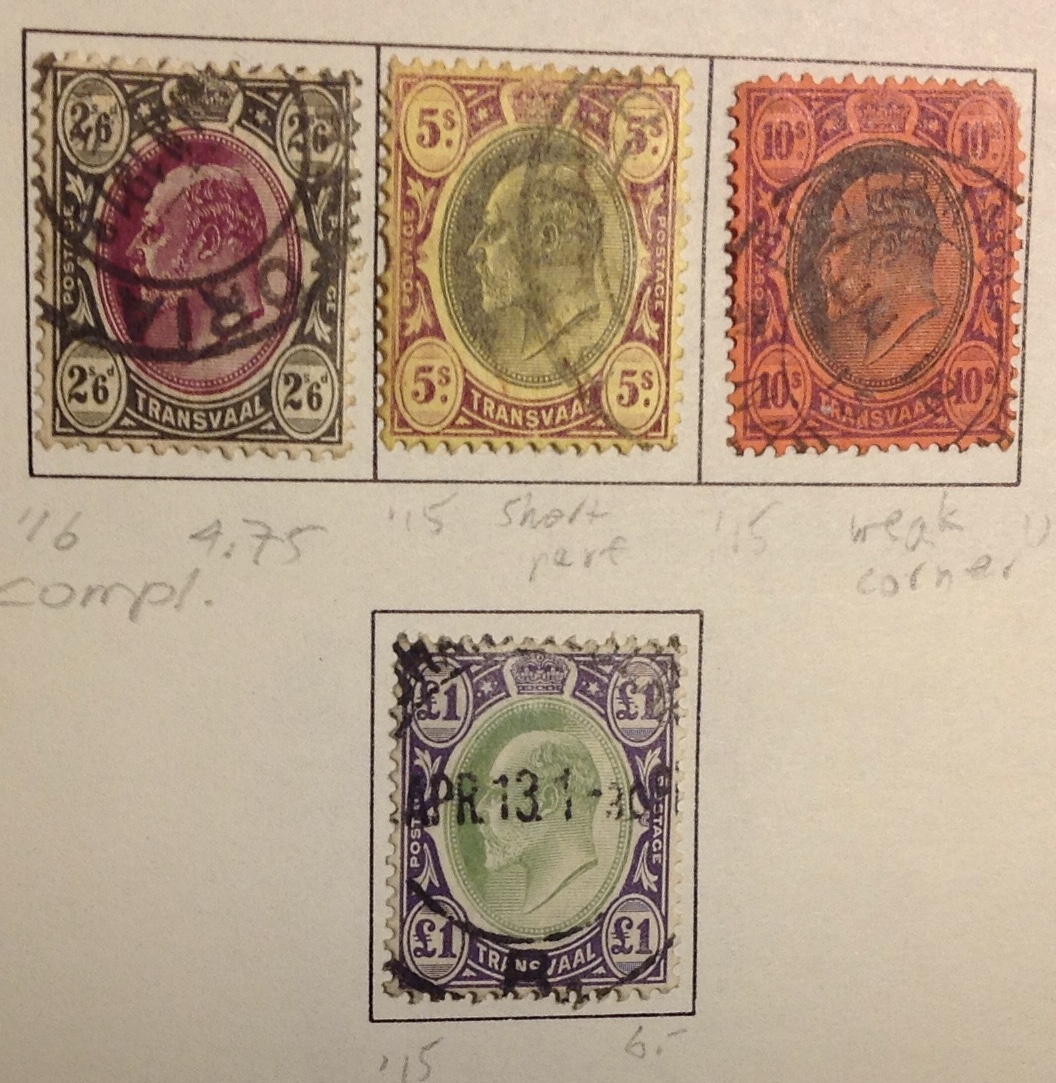
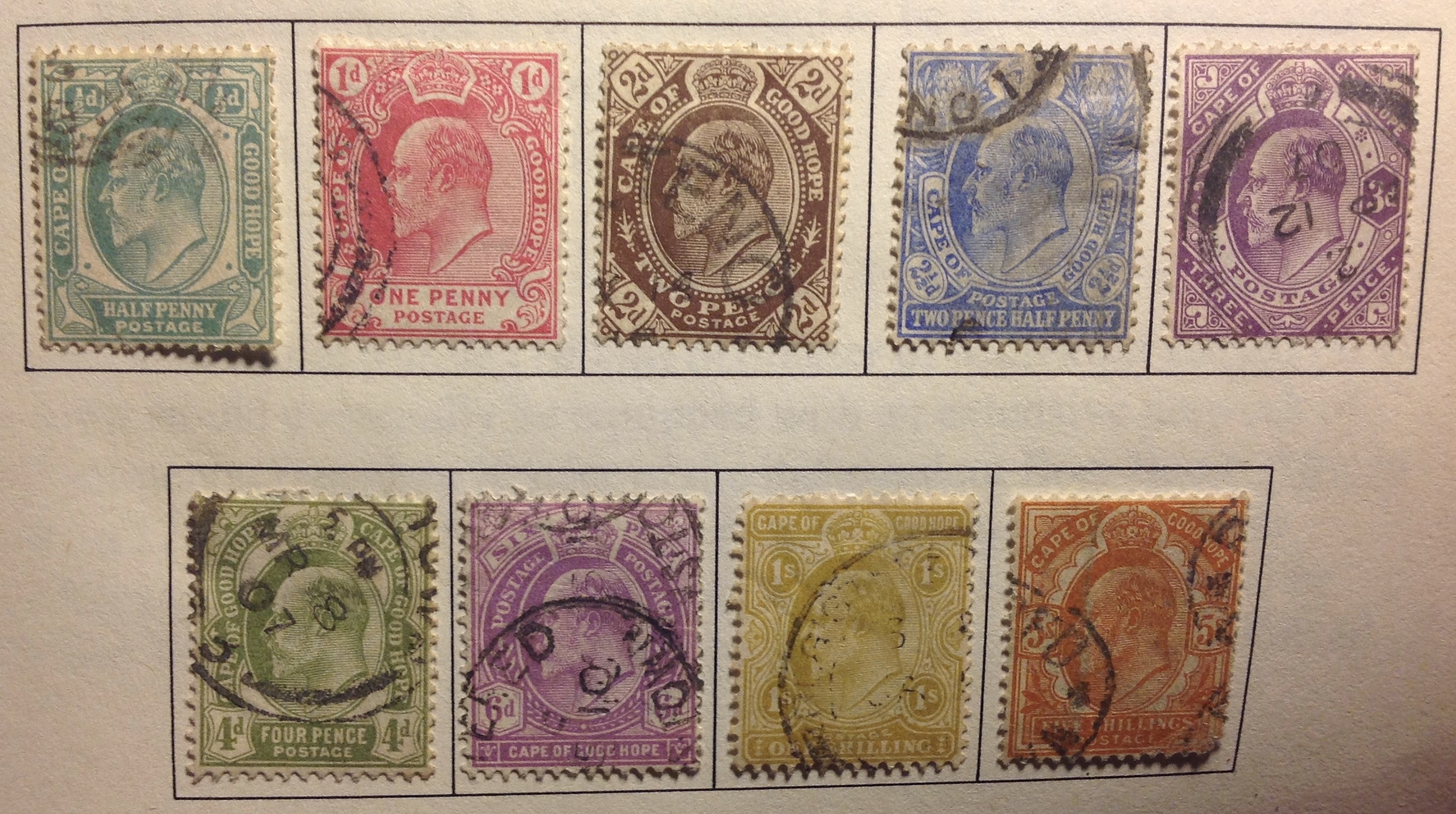 Above is the last set issued by the Cape Colony, starting in 1902 with the death of Queen Victoria and the start of the relatively short reign of her aging son, Edward VII. There’s nothing special about the set, except that I want to show it off because I have it complete, from the 1/2d to the 5 shilling. You may find the set online for under $20.
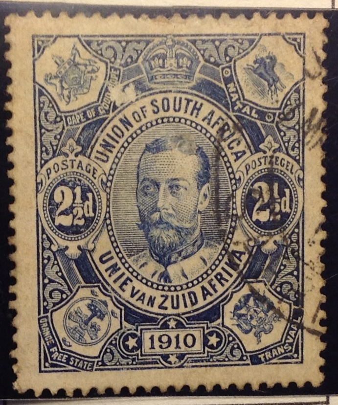 To the right is the first stamp of the Union of South Africa in 1910, the same year as the death of Edward VII and the ascent of his son, George V, to the throne. The union comprised the Cape Colony, Orange Free State, Transvaal and Natal (see coats of arms in the corners). As you can see from the map below, the union encompassed the whole of southern Africa with the exception of Swaziland and Basutoland.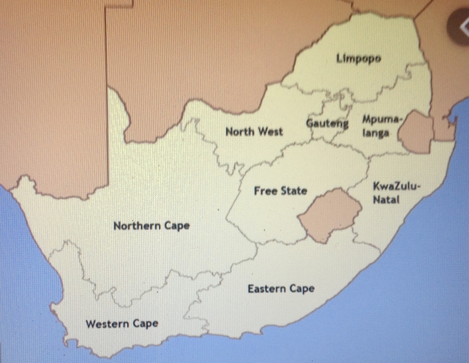
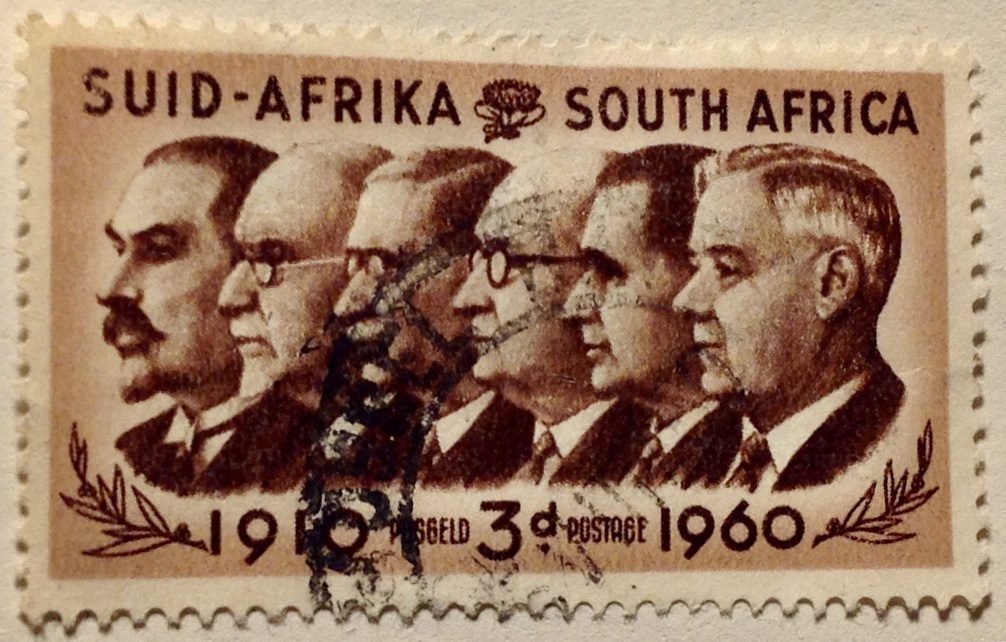
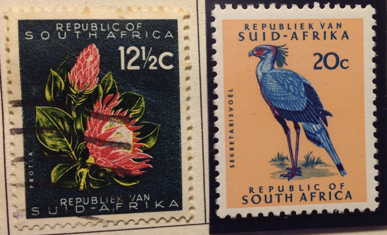 In 1961, the Union of South Africa became the Republic of South Africa (RSA). This name change did not alter the repugnant system of apartheid or improve the lives of black South Africans in any significant way. The RSA would not abandon apartheid until the 1990s.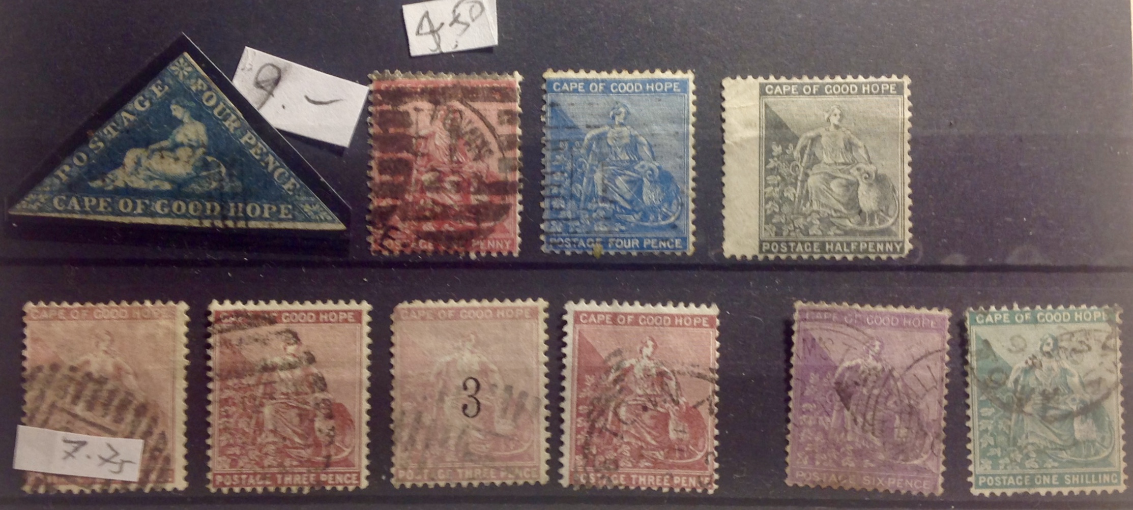
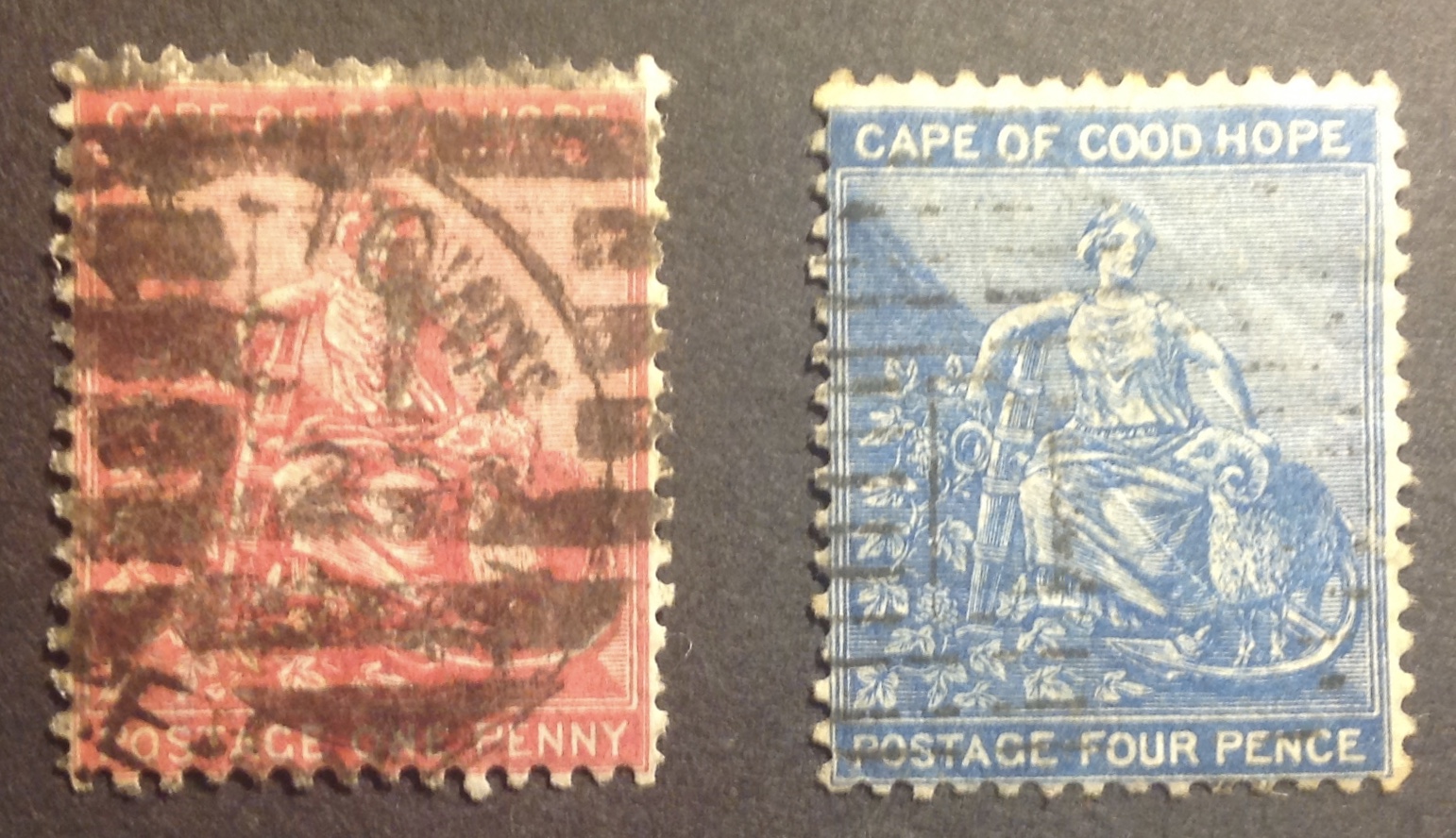 To start off, look at these two dandy examples of the first “rectangle” set (right). Notice the frame going all the way around the outside of each stamp. Do you see it? Do you? Do you? Look hard! See it? (Here’s a helpful note from The New World-Wide Postage Stamp Catalogue: “Worn plates of 1p, 4p show no top or outer frame lines.” I can hardly see them here either.)
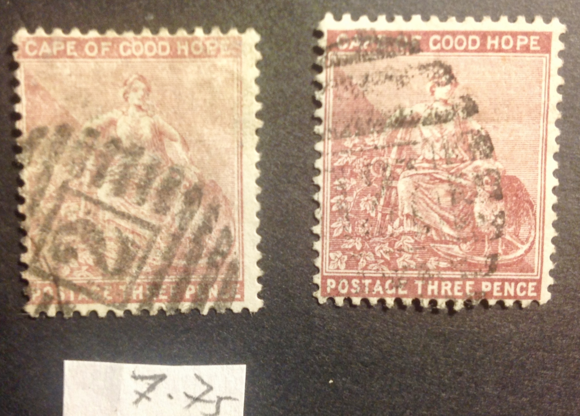 Now as a contrast, look at this pair (right). See the frame stop at the upper and lower border of the image? You might or might not be interested to know why one of these 3d stamps cost me $7.75 and the other didn’t. The reason is that the expensive one is listed in the catalogue as No. 25, ‘lilac rose (’80),” while the one on the right is listed as No. 26, “claret (’81)”
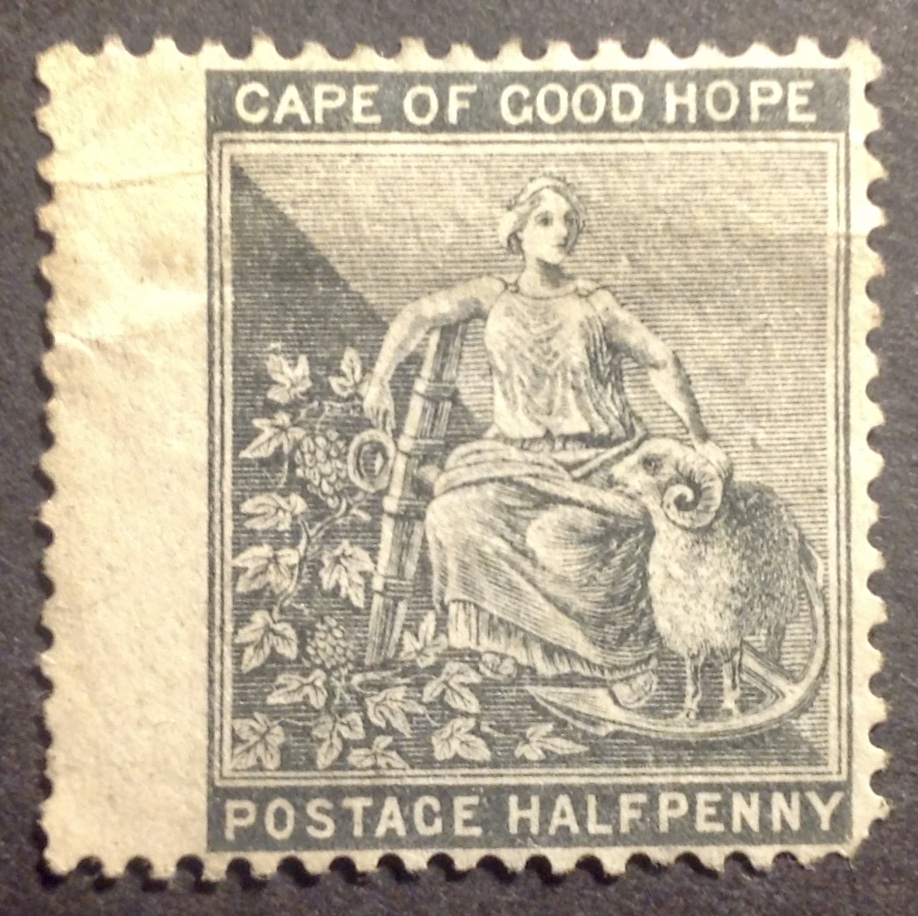 This stamp is not distinguished or valuable, but I include it because it is the only mint (uncancelled) variety I have from these Cape of Good Hope sets. I puzzled for some time over what are described as “emblems of the colony.” What at first looks like a wheel is the anchor, of course. That’s a ram standing inside the anchor’s curved heel, right? In the background are grapes, I’ll bet. And Hope is leaning on … well, that took me more time to figure out. Is it a lute or some other stringed instrument? Something to press grapes into wine? Something to poke or slaughter a ram with? Is she holding something, like a mug or flagon? Is she drunk on grape wine?
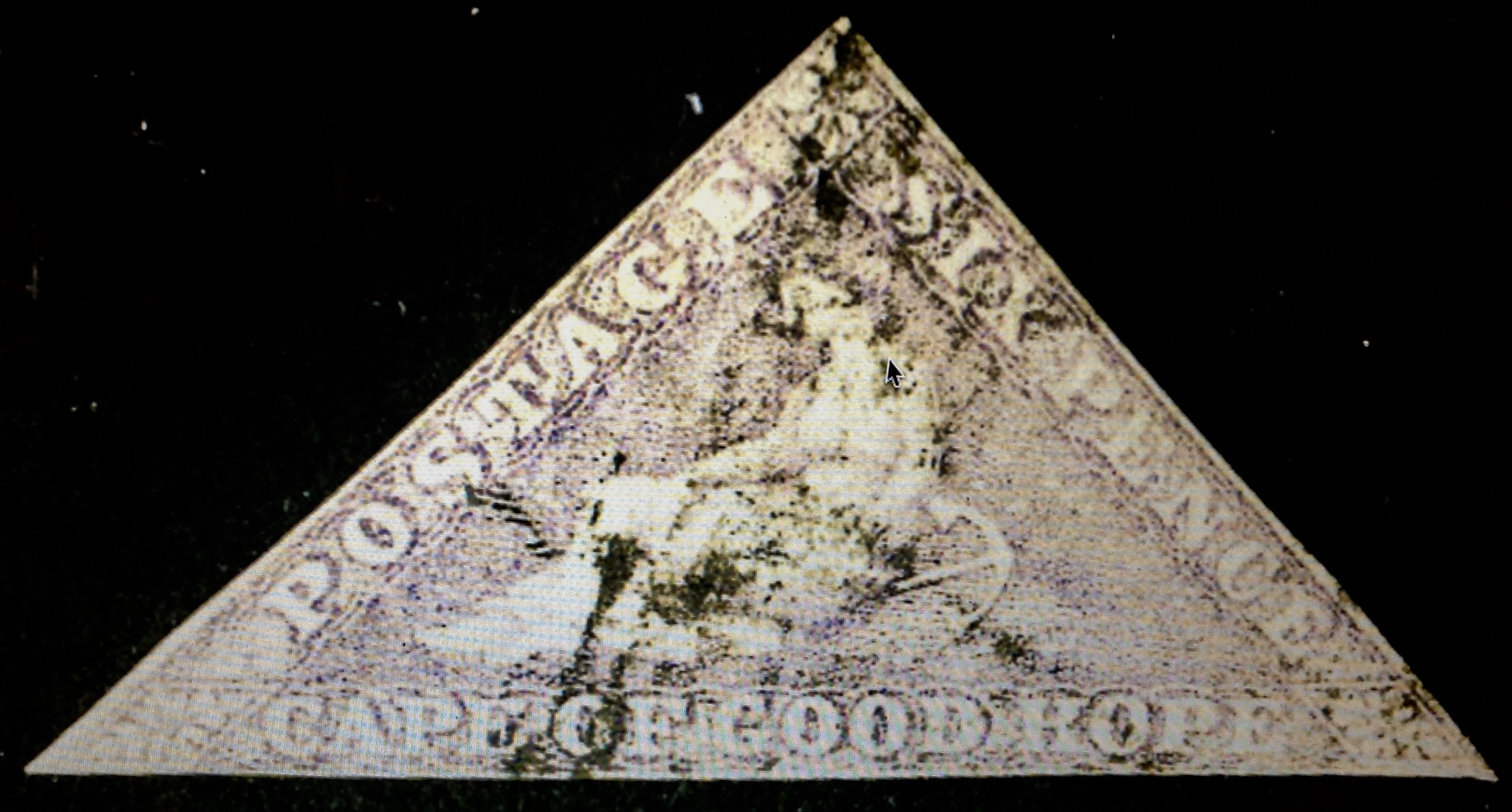 Here’s one that got away. The image is from online. It’s a half-decent example of No. 5, the 1 shilling yellow green (yellow green?). It catalogues at $175, and is a pretty example. I could have bought it for $35, but I let it slip away. (Sigh …)
