Congo stamps: The slide show

This is the gist of a talk I just gave at the Syracuse Stamp Club. Vice President Dan invited me to focus on Congo stamps. I already had presented once on this subject, but Dan said he was still confused about the “different Congos” and which stamps went with which. I readily agreed to take on this intriguing topic. I assembled a group of digital images of stamp “signposts,” mostly from my collection, to  help navigate the turbulent currents and tributaries of Congo-related philately. My presentation took the form of a quiz: Look at the stamp projected on the screen and identify or guess which “Congo” it came from. Also: see if you can stump the presenter with your questions. (I don’t know everything about Congo stamps!) Comments afterwards from the audience of 20-plus indicated they liked the program, so it seemed worthwhile to recapture some of it for the blog. On with the show — a quick narrative guide through 42 slides.

fullsizeoutput_71a1. Here is the first set of stamps issued in what would become the Belgian Congo. They picture King Leopold II of Belgium, and look a lot like Belgian stamps of the period. You can just make out the tiny writing, “Etat Ind du Congo.” That means “independent state of the Congo” — though it was anything but! What it really meant was that King Leopold was “independent” of accountability to his own government or anyone else but God. He ran this vast colony as his private fiefdom. Though he never set foot in the Congo, he micromanaged the place from his palace in Brussels, built a vast and exotic Congo museum complex in his royal gardens. While he mouthed platitudes about Christianity, civic progress, development and moral uplift, he ruthlessly suppressed indigenous populations. He exploited the country’s ivory, rubber and other resources for his own profit. He also issued stamps for his “independent” state. This set of five stamps catalogues at several hundred dollars, largely due to the rare 5 franc value.

fullsizeoutput_7242. The Congo may have been a vassal state of a callous ruler — Joseph Conrad  used it as the locus of his haunting novel, “Heart of Darkness” — but King Leopold did manage to put out some pretty stamps. Look at this lovely two-color engraving from the 1890s of the growing town that was to become Leopoldville.
fullsizeoutput_71b

3. By 1906, King Leopold’s Congo was such an embarrassment to the “civilized world,” thanks to the investigations and reports of  reformers like Roger Casement and Edmond  Morel, that the Belgian government had to step in and taking control. The “independent” Congo henceforth became the “Belgian Congo.” By the time the old king died in 1909, the regime in Brussels had issued a set of stamps obliterating the old title with the new name: “Congo Belge.” There are two sets: In one, the stamps are hand-cancelled; the others, as in this illustration, were machine-cancelled, worth considerably less.
fullsizeoutput_71c

4. The powers-that-be quickly followed up with another short set, using the same designs
as the earlier series, but with the new name. This engraving  shows the busy port of Matadi. But there was a festering problem: Since Belgium is a bilingual nation — French and Flemish — the French-only stamps were a political irritant.

5. Belgian stamps were bilingual by the 1890s, so the fullsizeoutput_71d Belgian Congo had to  accommodate the proud and vocal — and touchy —  Flemish constituency as well.  Here is the result. It turned out to be relatively easy to keep the central images of the original set and redesign the borders to make room for “Belgisch Congo” as well as  the French name. This  charming two-color engraving depicts the railroad from Leo to Matadi, at the time a considerable  engineering feat. Alas, the mammoth construction project took its toll in lives, most of them Congolese.
fullsizeoutput_71e

6. The “bilingual imperative” now in place for Belgian Congo stamps did have some awkward moments. Take this set from the 1940s — or rather, two sets from the 1940s. The  nicely engraved stamps were identical in every way — except that in one set, the country’s name was printed first in French, then in Flemish; in the other set, the names were reversed.

fullsizeoutput_71f

fullsizeoutput_721


7. This awkward practice continued, off and on, into the 1950s. This double set featuring Belgian King Baudouin was issued five years before independence.


fullsizeoutput_75f   8. What’s this? A set from 1930s Belgian Congo, overprinted “USA Airmail”? With denominations in U.S. cents? What gives? I wish I had a satisfactory answer for you, but I don’t. Were Americans really a presence in the Belgian Congo? Was this overprint used at the U.S. embassy, or by troops passing through? So far, it remains a mystery to me. Whatever its provenance, the set isn’t expensive to buy.

fullsizeoutput_1327

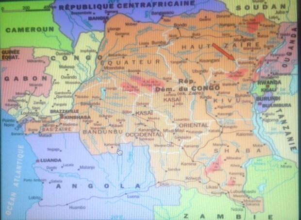
9. Right about now would be a good time to introduce a map of the Congo, so you can get  geographical idea of the stamp-issuing areas  represented in coming slides.  I lived in the Congo from 1962 to 1964, when I was 14-16 years old. My father was a diplomat, and we lived in Leopoldville, the capital city in    western Congo, not far from the Atlantic Ocean — or the Equator. The areas I will be discussing up to 1,000 miles from Leopoldville, in central and eastern Congo — Katanga in the southeast, Kasai in the center, Stanleyville in the northeast. Then there is Ruanda-Urundi, a separate Belgian territory bordering on the Congo’s eastern frontier.  I also will have things to say about the territory around Leopoldville — both south and north.  This map highlights the divisions of the “crisis years” between 1960 and 1964. This refers to the breakaway republics of Katanga and South Kasai, as well as so-called Simba uprisings around Albertville (northern Katanga) and Stanleyville (center-north), all of which produced postage stamps.

fullsizeoutput_129c10. This stamp marking the secession of Katanga shows a lot of gall. Not only does it co-opt a stamp from the “mother nation” of the Congo, it blots out that nation’s independence day with its own date, cleverly leaving “1960” uncovered. It also leaves alone the banner  “Independance” (inedependence), but  obliterates “Congo” with the audacious overprint “de L’Etat du Katanga” (of the state of Katanga). The essential illogic of this stamp, however, is that it depicts the whole nation of Congo and doesn’t even identify the rebel province that is declaring its independence.

fullsizeoutput_78c
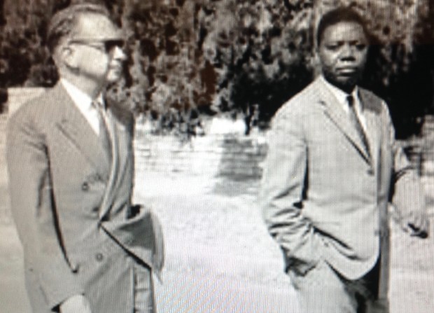
11. Here’s a semi-postal stamp from Katanga picturing the renegade leader, Moise Tshombe (who I once met, by the way, but that’s another story). It features the copper crosses that are emblems Katanga, literal currency at one time,  and a key source of the region’s economic well-being, such as it was.

fullsizeoutput_129b
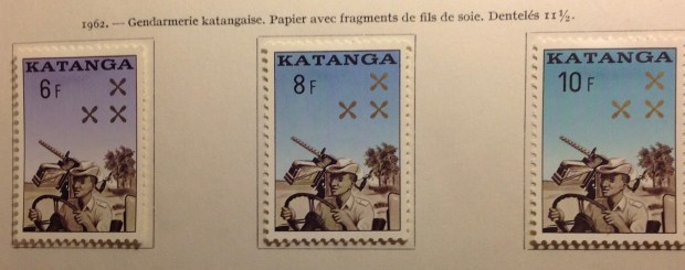
12. This Katanga set seemed quite modern for 1961. The indigenous bas-relief sculpture has primitive charm, though the characters do bear some resemblance to “Mr. Bill,” the hapless, creepy clay figure from early “Saturday Night Live.”

fullsizeoutput_74d13. I include this cover of Katanga stamps, all of them overprinted Belgian Congo stamps, because I am quite proud to display such a rich sample of postally used examples from a country that only existed for a couple of years. I expect it is worth as much as $20 or more — if you can find a buyer for this obscure stuff.

Version 314. These 1950s-era definitive stamps from India are familiar enough. But what’s with the “Congo” overprint? Here’s what: During the troubles in Katanga, the United Nations stepped up with peacekeeping troops to try to straighten things out. There also were troops from  Sweden, Canada and Ireland, but the Indians seem to be the only ones who issued their own stamps — or rather, their own stamps overprinted “U.N. Force (India) Congo.” Was it national pride? Was there a practical purpose, i.e., to provide the troops with stamps to use on letters home? If so, where are the covers with cancelled copies of these stamps? I’ve never seen one. If they exist, such philatelic oddities must be quite rare and valuable. India also overprinted this set for troops serving the United Nations in Korea (1953), Cambodia, Laos and Vietnam (1950s) and Gaza (1965).

fullsizeoutput_76615. Here is another overprinted set, this one involving the Belgian Congo flowers set of 1952-3. The set became the first issued by the independent nation, which was overprinted “Congo.” Here the same colonial flowers set was used for the breakaway republic of South Kasai, a renegade central province. This was only a half-hearted rebellion — South Kasai never broke relations completely with the central government, and President Albert Kalonji retained his seat in the Congolese parliament.

fullsizeoutput_76716. Here are the rest of the stamps issued by South Kasai, including original designs, i.e., not overprinted Congo stamps. The rebellion petered out in a few months, and Albert Kalonji, (pictured here) the president of the short-lived state,   ended up in exile — but alive.


17. The transition from colony to independence was haphazard in the Congo — socially, politically, economically — and philatelically. There were missing or misplaced overprints and surcharges, upside-down printings (“inverts”) and other varieties. As a 15-year-old stamp collector In 1964, I was able to buy stamps at the downtown Bureau de Poste to create a cover using six different versions of the original 6.50-frank stamp of the animal series depicting two leaping impala.  fullsizeoutput_76a

Top row, left to right: 1. the original stamp, issued in 1959;  2. the same stamp, overprinted “CONGO” in red, issued 1960;  3. ditto, overprinted in black.

Lower row, left to right: 1. ditto, with a silver surcharge “5F” and red  overprint, 1964;  2. ditto, with silver surcharge and black overprint; 3. finally, with a silver surcharge as well as a silver bar behind the black inscription “Republique du Congo.”

I created another covfullsizeoutput_769er with five different varieties of the 20-centime stamps from the same animal series, featuring a rhinoceros. Can you pick out the differences. The last item, lower right,   is a most peculiar error. Let me explain:

While the original Belgian Congo stamp was successfully surcharged “1F” on a silver rectangle, the “REPUBLIQUE DU CONGO” overprint is missing. This means the stamp looks for all the world like a new “Belgian Congo” stamp — issued in 1964, four years after independence! (This stamp is not listed in my Scott catalogue.)

fullsizeoutput_78518. Here is a Congo stamp featuring Patrice Lumumba, the controversial first prime minister of the Democratic Republic of the Congo in 1960. Only the stamp is not from that Congo, but from the “other” Congo — the former French Congo, now the “Popular Republic of the Congo.” Lumumba has never appeared on a stamp from his own country  — not a big surprise, since he was assassinated with the acquiescence or connivance of Congolese leaders Joseph Mobutu, Joseph Kasavubu and Moise Tshombe. It was up to other African nations like the neighboring Congo, ruled by Marxists and self-styled Marxists over the years since its own independence, to memorialize the mercurial Lumumba.

fullsizeoutput_787


19. Here are stamps from early in the former Belgian Congo’s independence years. They honor Dag Hammerskjold, the UN leader killed in a plane crash in September, 1960 while trying to mediate the standoff between Katanga and the mother Congo. The overprint reproduces a slogan from the short-lived administration of Congolese Prime Minister Cyrille Adoula — “paix, travail, austerite” (peace, work, thrift).In 1962, the earnest, honest Adoula seemed to hold out hope for a better future — but his tenure was cut short by events and plots.

fullsizeoutput_788

Kasavubu

20. Congo’s president from 1960 to 1965 was Joseph Kasavubu, a wily politician from an important tribal family. He managed to hang on through the Congo’s most turbulent years, only to be dismissed into  retirement after a young colonel named Joseph Mobutu took over in 1965.


fullsizeoutput_79c

A young Mobutu

21. After Kasavubu fired Adoula as prime minister in 1964, he called on Moise Tshombe, the exiled former leader of the Katanga breakaway province, to try and bring order to the Congo itself. This was not quite like Jefferson Davis being invited to take over after Abraham Lincoln, but you get the idea. Tshombe lasted about a year, whereupon Mobutu and the army stepped in. He rapidly consolidated his power and proceeded to rule the Congo for the next 30 years with a combination of harshness, violence, cruelty,  indifference toward his people, hypocrisy and narcissism, monumental greed and selfishness. Would you like to know how I really feel about him?


fullsizeoutput_7e322. Mobutu’s most cynical act was his claim of “authenticity” — that he somehow embodied African values and aspirations. He renamed his country “Zaire,” in ancient tribal tradition, gave himself fancy new titles, and began to sport a walking stick and leopard-skin hat.  This Zaire stamp says more than its designers may have intended. It pictures Mobutu contemplating the big diamond — loot! And what kind of guy has himself depicted on a postage stamp wearing sunglasses? Shifty!

fullsizeoutput_7e4

23. Here’s an even better likeness of Mobutu — again, probably not intended by the stamp’s designers …


fullsizeoutput_128a24. Now for a U-turn back to 1915, folks! Back to World War I, which was being fought in Africa as well as Eurasia. Germany had maintained  a colony in east Africa since the 1880s. After hostilities broke out in 1914, it didn’t take long for the English to the north and east, and the Belgians in the west, to overwhelm German East Africa’s forces. They divided the spoils: Britain “took” Tanganyika, and the Belgians moved into what is today Rwanda and Burundi (see maps, above and below).  The first stamps from these countries were hand-overprints on the current Belgian Congo pictorial set, like this one. These stamps are quite rare. Mine cost $29.85. It catalogues for much more than that. My scribbled note “authenticated” means the stamp carries the desired mark on the back. (I guess there are counterfeits of this rare set.)

IMG_2050

25. Here is the image of a stamp from the first set of “Ruanda,” also in 1916. It’s captured from an Internet screen, and is on sale for “just” $400! That’s a rare stamp!


fullsizeoutput_77e

26. The reason the Ruanda and Urundi stamps are so valuable is that so few were issued. They were soon replaced by a set with this busy overprint — in two languages. The inscription in French and Flemish reads  “German East Africa: Belgian Occupation.” The lettering partially obscures the delicate engraved designs. Aesthetically, overprints are ugly, marring the appearance of a stamp. In this case, postal authorities might as well  have printed the names on blank paper!


fullsizeoutput_1298

27. How about this one — an overprint on top of an overprint? You should be able to make out a faint hand-stamp “Tabora,” above the black line rising from left to right. The Scott catalogue says these local overprints were not authorized, and assigns them no value. This item from an Internet image was on sale for  a cool $99 — too rich for my wallet.


fullsizeoutput_128b

28. How about this item? It’s really not fair for the stamp designers to be so cagey. You can make out that it’s a Belgian Congo stamp, or at least was one originally. Then there’s a red cross and a  printed number, presumably designating a  charitable contribution of one franc on top of the stamp’s one-franc value. That’s decipherable. So is this a Congo stamp, or what? And what the heck is “A.O.”?  For answers, you need a philatelist, or historian, or at least someone with a Scott catalogue who knows where to look.  Then you would learn that “A.O.” stands for Afrique Orientale — East Africa. This is in fact another stamp from the Belgian occupation of Ruanda and Burundi — which in 1922 became the Belgian mandated territory of Ruanda-Urundi. One wonders how a stamp like this would be received by the indigenous population. Would they pay the extra franc for the Red Cross? Or as some philatelists suggest, did most  stamps like this one (which aren’t that pricey today) never even reach post offices, but rather go right to collectors?

fullsizeoutput_128c29. The first stamps of Ruanda-Urundi were overprints of a 1920s definitive set from the neighboring Belgian Congo.  I suppose it would be a stretch to call them stamps from the Congo, though the name is on them.


fullsizeoutput_128d

30. Here is a beauty from the first set inscribed with the name Ruanda-Urundi, in the 1940s  — a handsome portrait, and a fine example of the engraver’s and colorist’s art.


fullsizeoutput_128e


31. This stamp  commemorating the Olympic Games came out just as the Congo was preparing for its independence day June 30. The set shares the designs with last issue from the Belgian Congo.  Ruanda-Urundi remained tied to Belgium for another year before splitting into the Kingdom of Burundi and the Republic of Rwanda. The extra year didn’t prepare either nation any better for independence than the devolving Congo to the east.  The people of all three nations would continue to suffer, trading colonial oppression for corruption, misrule and tribal violence.

fullsizeoutput_128f


32. The first Burundi stamps carried clumsy  overprints on leftover Belgian Congo stamps from the 1952-3 flower set.


fullsizeoutput_1291


33. The first Rwanda stamps bore slightly fancier overprints, still using stocks of Belgian Congo stamps, this one from the animal series of 1959.


fullsizeoutput_1290


34. Both Rwanda and Burundi soon were issuing stamps of their own design. This one includes a portrait of Burundi’s king, who soon enough would be sent packing.


fullsizeoutput_1294


35. Before I bring you more or less up to date, a quick history lesson about other “Congo” stamps. Here’s one from the 1900s inscribed “Congo Francais” — French Congo. Now look at the next image.


fullsizeoutput_1292


36. These two stamps are inscribed “Moyen Congo” — Middle Congo — along with the name above, “Republique Francaise.” Why Congo and Middle Congo? Aren’t they both French territory? What’s the difference? Does it matter? Indeed it does. The original French Congo overlaps with modern-day Gabon, a small nation located along the west coast of Africa, north of the Congo. Middle Congo covered a much larger territory across the Congo river from the Belgian territory.

fullsizeoutput_129637. Middle Congo eventually took over from French Congo, and the territory issued stamps into the 1930s, when it joined French Equatorial Africa. The first regional issues included this overprint from Middle Congo. Upon reaching independence, a large part of Middle Congo unfortunately was dubbed the republic of the Congo. The fact that there are two Congo republics across the Congo River from each other has created decades of confusion, helping to make this slide show necessary!

fullsizeoutput_129338. Finally, one more “Congo” in this tangled philatelic history. The stamp pictured here was issued in 1914, and represents a colonial territory of Portugal that straddles the western “lip” of the then-Belgian Congo that extends to the south Atlantic ocean.   This small “Congo” territory gave the Portuguese access to the Congo river delta. Portugal also controlled Angola, directly to the south of Belgian Congo. (see maps). While the Portuguese only used the name “Congo” until 1915,  it kept control of the territory as part of  Angola until independence in 1975. Today it is the free Angolan province of Cabinda, still straddling the northern border of the Congo. There is an independence movement in this tiny province. There also are stirrings from others in the region who dream of resurrecting the ancient “Kongo” kingdom. This unlikely development would only happen if land is ceded from four countries that mistrust each other — Angola, both Congos and Gabon. A final reflection: I wonder what the indigeneous population thought  when they first saw this stamp back i 1914, which depicts a fierce-looking caucasian (actually the harvest goddess Ceres), wielding what could be a machete …

39. Now, to start wrapping things up. Mobutu finally was forced out of the country in the mid-1990s, decamping to his European mansions, where he died soon after, having  precious little time to enjoy the estimated $15 billion he st0le from his country. In 1997, in an act of embarrassment, or wishful amnesia, or spite, the powers-that-be changed the country’s name back to Republic of the Congo. This did not portend happier times for the much-abused Congolese people, alas. Even though Mobutu was gone, the country was worse than bankrupt, and misrule continued under Laurent Kabila and then his son, Joseph Kabila. This stamp captures the ethos of the post-Mobutu fullsizeoutput_75cera — “Zaire”: is blotted out with an ugly black rectangle.  The country’s name underneath is an almost-indeciperhable “Rep Dem du Congo.” There is a new value, with the old one covered by another black box. A vulture or hawk perches menacingly amid these dark blots. The eBay seller wanted $29.99 for this odd, apparently unlisted stamp, acknowledging that it might be bogus.

fullsizeoutput_1322


40. As it turns out, the Congo had to contend with a number of bogus stamps issued in 1997. These slick, multicolored philatelic items, still carrying the name “Zaire,”  commemorate  folks who had nothing to do with the Congo, like John Lennon, Frank Sinatra and Elvis. The stamps were officially declared illegal by Congolese postal authorities, who alerted the Philatelic Webmasters Organization. This group collaborates with the Universal Postal Union to call out spurious issues. The postmaster in Kinshasa identified  “a certain number of philatelic products still printed with the country’s old name (Zaire).” These stamps would not be admitted for sale or use in the Congo, the note said. You can still find these fake stamps for sale on eBay. Buyer, beware!

fullsizeoutput_132141. So we come to the end of this slide show, with an image of an authentic issue of stamps from the  modern-day  Democratic Republic of the Congo. Pretty stamps, eh? Don’t be fooled. There’s nothing  pretty about the way Congo is being run today. I wish I could say otherwise.

fullsizeoutput_1326

42. The Congo today. Note the name changes of provinces, the location of the Angolan province of Cabinda in the far west, and Rwanda and Burundi in the east.

Bonus: Pietersburg!

fullsizeoutput_a07
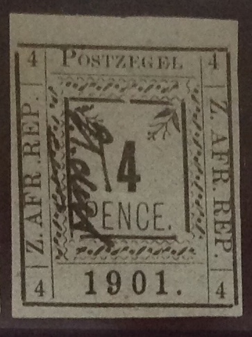
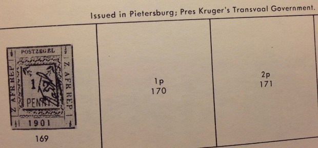
This thrilling selection of stamps arrived in the mail the other day, in a small flat package from South Africa. The stamps are from 1901, during the last days of the South African Republic (ZAR) based in Pietersburg (Transvaal), where tough, stubborn old Paul Kruger concluded  his decades-long conflict with the British and dominance of black Africans. Much blood was shed and misery visited on the people before  Kruger’s forces were defeated. Kruger’s strong convictions, military and political leadership

fullsizeoutput_a03

Paul Kruger in his prime.

helped to secure the Afrikaner tradition in South Africa’s culture. This wily Cape Colony farm boy should rank with the most adept of southern Africa’s tribal leaders — except for one thing. Unlike the Zulu, Matabele or  Xhosa, his tribe was a bickering lot of caucasians: Boers, Dutch settlers, Germans, Huguenots and diverse others, some tracing their African ancestry to the 1600s. (Kruger’s German forebear landed in Capetown in 1713.)

Kruger was old enough to take part as a child in the Boers’  Great Trek inland in the 1830s. He was present at the signing of the Sand Hill Convention with Britain in 1852, and was  instrumental in sustaining  the Boer-dominated  ZAR in ensuing decades. These “Pietersburg” stamps — authorized Boer provisionals — were printed by the local newspaper and issued only between March 20 and April 9, 1901.   Kruger had moved his government from Pretoria to Pietersburg to avoid capture by the British. By the time the stamps were placed on sale, the South African Republic was well on its way to defeat by British guns and troops. Kruger narrowly escaped to neighboring Laurenco Marques, Portuguese territory.

The rather undistinguished-looking stamps are listed in the Scott catalogue under Transvaal, the British name for the territory, with a smaller headline announcing,   “South African Republic,” and a special subsection for  “Pietersburg Issues.” Paul Kruger surely would object to this ranking, since his republic, spanning all but six years between 1869 and 1902, was a sovereign nation. The Scott catalogue explains, rather lamely: “Although issued by an independent state, the stamps of the South African Republic are included in this section (i.e. Transvaal) in accord with established philatelic practice.” Sounds like a British tilt, if you ask me. Philatelic protocol, like history, favors the winners.

At first glance, the Pietersburg stamps in the group all look alike. Be not deceived! Join me in a quick tour of this particular philatelic weed-lot — a game of Each-of-these-things-is-slightly-but-distinctly-different-from-the-others. Can you spot the differences?   Here’s a hint: The four stamps in the top row are the same, but different from the two in the second row, which in turn are different from the three in the third row. Now can you spot the differences?

Version 2

Stamp from Row 1

No? OK, look closely at the first-row close-up. Notice the stamp’s elements: the denomination (four pence) in a framed box, above the  large date “1901”; on either side  the inscription: “Z. AFR. REP.” — an awkward contraction  of the country’s name (then again, “ZUID AFRIKAANSCHE REPUBLIEK” is quite a handful of letters to have to strew across any postage stamp); finally, at the top the announcement, “POSTZEGEL” — postage. There is also a handwritten scrawl, but let’s not talk about that just yet.


Version 3

Stamp from Row 2

Now look at the second-row close-up. All the elements are there — but with a subtle change. See it? Look at the number, “1901.” Compare it to the date in the first close-up. Now do you see it? Why, sure! In No. 2, the date is at least one millimeter smaller. It’s a completely different stamp!


Version 4

Stamp from Row 3

On to Row 3. Again, all elements are present. (Notice the extremely large margin on the blow-up example I have included — a stamp from the side of the plate, I’d guess, probably no extra value.)  What is the difference here? Still stumped? All right … Look closely at the word “POSTZEGEL” at the top of the stamp. Compare it to the same word in close-ups No. 1 and No. 2. Notice anything? Sure! In the top two, the “P” is distinctly larger than the other letters. In No. 3, however, all the letters are the same size. It’s a completely different stamp!

Now, quickly, back to the handwritten scrawls, which appear on each stamp. Compare them, and two things are clear: the scrawl is visibly similar on each stamp; and  each one is slightly different — unique, probably. To “cancel” or “certify” these for postage, it seems a Boer bureaucrat — or was it Kruger himself? — had to sign each stamp issued in what remained of the South African Republic/Pietersburg during this three-week period in the spring of 1901. Maybe the same person didn’t sign every stamp, but it sure looks like it. Perhaps the  inscription means “cancelled” or something else. This is the only set of “hand-cancelled” stamps I’ve seen processed this way. (Yes, there are the rare British Guiana hand-cancels of 1854, and the fabled Bermuda Postmaster stamps of 1848 — but let’s not go there.)

Perhaps because of this singular “cancellation” process, together with relative scarcity, if not rampant demand, these Pietersburg stamps retain considerable value — $30 to $40 apiece in catalogues.  I got a bargain online, paying about $40 for the selection of nine stamps that include all three printing varieties. (The catalogue also lists perforated sets, and a few stamps with red scrawls instead of black.)

The Pietersburg stamps occasionally are available online — for a price. Curiously, you can find copies that have been cancelled the traditional way, with a circular date stamp, selling at a discount. Which begs the question: If the stamps already are marked by a hand scrawl, why cancel them again? Was the scrawl not universally recognized? Is it a signature at all? Am I asking too many questions? Yes!

fullsizeoutput_a11

Double cancel? This Pietersburg stamp carries the scrawl as well as a circular date stamp. What gives? (This illustration comes from the Internet, not my collection; I held out for stamps without the taint of “cancelled to order” (CTO)

The Scott Catalogue merits a word at this juncture. It acknowledges that “cancelled” copies of the Pietersburg stamps exist, but warns they may be spurious. The editors opine: “Used  copies are not valued, as all seen show evidence of having been cancelled to order.”  Ah! Those freighted words: cancelled to order, or CTO.  This means postal officials devalued, or “remaindered” their own stamps by cancelling them right in the office. Don’t ask me why, or I’ll have to do more research. But the practice has been widespread in philatelic history. Stamps going back to the Victorian era carry the unmistakable markings of in-house cancellation, an intentional practice which supposedly renders the postal “remainders”  worthless. Those stamps tend to bring weaker prices in today’s philatelic marketplace. Over the decades, many nations (though not ours) have produced reams of CTO sets, which I imagine are sold at a discount in shadowy stamp bazaars. The whole CTO thing makes me queasy, so I don’t really care to look into it too deeply. I mean, I want the stamps, but I don’t want to be scammed by worthless paper.

I have been on the lookout for Pietersburg stamps since rediscovering the blank spaces in my British Africa album and wondering about these strange designs and their apparent rarity. After learning the back story, and hearing about the suspect “cancellations,” I have been holding out for copies without the circular date stamps. Now, with his latest find, I seem to have acquired a cache of the real thing: stamps with the unique scrawls (the catalogue calls it “initializing”), no CTOs, all three varieties represented. What a find!  …

fullsizeoutput_9ff

Paul Kruger near the end of the ZAR.

Back to Pietersburg in 1901. The ZAR stopped issuing its stamps after just three weeks. For Paul Kruger and the Boers, the end was near. The war against the British was lost, though diehard Boer guerrilla fighters held out in the veld.  British countermeasures included a scorched-earth policy that produced thousands of destitute women and children — and an early incarnation of concentration camps. The aging “Uncle Paul” made his way by ship to Europe. He refused to return to a southern Africa ruled by the British, and died in Switzerland in 1904, aged 78, survived by many of his 17 children.

As you can tell, I am proud to add these unusual stamps to my collection, and may decide to install the small display shown in the photo at the top of this article as-is among the pages of my growing South Africa collection. The evanescent postal history of the Pietersburg stamps spins off  grim and gripping tales of ZAR conflict and resistance. During the first British takeover in Transvaal in 1877, postal authorities overprinted ZAR stamps with the initials “V.R.” — Victoria Regina — then issued a set with the queen’s portrait. When the Boers took charge again in 1884, they overprinted the Victoria series with Afrikaans surcharges before issuing their own stamps. As the British swept into Boer territory again in 1900-1901, they stamped “V.R.I.” on more ZAR sets — though not on those last ones from Pietersburg. (Maybe because of all those worthless CTO sets?)

Kruger’s last stand followed decades of pushing, shoving and shooting between British and Boers — with black Africans caught in the middle. Both sides issued their own stamps or overprints while in power. The Pietersburg story comes from one corner of southern Africa. The philatelic adventures multiply with the varieties of provisional stamps issued in Lydenburg, Wolmaransstad and Rustenburg, and from the “pseudo-siege” and destruction of Schweitzer-Reneke.

Elsewhere, more Philatelic history was being made. From the Cape of Good Hope to Zululand, competition, conflict and conquest — and the stamps reflecting it all —  roiled southern Africa between the 1870s and World War I.

Take one more moment to moon over this small, nondescript but dear Pietersburg collection; examine and re-examine the subtle differences and wonder what reasons lay behind the changes (Why a smaller date? Why a smaller “P”?); take note of printing variations, differing paper tones and above all, those enigmatic scrawls. I imagine a florid, nervous man in a sweat-soaked linen uniform and pith helmet, perched nervously on his stool inside the Pietersburg post office in 1901, pen in hand, inkwell at the ready, conscientiously initializing each stamp from the doomed republic as British guns sound in the distance …

ADDENDUM

Transvaal, a South African province until it was partitioned in 1994, covered 110,000 square miles and contained the modern capital city, Pretoria. (South Africa still has three capitals — Pretoria for executive government, Cape Town for parliament, Bloemfontein for the judiciary.)  Its first stamps were issued in 1869 by the Boer-led South African Republic (ZAR). In 1877 British forces occupied the state, but the ZAR was restored in 1884, and lasted until the end of the century, when Britain took over for good. That historical overview cloaks an era of violence, bloodshed, intrigue and ruthless politics as conflicting forces tried to prevail in a land where whites held dominion over indigenous black populations. Stamps from the era are emblems of a turbulent time. Some of these stamps are exceedingly rare and command prices in the hundreds, even thousands.

After spending so much time writing about the Pietersburg sets, issued in the last days and hours of the ZAR, I recalled I still lacked a remarkable set of stamps that would make a resonant visual counterpoint to the last Boer issues. In 1877, as the British initially took over, postal authorities began overprinting ZAR stamps with “V.R.” — Victoria Regina. These overprints took different forms, and included for the first time the name, Transvaal. I suspect some collectors have made it their philatelic mission to assemble and study these overprints. (** see footnote, below.)  Another set of stamps, issued between 1878 and 1880, feature an engraved profile of Victoria — an elegant   portrait of a mature queen in the fourth decade decade of her reign. I decided to go after this small set —  though the stamps aren’t cheap, with catalogue  prices ranging from a couple of bucks to $70-plus. Oddly, the 1/2 penny stamp, the lowest value, is one of the costliest. Needless to say, I didn’t end up with that one, or the top-value 2 shilling, either. I did manage to snag the

fullsizeoutput_a15

It’s always a thrill when the envelopes arrive!

others, though It took some doing. I ended up buying from three separate dealers, with a total outlay of nearly $60.

As usual, it was a thrill when the letters arrived. Notice the  colorful stamps the dealers used on their packets. (The stamp on the middle cover has a scuff. This is a great use for flawed mint U.S. stamps — they are still good for postage!)

After a while I opened the fullsizeoutput_a16envelopes. Here is what the contents look like, just as they spilled out. Dealers and experienced collectors know how to protect and ship stamps. It’s not hard. I don’t recall ever receiving a stamp damaged in transit. The only complaint I have is sometimes, a package will include sticky tape in close proximity to a stamp, which to me is a no-no.

Next, I assembled the stamps I ordered, mounting them on cut-down stock pages to admire on my desk before putting them in my album and forgetting about them for a while. In addition to the Victoria set, the envelopes also contained two more Transvaal stamps I ordered — from 1904, with a profile portrait of Edward VII, who by then had succeeded his late mother. For good measure I also acquired three early Mauritius stamps I need. You never can tell what you’ll end up with when you go shopping online …

fullsizeoutput_a14The main event, however, is the handsome 1878-80 Transvaal Victoria set  — five values in all, missing only the 1/2d and the 2 shilling. I admit they are not all in great shape. Some are missing perforations, the centering is not great, and one stamp has a thin spot on the back. Yet I still was willing to pay for the set. I mean, think about it: The stamps are nearly 140 years old. They started out being bought at a ZAR/Transvaal post office counter, stuck to an envelope and sent through the mail, involving carriages, trains and sailing ships, possible all three. So what if a couple of them are what is called “space fillers” — that is, they will never have much value because of their flaws. I go back to the emblematic significance of these stamps. They are artifacts from  a long-ago time and place of imperial Britain asserting itself over the Boers. For a while, British rule would be fragile and temporary in a state that continued to be bargained for and fought over — as though it actually belonged to either side.

** Footnote:  See, for example: Philatelic Series CD 81, “The South African Provisional War Stamps,” by B.W.H. Poole (1901).  Contents: Orange River Colony – First Printing, Varieties Of The First Printing, Second Printing, Varieties Of The Second Printing, Third Printing, Varieties Of The Third Printing, Second Issue, Varieties Of The Second Issue; Transvaal – Varieties Of The First Issue, Second Issue, Varieties Of The Second Issue; Mafeking Siege Issue, Varieties Of The Mafeking Siege Issue; British Local Issues – Lydenburg, Rustenburg, Vryburg, Wolmaransstad, Kuruman; Boer Local Issues – Pietersburg, Vryburg, In Dienst; Other Emissions – Krugersdorp, Schweizer Reneke, Commando Brief. Profusely illustrated with photographs of actual specimens. 56 pages.


Bonus: USA No. 10 or No. 11?

While visiting Daniel, an old friend and Milton Academy high school classmate in Brookline, Mass., June 17-18, 2016, the subject of stamps came up. Daniel went to a coat closet and returned with an old copy book, which he explained was his great-great-grandfather’s journal. He opened the front cover and  drew out a glassine envelope containing three fullsizeoutput_954early American stamps — a rare multiple of three of the first three-cent issue (circa 1852), featuring a side profile bust of George Washington. I examined them closely, thrilled to realize they had been sitting in that book for more than 150 years. They were still in pristine condition, as fresh as the day Daniel’s ancestor bought them at a post office for nine cents. Well, he probably bought at least four of them (for 12 cents), cut out one of them, licked the gum on the back and pasted the stamp to a letter, then stored the others for a future use that never arrived..

Daniel told me one of his sources had suggested the stamps might be worth as much at $50,000. I was impressed, though a bit skeptical, and promised to look into the matter. The following is from our subsequent correspondence, which delves into one of the thornier issues in U.S. philatelic lore.

June 21, 2016

Daniel, … I have been searching for more background on your precious stamps, which happily you showed me just before we left on Sunday. Wow! They are beauties. My catalog has them listed as No. 10, with all sorts of prices (some in the thousands), depending on varieties. The value increases with the condition. You have one “gem” (four margins, never-hinged original gum, good centering and color), and two very-fine specimens, also never-hinged.  As a multiple of three, the stamps only increase in value. … I shall keep looking for more info, but if you are really curious, have them professionally appraised by a reputable Boston firm. No need to unload them in a hurry, though — stamps like these seem to be holding their value and are a decent investment —  particularly considering the original purchase price of nine cents. Meanwhile, I plan to send you shortly some philatelic materials you might use to protect your stamps properly (don’t be nervous —  they seem just fine as they are, though to me it seems shockingly informal and casual …) …

Here’s an idea — would you or Maria take a picture of the stamps (through the envelope would be fine)? Then email the image to me. I plan to go to the Syracuse Stamp Club meeting Friday night (a bigger collection of originals you could never hope to see), and I expect I would get some interesting responses in showing around the photo. And I would report back to you …

June 23, 2016 (forwarded correspondence from Daniel)

Ben,  I  showed Fred Fiske one of my Milton classmates the three cent stamps circa 1852 discovered in my great, great grandfather’s journal (btw also George Buffington’s** step great great grandfather.)  Fred is intrigued as were you and as you can see from the email below (ed: i.e., a copy of my note, above), Fred  is a member of a secret philatelist society in Syracuse NY.  Not to get off track but grandpa reports in his journal he met the Emperor of the Austrian Hungary Empire in Vienna and declares the Hapsburgs  the ugliest family he has ever seen, looking like monkeys in fine clothes.  …   Daniel    ** (Ed: George Buffington is also a friend and Milton classmate.)

fullsizeoutput_980

Does he look like a monkey? Well, sort of …

June 24, 2016

Hi Daniel — Here is the image of a stamp from my collection featuring the last emperor of the Austro-Hungarian empire, Franz Joseph, in 1914, at the outset of World War I. I loved your report from your great-great-grandfather’s visit to the emperor, I guess in the mid-1800s. What were your ancestors up to in those days? Does this next-generation guy still look like a monkey? Sort of, I guess …

By the way, I am embarrassed to say I had the date of the stamp club meeting wrong. The third Friday of the month is not today, but last week! So I will have to wait until the first Friday of next month, July 1, to attend the next stamp club meeting. Meanwhile, however, I have found that a catalogue from 2006 lists your stamp. Scott No. 10, mint, at $2,500. More to come …  Best, FMF

p.s. Since we have some time, I would suggest you make another try to photograph your valuable stamps. The shot you sent me was good — clear and sharp — but it cut off the crucial left side of the multiple, which shows that the top left stamp is a gem — four margins, etc.  If I had that to show around next Friday, I would be like the bee’s knees …

Best, FMF

fullsizeoutput_982

Daniel’s second shot of the pristine upper-left-hand stamp in his rare triple clearly shows four full margins on this never-hinged gem. Notice, though, how the color has changed. Is it because of the quality of the photograph? Does it now look a shade more “dull red” than “orange-brown”? See how tricky color can be?

June 26, 2016

Fred,  Another shot trying to feature stamp on left.  …  My great great grandfather who wrote the journal where I found the stamps was Thomas Van Buren. He spent three months traveling through Italy and Austria in 1853, part of the time with his uncle, President Martin Van Buren, and his cousin Martin Jr.  They visited the Pope, the Hapsburg emperor and others. I read elsewhere that Martin used to laugh the Europeans assumed he was of noble birth, whereas the family was just poor farmers.  Anyway, Grandpa went on to be a California state senator, a NYS assemblyman,  a Civil War General and the consul general to Japan from 1872 to 1884.  Your old friend Daniel

July 15, 2016

Daniel, … My apologies for not getting back to you about the stamps. Amid the house-moving and the upset rumpus, I have missed a couple of stamp club meetings. I am determined to go on Saturday to the annual Stamp Club Picnic at a member’s house on Cross Lake, which is in Jordan, a small community northwest of Syracuse. The prospect of Stamp Club members cavorting in bathing suits (including me) is a daunting one, likely to frighten children and small animals. Yet I intend to persist, in order to quiz some of the more knowledgeable members about your fine multiple of U.S. No. 10.      Best, FMF

July 18, 2016

Hi Daniel — Saturday was beautiful, and so was the year-round vacation home of our host, Dick Nuhn of the Syracuse Stamp Club, on the shore of Cross Lake in northwestern Onondaga County (about 20 miles from here). There was a good turnout of stamp club members for the annual outing, with hamburgers, brats and spiedies, and a table of salads, as well as desserts. Bravo! The lake was charming — a smaller version of Lake George, of Champlain, or something. The Seneca River flows through it, so it’s part of the Erie Canal system, capable of transporting barges and other shipping and pleasure vessels from the Hudson clear to the St. Lawrence Seaway and the Canadian Maritimes …

One of my main purposes — in addition to eating, schmoozing and taking a dip in the refreshing lake waters — was to show around my photos of your three-cent of 1853 multiple on my Macbook. I displayed the stamps before Dick, our host, as well as Mike and Ralph, two early U.S. stamp experts; also Al Swift, who knows a thing or two on the subject, and several others. At one point, Dick took Mike and me into his log house, up a spiral staircase and across a catwalk to a balcony nook with a sweeping view of the lake. This is where he has his stamp collection, which sprawls from one side of the house to the other in vast profusion.  Here is some of what they said:

First, Dick looked up Nos. 10 and 11 in a recent Scott catalogue (2006, and prices may have gone up in the last decade). No. 10, described as “orange brown,” catalogued at about $3,200 — this, for a mint (unused) copy which, like the upper left one of your three examples, displays a clear border on all four sides (your other two are cut off just inside one border). Yours, of course, are “never hinged,” which makes them considerably more valuable. Having three together also is worth a premium — a pity you didn’t have the fourth one to make a square block, one of the observers said, which of course would have added even more value.

fullsizeoutput_955

These stamps are from my late father’s collection. I have included them to illustrate the difference between No. 10 (orange brown) and No. 11 (dull red) — at least, in Pa’s estimation…

Now to No. 11, which is identical in every way to No. 10, except for the ink — and the value. No. 11’s color is described as “dull red,” and the catalog value for a good mint copy is about $300 — one-10th the value of No. 10. As an observer noted, there are many shades of each variety, so it can be devilishly hard to discern clear differences between “orange brown” and “dull red.”  When stamps are cancelled with a clear date, it’s sometimes easier to distinguish varieties, since an earlier cancellation would rule out the later variety. But in the case of mint stamps, that’s obviously no help. I read elsewhere that the impression on No. 10 may be sharper than No. 11. The impression on your stamps, Daniel, is very crisp, and I still lean toward  them being No. 10, the more valuable variety. But I could not get any of my consultants to make a definitive identification.

I think we have stumbled on one of the more enduring challenges in U.S. philately: No. 10 or No. 11?  An expertising article I consulted online (“Identifying Scott No. 10 and No. 10A,” at http://www.uspcs.org) notes “(it) probably is the most frequently misidentified 19th century U.S. stamp. The problem of No. 11 and 11a … being advertised as No. 10 or 10a … seems to be chronic … .”

Trying to get to the bottom line with my stamp club buddies was tougher than pulling perforations. First I had to get them to accept, if only in theory, that this was No. 10 (gold) rather than No. 11 (dross). Then there was the matter of three-stamps-not-a-block but still-a-rare-multiple, not to mention mint-never-hinged. Multiply $3,200 by three and you already are up to $9,600 — not bad for a nine-cent investment by your ancestor, Daniel. Add the multiple and never-hinged factors and you get well beyond $10k, toward $20k. “But my friend was advised it might be worth $50k,” I announced. “What do you think?”  Mike took another look and allowed, “Maybe.”  At least he didn’t rule it out. He also didn’t make an offer. Dick said he once was presented with what the seller said was a cancelled No. 10. “I paid 35 bucks for it, but I’m still not sure if it’s really No. 10.” He showed me his copy, and I displayed for comparison purposes a photo from my father’s collection of what he claimed were No. 10 and No. 11. (By the way, these are all cancelled copies, which are much less valuablle than yours, Daniel.)

So there you have it. They wouldn’t say yes, they wouldn’t say no, just a definite maybe. Mike advised getting the darn thing appraised by an expert, like Mr. Sigismundo (sp?), a stamp expertiser from Central New York. I’ll bet there are several in the Boston area you could locate through the U.S. Philatelic Classics Society …     In philatelic solidarity, I remain,  FMF

July 19, 2016  (From Dan to Fred)  Thanks for learned thoughtful piece.  An endless search. More later

http://www.theswedishtiger.com/10-scotts.html  (ED: This link is to a site passed along  gets so far into the weeds over Nos. 10 and 11 as to drive ardent philatelists to drink, to distraction, discouragement or disconsolation. Is there any end to the depths of this hobby?

Sept. 3, 2016

email from FMF to D. Gerrity (copy to G. Buffington).  Subject: two more observations on Nos. 10,11. Forgive the return to a subject that it seemed we might have exhausted some time ago, but here goes:

1) One reason why a multiple of these early U.S. stamps may be more valuable than not, I recently learned, is that in those days, folks mainly took their mail to the post office, unstamped. They bought only the stamps they needed, stuck them to the envelopes and mailed them. That is, they didn’t keep a supply at home. Why bother?

2) It seems the valuable No. 10 stamp went on sale in July, 1851. After May of 1852, nearly all the 3-cent stamps used were the less-valuable No. 11.  What just struck me is the following: As I recall, you removed the envelope containing these stamps from a journal you said belonged to your great-etc. grandfather. So might there be a clue in the journal as to when he bought the stamps? If it was before May of 1852, there is a better-than-ever chance it was the valuable No. 10. Are there lots of journal entries? When exactly did he go abroad? (i.e., he couldn’t have bought U.S. stamps while he was traveling!) Does he mention sending a letter to someone? Or buying the stamps? (perhaps that is not the sort of thing one would note in one’s journal, but still …)

Now to let you get on to more pressing matters …

Philatelically yours,  FMF

p.s. I hope you and yours are well.

Sept. 3 also, from George Buffington —  Dear Fred and Dan:

This sounds like a lot of effort.  Can’t you just look at them and tell the difference? Well, I looked on the web and found the helpful thoughts below.      Love George  (ed: TEXT FOLLOWS)

Don’t look for design differences in the stamp. There aren’t any. The key is the ink color.

Scott #10 is described as orange-brown and Scott #11 is described as dull red. If you haven’t seen these stamps before, they are not too difficult to distinguish.

Scott #10 is very orange appearance in color. Copies of Scott #10 tend to be very bright too. Scott #11 is more red in appearance. If you have copy of Scott #224, then Scott #11 is more like the color of ink used for Scott #224. It’s not a perfect match, but #11 is darker in appearance.

Also, the impressions of Scott #10 are sharper in detail. Scott #10 came from earlier versions of the printing plates before there was much plate wear. Scott #11 came from later printings and the printing plates show some wear. Scott #11 isn’t as crisp appearing.

Using a magnifier, watch for recutting too. Scott #10A and #11A have the inner frame lines recut. Scott #10 and #11 are not recut.

About 5% of the stamp population is Scott #10 or #10A and 95% is Scott #11 or #11A. Watch your copies of Scott #11. You may just run into the more valuable Scott #10.

Scott #10 and #11 have been extensively plated too. The bible is “The 3 cent Stamp of the United States 1851-1857 Issue” by Dr. Carroll Chase. Subsequent work has updated some of Dr. Chase’s information, but his book is still largely complete.

Margins on these stamps are very small. If you see a pair of these stamps, you’ll understand why. There was almost no space between the stamps. Cutting them apart with scissors was not exact. Wide margins on these issues are difficult to find.

Sept. 4

email  from FMF to George Buffington:

George, you are as usual an inspiration to me.

First, with your common-sensible response on the Nos. 10, 11 controversy: just look at them and tell the difference.

It reminds me of my old late Mother, as well as Pa, who were happily liberal on political matters, but kind of skeptical when it came to the esoterica of mental health therapy. “Why,” my mother would say, “if you don’t know who you are, get out your Social Security card, hold it up in front of your face and look in the mirror.”

Well, yes. The thing is, philately is different from psychotherapy, for starters. Here are several further considerations, based also on the helpful expertise you supplied in your attachment:

1) The color controversy has long since baffled me. There are so many hues between orange brown and dull red that I have retreated from that line of inquiry, for now at least  …

2) I am equally befuddled by references to “plating” — as if the average collector could figure out which PLATE a particular stamp came from.

3) As for “recutting” — what the heck?

4) It turns out even expert stamp collectors are hard to pin down on this one. (I refer to my Bonus posting on Nos., 10 and 11, in which I was unable to get a single member of the Syracuse Stamp Club I interviewed to declare Daniel’s triple No. 10 or No. 11.)

5) The other thing is, it’s lots of fun to delve into all of this. Otherwise, how would I have known about Daniel’s fabled relative (and yours?) and his traveling/stamp-buying habits in the winter of 1852? With the evidence to date, I stick to my booster assessment that his is a rare multiple of No. 10, worth thousands!

Love, FMF

Sept. 4,

follow-up email to George, copy to Daniel. By the way, I checked No. 224, which your attached expertise statement suggests as a useful color guide to distinguish No. 11 from No. 10. It so happens there is a copy in my Pa’s collection, which I am holding. Comparing colors strengthens my conviction that Daniel’s is No. 10. …          Love, FMF

Stamp bonus: Welcoming new arrivals

fullsizeoutput_8fd

After I decant newly arrived stamps from the mailing envelope, I usually stick them on a small stock page, behind glassine holders on a black background, and display them on my desk so I can admire them for a while before mounting them in my albums.

It’s always exciting for a collector when the next envelope comes in containing stamps purchased for the collection, whether from an auction, a stamp dealer or even the U.S. postal service. When the mail is from a foreign land (and in the era of eBay auctions and global internet sales, this is common), it’s particularly fun to find an envelope in the mail festooned with exotic philately. Stamp dealers tend to use interesting postage on their shipping envelopes. (They are using up some of their extra stock.) Some  stamps used for postage turn out to be worth  collecting — which helps to ease the pain of the “shipping and handling” charge added to the internet order price.

So it was an added thrill the other day to receive a packet with an array of interesting stamps on the cover — including the $2.90 priority mail stamp from the 1990s that has a catalog value of more than $6, cancelled. (The reason for the extra postage was that the seller,  embarrassed because he got my address wrong, re-sent the envelope via express mail; not necessary, but appreciated!)

Inside the envelope were three gorgeous engraved stamps I had ordered from a dealer through his online site. The bill for all three stamps was $50, plus postage and handling, but since there was a 15 percent discount for orders of $50 or more, I felt quite set up. The fullsizeoutput_9053d. blue from St. Helena, picturing the badge of the colony, completes my long set of the George VI definitives from the 1930s (see illustration).


fullsizeoutput_8feThe one-pound stamp from Cyprus completes my George VI set from that country, same era. For a description of the pleasure that awaits in adding these two stamps to complete the sets on the pages of my British Africa and British America albums, please refer to a post in January 2017 on the joys of “filling spaces.”


IMG_1245

Here is the page in my British Europe album reserved for the Queen Elizabeth set of 1953. Notice the missing spaces for the 10-shilling and L1 stamps. Some day … Also notice how several of the stamps are cancelled and the rest are mint. This is a very controversial practice, a philatelic gamble that I hope pays off (see discussion in text) …

The third stamp from the envelope, the handsome five shilling engraving of the entrance to Government House in Gibraltar, is an incremental addition to my Elizabeth II set from 1953. — I’m still missing the 10 shilling and L1 stamps from the set, which are quite dear.  Back in 1961, as a foresighted 13-year-old, I gathered my meager resources and sent a money order to Gibraltar, hoping to purchase most of that early set, which today is selling for $100 or more. As it happened, my letter arrived just months

IMG_1251

Since I mentioned the garish set from Gibraltar, I figure I ought to include at least a small illustration of that particular set for your viewing. Am I wrong to suggest these stamps are a bit — gaudy? Clashing? Ugly? There are uniform design elements and consistencies, to be sure The L1 stamp is a handsome two-color engraving — but it doesn’t match the rest of the set. On quite a few stamps, the colors don’t go together. starting with the 1/2d, bright green and indigo. Eek. The 7d looks like gray and Pepto Bismol. Urp. The contrasting red-brown and ultramarine on the 2 shilling makes my eyes go numb … Is it just me? Maybe you think this is a beautiful set. Well, I guess you are entitled to your opinion, even if it’s wrong. … (A dissenting opinion: Daughter Molly read the above and responded by email: “I think the supposedly ‘garish’ Gibraltar set looks quite Art Deco. It would be at home lounging in a deck chair on South Beach sipping Mai Tais while planning a night of salsa dancing with the pool boys.”)

after a new and rather garish set of definitives was released, replacing the stamps I had hoped to buy, so I got those instead. The garish set hasn’t done too badly, increasing nicely in catalog value. Still, I miss having a mint, never-hinged, post office-fresh 1953 set.

One other comment about the 1953 Gibraltar set — and the aforementioned Cyprus set from the 1930s as well. Unlike the all-mint set from St. Helena pictured up top, these two other sets contain both mint and postally used stamps. This may seem unremarkable, until you learn that such sets have considerably less market value, and perhaps less collector appeal. Catalogues list prices for sets that are all-mint, or all-used. Mixed mint and used sets are a philatelic mongrel to the traditional collector: neither phish nor phowl.

You may ask: If mixed sets are worth less than all-mint sets, and maybe even some all-used sets, why collect such mishmashes? Why not hold out for the more marketable commodity? Besides, don’t all-mint sets look prettier than sets with some stamps mint, others cancelled?

Good questions, to be sure. The prettiness argument is tough to counter, because it’s true. Mint and used stamps mounted together can look like a jumble — particularly in my albums, where I use black plastic strips to guard my mint stamps and plain stamp hinges to mount my used stamps. Indeed, you may not be convinced by my response in defense of mixed sets that follows.  Please believe, however, that it is heart-felt. You see, I have decided to strive for philatelic completeness over philatelic correctness. I abhor those empty spaces in my album pages, and get pleasure from having entire sets assembled —  mint, cancelled, even mixed. If I had a choice, I would go for the all-mint set, of which I have many. I also believe that a mixed set — with good mint stamps mingled among the used varieties — generally will be  worth  more than an all-used set. If I am looking for an elusive stamp to complete my mint set, I might go for a cancelled version. The mint one might be hard to find, or overpriced. Or I’m just too cheap to shell out the bucks. Or impatient. I dunno.

I have accumulated a considerable number of complete sets with mint and used stamps together. For early sets — George V and before — such mixed sets are not as big a deal.  Older  stamps are harder to find, and complete sets are rather rare. But I love all my mixed sets, old and newer. My basic motive in accumulating these mixed sets is that I am not willing to wait around for the exact stamp I need to pop up at the right price. Life is too short. Complete sets are more interesting than incomplete sets, even if the stamps are mixed. (They all must be in good condition, however!) If the coveted mint stamp appears and is affordable, of course I will pounce on it. If I can only find (or  afford) a cancelled copy that fills out my otherwise mostly mint set, I’ll be tempted.

Part of me says: Fred, why are you doing this? Where are your standards? Don’t you realize you are settling for a mixed set, whose value is tainted? Then I also figure: Who knows? Maybe mixed sets won’t always be the pariah of the philatelic world.

There, I said it. I’ll stick to my story that collecting mixed sets is OK. One, you get the pleasure of completeness, now. Two, it’s still a solid investment, and could turn out even better. The future of stamp collecting is so dicey that in a few years the difference between mint and cancelled may grow less significant than the stamps themselves. Then it will be complete sets that collectors of the future will want … that is, if the whole hobby doesn’t turn to dust with the last generation of true stamp collectors …

Just one more point to discuss here. There must be thousands of stamps in my British Africa collection alone, plus thousands more from British America, British Europe, the Congo, my American and European collections, and so on. I have accumulated enough stamps over the decades to fill three shelves of a small bookcase to overflowing with my albums, stockbooks, binders and catalogues.  How much is my collection worth? Certainly not its weight in gold. I imagine if instead of my giant, “magpie” collection (from here and there, including this and that), I had focused on buying several choice items, I probably would have been making a better investment. Stamps that already are rare are getting rarer, and their prices are strong and getting stronger. (Even though stamp collecting as a hobby is dying, etc., etc. Go figure.) I did not choose to be that kind of collector — probably because I started young, when it was easiest and most rewarding to accumulate large quantities of cheap stamps. The stamps I acquire now usually are not as cheap. They allow me to fill out sets, some of which I started collecting in my youth. There’s satisfaction in that. Years go by, and the albums grow richer with complete sets — and continue to grow more valuable. It is ever-more-entertaining to leaf through pages of philatelic history, bedecked with more and more orderly rows of these colorful, artistic, revealing postal artifacts …

Bonus! A Vaster Empire …

 The inscription on a Canadian stamp that includes a map of the world
reads: “We hold a vaster empire than has been.” On the stamp, territory within the British Empire, circa 1898, is colored red. The empire’s reach is impressive, with great swaths covering North America (Canada), India. Australia and a good share of the African continent; plus generous red daubs in the Caribbean, east Asfullsizeoutput_840ia and across the Pacific.

To complete the engraving, the artist added one more inscription: “Xmas 1898.”  Some collectors consider this the first Christmas stamp, a tradition that has carried on fitfully over the decades, beginning in earnest with yearly issues only in recent years. If you insist that the 1898 issue was indeed the first Christmas stamp, then please answer this question: Why did it take decades for the next one to arrive?

fullsizeoutput_82f

Victoria’s 60 year on the throne: In this double commemoration, a Leeward Island stamp from the jubilee series of the 1890s also carries the unusual “Sexagenary 1897” overprint.

Here’s a story that offers a colorful explanation for the Christmas reference. In philatelic lore, Canadian Postmaster General William Mulock was making the case that the 1898 stamp should be issued Nov. 9, to “honor the prince” — that is, on the birthday of the Prince of Wales, also known as the king in waiting. Hearing the suggestion, the Dowager Queen was said to have asked peevishly: “What prince?” (As it turned out, Edward VII would ascend to the throne upon the death of his dear mater Victoria in early 1901. Was she just cross with Mulock that day, or did she not wish to be reminded of who was biding his time in the wings?) Mulock, sensing his faux pas, quickly came up with an inspired rejoinder: “Why, madam, the Prince of Peace.” This met with Victoria’s approval, and so the first Christmas stamp, such as it was, was born.

There were two other purposes for the stamp. One was to mark the inauguration of the Imperial Penny Postage rate (which apparently was equivalent to 2 cents in Canada, the value on this stamp). The other was to commemorate the remarkable sexagenary (60th year) of Queen Victoria’s rule.

Ten years earlier, the Welsh poet Sir William Morris composed an ode, “A Song of Empire,” to mark Victoria’s 50th Jubilee in 1887. The line quoted on the 1898 stamp came from these verses:

We hold a vaster empire than has been!

Nigh half the race is subject to our Queen!

Nigh half the wide, wise earth is ours in fee!


fullsizeoutput_816

In this map of the world in 1921, as compared to the one from 1898 depicted on the Canadian stamp, you will notice how the British Empire (again, in red) expanded, particularly in North Africa and around India.

fullsizeoutput_840
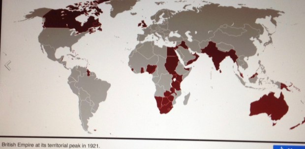
The statistical apex of territorial claims in the British Empire actually would not come until 1921. At that time, the empire had influence over 33.7 million square kilometers. Half of the globe’s dry land was “theirs in fee.” The empire’s population of more than 458 million souls constituted one-fifth of the Earth’s people.

The map depicted on that Canadian stamp from 1898 is still impressive. As an aside, notice how Canada happens to be centrally located under the crown. Did Queen Victoria not notice that Postmaster Mulock was making a not-so-subtle political point with his stamp? The inscription begins, “We hold a vaster empire …” That could mean the royal “we,” of course. Or it could suggest a broader imperial covenant that shares responsibility for the empire’s dominion with some of its most loyal subjects — like Canadians,  who happen to bestride a transcontinental nation at the center of the world, “wearing” a crown, no less (at least according to this stamp) …

Depending on how you feel about empires in general, the British Empire in particular, you may be as horrified as you are impressed by its vast reach. Look at that little island off the northwest coast of France. England? Posh! That puny principality had the audacity to go out and impose itself on half the world, then claim some sort of ownership, or stewardship, rights and fees and privileges amounting to domination of one sort or another. What presumption! What bloody gall! The white man’s burden? The master race? What dangerous malarky!

Why this quest for global domination? The proclaimed mandate was to spread civilization, freedom, rule of law, Christianity and commerce. The reality was oh, so different. You can argue that the British Empire was the “best” empire (compared with, say, the Belgians, the Portuguese, the Spanish …) If so, it was only the least oppressive of the lot — and that’s just by a slim margin. Don’t get me started on the racism, intolerance, repression, cruelty, rights deprivation, genocidal policies and other flaws of imperialism. I may never stop …

Instead, please entertain another thought about the British Empire, as depicted on that stamp from Xmas 1898. A thought that encompasses the sheer stubborn force of the imperial hand — the hand with which Belgian King Leopold’s men hacked out a path through the Congolese jungle for the first train from Matadi to Leopoldville. The force that sent navigators, swashbucklers, adventurers, soldiers, entrepreneurs, scientists and soon enough, administrators and bureaucrats to every corner of the world.  By 1898, the familiar saying that “the sun never sets on the British Empire” was literally true: When the governor general in Ottawa was sound asleep, the viceroy in Delhi was enjoying high tea — and vice-versa.

Imagine a civil service based in Whitehall, the London hub of the Foreign Office, where immaculately groomed mandarins supervised the affairs of empire on six continents (Antarctica came later). Was it possible to set standards for the orderly conduct of public business that could be upheld effectively in places as diverse as Nigeria, North Borneo and the Bahamas? To the extent that it was possible, might it not be considered a remarkable achievement?

As a stamp collector, I have long wrestled with the idea of the British Empire imposing civic order on the world. Not just oppressive domination, but also a sensible way of doing things — predictable, engaging, connected, occasionally even elegant in its protocols. Naturally, I am also talking about philatelic order. That is, the way stability and uniform standards in philately embody the unifying principles of empire.

And so, dear reader, I offer the set of illustrations that follows,  rendering that “vast empire” as a series of unified stamp designs replicated across continents and seas. fullsizeoutput_836
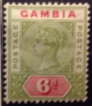
Pictured here is an example of the stamps that were in circulation in 1897 or thereabouts, issued for use in far-flung precincts of  the British Empire, all bearing a likeness of Queen Victoria. As you observe the similarities and subtle differences in the portraits and borders, explored in the next commentary, you can get a sense of how these stamps helped to draw together the British Empire; how they created an identity, a self-image, sustaining a unity of purpose, a commitment to stability and civic  order, even pride in being part of this global enterprise. As you contemplate this mosaic of empire reflecting the image of an aging queen, consider these lines from Sir William Morris’s ode:

… And where her rule comes all are free

And therefore ’tis, O Queen, that we

Knit fast in bonds of temperate liberty

Rejoice to-day, and make our solemn Jubilee.

Yeah, yeah. I know the British Empire never lived up to these bonnie words by the Welsh poet. The claim that “all are free” under Victoria’s rule falls well short of the truth, along with Livingstone’s claim to be a guileless Christian missionary, Stanley’s pose as a crusading journalist, or Leopold the  philanthropist.

Yet if there is a sliver of inspiration to be found in the moral purpose that once helped to fuel the colonial juggernaut; if you can imagine the thrill of exploring, bringing order, building new civic spaces … then that may be enough to draw you on to these iconic images of imperial Britain at its vastest.

A note on the Photo Gallery: Victoria’s Empire 

What I have tried to do in the following series of illustrations is to present a fine-grain glimpse of the British Empire by grouping similar designs in portraits of Queen Victoria on stamps printed for use in the Home Country, and those available in the farthest colonial outposts during her long reign. What I already am discovering is that although there are significant similarities between stamps from the same era and with the same general characteristics, there are also subtle differences, It turns out there is not exactly a one-size-fits-all approach by the designers — at least, not during the Victorian era. In the 20th

Version 3

The two-stamp Peace Issue of 1946 is an example of an “omnibus set” — the same design adopted by virtually every British territory.

century, the British  began issuing “omnibus” series — identical designs across dozens of territories to celebrate, for example, King George’s silver jubilee in 1935, the coronation of George VI in 1937, the Peace Issue of 1946, and the Universal Postal Union set of 1949. Omnibus commemorative issues continued into the modern Commonwealth years.

Now I invite you on a leisurely tour of stamp designs during the Victorian era. Let’s start at the very end — the final years. The sexagenary, diamond jubilee, 60th year of her rule (1897), was celebrated in song and circumstance. Special sets of stamps were issued in a few colonies (British Guiana, Canada, Newfoundland). Another set was issued by more than a dozen colonies, similar in size and number to the regular definitive series of earlier decades, only this time with an image more uniform than ever before,

across colonies and continents. The typographed design — a compact miniature profile bust of the queen in a border, placed atop a tablet containing the value — was adopted with slight variations around the world. It’s the first omnibus set, in effect.

This extraordinary postal event illustrates how philately helped to unite the British imperium. Imagine these stamps, so similar in appearance, being purchased in a post office in Ceylon, British Honduras, Gambia or elsewhere, affixed to an envelope, stamped with a local postmark, and sent on its way to another part of the world — like a gossamer thread, stitching together a durable and colorful fabric of empire.


Victoria’s Empire on Stamps

fullsizeoutput_1330
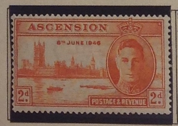
Great Britain was the seat of empire, and GB never had to put its name on its stamps — because it was first, in 1840. (Can you believe it?) This set — the Queen Victoria Jubilee Issue — was released in 1887, with added values in later years. It set the standard for issues in colonies around the world. I include two stamps from the set,with considerable variations — if you can make them out under the heavy cancels. I particularly like the royal purple of the 2 1/2 d.

Notice in the images that follow, how many of these stamps, issued on five continents at roughly the same time, have a similar design (you might try enlarging them on your screen for even closer views of these beauties; then you will be able to appreciate the many subtle and not-so-subtle differences among them). This has to be one of earliest manifestations of globalization.  To borrow a concept from columnist Thomas Friedman, the British already were busily “flattening” the world in the 1890s. Below is a gallery of the stamps pictured in the map above, with additions and comments when called for …

British America

Two predominant designs were used in Jubilee stamps from the Americas. These from St. Vincent show one design, with a crimped border around the bust. Notice the hand-written cancels. These tend to lower the value of the stamp — the preferred cancel is a circular date stamp in black ink — but the handwriting is intriguing. What does it mean?

These Jubilee stamps, above,  from three Caribbean/Central American colonies are identical  in design — though the tablet border and numeral style change for the British Honduras set. Notice, below, a similar looking British Honduras stamp with a circular border of the cameo portrait — one  replicated in a number of other colonies. Why the change? Which border is better — crimped or circular? You decide …


Oddball variations, below.  The stamp at left, from Jamaica, still has the bust-portrait and the number tablet, but otherwise is very different in design  (just wait until you see Natal, a little further on …)

At right you have all the elements of a Victoria jubilees design in a stamp from British Guiana — but no Victoria! Instead, there is the badge of the colony. Why? You’d have to consult the mandarins at Whitehall on that one …


Sidebar: glimpse at the end of an era. Below is one of the final portraits of Queen Victoria engraved on a stamp. Caught in a reflective mood, the queen seems to be staring fixedly into the light — the future? The celestial lumens? It is a remarkable portrait of the ungainly queen. In real life, she could seem as awkward and bad tempered as the famous Lewis Carroll caricature in Alice’s adventures … But on stamps she was never less than regal.

Interesting aside: There was a problem with the first Canadian set (above left), even though it was a bold new design for 1897 and still has a clean, startlingly modern look. The problem: There was no number, just letters and four maple-leaf ornaments engraved in the corners. The second set (right), issued in 1898, took away two of the maple leaves and replaced them with numbers in the lower corners. It seems postal authorities overestimated the literacy of the population. Maybe it was also a French-English thing. Just guessing.

British Africa
By now these Jubilee designs should be getting pretty familiar to you. Oh yes, notice the similarities between the Natal stamp and Jamaica, above. Well, not so similar when you actually compare them … These stamps span the African continent, from the Atlantic nations of Gambia and Sierra Leone, across the vastness of Northern Nigeria, to the south African colonies of Natal and Zululand.

British Asia
Below are a couple more samples, of Jubilee stamps — one from Ceylon/Sri Lanka off the east coast of India, the other from thousands of miles to the east and the Straits Settlements of Singapore and Malaya. Underneath is an Indian stamp from 1899 that is not the same design at all. But it’s a classic late portrait, so I’m including it, just for fun.


Australia and British Oceania
For some reason the omnibus Jubilee design memo did not reach Australia, the Antipodes (I think that means New Zealand) or any of the micronesian colonies, protectorates, condominiums and what-have-you strewn across the south Pacific. Since I’m not a big collector of this area, I only managed to scrounge up a few battered examples of late Victorian philately from down under — including Victoria on Victoria! (Today Australia’s smallest and richest state, Victoria once was a separate colony and issued its own stamps from 1850 to the early 1900s. During that time it produced at least 50 original portraits of Victoria on stamps. Some of them, I must say, are quite primitive! It’s fun to check them out on eBay. Oddly, the last stamps from the colony of Victoria pictured the queen’s son and heir to the throne, the new King Edward VII, ruining the eponymous philatelic fun — but at the same time injecting a gender-bending element: Edward-Victoria!


Same stamp design on five continents. Now let’s play a parlor game of spot-the-similarities among the eight stamps appearing below: 1) All feature the Victoria bust; 2) in a circular border containing the country name and amount; 3) all letters, no numbers … Now, enjoy the variations in these delicate designs — do any of them have the same border flourishes, for example? This harmonious “set” of nine stamps actually comes from five separate continents — including Mauritius, which I include just as an illustration because I don’t have that particular one — yet.


Mid-Victorian design similarities, 1860s-1880s. Another round of spot-the-similarities, anyone? Eight more stamps from earlier in the Victorian era, spanning three continents, are depicted below. They share the iconic portrait of the queen, a round border and a bar below with the value. Look how closely Lagos (Africa) resembles Dominica, Tobago and St. Christopher (Caribbean). Not … quite … the … same, though.


Round three. Try to find any design differences among the 10 beauties pictured below. The new challenge for this page is inspired by Sesame Street, I think. Which of these things belong together, which of these things is not quite the same? Or something like that.

Spoiler: Check the Trinidad stamp, which looks like it should have the standard Victoria portrait, but instead uses the badge of the colony, or “Britannia,” if you will. What gives? What next? A “portrait” of a giraffe on a stamp from Tanganyika?


fullsizeoutput_88ffullsizeoutput_890

I kid you not. At first I thought this giraffe set from the British Mandate of Tanganyika was an anti-monarchist spoof. But it’s real enough. The series appeared in 1922. A set with George V’s portrait didn’t follow until 1927. The stamps are gorgeous little engravings, colored with brilliant inks of  carmine, green, orange and dark violet that contrast deliciously with the jet-black centers. Still, it’s a shock to see the spot normally reserved for a Royal be usurped by a dopey-looking giraffe. Why, it borders on insubordination! This   set allows one to imagine at least some of the mandarins of the Colonial Office had a sense of humor.

fullsizeoutput_88aEarly Victorian stamp design similarities — 1850s-1860s.  Most  British stamps from Victorian era  originated with the cameo portrait of Princess Victoria created by William Wyon in 1834, pictured here. That image appeared on a medal commemorating the new queen’s visit to London in 1837. It also became the basis for the world’s first stamp — the “Penny Black” of 1840 (see below). The stamp’s designer, Sir Rowland Hill, picked the rough sketch by Henry Corbould (I’m still looking for that sketch), and engravers Charles Heath and his son Frederick fullsizeoutput_606produced the stamp. The image, subject to minor revision over the years, and illustrated by the early  stamps pictured below, would remain in continuous use in successive sets issued in Great Britain and the empire until Victoria’s death in 1901.


The Chalon head

fullsizeoutput_87f

It’s hard to believe the portrait at right is of the same woman who was portrayed in  those stamps above as a classical bust or an aged dowager. In this painting, she appears young and winsome, swallow-necked and elegant, with a coy, doe-like beauty.


“Chalons” are prized among British Colony stamp collectors because they are generally early and rare — not to mention beautiful engravings. The stamps, some of which are pictured below,  appeared starting in the British empire in the early 1850s. The first was Canada’s provinces (1851), then Nova Scotia (1853), Tasmania/Van Diemensland (1855), New Zealand (1855), The Bahamas (1859), Natal (1859) Grenada (1860), New Brunswick and Queensland (1860).

fullsizeoutput_1332

Notice my pencil marks below the stamp, which indicate I purchased it in 2012 for $16.53, and that a catalogue listing in 2009 valued the stamp at $110. Not a bad deal!

In most colonies, the stamps were replaced as Victoria aged. Canada marked Victoria’s sexagenary in 1897 with a startling pair of side-by-side cameos of the queen “then” (the Chalon head of 1837) and “now” (the plump old dowager). The same person? Impossible! In Queensland (now Australia), you could still buy a high-value stamp with a Chalon head at the post office as late as 1912, more than a decade after Victoria’s death. fullsizeoutput_888


fullsizeoutput_866Take a second look at the portrait in the Nova Scotia stamp,  at right — the green 8 and 1/2-center from 1860 (value: a few bucks at most). On double-take, it’s clearly  not based on the Chalon head. My bet is on the Winterhalter portrait of 1859, reproduced below. fullsizeoutput_88c

fullsizeoutput_87d

Above is full Chalon portrait of Queen Victoria. It was painted in 1837 by Alfred Edward Chalon, intended as a gift to Victoria’s mother and to mark her first public appearance as queen — for a speech at the House of Lords to prorogue Parliament. The painting became known as the “Coronation portrait,” and engraved images were popular with the public as early as 1838. This painting is the basis of the “Chalon head” portrait used on early Victorian-era stamps, illustrated above.

fullsizeoutput_886Reality check: Here is an apparent photo-like record of the marriage of Victoria and Albert in London, Feb. 10, 1840. The close-up below is strikingly  immediate, bringing you face to face with an intimate moment more than a century-and-a-half ago. …  Queen Victoria looks, well, short and dumpy. She has a big nose and a receding  chin. She is, well, homely. Perhaps such realistic depictions don’t do her justice. Or perhaps the engraver’s art is, well, artful. There is no mistaking her resolve in this image as she gazes at her prince.  They were by all accounts a happy couple, in love and devoted to each other for the 21 years allotted them before Albert succumbed to stomach ailments and fullsizeoutput_883typhoid fever. They had nine children. Victoria would continue on as queen until her death in 1901, becoming the longest-reigning British monarch in modern history — that is, until her great-great-grandaughter Elizabeth broke her record in 2015.

The British Empire’s fourth dimension — through time in stamps


Onward from the Congo. But where?

fullsizeoutput_7e5

Here are the first two stamps of the first set of the “Etat Independent du Congo.” They were issued in 1886, and are worth a few bucks.

Note to readers —

You now have at your disposal my first foray into Congo stamp commentary — “10 Interesting Anecdotes about Congo Stamps” — including Anecdote No. 10, a long and personal memoir of my own experiences in the Congo, between 1962 and 1964, in which my writing seems to have abandoned all restraint. Oh well, at least there are profuse illustrations …

fullsizeoutput_7e6

A nice engraving from the first airmail set, in 1920 — though the plane looks a bit like a dragonfly, don’t you think?

What next? My provisional  plan was to continue with a page-by-page exposition of my Congo collection, starting with the King Leopold sets from the lawless years of the Congo Free State in the 1880s and 1890s; then through the tedious and oppressive decades of Belgian colonial rule until independence in 1960; then the prism-like philatelic

fullsizeoutput_7e9

The long series featuring masks, issued between 1947 and 1950, featured beautiful two-color engravings.

shattering of the fractured secessionist states and beyond. Now, however, I realize that other commentaries may have to come first. Before I go on, however, a parting word or two on the Congo.

My active collecting of Congo stamps

fullsizeoutput_7e8

This is from a set issued in 1958, two years before independence, to commemorate 50 years of Belgian rule in the Congo. 1908 was the year King Leopold yielded to pressure and gave up his “independent state.” I guess it’s an event worth celebrating — the evolution of the Congo from a King’s private fiefdom to a vassal colonial state. The kings, left to right, start with Leopold I (don’t know why he’s in there …), then King Leopold II, Albert, Leopold III, and finally the young new King Baudouin.

ended soon after I left Africa in 1964. It was depressing to witness the stagnation and disarray of the Congo during the decades of Mobutu’s brutal, careless dictatorship after 1965. I just didn’t have the heart to collect the bland, crude,  haphazard issues that emerged from the Congo, then Zaire, now simply “Congo.” It’s been more than 20 years since Mobutu left, and the Congo is still a basket case of a nation. What gives?

Perhaps this is enough about the Congo for the time being. Look at it this way: If I  whetted your appetite for more by sharing my 10 anecdotes, fine.  I’ll get back to my Congo collection by and by. I’m sure there is a story on every page. As we divert from our fascinating philatelic hike through the Congo, let me just leave you with a few more images and long captions to round things out.

fullsizeoutput_7ea

Does it strike you as a little depressing that an early issue of stamps from the Republique du Congo should celebrate the “reopening of Parliament”? That is, barely a year into independence, the country has had its parliament set up, shut down, then started up again. The overprint is on a stamp featuring President Kasavubu and marking the first anniversary of independence. Some anniversary. The country was still split by secessionist movements, and within years a new dictator would emerge, Joseph Mobutu, who was just as bad for the Congo in his way as old King Leopold II. This stamp purporting to celebrate a real, working, open parliament tacitly admits the failure of democracy thus far. It’s only 1961, and the Congo still has far to fall …

fullsizeoutput_7ec

Here is a poignant artifact. In 1964, the Congo issued a set of stamps, along with this souvenir sheet, celebrating the 10th anniversary of the national university, Lovanium. The images of science, a scientist and the badge of the university superimposed on an orderly set of modern buildings gave every reason for hope in the technological future of this young nation. Alas, it was not to be. Today, the Congo is a barely functioning state covering a vast land mass, manifestly incapable of meeting the basic needs of its citizens. I could check and see what has become of Lovanium and its brave hopes, but I don’t care to. You do it. For me, it’s too depressing.

fullsizeoutput_7e3

Joseph Mobutu is pictured here in his leopard-skin cap, sign of his African “authenticity.” Can you imagine being immortalized on a stamp — wearing sunglasses? Perhaps it’s to disguise the fact that he has eyes only for the big diamond pictured at right. Mobutu stole a fortune estimated at up to $15 billion from the Congo. Where is all that money today? Good question …

fullsizeoutput_7e4

OK, I’m a retired opinion writer, so allow me an editorial comment: This stamp seems a fairly accurate portrait of Joseph Mobutu, the leader of “Zaire” — a royal python strangling his country.

fullsizeoutput_75c

So what do you make of this bird? I think it’s originally a stamp from Zaire, but the name is blacked out like a censor’s box. Underneath is the inscription, “Rep Dem Du Congo” — cryptic at best. The old value also is blocked out by a black square — literally a box at the foot of the falcon, or hawk, or vulture pictured in the stamp. The new value, 70fc, is a mystery to me (“Francs Congolais,” perhaps?) … eBay calls it an “unknown overprint.” I cannot certify either its provenance or legitimacy. … The only other thing I’d say is that this very odd stamp is jarring: Those black boxes and the beady-eyed predator convey a sense of menace, foretelling dark days and disorder.

fullsizeoutput_1322

Here’s the last Congo caption for now, I promise. The stamps above were produced in 1997, as the nation’s name was changed from “Zaire” back to “Congo.” According to the Universal Postal Union, the stamps were “illegal issues.” In a letter to the UPU, M.S. Raman, assistant postal director, declared that the stamps “are fraudulent and are therefore not admitted for philatelic sale by its postal Services.” Below are legitimate stamps from 2000, using the correct (if not exactly accurate) new name for the country: Republique Democratique du Congo.

fullsizeoutput_1321

So after Congo … now what? Earlier, I set out a leisurely alphabetical stroll through my British Africa book. I started with Ascension, got through Basutoland — then got distracted by the Congo thing. The natural progression now would be to get back on track, which means Bechuanaland. Indeed, I find this prospect irresistible. Basutoland and Bechuanaland had considerable philatelic similarities, with interesting differences.

fullsizeoutput_132a

Notice the stylistic similarities between these definitive sets from Bechuanaland Protectorate, above, extending from George V in the 1930s through George VI and finally, to Elizabeth II in the 1950s. Now view the similarities in Basutoland’s series, below — up to a point. Why didn’t Basutoland keep up the tradition and print the same design with Queen Elizabeth? Is it really all about the crocodile?


fullsizeoutput_132d

fullsizeoutput_7f3

Can you make out Queen Victoria’s portrait above, facing left, in this 2-shilling stamp from the 1880s? The overprints, below, on Cape of Good Hope stamps, are clear enough — but who decided to run them both ways?

The history told in Bechuanaland stamps dates back far before Basutoland to the Victorian era, when imperial pioneers were still exploring. They established, by negotiation or force, protectorates and colonies, sometimes both on the same land. Bechuanaland is an example of
this, and stamps help tell the story.  Bechuanaland (now Botswana) covers a land mass the size of France, is landlocked, bordering South Africa. Historically, its sparse pastoral population, dry climate and arid regions ensured that it would not be at the center of  continental dramas and battles for the lucrative spoils of gold, diamond, rubber and the like. To the south, however, colonial history and politics brought bloody clashes and diplomatic rifts that reached Whitehall and Berlin, and reverberated back to Capetown.

South Africa had its barons, burghers, magnates, soldiers, statesmen and adventurers.  The interactions between whites and blacks were racially regimented and hierarchal, but political relations fullsizeoutput_7f4were another matter. From early on, black Africans collaborated, conspired and clashed with whites, the same as would one tribe with another. Particularly vivid are stories of the sometimes nuanced relations between Boer and Zulu leaders in the 1880s and 1890s.   The turn of the century brought to full flower the Boer War with the British. The pitched battles were appalling in the loss of life and limb. In comparison, the  tangle of philatelic history involved will be a pleasure to try and unravel.

fullsizeoutput_7f5

Same country, same people, only now “British Bechuanaland” becomes “Bechuanaland Protectorate.” (In the case of this stamp, these developments are recorded on a half-penny stamp that originally was issued for use in Great Britain.) It seems the colonial masters never settled on one definition of their overseas holdings. Some were more independent, or more protected, or more autonomous or semi-autonomous, than others. There were crown colonies, and protectorates, mandates and trust territories, dependencies and federations … all so that Great Britain could cling to its self-image as a source of influence in “a vaster empire than has been.” Even today, if you made a tour of countries once or still within the “Commonwealth,” I suspect you would still see many signs of continuing British cultural influence.


fullsizeoutput_806

This is Africa? Although I wasn’t a collector of South African stamps until recently, I remember being struck early by this particular design. South Africa first issued this set in the 1920s, and kept coming up with slight variations over the years until the 1950s. This image of imposing, elegant government buildings struck me as incongruous for an “African” country — which was supposed to be primitive, right? I was a teenager at the time I was making this judgment. It just looked so — European, so — cosmopolitan. How could this be Africa? How indeed? The fact is, no country in sub-Saharan Africa could ever compete with South Africa when it comes to infrastructure. Impressive. But it was still a racist system, inherently unstable and fatally flawed.

Indeed, I don’t see how I can resist a fuller look at South African stamps. My South African collection, though improving, is not much to boast about. My increased interest is relatively recent — I used to consider South African stamps dull, some downright ugly, and with all that English-Afrikaans bilingual clutter!


fullsizeoutput_132e

Until recently, I tended to dismiss South African stamps as rather … homely. Now I’m not so sure. There’s lots of history to explore. Lots to learn …

fullsizeoutput_80d

The Cape of Good Hope stamp above, overprinted with a big red “G,” is from Griqualand West, in 1877. This was a short-lived British crown colony, apart and distant from Griqualand East, which never put out postage stamps. The “:Nieuwe Republiek” stamp below, issued in 1887, is from a breakaway republic of the Boers, which apparently retained sterling currency. Look closely and you should see the embossed coat of arms behind the printing. I paid $12.94 for this stamp in 2012. The Griqualand West stamp (from 1878) cost me $4.95 in 2015.

fullsizeoutput_80b

As I am reading more South African history, I become intrigued with its philatelic artifacts — for example from short-lived colonies and states like Griqualand West and the New Republic.

The striking imagery and symbolism of stamps make them authentic labels of politics and culture. There is much to learn from postal history. Some stories are arresting and cinematically vivid. No doubt it will take some time to get there, but I already look forward to sharing the story behind my stamp from Cape of Good Hope, overprinted in 1899 with the alarming inscription: “Mafeking Besieged.”  The bloody tale involves the heroism and ingenuity of Col. (later Lord) Baden-Powell, who inspired the Boy Scouts.


fullsizeoutput_80e

How about this beauty? It’s from 1895, celebrating with images of progress and productivity. The central coat of arms (under a heavy cancel, sorry) represents the doomed “South African Republic” of the Boers.

fullsizeoutput_80f

I purposely didn’t include a stamp in this illustration — only the blank spaces on my page in the British Africa album. That’s because the so-called Pietersburg issues of 1900 are rare and expensive. I could include a photo from eBay, but I prefer to wait. Perhaps by the time I write more expansively about South Africa I will actually have one of the elusive rascals. I already have learned some arcana, to wit: I should insist on a copy with only a handwritten cancellation, as above, and not with a customary postal cancellation, because those copies were cancelled-to-order and worth considerably less … (What does cancelled-to-order mean? That’s another story — don’t get me started …)

fullsizeoutput_804

Above is my “Mafeking Besieged” stamp, a surcharge and overprint of the familiar Cape of Good Hope stamp. You will see the upper left hand corner is “rounded,” with stunted perforations, thus diminishing its value. The stamp is catalogued at $47,50 or more, and I feel lucky to have acquired it on eBay for just 17-and-a-half pounds.


Why should I venture so soon to South Africa?  The alphabet plan offers its delights as well: after Bechuanaland comes British East Africa (1890-1903), then Cameroons (wait, that wasn’t a British colony, was it?), and then … well, then comes Cape of Good Hope — South Africa! — and we’re off to the races!


fullsizeoutput_810

The Orange Free State was also a Boer Republic — until it wasn’t. Notice how the original design was surcharged once, then again, and overprinted “VRI” to signify the dominion of Queen Victoria over the Boer land.

fullsizeoutput_811
fullsizeoutput_7fc
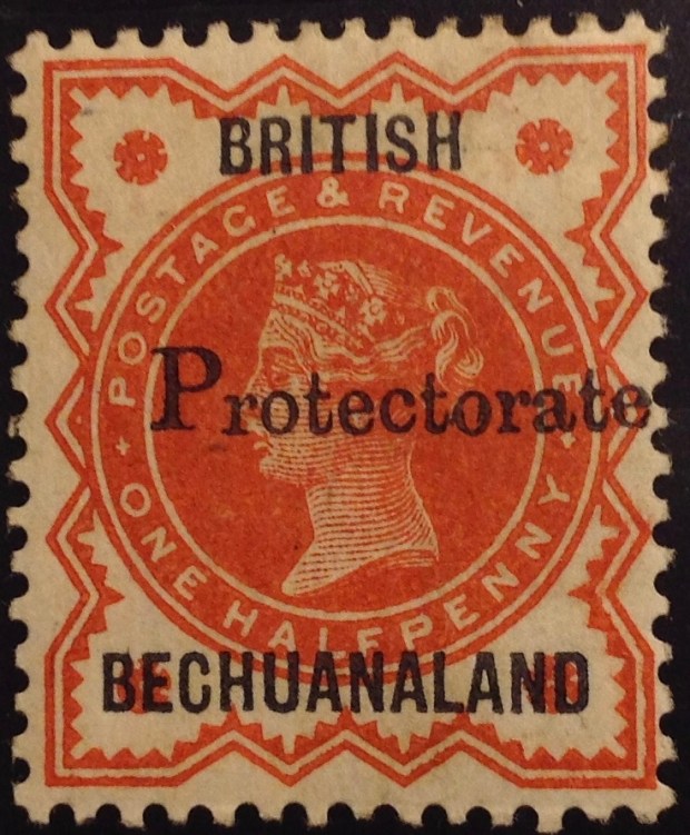
Here are some stamps from countries I will be skipping over — like British East Africa, a “country” that first ran like a concessionary stand for imperial adventurers, developers, entrepreneurs and looters under the British. (“Light and Liberty”? Don’t make me cry …)


fullsizeoutput_802Here is a stamp from German “Kamerun,” occupied by Great Britain after World War I. The French took over much of Cameroon, in west Africa, though British influence remained. As the region was going independent in 1960s, the UK issued a set of stamps — Nigerian definitives, overprinted — for use in the Anglophone trust territories (UKTT) until their final disposition could be decided. The Scott catalogue explains what happened next: “Nos. 66-77 were withdrawn in Northern Cameroons on May 31, 1961, when that territory joined Nigeria and in Southern Cameroons Sept. 30, 1961, when that territory joined the Cameroon Federal Republic.”

fullsizeoutput_800

fullsizeoutput_803

Even non-philatelists have heard of the Cape of Good Hope Triangles. Here is one of two in my collection. I inherited them from my father. If he and I are not mistaken it is COGH No. 1, issued in 1853. It’s a pretty nice example of a fairly valuable stamp (catalogue listing: $200, used). It is a beautifully engraved design of a seated “Hope,” worth collecting as a rare art object, don’t you think? Can you imagine, though, trying to use these stamps? Cutting them out from the sheet at all those angles? No wonder triangle stamps never caught on … And no wonder they are hard to find with complete and ample margins. I do hope this is genuine. The catalogue warns that “counterfeits exist.”


10 Congo Stamp Anecdotes

TEN INTERESTING STORIES ABOUT CONGO STAMPS

1. The Origins of Rwanda and Burundi stamps. The first stamps issued in Rwanda and Burundi, back in 1915, were from the Belgian Congo.

fullsizeoutput_753

This complete set is from eBay on the Internet; the asking price: $1,751.45.

They were overprinted by hand stamp, “Ruanda” or “Urundi.” They took the place of German East Africa stamps as  the Germans were chased out during  World War I. The colony also included land ceded to Portuguese  Mozambique  the new British colony of Tanganyika. The early Urundi and Ruanda stamps are among the most valuable from the Congo region, since they are so rare. They quickly were supplanted by a set of machine-overprinted stamps with the confusing bilingual inscription: in French, “Est Africain Allemand — Occupation Belge,” crowded in with the Flemish,  “Duitsch Oost fullsizeoutput_77e
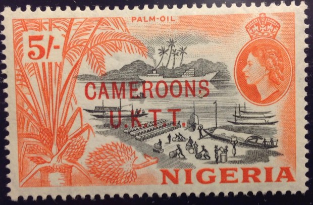
Africa — Belgische Bezetting.”  This cluttered inscription  suggests  the Belgians were taking over from the Germans. But in such a case, one might ask, why still call it “German East Africa”? Was there a nationalist motive — to rub Germany’s nose in its defeat by asserting mastery over its erstwhile colony? Or was there a tacit colonial bond implied here, as though the two imperial powers were exchanging property, perhaps temporariliy,  but otherwise maintaining all the imperial trappings and perquisites?

2. Belgian Congo stamps: A gallery of portraits.  During its 83-year existence (1910-1993), the apartheid government of South Africa issued only one stamp I know of depicting  a black face — a 4-cent commemorative promoting “Health Care and Service” in 1979. Though racial oppression and exclusion also was integral to the Belgian colonial administration, stamps from the Belgian Congo  and Ruana-Urundi often featured black faces and bodies — even celebrated them. The early engravings are quite lovely.

Version 2

fullsizeoutput_77c

fullsizeoutput_775

fullsizeoutput_777

Version 2

fullsizeoutput_77a

fullsizeoutput_77b

3. Overprints and surcharges. Overprints and rcharges were part of Congo stamps from the beginning. In the 1880s and 1890s, three stamps from the first and second King Leopold portrait series were defaced by parcel post overprinfullsizeoutput_779ts. These are costly Congo stamps, because they are so rare. Later on, stamps in the colorful definitive series of 1909 were recycled numerous times. Four of them were overprinted with the year “1921”; many were surcharged with new values. Eventually, there fullsizeoutput_76ewere surcharges on surcharges. Imagine being confronted with a 10-centimes stamp, surcharged 30 centimes, then handstamped 25 centimes. What gives? Now go one stamp further: What about when the “0,25” is handstamped twice? Is that a double surcharge? A misprint? A new variety? So many questions! Congo postal authorities fullsizeoutput_76fkept surcharging sets through the years, up until independence and beyond, with predictably mixed results.

( See Anecdote 5)

fullsizeoutput_752

Here are examples of a double surcharge with the hand-stamped “0,25” inverted. This clearly is too much to ask a postal customer to decipher! (The image is from the Internet; eBay’s asking price for these rarities: $150.)

4. Detatchment USA? I was surprised to come across a short set of Belgian Congo stamps from the 1930s with an overprint suggesting an American occupation. I must have picked up the set at a stamp show years ago for a few bucks. The complete set (there is one more stamp) sells on eBay for as much as $100. As far as I know, the United States never occupied the Congo, or ever deployed troops there — at least openly.  The Congo did play a role as an ally in World War II. The Belgian government-in-exile in London maintained its colony and provided the United States and others with key raw materials like rubber and minerals. Uranium went  to the Manhattan Project that produced the atomic bombs dropped on Hiroshima and Nagasaki …

fullsizeoutput_75fTo get back on the philatelic track, why a “USA Detatchment”  overprint on Congo stamps from the 1930s? These stamps would not have been issued during the war, since by the 1940s there was a new definitive set in circulation. A little research turned up the following scanty information: The stamps were issued in 1931 as a “private printing.” For decades, it had not been unusual for the U.S. government to dispatch “detachments” of Marines or other soldiers to guard U.S. embassies and other assets abroad. (In Cameroon, for example.) However, there was no mention of embassies issuing postage stamps for use by the troops or anyone else. Were these stamps valid in the Congo, for example as postage on mail sent home by the U.S. troops in Leopoldville? I don’t know. I  have never seen any cancelled examples of these stamps, or postally used covers including them.  They may well be “Cinderellas” (a term applied to postally spurious issues, which I promise to address in a future commentary). They certainly constitute an interesting historical oddity: “American” stamps, with U.S. currency denominations and “USA Airmail” overprinted on Belgian Congo stamps. There must be more to this story.

By the way, during the turmoil after Congolese independence in 1960,  Sweden, Ireland and Canada, among others, sent troops to the Congo at the request of the United Nations to help keep the peace. Another contingent came from India, whose postal authorities issued a set of India’s then-curVersion 3rent definitive series, overprinted “U.N. Force (India) Congo.” This set sells for a modest sum, mint or used, though cancelled copies on postally used covers mailed in the Congo might command a  higher price. (Indians must have been proud of their role as international peacekeepers. Postal authorities in Delhi issued overprinted sets for use by troops in Korea in 1953; Cambodia, Laos and Vietnam in the 1950s and 1960s; and Gaza in 1965.)

5. The same — and not the same. The transition from colony to independence was not easy in the Congo. Disorganization, disarray and disruption ran rampant. Economic and social upheaval was reflected in haphazard philately, including upside-down overprints known to philatelists as “inverts,” some of which sell today for $5 or $10 or more. The many surcharges  created ever more opportunities for misprints and other errors.  Stocks of stamps from the Belgian Congo — in particular the Flower series and the Animal series — were overprinted, some with new surcharges, and sold in Leopoldville for years after independence. As a 15-year-old stamp collector In 1964, I was able to buy stamps at the downtown Bureau de Poste to create a cover using six different versions of the original 6.50-frank stamp of the Animal series depicting two leaping antelopes. fullsizeoutput_76a

** the original stamp, issued in 1959

** the same stamp, overprinted “CONGO” in red, issued 1960

** ditto, overprinted in black

** ditto, with a silver surcharge “5F” and red  overprint, 1964

** ditto, with silver surcharge and black overprint

** finally, with a silver surcharge as well as a silver bar with black inscription “Republique du Congo” replacing “Belgisch Congo Belge.”

I have another covfullsizeoutput_769er with five 20-centime stamps from the series, featuring a rhinoceros, also with varying overprints and surcharges. The last item on this cover, below right,  is a most peculiar error. Let me explain:

While the original Belgian Congo stamp was successfully surcharged “1F” on a silver bar, the “CONGO” overprint is missing. This means the stamp looks for all the world like a new “Belgian Congo” stamp — issued in 1964, four years after independence! Another example of this phenomenon is the 15-centime value of the Flowers set, surcharged 10 centimes — but without the necessary “CONGO” overprint (see photos below) — thus inadvertently creating a new issue for the Belgian Congo after Congolese Independence Day!  See below for  more examples of weird surcharges.

Version 2

The 60-centimes stamp from the flower set originally was surcharged “50 centimes” for the independence issue in 1960 overprinted “Congo.” But the example on the left omitted the surcharge, thus creating a new variety. The stamp on the right shows the 50-centimes surcharge, but upside-down. The middle stamp, with a 10-centimes surcharges on the original 15-centimes stamp, omitted the “Congo” overprint, thus inadvertently creating another variety for the “Belgian Congo” — after independence.

fullsizeoutput_755

Here is an Internet image of the “new” 10-centimes stamp from the “Belgian Congo,” along with another example of the 60-centimes stamp overprinted 50 centimes — but also omitting the “Congo” overprint. How do you list stamps like these in a catalogue?

6. Impudent Katanga.  The chaotic, violent years after Congolese independence included secessionist movements, some of them bloody. Moise Tshombe, from resource-rich Katanga in the southeast, led the first break from the federated government less than a fortnight after independence day June 30, 1960, proclaiming a state that lasted until January 1963. During that time Katanga issued a handful of sets, first overprints of Belgian Congo stamps, then pirated stocks of stamps from the independent Congo based in Leopoldville, and finally a few sets of original designs inscribed “Etat du/Inchi ya KATANGA.”  The stamps were not recognized as valid by the International Postal Union, but mail from Katanga still got delivered. It is  somewhat jafullsizeoutput_771rring, to me at least, to study the first set of Katanga stamps — originally issued to celebrate the independence of the Republic of the Congo, showing a map of the whole country — with the name “Congo” obliterated by the bold overprint, “L’Etat du Katanga.” A smaller overprint cleverly covers the inscribed date of Congolese independence, “30 Juin,” with a new “11 Juillet,” Katangan Independence Day — while keeping the “1960” date uncovered. In this way, the secessionist government celebrated its own independence by repurposing stamps whose central image depicted the nation from which Katanga seceded. It is as if the U.S. Confederacy in 1861 put out a set of overprinted stamps with a map including its giant enemy to the north.

fullsizeoutput_772

fullsizeoutput_774

Here is the last set of stamps issued by the independent state of Katanga. The happy-go-lucky jeep driver carries what looks like an anti-aircraft gun. Many Congo-area stamps of this era, including these, were designed and produced by the Swiss company Helio Courvoisier SA.

7. Half-hearted secession.  Anothefullsizeoutput_766r breakaway republic was the central state of South Kasai, declared by Luba leader Albert Kalonji in August, 1960. It was a half-hearted effort — there was never a complete break wifullsizeoutput_767th the federal government. This unlikely nation started out like its more
affluent neighbor, Katanga, with overprints of Belgian Congo stamps. It then issued a few of its own design, including a souvenir sheet, before the rebellion petered out in 1962.There were a few envelopes cancelled with the
stamps from the “Etat Autonome du Sud-Kasfullsizeoutput_76cai.” I have one (shown here), and I hope it has some value. The stamps were not recognized by the Universal Postal Union, and while you can find them occasionally on eBay, they are not listed in most catalogues.  Prices for South Kasai stamps are not high, but I believe there is some value to them because of their unusual historical provenance, their sheer oddity, and limited numbers.

8. Murky and murkier. The murkiest of tfullsizeoutput_75ahe sessionist “republics” were the “Republique Populaire.” declared in Stanleyville to the northwest in 1964, and the “Congo” rebellion in the northern area of Katanga, centered on

fullsizeoutput_76d

Notice the overprints are reversed on the cover in comparison to the set above it — a lateral invert. The cover is mine; the set is offered on eBay for $249.

Albertville, that same year.  These rump rebellions, which some historians record as simba revolts aided and abetted by China, did not result in any original postage stamp designs — or much other than  bloodletting. From Leopoldville, then-Prime Minister Tshombe dispatched federal troops. Some were led by mercenary officers who had fought for Tshombe in Katanga. Before they were subdued, the rebels did have time to issue overprints of Belgian Congo and Republic of Congo stamps. The cover shown below from Stanleyville offers rare “cancelled” copies of stamps from this questionable postal authority — though it is quite obvious someone merely pasted the stamps on the card and had them cancelled. This philatelic oddity did not come with a certificate of authenticity and integrity. I still cherish the cover as a rare philatelic artifact.

fullsizeoutput_764Postal authorities in Albertville used leftover supplies of stamps from Katanga, overprinting them simply, “Congo.”  The result, in effect, was a set of stamps designed and printed by Katanga, a defunct state that had seceded from the Congo, now appropriated by a subsidiary  secessionist state around Albertville and relabeled “Congo.” Is this a step forward, backward or sidewise? To comfullsizeoutput_750pound the muddle, the rebels in Albertville managed to take the 10-centimes stamp from the 1953 Flower series, and stamp their  “Congo” claim directly on top of the “Katanga” overprint that was meant to supplant the crossed-out “Belgish Congo Belge”  inscription. The result is a palimpsest (a word I have been waiting for years to use, which means a series of superimposed images). The stamp pictured here is listed on eBay (price: $450). The more you look at it, the more indecipherable it becomes — an apt emblem for the state of affairs at Albertville in June of 1964, and perhaps for the Congo as a whole  …

9. A salute to colonial nostalgia. Every now and then, as my Congo collection grew, I would come across intriguing images of stamps from the handsome 1940s definitive set reprinted as mini-sheets — that is, stamps perforated and centered within a larger sheet. Some of the surrounding margins were white, others colored in alluring shades of red, green and gold.  What are these sheets about? And why are they so expensive?

Eventually I consulted my fullsizeoutput_756reliable Scott Standard Postage Stamp Catalogue. Here is what it said: “Miniature sheets … were printed in 1944 by the Belgian government in London and given to the Belgian political review, Message, which distributed them to its subscribers, one a month.” Scott valued each sheetlet at $12.50. The Scott catalog continued: “Remainders of these eight miniature sheets received marginal overprints in various colors in 1950, specifying a surtax of $100f per sheet and paying tribute to the Universal Postal Union. These sheets, together with the four of Ruanda-Urundi, were sold for the Committee of Cultural Works (and not at post offices) in sets of 12 for 1,217.15 francs.” Scott valued the series at “about $150. On eBay today, the series with white margins  sells for $799, the series with the decorative borders is priced at $1,799.

Does anything strike yfullsizeoutput_759ou about these stamp sheets? How about as an emblem imperial disassociation? An example of the oblique colonial view, disengaged, distanced, perhaps even a bit sentimental (Congo!). These sheets bespeak a European population of the 1940s, profoundly, even willfully ignorant of prevailing conditions in the Congo and the  discriminatory customs and legal processes; directly or indirectly, they were complicit in those racist laws, practices and opinions. The stamps were designed and printed in London. Many Belgian Congo stamps were produced by Waterlow and Sons Ltd.  In 1944, with the Belgian government-in-exile now located in the British capital, you might consider this  a philatelic favor done by one imperial power for another — with a tidy profit, to be sure. Given the grim  distractions of wartime, these charming little sheetlets must have been welcome surprises. They were  distributed, gratis, to subscribers of Message, one accompanying each monthly issue. Look closely below, and you will see special side perforations in the sheetlets that allowed them to be stapled into the larger publication, to be safely removed later by collectors. The more elaborate, bordered sheets were sold with a 10-fold markup to honor the Universal Postal Union and benefit the Committee of Cultural Works.

When I get a chance, I hope to look into this further. What was Message’s view of the affairs of the Congo? Why was it chosen to distribute these stamp sheets? What was the Committee of Cultural Works, and how did it  use money from the sale of these sheets? These questions beg the ultimate question: Did this philatelic enterprise in Brussels in any way enhance the well-being or even enter the consciousness of the Congolese, still living under Belgian domination, repression and exploitation in that vast, squalid African nation? I doubt many Congolese acquired these prized sheetlets. I also doubt there were many indigenous subscribers to  Message in Leo, Matadi, Coquilhatville, Albertville. Not many members of the Committee of Cultural Works lived in Stanleyville, Elisabethville, Luluaburg, Thysville …

10. Paix, travail, austérité …  a personal memoir. These French words mean peace, work, thrift. They are a hearty recipe for civic progress. Some combination of these ingredients promotes successful lives, communities anfullsizeoutput_787d societies. Yet the words have a painful poignancy, for they represent what the Congo could have become, should have become, but has fallen tragically short of becoming.

The words were spoken in 1962 by Cyrille Adoula (pictured below), then prime minister of the Republic of Congo. His words were transcribed as an overprint on a set of stampfullsizeoutput_78fs issued in October, 1962. The set originally came out in January, honoring  Dag Hammerskjold, the United Nations envoy who was killed in 1961 when his plane crashed on a peace mission to the Congo. Hammerskjold had made at least four other trips to the region. In September 1961, his plane went down near Ndola, Northern Rhodesia (now Zambia), close to the Congo border.   Hammerskjold and 14 others were killed. One theory is that the plane was shot down on the orders of Union Miniere, the mining giant that was resisting U.N.  intervention. Former president Harry Truman added to the furor when he was quoted as saying that Hammarskjold “was on the point of getting something done when they killed him.” Truman added: “Notice that I said ‘when they killed him’.”

Months before these stamps were issued, the doomed prime minister of the Congo, Patrice Lumumba, had been secreted to Elisabethville. Dismissed by President Kasavubu, disgraced and disheartened, Lumumba had been arrested by Col. Joseph

fullsizeoutput_785

This portrait of Patrice Lumumba is on a stamp issued not by the Republic of the Congo, but rather the Republic of the Congo. Huh? Pardon the confusion. This stamp is from the former French Congo (why must I continue to allude to colonial days?!). Some call it Congo-Brazza, because its capital city is Brazzaville, which is located across the Stanley Basin from Leopoldville/Kinshasa along the Congo River. Lumumba was never honored on a postage stamp in his native land, that I know of. I guess Mobutu is partly to blame for that. Kasavubu, Tshombe and later, Mobuto, were featured on stamps. Tshombe’s likeness was reserved for Katanga issues, while Kasavubu stares out from a long set of Congo definitives. Later on, Mobutu’s likeness was printed on multiple sets of definitive stamps, helping to build a cult of personality and “authenticite” to mask his duplicitous and unscrupulous misrule.

Mobutu and held in Thysville, near Leopoldville. Reports say he was beaten on the plane ride to Katanga, where he was confronted by political enemies including Moise Tshombe. After more beatings and torture, Lumumba and two associates were executed by a team led by Belgian mercenaries, under orders from Katanga. Tshombe was reportedly among those present at the execution.

Cyrille Adoula suffered no such fate. Earnest but somewhat colorless, he was a trained technocrat, a banker. I wish that he had been able to lead the Congo in all sorts of promising new directions. I wish that somehow, everyone could have risen above the bloody drama of Lumumba, the proxy war of communism vs. democracy, the tribalism, the contest for Congo’s fabulous natural resources waged by the superpowers, neighboring nations and multinational corporations. With the right kind of leadership and help, the Congo could have  surged forward, become a great nation. Well, why not?

fullsizeoutput_78e

A hopeful moment — Congolese Prime Minister Cyrille Adoula, right, meets JFK during a visit to Washington. Adoula was quoted on the overprinted stamps pictured above, but I don’t believe his image ever appeared on a postage stamp

In some ways, Adoula seemed the Man of the Hour. He had been an independence activist since the 1950s, when he joined with Lumumba and Ileo to form the Mouvement National Congolais (1958). He was handsome and suave.   He had a modest, competent way about him.  The reason I speak so extensively  about Adoula is that he was prime minister during most of the time I lived in the Congo. My father, the CAO in Leopoldville, mingled with Adoula at diplomatic events and perhaps elsewhere. Pa and Mother were rather keen on Adoula’s prospects.  They were Adlai Stevenson Democrats, and he was their kind of guy, with a moderate political agenda and some sensible ideas— like paix, travail, austerite. Alas, this was hardly a sensible time. Amid the turmoil before, during and after the Lumumba premiership, there were two secessionist movements — in Moise Tshombe’s Katanga, and in South Kasai. It took United Nations intervention to put the Congo back together — though seen one way you might ask: Why bother? Look who put it together in the first place: A bunch of  imperialists meeting in Berlin in the 1880s, that’s who. Oh well.

By 1963, with the Congo in one piece again, Adoula tried to assemble a coalition unity government under President Kasavubu that would accommodate both the disgruntled Lumumbist elements and Tshombe’s Katangans. As if that wasn’t hard enough, 1964 brought new rebellions around Stanleyville and Albertville, and Adoula gave up, was forced out or both, yielding to none other than … Moise Tshombe. Americans, imagine  the parallel: A year after the Civil War, the new head of the Re-United States  is … Jefferson Davis!  Adoula agreed to serve Tshombe as ambassador to the United States and Belgium. While Adoula and his family lived in Washington, Mrs. Adoula and my mother got to be a bit chummy. Pa was posted back to D.C. for a rotation, and Mother arranged with the Congolese Embassy to have a group of diaspora wives meet at our house on Madison Street. They did projects, spoke English, drank tea (sherry?), talked about babies and children and … civics, no doubt.

Mother was always terrific at this kind

fullsizeoutput_792

Part of my Pa’s job of the Cultural Affairs Officer of he United States Information Agency in the 1950s and 1960s was to pose for dog-and-pony shows like this one. Here, in 1964, he stands at left with two apparently Congolese young men, one of whom (I’m betting the guy on the right) drew this mural of LBJ and Mt. Rushmore, which he labeled “The Shrine of Democracy,” and donated it to the U.S. ambassador. Pa decided to display it in the window of the USIS library, and had this photo snapped to honor the occasion. Turned out the artist was from neighboring Angola. …

of stuff. Both Mother and Pa found their life’s work in cultural diplomacy. Pa grew up chafing in the close confines of Boston Brahmin society. He thrived in the diverse locales where we were posted — Dhaka, Heidelberg, Leopoldville, Bremen. In the Congo, he worked hard at keeping the library going, managing cultural exchange programs, meeting and greeting and generally projecting a benign, forward-looking U.S. policy of engagement. At his side was Mother, who had  “escaped” from Iowa — and from my remarkable grandmother. Janette Stevenson Murray was a civic leader, an internationalist and vocal supporter of the United Nations and Eleanor Roosevelt. She was elected to head the Cedar Rapids board of education —  before women could vote in national elections. Grandma Murray was so busy with civic affairs and education that she didn’t have much attention left to pay to her five children. Her neglect apparently was not too harmful — her offspring and descendants include professors, M.D.s, Ph.d.s and M.D./Ph.D.s, world travelers and a two-time GOP candidate for governor of Iowa. When Grandma was selected American Mother of the Year in 1947, I think Mother was embarrassed by the publicity. She skipped the award ceremony at the Waldorf Astoria Hotel in New York City. To be fair, 1947 was a busy time for Mother — she was raising her young family, while Pa was transitioning from the Navy back to civilian life. Both my parents still seemed committed to moving beyond their upbringings. Besides, Mother of the Year seemed pretty square …  Years later, in 1980, JMF would compile a dossier entitled, “JSM: A Reconsideration.” In it she finally — albeit a bit begrudgingly  — celebrated her mother’s honor back in 1947. She acknowledged that it was quite a big deal, after all. (Editor’s note: Not any more, it seems. I don’t even know if the USA still chooses of “Mother of the Year.” Ever heard of her? How does she stack up against Miss America? Miss Universe? The Avengers?)

I was glad Mother got to make public amends with her mom — albeit seven years after Grandma died. That reconciliation affirmed her own mission, which was essentially to carry on JSM’s work — promoting international understanding, mutuality, good will and hospitality. In the 1950s

fullsizeoutput_796

Can you spot my mother (at the right, in the back, with the pearls) among the gathering of women in Leopoldville, pre-1965? Another shot of the same party is below.

and 1960s,  Grandma must have glowed over her daughter’s civic engagement work in East Pakistan, Germany, the Congo, Iceland, and Washington, D.C. Pa handled cultural diplomacy projects like the library, Fulbright scholarships and other exchanges, ran public events, sent cables to D.C., and so on. Mother organized women’s groups, and was a sparkling fullsizeoutput_79ahostess at lively diplomatic parties held at our house. Visiting celebrities included Marian Anderson, Jack Teagarden. John Glenn, the Dorian Quintet and Buckminster Fuller. Mother was gracious, Pa was gallant, liquor flowed. Mother would charm the men and bond with the ladies, using smarts and poise  acquired at Coe

fullsizeoutput_791

More public diplomacy from my mom. As you can see, she really got into it.

College and Columbia Graduate School. Pa would carry on social diplomacy: schmooze, hold forth, recite poetry and share anecdotes. As a team, they were extraordinarily effective in promoting intercultural understanding and friendship.  For a baker’s dozen years  — from 1957 to 1970 — they did their thing around the world.  I’m proud of what they accomplished. The fact that my siblings and I got to tag along was a blessing, I guess, mostly. It sure contributed to my interest in stamp collecting!

fullsizeoutput_788

President Kasavubu: stolid schemer. Grandson of a Chinese railroad worker, Joseph Kasavubu (today spelled Kasa-Vubu) was an early advocate for independence. He also was an able politician, wily enough get himself named president of the Congo in 1960, and to hold the job until 1965, when Mobutu seized power. Afterwards, he was allowed to retire to his village, where he died in 1969. Interestingly, one of Kasavubu’s daughters also went into government. Justine Kasa-Vubu was appointed a cabinet minister in the Kabila administration in the 1990s, after Mobutu’s ouster, then to the key ambassadorship in Belgium. She broke with Kabila and ran for president in 2006.

Speaking of which: back to Congo stamps, or rather, a bit more of personal Congo history before I do. Cyrille Adoula continued to serve under  Mobutu until he retired from politics in 1970. He died in 1978 at age 56 in Lausanne, Switzerland. Though I “came of age” in the Congo (age 14-16), I didn’t run in the same circles as my Ma and Pa, so I never recall meeting Adoula. I might have been introduced to him somewhere as a 15-year-old and not remember it. I know both my parents met Mobutu, though I don’t believe I ever saw him. Mother described her encounters with the future dictator, many years later, in response to my inquiry, not making a very big deal of it. “He was polite, quiet, always watching,” I think she said. No doubt some of my Congolese classmates in College Albert, the Jesuit high school I attended, were sons of the well-connected —  Benares, Nsiangani, Kisangani and others. But we never socialized, maintaining a cordial, occasionally even friendly, distance.

fullsizeoutput_78c

Tshombe: the chameleon. This portrait of Moise Tshombe is superimposed on a Katangan emblem, including the trio of copper crosses. The flag of the Republic of the Congo looks startlingly similar in design, which raises the tantalizing question: Was Tshombe just kidding about his breakaway republic? In 1960 he claimed he was trying to “secede from chaos.” In 1964, he took the chance to become prime minister of that chaos. He lost popular support after he used his Belgian mercenary pals to subdue the simba rebels in Stanleyville and Albertville. In 1965, President Kasavubu sacked Tshombe, months before Mobutu sacked Kasavubu, abolished the presidency and began three decades of dictatorial rule. Tshombe returned to Spain. He died in Algeria in 1969.

I did meet Moise Tshombe, once. My recollection of that encounter is  cinematically vivid: It was a summer night in Leo — August 1964, shortly after Tshombe returned from Spain to take over as prime minister of the Republic of the Congo. It was literally the eve of my departure for Europe and, eventually, the USA, where I would begin my junior year of high school at Milton Academy, a prep school near Boston. A month earlier Tshombe, the expat leader of the defunct  Republic of Katanga, had been transformed into the Congo’s homecoming hero, the white knight — well, not white — summoned to unite the Congolese and make the reintegrated nation all that it could be … I was vaguely aware of all of this. I certainly knew who Tshombe was — one of the biggest stars in the Congo.

fullsizeoutput_7bd

Here is Tshombe, to the right (heck, is he the only black guy in sight?) at a party that probably took place about the same time as the Fenhagens party, and could have been in Leopoldville. It certainly appears celebratory. I remember people were taking flash photos at the party. There surely was music — it was 1964, Beatles music was everywhere. But a conga line? Hey, it could have happened. Doesn’t Tshombe have a goofy expression? The man was digging it!

The scene was a crowded house party I attended with my parents at the Fenhagens. It was my 16th birthday, coincidentally. The night was warm, the air  sweet. We were in a fashionable residential quarter of the capital city.  Most of the guests were white, from the diplomatic community. The house had an outdoor swimming pool, a balcony, exterior lights that made the setting quite gay — like a movie set for “La Dolce Vita,” Leo-style.  There were fashionable people laughing, drinking and dancing, inside and out, with some kids like me running around. In the middle of a small crowd, with the entourage that always surrounds charisma and power, there  stood … Moise Tshombe. Of medium height, with a graceful build, he stood in the lights, his handsome, expressive face shining. Dressed immaculately in a tailored suit and flashy tie, smiling broadly, he worked the crowd, eyes twinkling. Clearly he was having a good time. I don’t know how he got invited to the party, but his motorcade paused on the street so he could join the fun. He had a word for everyone, spoken in elegant French of course. As he passed me, our eyes met.  Ever the one with a penchant to speak up, I blurted out. “Bonsoir, M. Tshombe! C’est la premiere fois que je vous ai jamais vu!”  (Good evening, Mr. Tshombe! It’s the first time I have ever seen you!”)  Dumb, right? Smart politician that he was, Tshombe grasped my hand in his, grabbed my elbow with his other hand — or maybe it was just a friendly wave? — and delivered the punch line: “A la prochaine!” (Till next time!)

fullsizeoutput_7a7

Here is a peek into the FMF diary! This entry is for Aug. 4, 1964 — the date of the party at the Fenhagens where I got to meet Moise Tshombe, the ex-president of Katanga, future but short-lived president of the Republic of the Congo, and alleged accomplice in the abduction and murder of Patrice Lumumba. It’s funny that my memory, no doubt reinforced by my mother, who was a bystander within hearing distance, has him saying “a la prochaine,” which is altogether more resonant and meaningful than “la prochaine fois.” The first term is a comradely salute of farewell — to the next time we meet. The second phrace literally translates as “the next time …” What does it mean? The next time we meet, I (Tshombe) will be president? I don’t think he had taken over officially at that point. He was not introduced as the president, bur rather seemed to be coming as a private citizen to the party at the Fenhagens. The second phrase — next time — if he really said it, is much more opaque, though suggestive. I wonder if I misheard it, so that my diary entry, written the same day, is less accurate than a memory reinforced by the mother … As I think about it, I grow ever more certain that I heard correctly. It was just a phrase Tshombe tossed off, a sentence fragment, a thought triggered by my reference to “la premiere fois.” Perhaps it was an unformed thought, unfinished, interrupted. Nothing to hear here. In the end, trust your eyewitness records. Accept that history is not usually resonant and meaningful, but often opaque, if suggestive … Now I’m wondering about those handshakes. How did I come to shake his hand, twice? …

(Reality check: I just thought to check my diary, which actually extends back to Pakistan in 1957, when i was nine years old. Here is my entry for Aug. 4, 1964: “Guess who I met this evening, at a party at Darby Fenhagen’s? TSHOMBE! I shook his hand 2x and told him this was the first time I had met him. He said, “La prochaine fois …” What does that mean? Anyhow, that’s quite a thing to have done on my last night in the Congo, don’t you think? Yes! That’s quite a birthday present, what?”)

Alas, there would be no “prochaine,” no next time. Napoleon’s comeback in France after his first exile was 100 days; Tshombe’s in the Congo was about a year. Like Lumumba before him, he was dismissed by President Kasavubu. Months later Col. Mobutu took over for good, then ill. He had no use for Tshombe, who retreated back to Spain. (Isn’t it  interesting how these deposed heads of state managed to escape not only with their lives but with considerable means — Tshombe from copper- and mineral-rich Katanga, Albert Kalonji from diamond-rich South Kasai?)

fullsizeoutput_79c

Mobuto: the tyrant. I apologize for displaying these stamps so large, for  design purposes only, because they portray such a despicable character. Col. Joseph Mobutu started making mischief even before independence, played a key role in the ouster and demise of Patrice Lumumba, and undermined the weak governments that followed. He eventually seized power, dealt with his adversaries ruthlessly, and ran the Congo like his fiefdom — a modern King Leopold — for three decades. Like the Belgian imperialist king, Mobutu deftly maneuvered with world powers. He played off the West vs. the Communists. He hijacked the venerated tradition of African “negritude,” adopting a leopard-skin cap and other accoutrements of “authenticite.” Meanwhile, he robbed his country’s wealth and ignored the welfare of his subjects. It was the 1990s before anyone figured out how to get rid of him. He “retired” to Europe, with a fortune estimated at up to $15 billion. He died shortly after his ouster, in 1997, age 66.


The Mobutu regime convicted Tshombe of treason in absentia, and he never returned to the Congo. He died in 1969 at age 58. There also would be no comeback for the Congo. In the wake of independence, secession, rebellion,  bloodshed and ultimatelty, tyranny, those goals set by Cyrille Adoula — paix, travail, austerite — were trampled, gored, eviscerated. The Congo would be ruled by an ever-more-venal and corrupt system, rotten to the core of Mobutu’s megalomania and greed. He  amassed and expropriated a fortune measured in billions. He ruled with casual brutality, deception, manipulation and cynical indifference toward his people for three decades. The resourceful Congolese did the best they could to cope, living in a society perpetually caught between calamity and collapse.


fullsizeoutput_79f

I can’t resist including this photo of Congolese President Mobutu Sese Soko on a state visit to Washington D.C. in 1973, meeting with Richard Nixon in the White House. Note the leopard-skin cap and the walking stick, emblems of Mobutu’s “authenticite.” He maintained a campaign of eradicating colonial influence, changing the country’s name to Zaire. It didn’t last. The capital’s name was changed early on from Leopoldville to Kinshasa, and that name stuck (Natch: No one expects the independent Congo’s capital city to remain named after its first and worst colonial master.) But the title “Zaire” turned out to be about as “authentic” as Mobutu and his fake African nationalism. After his departure, the country’s name was changed again, this time simply to: “Democratic Republic of Congo” (no more “the”).

fullsizeoutput_7a8

Post-colonial nostalgia. Tshombe, right, with U.N. Envoy Dag Hammarskjold. Tshombe was president of the breakaway Republic of Katanga at the time. Hammerskjold was trying to broker a settlement and prevent a civil war. Hammarskjold was killed in September 1961 when his plane went down near the Congo border. Tshombe’s Katanga lasted into 1963, when federal forces prevailed with the help of the United Nations, the CIA, deployments from Sweden, Canada, Ireland, India, Belgian agents, mining interests, communists, Lumumbists and, and … aren’t those enough behind-the-scenes actors? (On his side, Tshombe deployed officers and soldiers-for-hire from Belgium, Italy and South Africa, with considerable success; much blood was shed; hundreds were killed in the fighting, including civilians.) In 1963 Tshombe abruptly relocated to Spain, only to return in the summer of 1964 to become president of the Republic of the Congo. That lasted a year before Tshombe was dismissed by President Kasavubu. After that Col. Mobutu took over and the democracy game was up.

fullsizeoutput_7b7

Moise Tshombe was one of Africa’s most promising yet enigmatic figures. Having met him I can attest to his charisma. He was charming, urbane, smart — and apparently, ruthless. How could the man dancing in that conga line in 1964 have stood by and watched as Patrice Lumumba was tortured and executed in 1961? This portrait brings out a brooding side of Tshombe. There’s a bit of Clark Gable there, a little James Cagney, some Ernest Borgnine … Enough! Enough about Tshombe and the conga line. (Oh wait — I think they were doing a line dance called the Madison in that photo; it was all the rage in Leo in 1964 …) Now let’s get back to stamps, shall we?


Congo: An Introduction

In the autumn of 1962, my family and I were into our third year living in a stately German home on picturesque Philosophenweg, a cobblestone lane winding up the Heiligenberg from the city of Heidelberg.   My father was a diplomat with the U.S. Information Service, director of Amerika Haus, a commanding pile that  occupied a city block downtown and housed a library, other public spaces and offices. Pa managed Fulbright scholarships, cultural tours and public diplomacy programs. We lived in some luxury: Our spacious house had terraced yards, fruit trees and a garden, with a commanding balcony view of the Neckar River valley. On the hill across the river stood the 800-year-old Schloss Heidelberg, with its ornamfullsizeoutput_718ental stone facades, towers and ruins — the latter untouched since the ravages of the Franco-Palatine wars and lightning strikes hundreds of years earlier. My twin sister Anne and I, just turned 14, were completely bilingual by this time. (Indeed, I recently had ranked second in my class — in German!) I must have been indistinguishable from the locals with my blond hair, accentless German and shiny black Lederhosen. Every morning we would head off by bicycle or Strassenbahn to the Englische Institut, a German-language school where we had advanced through the classes, from Quinta or Quarta, Unterterzia and Oberterzia to Untersekunda, the rough equivalent of eighth grade. After school we would make the return trip, mount the hill past Heidelberg University and climb the 76 steps to home. When we first arrived, I was disappointed not to be attending the American school attached to the massive U.S. military installations in Heidelberg, and missing out on life in the suburban precincts of Mark Twin Village and, a little further out of town, Patrick Henry Village. By this time, however, I was pretty well assimilated. I enjoyed friendships with German and American kids, played Little League baseball, went to the PX for American movies. I was pretty comfortable in two worlds.

By 1962 time I was already an avid stamp collector. I frequented Heidelberg’s central Postamt, as well as the stamp store, conveniently located near the Bismarckplatz transfer station for the streetcars. There I would drool over the displays, under the watchful eye of the cigar-smoking owner, and spend what few pfennigs and marks I could amass on new stamps for my collection. Among the oddities of collecting German stamps in the 1960s was the independent postal operation in Berlin, which produced  stamps identical to West German issues with the word “Berlin” added to “Deutsche Bundespost.”  Then there was East Germany, the Deutsche Demokratische Republik — DDR — whose colorful stamps seemed completely alien to their Bundesrepublik counterparts, somehow inauthentic … like the country itself, as it turned out. (An irritating feature of DDR sets was that usually, one stamp in each set was issued in smaller numbers, thus commanding a sharply higher price for collectors; oddly, the same practice was adopted by the Democratic Republic of the Congo.)

My American friend Jock Rose pursued this hobby with comparable zeal — a zeal shared by at least one of my German classmates, Jurgen Ostwald. We earnestly compared our collections, and engaged in lively trading sessions where we would barter stamps for stamps, like nerdy Bedouins in the Casbah. We reluctantly relinquished prized duplicates or less-desired items to add coveted stamps to our pages — mindful to keep the value of these trades as even as possible (or even come out “ahead” in catalog value!).

My philatelic inclinations originated earlier, when I was just past 10, at our posting to what was then Dacca, East Pakistan (now Dhaka, Bangladesh). The sensed the lure of the exotic stamps on sale at the local post office. My father and older brother Jonathan, both collectors, spurred me on. In Germany my flirtation became an infatuation. I would ascertain exactly when the next commemorative stamp was coming ofullsizeoutput_711
ut, then draw topical cachets on envelopes, visit the Postamt on the appointed day, affix the brand-new stamps to my custom-designed covers and drop them in the mailbox — or sometimes have them hand-cancelled by a postal clerk.I still have a bunch of these
“first-day covers,” which I expect are virtually worthless
today. It sure was fun making them,
though. (My German fullsizeoutput_712collector-friend Jurgen lived in Leimen, a nearby village. He picked up my practice of improvising these first days covers, and kept sending me samples for more than a year after I left town. Now that’s philatelic friendship!)

It was in Heidelberg that I began sending letters to far-flung British colonial outposts —  Ascension, Basutoland, British Guiana, Cayman Islands … — including postal money orders sufficient to cover the cost of a modest selefullsizeoutput_713ction of stamps, purchased at face value, which obliging postal authorities would send back to me, sometimes in envelopes embellished with a variety of current issues. Some of these stamps have increased nicely in value. (One example: the 1953 Queen Elizabeth II definitive set from Ascension, which cost me less than $5, now has a catalog value of $150+.)

So there we were in Heidelberg, one of the loveliest  cities on Earth. We knew it couldn’t last. Most  USIS postings are for just two years, not three.(Pa must have been doing a great job!)  So when the news came in the fall that Pa had a new assignment, it was not unexpected. The destination, however, was a complete surprise. He told us over lunch at the PX one Saturday: We were going to Leopoldville, Congo.

The Congo! Africa! And without any home leave in between. We were expected by the end of the year. I recall my sister was distraught at the prospect of leaving Heidelberg — she had a big crush on the city, as did I. She also was worried about leaving her cat behind. My first reactions included excitement and fear. Excitement for the adventure, fear of the unknown. Somewhere in that mental process I was already curious about the stamp possibilities. A whole new country! In Africa! fullsizeoutput_720

What a funny way to begin to acclimate oneself to such a major life change. From German stamps to Congolese stamps. Not much of a cataclysm, just a little philatelic stretching. But with that change came excitement, too. A new country’s stamps, after all, meant that you were in a new country. Stamps were an emblem, proof positive, a centering and focusing fact of life, established, normal, reassuring in their way. And yet, within that normality of stamps was a new world of information, design, history, politics, art, not to mention possible investment value … What a hobby!

Before living in the Congo, I don’t remember being aware of any stamps from that country in my collection. I may have had a stray stamp or two from fullsizeoutput_724
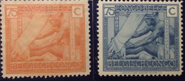
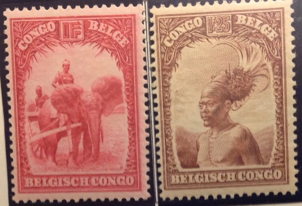
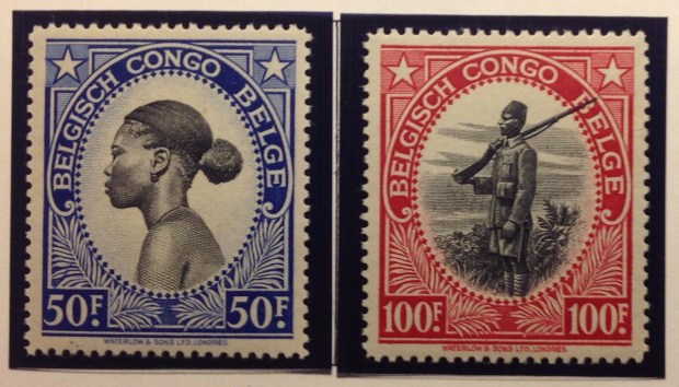
the Belgian Congo in the middle years — 1920s to 1950s. The “mask” set of 1948 was striking, and quite common, so a few of them may have found their way into my collection. I certainly didn’t consider the Congo a specialty, like British Colonies. As it turned out, early Congo stamps were quite advanced. The 1894 multicolor definitives from the Congo Free State were exquisite engravings of local scenes, printed in black within exotic ornamental borders in different colors. Some stamps in this early set are quite affordable, and subsequent sets that used the same designs are cheap and easily available, both cancelled and mint. (It’s remarkable to think there was so much letter traffic from the Congo so long ago …)  Other early Congo stamps, and others later on, are valuable. Little did I know that when I traveled to the Congo in the fall of 1962, I would be launching a philatelic expedition that now, a half-century later, has produced a nearly complete collection of stamps from the Congo. That means starting with Belgian King Leopold’s Congo Free state in 1889, then the Belgian Congo beginning in 1908, continuing past Independence Day June 30, 1960. (Indeed, as I write this, I am awaiting impatiently delivery of a key stamp filling one of my few gaps — the 50f stamp of the flower series of 1953, which I found at  the Stamps to Go online store for $7.50) I am certain this collection is very valuable — worth thousands, I expect. The first set alone fullsizeoutput_71a(pictured here) is worth hundreds. (I have it complete.) I am missing a few stamps here and there — like the first parcel post stamp in 1887 (catalog value: $400+; note empty space on page). However, less than a   handful are missing of the more than 400 stamps issued by the colonial administration.  This collection is indeed superb, and I can’t wait to tell you more about it. First, however, a word or more of historical context.

The early years of King Leopold’s rule in the Congo were dreary to say the least. Unlike other imperial monarchs, Leopold claimed his vast realm in the Congo basin and beyond not as a colony or a protectorate, but as an “independent state,” subject only to his direct rule. He was, in short, “owner” of this “property.” From the beginning, Leopold preached a doctrine of philanthropy — that his mission  was to raise up the African, abolish slavery once and for all and establish Christian hegemony in place of paganism. This was his great civilizing  goal: to build a new society in the Congo, prosperous, reverent, obedient. King Leopold schemed and maneuvered defty amid the machinations of European powers scrambling for their share of the African colonial spoils. How tiny Belgium ended up with the largest land prize — a territory half the size of the United States — is a tale of intrigue and dissembling by a masterful tactician and subtle diplomat. Whether Leopold believed all that guff about philanthropy and uplift in the Congo is a riddle I don’t believe researchers have yet solved. Remember that David Livingston, the pioneering colonial missionary “found”  by Henry Mortimer Stanley, declared his aim always was to abolish slavery in Africa and establish the “three Cs” — commerce, christianity and civilization.

Leopold’s personality was as opaque and contradictory as his motives. He built a vast Museum of the Congo amid the gardens of his royal estate in Tervuren, outside Brussels. The huge domes of the Congo glasshouses sheltered rubber trees at his castle in Laeken. Yet Leopold never set foot in the Congo. (To my knowledge, other colonial monarchs did not visit Africa, either; George VI, who paid a royal visit to Bechuanaland, Basutoland, Swaziland and South Africa in 1947, may have been the first.)  King Leopold’s high-minded principles were contradicted by the rude conduct and policies of his Congo administrators, enacted and enforced in his name. The putative “civilizers” of the Congo behaved no better than the most  brutal chiefs. They could hardly be credited with building a new, enlightened society in the Congo. The sadistic exploitation of Congo laborers in the rubber plantations and elsewhere, the savage mistreatment of families, the racial bigotry,  dehumanizing practices and cruel punishments — all were inexcusable, and not just by today’s standards. Nineteenth-century activists in England, like Edmund Morel and Ramsey MacDonald, and others who were pressing for an end to colonial racism and imperial aggression, took particular aim at the Belgian king’s African fiefdom. It took decades, but the damning evidence against Leopold’s “free state” mounted, culminating in the reports of Morel and Roger Casement. Nearing the end of his life, Leopold relinquished his hold. The “Etat Independent du Congo,” henceforth the Belgian Congo, finally would be subject to the laws and policies of the civil government in Brussels.

The new colony presented a particular, if not unprecedented, philatefullsizeoutput_71blic challenge. Since Belgium itself was bilingual — French and Flemish — the same duality would have to be reflected somehow on the stamps of its new overseas territory. French was the only language used on stamps from Leopold’s suzerainty. Now all stamps from the colony had to accommodate both languages of its new colonial masters. This awkward design requirement has been shared by other bilingual stamp-issuing nati
ons — Canada and  South Africa, as well as Belgium itself. The bilingual imperative played out in some unusual ways in the Congo. The first stamps from the ne
w Belgian colony, issued in 1908, were the same two-color engravings of 1894  —with a new overprint on “Etat Independent du Congo” that read: “Congo Belge.”  Imagine the fuss in Belgium’s parliament — where is the Flemish inscription? This is an insult to all fullsizeoutput_71cFlamands! A year later, in 1909, the colony got the first set of its own — a four-stamp group that incorporated the earlier designs with the French only inscriptions. Flemish Brussels must have been in a tizzy. (Gott in Himmel! Will these pesky Walloons never show us proper respect? Congo is every bit as much ours as theirs!) Finally, in 1910, the first bilingual stamps began trickling out. The clever designers used the same engraved scenes from the 1890s — of the port city of Matadi,  the Congo river at Stanley Falls, a river fullsizeoutput_71dsteamer, hunting elephants and others. Most remarkable is a rendering of a smoke-belching engine towing cars across the M’pozo River on an elevated bridge. Remember, this design dates to the 1890s. Building the Matadi-Leopoldville railroad through the Congo was a mammoth undertaking that displayed Leopold’s relentlessness. While his stamp designers celebrated this engineering triumph, little was said about the terrible toll of this arduous railway construction project. It took three years to advance the first 14 miles, and many more years to reach Stanley Pool. Some 132 Belgian professionals and other Europeans fell victim to accidents and pestilence. But most of the victims — at least 1,800 in the first two years alone — were the poor Congolese, toiling and dying as vassals to their “roi souverain.”  The new stamps bore alternating titles, “Congo Belge” first, “Belgisch Congo” second, and bilingual references to “centimes” or “centiemen,” “francs” or “franken.” (This set remained in circulation for many years, in many permutations, as we shall see.)

In the 1940s, authorities tried
something new, fullsizeoutput_71fbilingually speaking. The colony issued two identical sets of definitive stamps: one set listed “Congo Belge,” abovfullsizeoutput_71ee “Belgisch Congo,” the other reversed the order. (Both sets are valued the same in catalogs; philately did  not take sides in this bilingual balancing act.)  In the 1950s, a two-set issue of four stamps did the same thing: one set was inscribed French fullsizeoutput_721first, the other Flemish first. Take your pick. In this case, no two stamps in either set are valued the same, but I can’t discern any favoritism of one language over another. And that is about as far into the philatelic weeds as we need to go on that subject, wouldn’t you agree?

… Except to add that when the Belgian Congo/Belgisch Congo  became la Republique Democratique du Congo in 1960, postal authorities drifted along for a while overprinting bilingual Belgian Congo stamps with “CONGO.” As the  independent nation began issuing its own stamps, however, Flemish disappeared.

END OF INTRODUCTION


Bonus: Royal Portraits!

One parlor pastime for British Colony collectors is to examine the portraits on stamps of royal family membersfullsizeoutput_854 as they age. First is Victoria, who appeared as completely different personae during her long reign: as a swanlike beauty in the early Chalon portraiture; a classically sculpted empress-in-profile in her middle  decades; finally, as the stout dowager queen, under  an elaborate headdress, gazing wistfully into the light …

The former British colony of Victoria, in southeastern Australia, indulged in a 50-year philatelic tribute to its eponymous queen. Victoria postal authorities issued more than 200 stamps with portraits through the years, starting with a crude rendering fullsizeoutput_818in 1850 of a simply dressed monarch sitting demurely on her throne. (SInce I don’t make a specialty of collecting Australia, I cannot offer a worthy sampling here.  But you can find wonderful, full-color renderings of all the Victoria stamps you’d want to see — or buy — on eBay and other sites.)
fullsizeoutput_846

The Canadian province of Newfoundland was a big-time producer of stamps bearing portraits of royals during its 90-year postal history fullsizeoutput_5dathat ended in 1947. There were three portrayals of the future King Edward VIII — as a stripling laddie in 1868, a bonnie  prince in 1880, and the plump, bearded embodiment of the “Edwardian age” in 1897. Isn’t it  interesting to examine contemporaneous depictions of this particular Duke of   Wales through the years, starting long before he began his 10-year reign at age 59 in January, 1901.fullsizeoutput_5de

fullsizeoutput_5dc

Below are more portrayals of future British monarchs before they ascended the throne.

George V 

fullsizeoutput_5dffullsizeoutput_5ea

George VI  (Prince Albert, Duke of York)   

Version 2

fullsizeoutput_5e1

Elizabeth II
fullsizeoutput_5e4fullsizeoutput_5ebfullsizeoutput_5e6

fullsizeoutput_5f3fullsizeoutput_5e8fullsizeoutput_5f1