Bidding was brisk at the latest auction for dozens of lots at the Syracuse Stamp Club. But no one seemed interested in the stock page of German commemorative stamps from the 1980s. The asking price was one dollar, and I raised my hand. I am not an active collector of German stamps, but since I lived there for nearly three years in the 1960s (my father was director of America Haus in Heidelberg), I had accumulated a semi-decent collection. Since I had almost no stamps from the 1980s, I was fairly confident that while these commemoratives may not be worth much (despite the alleged catalog value of $24.25), at least they didn’t duplicate stamps already in my collection.
There were no other bidders, so I got the whole page for a buck. (“Going once … going twice … SOLD to Mr. Fiske!” shouted the cheerful volunteer auctioneer.) I brought home my prize and it sat for several days on my desk. Last night I was about to add the stock page, without more than a  glance, to my loose-leaf album of post-1960s German stamps — when I paused. Should I just snap in the page, shelve the stock book and go on to other business? No! I determined to take a closer look at these commemoratives. After all, each one was a minor work of art, or illustration, or example of graphic artistry.
As I drew one stamp after another out of the slotted strips on the page, I noticed most of them had small inscriptions. With a magnifying glass, I began to decipher the lettering, using my rusty but still serviceable German. Some commemorated old German cities — 1,000-year-old Wallsroede, 1,250-year-old Bad Hersfeld, and the almost unimaginable 2,000 years of the city of Trier. (Actually, it seems Trier was founded by the Celts in the late-4th century BC as Treuorum, which would make it more than 4,000 years old. It is considered among the oldest cities in Germany, needless to say.) Other stamps marked anniversaries of events and/or institutions — the centennial gathering of the association of Catholic student unions, the centennial of the German “skat” card-playing congress, the 450th year of German beer sanitation laws (“Reinheitsgebot fuer Bier”). There also were stamps honoring noted Germans, including Bach, Brahms and Kafka (was he really German?). I began to notice stamps in this latter category that paid tribute to individuals who lived from the later part of the 19th century through the 1960s. It occurred to me that all these folks had to make their way through the years of Hitler’s rule, from 1933 to 1945, as mature adults. How did they cope? How did they manage to navigate the mined waters of the Nazi era and emerge as distinguished Germans, worthy of a posthumous postage stamp in their
honor?
Since I wasn’t familiar with some of these names, I tur ned to Wikipedia for help. Here is a brief rundown of these worthies, and the differing ways they dealt with the
rise and rule of the self-styled Third Reich.
Romano Guardini (1885-1968) — This Italian-born Catholic priest was a prominent theologian who in the 1930s criticized Nazi doctrine
and was forced to resign from his prominent academic post in Berlin. He withdrew to a rural parish until the war ended and he could resume his career. He died in Munich.
Egon Erwin Kisch (1885-1948) was a d ashing communist j
ournalist born in what is today the Czech Republic. He traveled widely and wrote popular accounts of his adventures, calling himself der Rasende Reporter (the frenzied journalist). After 1933 he was driven out of journalism by the Nazis, who arrested d briefly jailed him before expelling him and burning his work. Bouncing from England to Australia to Spain, France and the United States, he finally found a welcome in Mexico. After the war he resumed his career in Prague, though he died three years later.
James Franck (1882-1964) and M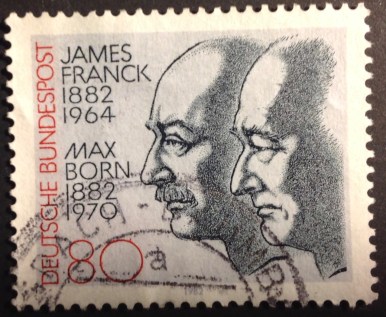 ax Born (1882-1970) were brilliant physicists, close collaborators and good buddies (hence their joint appearance on the same stamp.) Franck won the Nobel Prize in 1925 for his study of electrons. Born, who won in 1954, was considered a father of quantum physics. As soon as the Nazis came to power in 1933, Franck resigned his post at the University of Goettingen in protest, and helped Jewish physicists find jobs abroad before decamping himself. After a stay in Denmark he moved to America, where he worked on the Manhattan Project. He issued a report urging that the atom bomb not be dropped on Japan without prior warning. Born wrote dozens of groundbreaking papers in Germany, but because he was Jewish, he skedaddled in 1933. He resumed his remarkable career in England, and returned to Germany in 1952.
 Josef Kentenich (1885-1968) was a Pallotine priest and founder of the Shoenstatt Movement, emphasizing service and sacrifice. Protesting against the Nazis (“I see no place where the water of Baptism could run there …”) he was arrested by the Gestapo and spent three years in the Dachau concentration camp, where he continued his work. Somehow he survived and was able to resume his benevolent work.
Oskar Kokoshka (1886-1980) — now there’s a name I recognize. The Austrian artist, poet and playwright was a prominent member of the expressionist movement in art. Naturally the Nazis branded him a “degenerate,” and he fled Austria under the shadow of the Reich in 1934, settling in Scotland. After the war he lived in Switzerland.
Otto Warburg (1883-1970) wa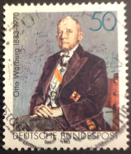 s a physiologist and doctor who won the Nobel Prize in 1931 for his study of the respiratory enzyme. Although his father was Jewish, Warburg was spared by the Nazis because of his key ongoing cancer research. He was officially listed as “one-half Jewish,” or maybe “one-quarter,” since the Nazis placed more emphasis on the matrilineal line. He was granted equal rights with gentiles, and stayed put — even though the Rockefeller Foundation offered him a post if he emigrated. After the war he did explore moving to America, but was turned down.
Karl Barth (1886-1968). B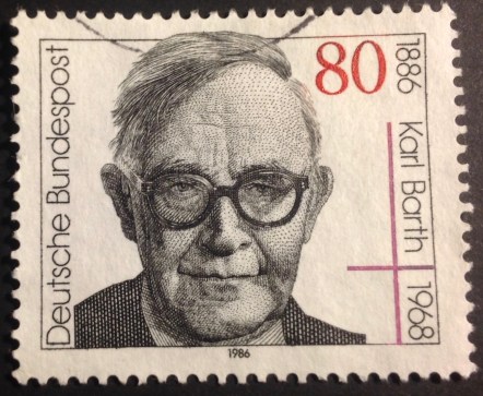 orn in Switzerland, Barth is considered among the great Protestant theologians of the 20th century. As a professor in Bonn, he challenged the Nazis’ effort to establish a state religion. He was sacked in 1935 for refusing to swear an oath to Hitler, and returned to Switzerland for good. After the war he published an influential statement promoting both German penitence and reconciliation.

Pope Pius XII (1876-1958) may seem an odd choice for a German tribute. Considered by some “Hitler’s pope” for not sufficiently resisting the Nazis after taking over the Vatican in 1939, the former Eugenio Pacelli nevertheless is honored on this stamp marking the 88th commemoration of Catholic Day in 1984.
Edith Stein (1891-1942) wa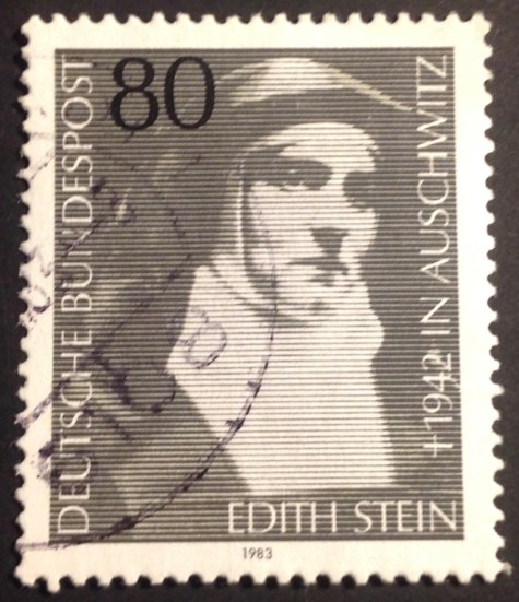 s a Jewish philosopher who converted to Catholicism and became a Carmelite nun. After Hitler’s takeover, she had a premonition she would not survive the Nazis. Fearing for her safety, her order transferred her to the Netherlands. But after the Nazis occupied Holland, and Dutch bishops publicly condemned Hitler’s racism, the German occupiers rounded up all Jewish converts, like Stein, who previously had been spared. A Dutch official, impressed by her faith, offered an escape route, but she refused him, declaring her intention to “share in the fate of my brothers and sisters.” She perished in a gas chamber at Auschwitz in August, 1942. In 1987, she was beatified as St. Theresa of the Cross.
This compilation of thumbnail biographies is the kind of mini-history lesson that makes stamp collecting such an intriguing and rewarding hobby. I come away from this particular exercise with a new appreciation of how some prominent Germans managed to maintain their values and integrity despite the rise of Hitler — and for the most part, survive intact.
The final stamp pictu red here demonstrates how Germany atoned for its past. The inscription on the stamp includes the word “Widerstand” — resistance to Nazism between 1933 and 1945. The other word, which I had to look up — “Verfolgung” — means pursuit and persecution. Verfolgung und Widerstand — pursuit and resistance. By such redemptive acts — commemorating resistance to the Nazis, and acknowledging its trespasses and persecutions — Germany has long since reaffirmed its place of honor in the community of nations.
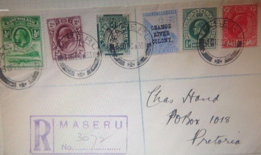
 st set is strikingly exotic — engraved, with a profile portrait of George V above a stylized scene of a crocodile basking by a river with mountain peaks behind. I’m missing the higher values, but the seven-stamp partial set still makes an attractive display, don’t you think?
 Notice that I have the “universal” set of stamps rom Basutoland commemorating George V’s jubilee in 1935. As promised, they are handsome engravings of the king and Windsor Castle in regal colors: carmine and blue; gray black and ultramarine; blue and brown; bright violet and indigo. These are very familiar stamps for British Colony collectors, but still pretty.
 You see at once the contrast and similarity of the George VI definitive set and its predecessor. The design is the same: crocodile, riverbank, mountains. The portrait changes from George V to George VI, and the stamps take on a more modern cast. What makes this limited change in design interesting to a stamp collector? It relates to stately transitions and continuity. In the case of the monarchy, the lament “The King is dead!” that sounded throughout Britain in January, 1936, as George V expired, was followed in the same breath with, “Long live the King!” (Never mind that the Duke of Wales, a/k/a King Edward VIII, only stuck around for a few months before skedaddling with Wallace Simpson …) By 1938, there was a new set of stamps for sale in Maseru, Basutoland’s capital. It looked the same, but there was a fresh new face on the stamps. George VI looked handsome, resolute; very white, to be sure; very much the image of a king, under a crown, ruler of the colony.
 The other two sets on this page deserve notice. The first consists of South African stamps overprinted for use in Basutoland, commemorating the end of World War II in 1945. Similar overprinted sets appeared in Bechuanaland Protectorate and Swaziland. This looks like an economy move for a depleted empire at the end of a brutal and costly conflict. Imagine the mixed feelings of the Basuto man-on-the-street when he discovered a new set of South African stamps (albeit overprinted) on sale at his local post office. To add insult to philatelic insurgency, the stamps are printed se-tenant (attached) both in English and Afrikaans, the language of the Boers — and apartheid.
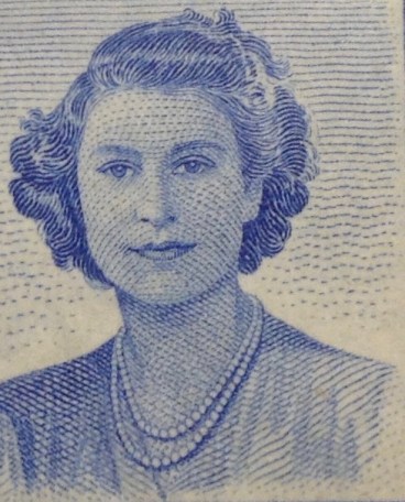 In 1947, the British royal family paid a visit to Africa and stopped in Basutoland. A four-stamp commemorative set was issued there and in other colonies the Royals visited. The stamps display a handsome group — King George, already looking aged but still handsome both in uniform and coat-and-tie; Queen Elizabeth, the future “Queen Mum,” elegant in her pearls; and the girls, Elizabeth and her kid sister Margaret. Not yet 21, the future queen is a pretty young woman, already striking in her composure. (Yes, these are flattering engravings, but they are excellent likenesses all the same.)
 Note the empty spaces for the Silver Wedding set, another “universal” issue throughout the colonies. I don’t have many of these sets, for a couple of reasons: 1) The set is freakishly priced, with a cheap and virtually valueless low-denomination stamp, and a top-value companion — a deterrent to this young stamp collector. 2) The stamps are pretty boring, even though the high-value one is a handsomely engraved double portrait of George VI and Elizabeth in profile (the lower value is usually lithographed). 3) Notwithstanding their high combined face value, the sets are not hard to find or prohibitively expensive, suggesting they are not widely popular or in demand. 4) Even in his engraved portrait, George can’t hide how poorly he’s doing, which is kind of a downer. In short, this set seemed dull, even a bit creepy. I tended to avoid it, spending my precious savings
  elsewhere.
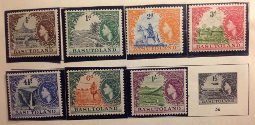 days. You’ll notice that the colonial stamp producers did not choose to continue the set with the alligator for Elizabeth, even though they kept up a common design for definitives in Bechuanaland Protectorate, to the north, and in other colonies. Maybe they considered a sharp-toothed croc an inappropriate companion, lurking beneath the comely young queen. It’s not like the crocodile is the colony’s badge or anything. So they broke with tradition and gave Basutoland a brand-new set. And look what they came up with! Even this short set is gorgeous. I have had many happy moments mooning over the finely engraved scenes that peek out through the decorative borders. In each stamp there is an engraved cameo profile of the queen under her crown, presiding with benign attentiveness. The contrasting colors are daring: orange and deep blue; carmine and olive green; deep blue and indigo …
 addition to the two “postage due” stamps (which I don’t have) and a single 2d stamp surcharged 1/2d (there must have been a shortage of the 1/2d definitive), there is a nicely engraved, three-stamp set commemorating the creation of Basutoland’s new legislature, the National Council, in 1959. The first stamp recognizes the “Laws of Moshesh 1854,” with a likeness of long-reigning King Moshoeshoe. (There seem to be numerous spellings of his name.) The second depicts a modest building and the caption “Basutoland Council 1903,” referring to what passed for a local deliberative assembly more than a century ago. The third stamp shows a pipe-smoking Mosotho tribesman on horseback, with his distinctive robe and peaked hat (Is that a dove with an olive branch flying behind him? A swallow with a twig for its nest? An airplane?) In case you are wondering, none of these stamps is valuable.
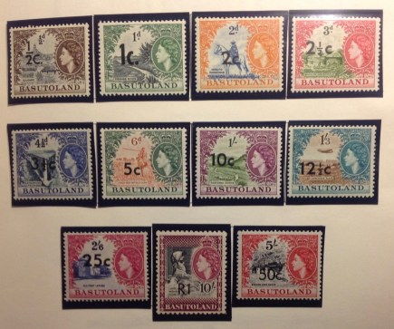 stamps are denominated both in “cents” and the old “st’ling.” Another wave of conversions to decimal came before World War II in Caribbean colonies. The nadir of the surcharge business came with those hapless stamps that received two surcharges, one supposedly cancelling out the other — thus leaving the poor customer (and postal clerk) to contend with three separate values on a single stamp. Surcharges were a confusing bother to postal officials and the general public, and were yanked as soon as a new, “proper” set of definitives could be printed. Once the surcharged stamps were taken out of circulation, they sometimes jumped in value to collectors.
 Sure enough, along came the “new” definitive series with decimal currency. In this case, Basutoland got the same splendid Elizabeth II set first issued in 1954, with decimal values in place of pence and shillings. The brilliantly etched vignettes and borders are restored to their full glory. My set is complete. A pencil note states I bought it in 1991 for $11.50. Today, the set goes for $45 on
  investment, eh?
 colonial monarch to the next, the transition of British colonies to independence was seldom smooth — politically, economically socially or symbolically — and this was reflected philatelically, in unforeseen developments and awkward moments, odd stamp issues, false starts, dramatic turns, printing errors, other calamities and incongruities to match the times. — as you will see …
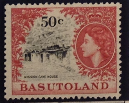
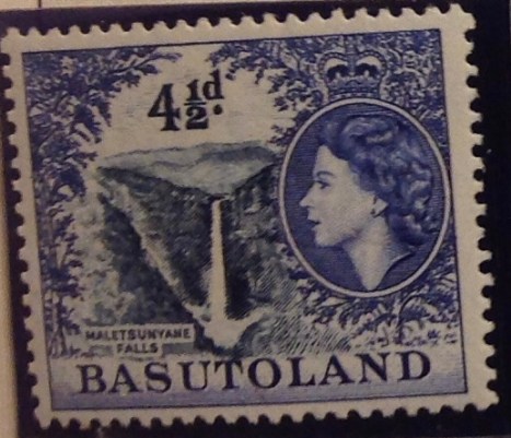 Before departing from Basutoland, enjoy a few last closeups of that artful set, first issued in 1954.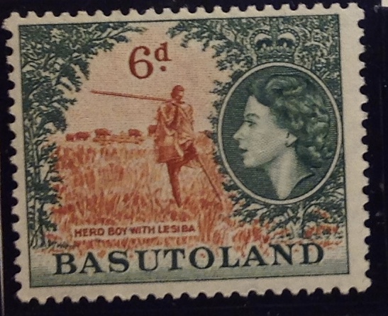
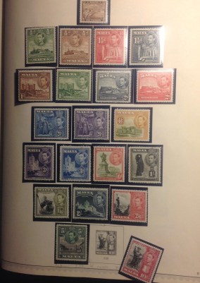
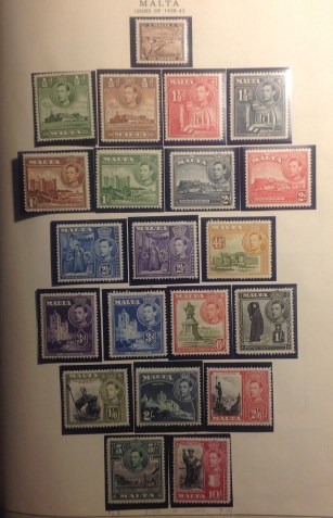

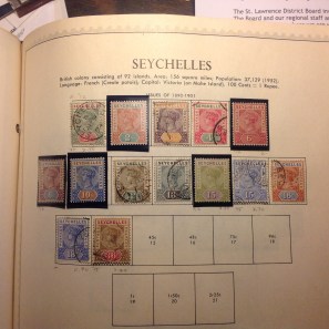


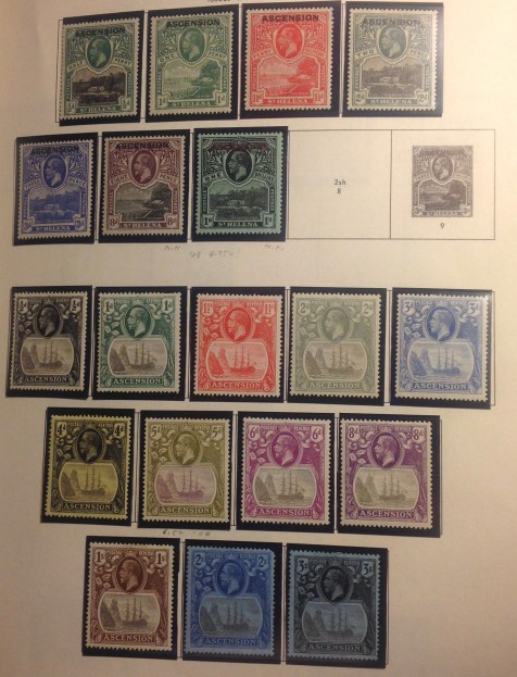 nsists of stamps of St. Helena, another British possession 800 miles to the southeast, overprinted “Ascension.” One wonders how local inhabitants reacted to stamps depicting a faraway island, intended to represent them in the wide world. How humiliating … Mercifully, it took only two years — from 1922 to 1924 — for colonial stamp designers to come up with an original set for Ascension, displaying the Badge of the Colony.
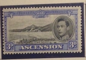
 he stamps are wide and tall, with artistic engravings of Georgetown, Long Beach, a map of the remote South Atlantic island and other scenes. The vignettes are printed in black, as is the profile of the king. The borders are intense colors — violet, green, ultramarine, orange … The contrast is striking, and the fine designs of the engraver’s art resonate back and forth between the dark centers and portrait on each stamp and the succession of bright colors on the borders. This set is cancelled, missing the higher values —an attractive work-in-progress.
 ed artistry and design integrity. The stamps are laid out in orderly rows, set off by their black protective mounts. They hint at considerable value even as they please the eyes and stimulate the imagination. This is the George VI definitive set, mint and complete. In this case, “complete” means a full complement of 15 stamps, from a half-penny to 10 shillings. (Never mind the blank space on the page of the Minkus album; the authoritative Scott catalog affirms the set’s completeness, ignoring the suspect “yellow orange & lilac” 1 1/2d value cited by Minkus.)
 Please indulge a little esoterica here — a comment on the unusual number of color changes in this set. There were
 black. One can imagine a bit of confusion when the black-only 3d stamp replaced the black-and-blue 3d in 194
 You may notice if you squint that below some stamps on the pages of my albums there are tiny penciled inscriptions: date and amount paid, for the most part. I began doing this a decade or more ago, noting prices paid above $2. (The most I have paid so far for a stamp is $105 for an embossed stamp from Natal, circa 1857.) This notation system should help me or my heirs when it comes time to tote up the cash value of my collection, at least from the standpoint of my own expenditures. I’m sure it’s already in the thousands …
 The page rounds out with another Common Design set, this one to commemorate the end of World War II. The two mono-color stamps contain a new, face-on portrait of the king, looking calm, resolute, well-turned-out and handsome as ever. Next to him is an impressive engraved rendering of the Houses of Parliament reflected in the Thames. While this set, like the coronation set, never became valuable, it’s easy to imagine what an important purpose the stamps served. At the end of this punishing war, it announced that Britain was still a commanding presence — solid, secure, orderly, reassuring, a monumental edifice firmly planted at the center of the empire.
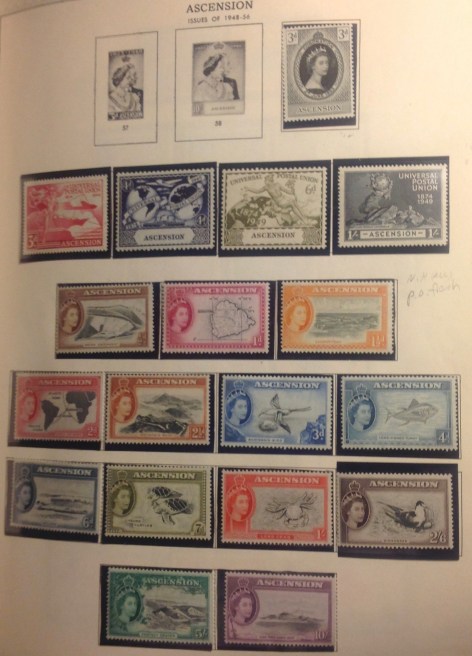 ry of George VI and Queen Mary in 1948, the coronation of Elizabeth II in 1953, and the four-stamp set commemorating the 78th anniversary of the Universal Postal Union (see below), were occasions for more “universal” issues. (I will say more about the Silver Wedding and UPU sets later). The same designs were in circulation in virtually every colony. The engraved portrait of HM Elizabeth II brings out her youthful beauty. Barely out of her teens, she seems serene and confident as she begins her reign over the final incarnation of “a greater empire than has been.”
 Majesty’s Service,” addressed to 13-year-old me! Here is a rare photo recording the arrival of one such packet — perhaps from Ascension. The household gathered at the front door of Philosophenweg 9 in Heidelberg to bear witness as FMF received and opened his postal letter. It was such a memorable event, the postman stuck around for the occasion. Mother served cookies and lemonade for the occasion.
 t adventures in international post-office shopping, I got lucky with the envelope containing my stamps. The kindly postmaster affixed a complete set up to the one-shilling value on the cover, making it a pretty and desirable showpiece in itself. … They may well be the cover I am opening in the dramatic scene photographed above, which would make the date June 6, 1962. How can I be so sure of the date? Because as you will note on the envelope’s display page, I recorded how long it took for my letter to get to Ascension and back. (The dates are presented European-style: day first, then month, then year.) This kind of compulsive data-keeping is typical of stamp-collecting, I think: mildly significant, moderately useful, slightly esoteric … not altogether boring …


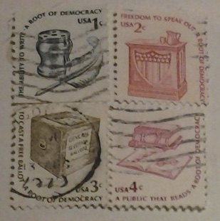 and accompanying note that I hope helps to explain why we stamp collectors get enthusiastic about our hobby …
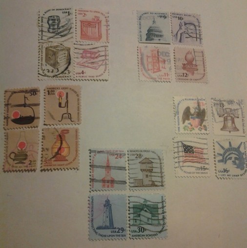 our other stamp quartets in the Americana series, up to the top $5 value. The sayings that circle round the stamps unite each quadrant, and the five quadrants form their own circle, united by their design and content.
 Europe (red dust cover, or should I say, magenta?). One reason why I don’t store these albums next to each other is that the thinner albums immediately to the right of each one contain newer stamps (1960s on) from each area of the world, including the last colonial stamps as well as post-independence issues.
 overs” like this one, with stamps placed on specially engraved envelopes and cancelled on the first day of issue. These covers were supposed to become collector’s items, but it hasn’t turned out that way, to the chagrin of first-day cover enthusiasts. Today FDCs are a glut on the market …
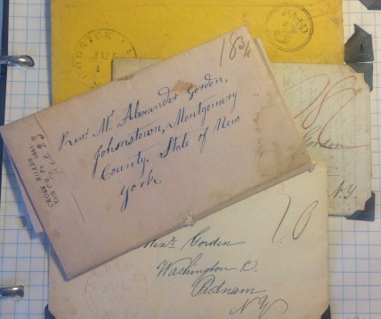 nvelopes sent through the mail before the advent of U.S. postage stamps in 1847 — for example, this one bearing a postmark of 1844 (see date in small type at left); another is from 1840. There are some envelopes with early American stamps, others with Confederate stamps from the 1860s (see below). They may be worth something, but probably not much. …
 Another type of cover is the specially cancelled “first flight” envelope bearing an early airmail stamp. For example, this envelope was carried on the first stamped-mail flight from Miami (and Virgin Isla
 nds?) to New York City on Jan. 9, 1929. Some “first flight” covers are valuable. And romantic! The rarest cover in my collection is one addressed to my Uncle Reddy, in Needham, Mass. (see below). It bears the 24-cent “Jenny” airmail stamp, cancelled with the message: “Air Mail Service; New York; Jun 3, 1918; First Trip.” A rubber stamp in the lower left corner of the envelope announces: “VIA Aeroplane Mail.” Quaint! While the envelope isn’t in particularly good shape, a similar cover was offered on eBay recently — for $250!
 You do know the difference between a stamp album and a stock book, don’t you? Do I have to explain everything? Oh, all right. Take my American collection, which starts with a binder full of pages offering spaces for every major variety of U.S. stamp … from the first two in 1847 — the Benjamin Franklin 5-cent and the George Washington 10 cent — until the pages run out in the 1960s. Beyond that date — now more than a half-century ago! — I have relied on stock book pages to hold my U.S. stamps. A typical stock book page has up to 10 plastic or parchment strips arrayed in parallel rows, Each strip is attached to the page at the sides and across the bottom, thus creating a secure holder for up to a half-dozen stamps inserted (using stamp tongs, of course!) across the width of the strip. Space out the stamps in your own design, or bunch them up for bulk or “stock” storage (hence the name “stock” book). I have numerous small stock books loaded with duplicate stamps, many of them cancelled. You must take care when the stamps are uncancelled, or “mint.” Allow humidity into a room where mint stamps are stored on top of each other in stock books, and you could have a real sticky problem!
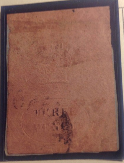 or a stamp is $105, a princely sum which I paid in 2013 for Natal No. 1, 3 pence, rose, 1857 (pictured here, larger than actual size). The stamp has a catalog value over $500, but that is for a copy with four clear margins, whereas my copy has only three. I have no certificate of authenticity, and there are known to be reprints with bogus cancellations. Nevertheless, I am fairly certain this is the real deal. Now, if you’re just skimming over the album page, you might be tempted to dismiss this rarity. It looks like a smudged square of colored paper with some bumps on it. Look more closely, though, and you will see a clear impression saying “THREE PENCE,” much of it picked up by the bla
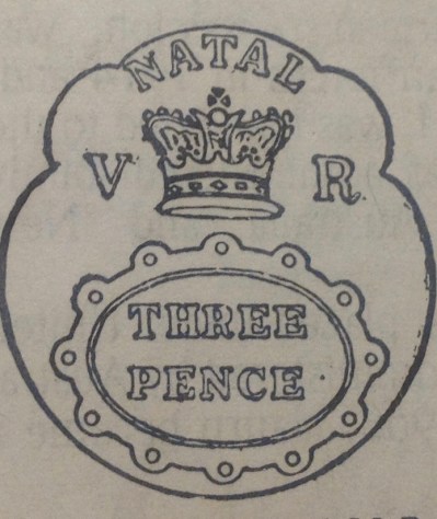 ck ink of the cancellation. Actually, the margins are unusually large for this variety: just in at the bottom, clear the rest of the way around. Compare the faint embossing on the stamp with the actual design outline, at right, as presented in the Scott stamp catalogue, and you may be able to discern details on the original:: 1) as stated, the number is clear under the postal strike; 2) also visible are the circular border and the letter “A” from Natal at top; 3) “V” is visible at left, and a faint “R” at right. Can you see it? Now think of this odd stamp, embossed more than 150 years ago, placed on an envelope in the new south African colony of Natal for the outgoing mail. Now That stamp is in my collection. As you might suspect, I have examined this stamp in great detail, and confess to be being hypnotized in looking at it — something about the fleshy color, the tattoo-like embossing, the nearly hidden letters and symbols, then imagining this artifact making its way from that African postal outpost back in 1857 … philately just boggles the mind!
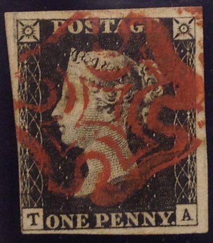 th you now (more will be presented in future chapters) is the Penny Black from Great Britain. This is the First Stamp, issued in 1840, bearing the engraved profile of Queen Victoria. It was produced by Sir Rowland Hill. This stamp cost me $70 in 1991. The Penny Black is not exceedingly rare, but very old. Mint copies (uncancelled) are expensive. But used examples with nice cancellations and four margins — that is, where you can see white all the way around the design — can bring hundreds. Mine has four margins, or so I claim. You may need a magnifying glass to discern the thin sliver of white that continues around the lower left of the stamp — but I maintain it is there! Thus I believe my stamp should be worth at least — $70!
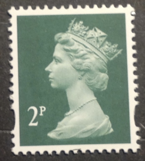 amps still include “USA,” while Great Britain’s regular issues include nothing but a value and an iconic portrait of Elizabeth II.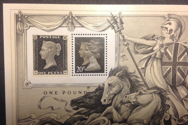
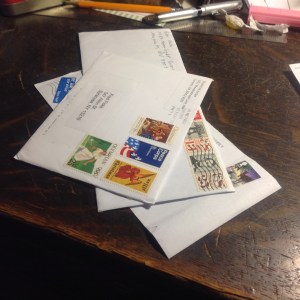 (often from foreign lands), and because they are a little bit pregnant — there is a pleasing heft and lift to the envelopes, a promise of what lies within. Altogether a fairly low-key pleasure, but a pleasure nonetheless. In the the second photo, one envelope is open and the stamps have been removed for a first look (using stamp tongs, of course). It’s always at least a small thrill. Soon enough, the stamps will be safely mounted in their places on the pages of thick stamp albums, and they will take their places in sets from countries around the world — most of which no longer exist. For now, the stamps are out, on the table, colorful
  artifacts sometimes well over 100 years old. The stamps have survived all these years. Some are a little faded, others have retained their intense colors, appearing fresh in their third century. This is a time to lift the stamps (in tongs of course), turn them over, examine their backs, look for thins or creases, double-check watermarks. (What are watermarks? Be patient, we’ll get to that.)
 examination and appreciation. (Of course, while you are doing all this, you are also living your life. Please don’t think stamp-collecting is an all-consuming habit. After all, FDR was an active stamp collector all his adult life, and he still had time for other things …)
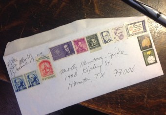 stated value for mailing purposes. So the senders combine stamps that add up to the going rate — 49 cents in the USA in 2015 (later reduced to 47 cents, a change made even more confusing by the “forever” non-numerical value) — and load up the envelope with the old beauties. Seeing such colorful mail makes the whole thing more fun. I wonder if the letter carrier even gets a tiny kick out of delivering these substantive letter-packets decorated with such philatelic richness.
 While the U.S. Postal Service no longer issues stamps with denominations for first-class mail (i.e., now you just use “forever” stamps), if you ask at your post office, you will find there are still many different tamps for sale, from 1 cent to $10 and beyond. You just have to ask. The highest-value stamps are for heavier mail, priority mail, express mail and the like. The denominations have progressed upward in recent years — $13.65, $14, $16.50, $18.30 … In 2013, the USPS issued a stamp selling for $19.95 that depicted a
 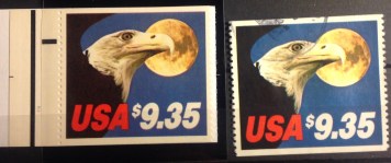 bustling Grand Central Station in New York City; in 2014 came a $19.99 stamp picturing the USS Arizona Memorial. What? You’ve never seen these stamps before? Here is a picture of some of them. They all have been available at one time or another for purchase at most post offices — for face value (i.e., the prince on the stamp). Some of the older stamps that have gone out of circulation, that is, no longer are sold by the post office, have increased in value to collectors. If high-value stamps are a good investment, you’d think some residual value would attach to cancelled examples. And you’d be right. The first Express Mail stamp, issued in 1983 with a price tag of $9.35, sells today for about $40 in mint (uncancelled) condition. But cancelled copies are valuable, too, priced at about $35. The $11.75 Express Mail stamp from the space shuttle series in 1998 sells today for about $30 mint, $19.95 cancelled, or “used.” These are reasons I make a point of collecting used as well as unused copies of these high-value stamps — and ask friends and family to use them so I can collect them right off the packages. To me, the mint and used copies are both worth collecting. And who knows? Some day, these rarely used stamps may be more valuable cancelled than mint!
 n a trip to the post office in downtown Moscow. It seemed to me the postal clerks saw her coming and either eyed the exit, rolled their eyes, smiled sympathetically, groaned inwardly, or issued a good-natured sigh. Probably some combination of all of these. It wasn’t always convenient for them to go hunting for high-value stamps. There might be a few other customers waiting in line, also sighing, rolling their eyes, etc. Tolerance for philatelic game-playing is not wide or deep. But Mother generally persevered, alwa
 ys with a kind word and good will. More often than not she prevailed, and the resulting packages had enduring value — not just for the contents, but because of the collectible stamps pasted on them. For example, Mother sent me the $13.65 Express Mail stamp from the monuments series in 2002-3 that you see here. The cancelled copy is catalog-priced at around $9. And to think the stamp already did its duty, carrying Mother’s precious package to me … Now that my old mother is no longer around to run this little philatelic gambit, I have not yet figured out how to get used copies of those $19.95 and $19.99 stamps into my collection through legitimate use of the postal system. I shall keep trying, mercilessly cajoling other loved ones into playing stamps with me …
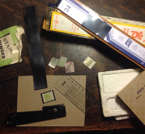 ge and stick the stamp in its space in the album. The hinges are peelable, and will not harm the stamp. For mint (uncancelled) stamps, whose gum needs to be protected, readying the stamp for safe display requires special mounts. Using stamp tongs, insert the stamp in a 10-inch-long protective sleeve — the black strips come in numerous widths to accommodate all sizes of stamps. A 22-strip pack costs less than $10 and can accommodate up 100 stamps. Use a razor cutter to lop off the inserted stamp from the rest of the strip. (But be careful not to nick the stamp, including the perforations!). For this cutting operation, I use a little kit I picked up as a lad in Germany …oh, just about 55 years ago. Amazing, how it’s lasted. We stamp collectors do venerate aged things, after all. On the other hand, how can a durable plastic razor holder and a see-through glass ruler wear out? In cutting, I position the stamp on a piece of cardboard, so I don’t mar my desk top or make an uneven cut. I keep a container of recycled pieces of cardboard nearby for this express purpose. I don’t use pieces of cardboard more than once. Cutting through the strip on top of another cut mark in the cardboard could result in an uneven cut. Even if I am only making one cut for one stamp, I still discard the whole piece of cardboard afterwards. Call it wasteful. Call it extravagance. I prefer to think of it as an infinitesimal act of gay abandon. (The cardboard eventually goes out with the recycling anyway.) Now you are ready to moisten a small part of the back of the black mount — careful not to stick your tongue inside, wet the precious gum and ruin the stamp! — and paste the mounted, protected stamp in its designated spot. Aaah! This is what it’s all about — putting stamps in spaces, seeing sets materialize in all their glorious order and color and design …
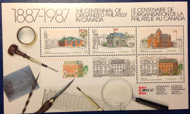

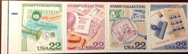



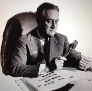

 stamps (see photo, top right). But there seems to be a design error: The president’s right hand holds a magnifying glass and is just fine; however, he clasps a stamp in a left hand that contains five fingers — and a thumb! (You’d think this stamp would be valuable, but you can buy it for a quarter.) One further note on this bit of arcana — the photograph the engraver used actually does seem to show “six finger
 s,” though closer perusal reveals the extra “pinkie” as distorted image of FDR’s shirt cuff. It must be!
 , James A. Farley (seen here in a very flattering formal oil portrait), was an old friend and mentor in
 the sheets, and
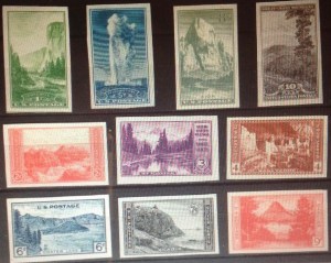
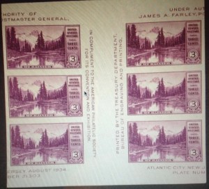 How to collect these items? None of the stamps are particularly valuable by themselves. (The original national parks set of 10 sells online for well under $10.) Should you try and get a full sheet, unperforated and ungummed, as an unusual but somewhat spurious collector’s item? What about all the other souvenir sheets, vertical and horizontal “gutter pairs,” “arrow” blocks of six and other Farley shenanigans? Cut out from their sheets or other special settings, aren’t the stamps the same? And get a load of this odd note, from the fine print of my Scott catalogue: “In 1940, the P.O. Department offered to and did gum full sheets of Nos. 754 to 771 sent in by owners” — thus creating new philatelic varieties, it would seem.
 to erase the stereotype of the geeky stamp collector, dusty, bespectacled, aging, beetling about his business (like me). I have little confidence left in the tradition of fathers passing along their interest in stamps to sons — as my father somehow did with me. As far as I can tell, my older brother Jonathan and I are the only ones in my extended, intergenerational family circle who give a hoot about stamps. Too bad, because stamps are worth paying attention to.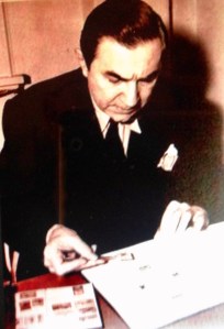
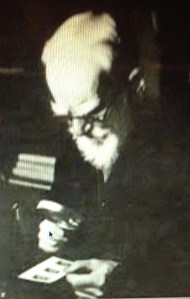
 shot of
 Britain’s Queen Elizabeth was a real enabler of Sarkozy, handing him one philatelic trophy after another. To be sure, she had plenty to give — the queen was heir to a stunning collection begun by her grandfather, and expanded by her father.
 George V’s original collection filled 328 60-page red albums; his son George VI’s albums are blue; Elizabeth’s are green. It seems George V got started long before he became king, aided by Prince Alfred, his uncle and Duke of Edinburgh. The king’s philatelic ambitions soared. He once wrote an adviser, “I wish to have the best & not one of the best collections in England.” He certainly tried to achieve his goal. In addition to accumulating special items by dint of his royal access, the king made astute purchases, acquiring such rarities as the Post Office Mauritius and the Great Britain Two Pence Tyrian Plum. (Don’t you just love the name of that color?)
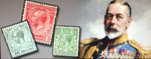 raightforward monarch, quite popular during his reign and well-suited to his times — though it’s hard to see how collecting all those stamps bearing his profile could not have swelled his royal head. He is credited with helping to revive a hobby that had grown a bit moribund. (Where is the next George when we need him?!) A popular story has one of his retainers reporting that “Some damned fool had paid as much as L1,400 (about $3,600) for one stamp,” and the king mildly replying, “Yes, I was that damned fool.” His investment paid off: The rarity in question later sold at auction for $3.9 million.
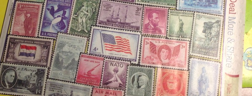
 ** In addition to collecting stamps, little Freddy began a daily diary in Dacca, when he was eight, and kept it up until high school and sporadically, beyond. When I get around to reviewing its generally hum-drum contents in coming years, no doubt I will find specifics about the years-long set-to with the Kenmore Stamp Company. Accordingly, I shall endeavor to keep this record updated with my findings.
 FMF STAMP PROJECT