TEN INTERESTING STORIES ABOUT CONGO STAMPS
1. The Origins of Rwanda and Burundi stamps. The first stamps issued in Rwanda and Burundi, back in 1915, were from the Belgian Congo.
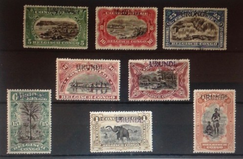
This complete set is from eBay on the Internet; the asking price: $1,751.45.
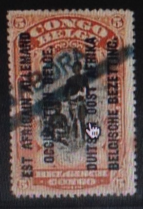
They were overprinted by hand stamp, “Ruanda” or “Urundi.” They took the place of German East Africa stamps as the Germans were chased out during World War I. The colony also included land ceded to Portuguese Mozambique the new British colony of Tanganyika. The early Urundi and Ruanda stamps are among the most valuable from the Congo region, since they are so rare. They quickly were supplanted by a set of machine-overprinted stamps with the confusing bilingual inscription: in French, “Est Africain Allemand — Occupation Belge,” crowded in with the Flemish, “Duitsch Oost 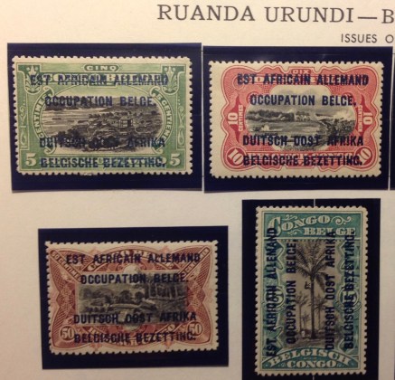 Africa — Belgische Bezetting.” This cluttered inscription suggests the Belgians were taking over from the Germans. But in such a case, one might ask, why still call it “German East Africa”? Was there a nationalist motive — to rub Germany’s nose in its defeat by asserting mastery over its erstwhile colony? Or was there a tacit colonial bond implied here, as though the two imperial powers were exchanging property, perhaps temporariliy, but otherwise maintaining all the imperial trappings and perquisites?
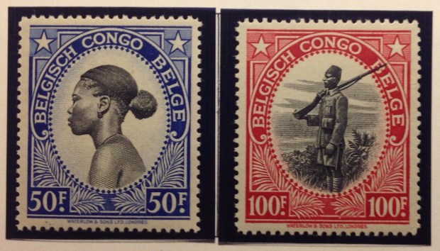
2. Belgian Congo stamps: A gallery of portraits. During its 83-year existence (1910-1993), the apartheid government of South Africa issued only one stamp I know of depicting a black face — a 4-cent commemorative promoting “Health Care and Service” in 1979. Though racial oppression and exclusion also was integral to the Belgian colonial administration, stamps from the Belgian Congo and Ruana-Urundi often featured black faces and bodies — even celebrated them. The early engravings are quite lovely.

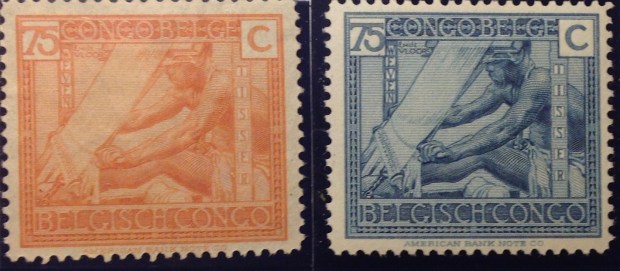

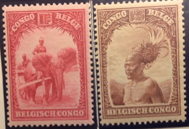


3. Overprints and surcharges. Overprints and rcharges were part of Congo stamps from the beginning. In the 1880s and 1890s, three stamps from the first and second King Leopold portrait series were defaced by parcel post overprin ts. These are costly Congo stamps, because they are so rare. Later on, stamps in the colorful definitive series of 1909 were recycled numerous times. Four of them were overprinted with the year “1921”; many were surcharged with new values. Eventually, there
  were surcharges on surcharges. Imagine being confronted with a 10-centimes stamp, surcharged 30 centimes, then handstamped 25 centimes. What gives? Now go one stamp further: What about when the “0,25” is handstamped twice? Is that a double surcharge? A misprint? A new variety? So many questions! Congo postal authorities
  kept surcharging sets through the years, up until independence and beyond, with predictably mixed results.
( See Anecdote 5)

Here are examples of a double surcharge with the hand-stamped “0,25” inverted. This clearly is too much to ask a postal customer to decipher! (The image is from the Internet; eBay’s asking price for these rarities: $150.)
4. Detatchment USA? I was surprised to come across a short set of Belgian Congo stamps from the 1930s with an overprint suggesting an American occupation. I must have picked up the set at a stamp show years ago for a few bucks. The complete set (there is one more stamp) sells on eBay for as much as $100. As far as I know, the United States never occupied the Congo, or ever deployed troops there — at least openly. The Congo did play a role as an ally in World War II. The Belgian government-in-exile in London maintained its colony and provided the United States and others with key raw materials like rubber and minerals. Uranium went to the Manhattan Project that produced the atomic bombs dropped on Hiroshima and Nagasaki …
 To get back on the philatelic track, why a “USA Detatchment” overprint on Congo stamps from the 1930s? These stamps would not have been issued during the war, since by the 1940s there was a new definitive set in circulation. A little research turned up the following scanty information: The stamps were issued in 1931 as a “private printing.” For decades, it had not been unusual for the U.S. government to dispatch “detachments” of Marines or other soldiers to guard U.S. embassies and other assets abroad. (In Cameroon, for example.) However, there was no mention of embassies issuing postage stamps for use by the troops or anyone else. Were these stamps valid in the Congo, for example as postage on mail sent home by the U.S. troops in Leopoldville? I don’t know. I have never seen any cancelled examples of these stamps, or postally used covers including them. They may well be “Cinderellas” (a term applied to postally spurious issues, which I promise to address in a future commentary). They certainly constitute an interesting historical oddity: “American” stamps, with U.S. currency denominations and “USA Airmail” overprinted on Belgian Congo stamps. There must be more to this story.
By the way, during the turmoil after Congolese independence in 1960, Sweden, Ireland and Canada, among others, sent troops to the Congo at the request of the United Nations to help keep the peace. Another contingent came from India, whose postal authorities issued a set of India’s then-cur rent definitive series, overprinted “U.N. Force (India) Congo.” This set sells for a modest sum, mint or used, though cancelled copies on postally used covers mailed in the Congo might command a higher price. (Indians must have been proud of their role as international peacekeepers. Postal authorities in Delhi issued overprinted sets for use by troops in Korea in 1953; Cambodia, Laos and Vietnam in the 1950s and 1960s; and Gaza in 1965.)
5. The same — and not the same. The transition from colony to independence was not easy in the Congo. Disorganization, disarray and disruption ran rampant. Economic and social upheaval was reflected in haphazard philately, including upside-down overprints known to philatelists as “inverts,” some of which sell today for $5 or $10 or more. The many surcharges created ever more opportunities for misprints and other errors. Stocks of stamps from the Belgian Congo — in particular the Flower series and the Animal series — were overprinted, some with new surcharges, and sold in Leopoldville for years after independence. As a 15-year-old stamp collector In 1964, I was able to buy stamps at the downtown Bureau de Poste to create a cover using six different versions of the original 6.50-frank stamp of the Animal series depicting two leaping antelopes. 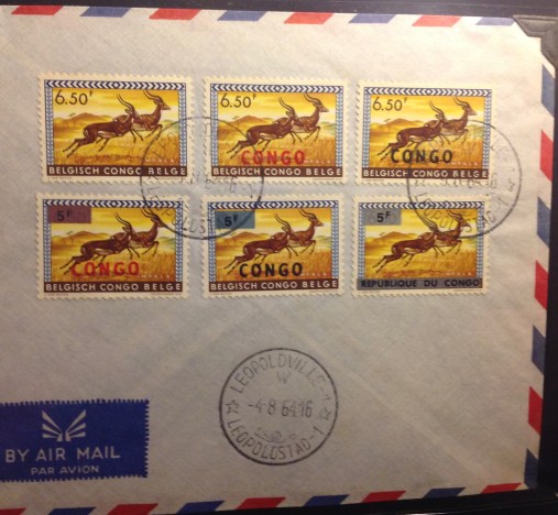
** the original stamp, issued in 1959
** the same stamp, overprinted “CONGO” in red, issued 1960
** ditto, overprinted in black
** ditto, with a silver surcharge “5F” and red overprint, 1964
** ditto, with silver surcharge and black overprint
** finally, with a silver surcharge as well as a silver bar with black inscription “Republique du Congo” replacing “Belgisch Congo Belge.”
I have another cov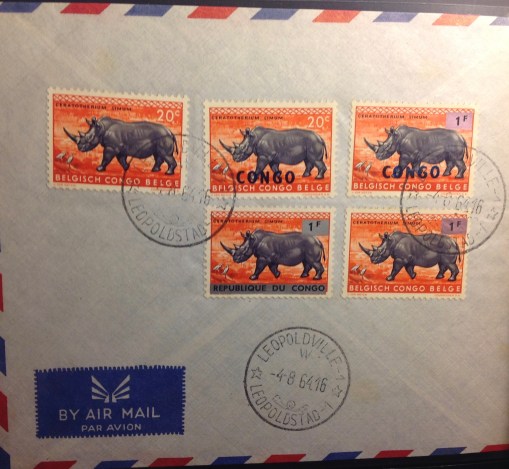 er with five 20-centime stamps from the series, featuring a rhinoceros, also with varying overprints and surcharges. The last item on this cover, below right, is a most peculiar error. Let me explain:
While the original Belgian Congo stamp was successfully surcharged “1F” on a silver bar, the “CONGO” overprint is missing. This means the stamp looks for all the world like a new “Belgian Congo” stamp — issued in 1964, four years after independence! Another example of this phenomenon is the 15-centime value of the Flowers set, surcharged 10 centimes — but without the necessary “CONGO” overprint (see photos below) — thus inadvertently creating a new issue for the Belgian Congo after Congolese Independence Day! See below for more examples of weird surcharges.

The 60-centimes stamp from the flower set originally was surcharged “50 centimes” for the independence issue in 1960 overprinted “Congo.” But the example on the left omitted the surcharge, thus creating a new variety. The stamp on the right shows the 50-centimes surcharge, but upside-down. The middle stamp, with a 10-centimes surcharges on the original 15-centimes stamp, omitted the “Congo” overprint, thus inadvertently creating another variety for the “Belgian Congo” — after independence.

Here is an Internet image of the “new” 10-centimes stamp from the “Belgian Congo,” along with another example of the 60-centimes stamp overprinted 50 centimes — but also omitting the “Congo” overprint. How do you list stamps like these in a catalogue?
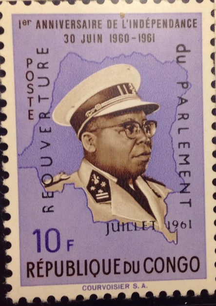
6. Impudent Katanga. The chaotic, violent years after Congolese independence included secessionist movements, some of them bloody. Moise Tshombe, from resource-rich Katanga in the southeast, led the first break from the federated government less than a fortnight after independence day June 30, 1960, proclaiming a state that lasted until January 1963. During that time Katanga issued a handful of sets, first overprints of Belgian Congo stamps, then pirated stocks of stamps from the independent Congo based in Leopoldville, and finally a few sets of original designs inscribed “Etat du/Inchi ya KATANGA.” The stamps were not recognized as valid by the International Postal Union, but mail from Katanga still got delivered. It is somewhat ja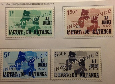 rring, to me at least, to study the first set of Katanga stamps — originally issued to celebrate the independence of the Republic of the Congo, showing a map of the whole country — with the name “Congo” obliterated by the bold overprint, “L’Etat du Katanga.” A smaller overprint cleverly covers the inscribed date of Congolese independence, “30 Juin,” with a new “11 Juillet,” Katangan Independence Day — while keeping the “1960” date uncovered. In this way, the secessionist government celebrated its own independence by repurposing stamps whose central image depicted the nation from which Katanga seceded. It is as if the U.S. Confederacy in 1861 put out a set of overprinted stamps with a map including its giant enemy to the north.

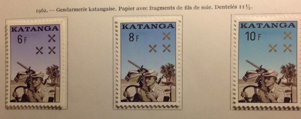
Here is the last set of stamps issued by the independent state of Katanga. The happy-go-lucky jeep driver carries what looks like an anti-aircraft gun. Many Congo-area stamps of this era, including these, were designed and produced by the Swiss company Helio Courvoisier SA.
7. Half-hearted secession. Anothe r breakaway republic was the central state of South Kasai, declared by Luba leader Albert Kalonji in August, 1960. It was a half-hearted effort — there was never a complete break wi
 th the federal government. This unlikely nation started out like its more
affluent neighbor, Katanga, with overprints of Belgian Congo stamps. It then issued a few of its own design, including a souvenir sheet, before the rebellion petered out in 1962.There were a few envelopes cancelled with the
stamps from the “Etat Autonome du Sud-Kas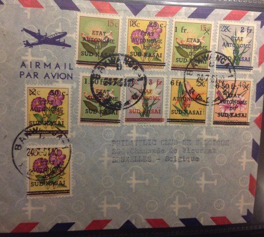 ai.” I have one (shown here), and I hope it has some value. The stamps were not recognized by the Universal Postal Union, and while you can find them occasionally on eBay, they are not listed in most catalogues. Prices for South Kasai stamps are not high, but I believe there is some value to them because of their unusual historical provenance, their sheer oddity, and limited numbers.
8. Murky and murkier. The murkiest of t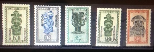 he sessionist “republics” were the “Republique Populaire.” declared in Stanleyville to the northwest in 1964, and the “Congo” rebellion in the northern area of Katanga, centered on
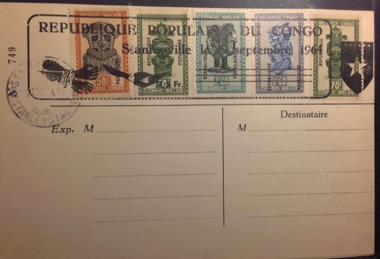
Notice the overprints are reversed on the cover in comparison to the set above it — a lateral invert. The cover is mine; the set is offered on eBay for $249.
Albertville, that same year. These rump rebellions, which some historians record as simba revolts aided and abetted by China, did not result in any original postage stamp designs — or much other than bloodletting. From Leopoldville, then-Prime Minister Tshombe dispatched federal troops. Some were led by mercenary officers who had fought for Tshombe in Katanga. Before they were subdued, the rebels did have time to issue overprints of Belgian Congo and Republic of Congo stamps. The cover shown below from Stanleyville offers rare “cancelled” copies of stamps from this questionable postal authority — though it is quite obvious someone merely pasted the stamps on the card and had them cancelled. This philatelic oddity did not come with a certificate of authenticity and integrity. I still cherish the cover as a rare philatelic artifact.
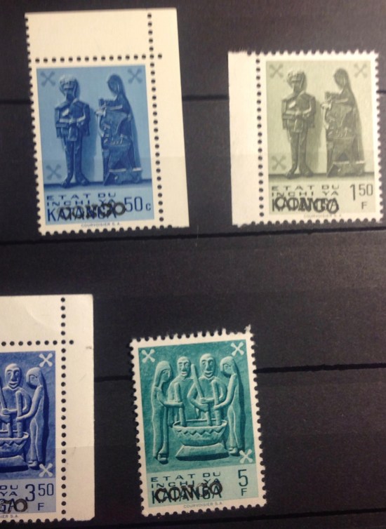 Postal authorities in Albertville used leftover supplies of stamps from Katanga, overprinting them simply, “Congo.” The result, in effect, was a set of stamps designed and printed by Katanga, a defunct state that had seceded from the Congo, now appropriated by a subsidiary secessionist state around Albertville and relabeled “Congo.” Is this a step forward, backward or sidewise? To com
 pound the muddle, the rebels in Albertville managed to take the 10-centimes stamp from the 1953 Flower series, and stamp their “Congo” claim directly on top of the “Katanga” overprint that was meant to supplant the crossed-out “Belgish Congo Belge” inscription. The result is a palimpsest (a word I have been waiting for years to use, which means a series of superimposed images). The stamp pictured here is listed on eBay (price: $450). The more you look at it, the more indecipherable it becomes — an apt emblem for the state of affairs at Albertville in June of 1964, and perhaps for the Congo as a whole …
9. A salute to colonial nostalgia. Every now and then, as my Congo collection grew, I would come across intriguing images of stamps from the handsome 1940s definitive set reprinted as mini-sheets — that is, stamps perforated and centered within a larger sheet. Some of the surrounding margins were white, others colored in alluring shades of red, green and gold. What are these sheets about? And why are they so expensive?
Eventually I consulted my  reliable Scott Standard Postage Stamp Catalogue. Here is what it said: “Miniature sheets … were printed in 1944 by the Belgian government in London and given to the Belgian political review, Message, which distributed them to its subscribers, one a month.” Scott valued each sheetlet at $12.50. The Scott catalog continued: “Remainders of these eight miniature sheets received marginal overprints in various colors in 1950, specifying a surtax of $100f per sheet and paying tribute to the Universal Postal Union. These sheets, together with the four of Ruanda-Urundi, were sold for the Committee of Cultural Works (and not at post offices) in sets of 12 for 1,217.15 francs.” Scott valued the series at “about $150. On eBay today, the series with white margins sells for $799, the series with the decorative borders is priced at $1,799.
Does anything strike y ou about these stamp sheets? How about as an emblem imperial disassociation? An example of the oblique colonial view, disengaged, distanced, perhaps even a bit sentimental (Congo!). These sheets bespeak a European population of the 1940s, profoundly, even willfully ignorant of prevailing conditions in the Congo and the discriminatory customs and legal processes; directly or indirectly, they were complicit in those racist laws, practices and opinions. The stamps were designed and printed in London. Many Belgian Congo stamps were produced by Waterlow and Sons Ltd. In 1944, with the Belgian government-in-exile now located in the British capital, you might consider this a philatelic favor done by one imperial power for another — with a tidy profit, to be sure. Given the grim distractions of wartime, these charming little sheetlets must have been welcome surprises. They were distributed, gratis, to subscribers of Message, one accompanying each monthly issue. Look closely below, and you will see special side perforations in the sheetlets that allowed them to be stapled into the larger publication, to be safely removed later by collectors. The more elaborate, bordered sheets were sold with a 10-fold markup to honor the Universal Postal Union and benefit the Committee of Cultural Works.
When I get a chance, I hope to look into this further. What was Message’s view of the affairs of the Congo? Why was it chosen to distribute these stamp sheets? What was the Committee of Cultural Works, and how did it use money from the sale of these sheets? These questions beg the ultimate question: Did this philatelic enterprise in Brussels in any way enhance the well-being or even enter the consciousness of the Congolese, still living under Belgian domination, repression and exploitation in that vast, squalid African nation? I doubt many Congolese acquired these prized sheetlets. I also doubt there were many indigenous subscribers to Message in Leo, Matadi, Coquilhatville, Albertville. Not many members of the Committee of Cultural Works lived in Stanleyville, Elisabethville, Luluaburg, Thysville …
10. Paix, travail, austérité … a personal memoir. These French words mean peace, work, thrift. They are a hearty recipe for civic progress. Some combination of these ingredients promotes successful lives, communities an d societies. Yet the words have a painful poignancy, for they represent what the Congo could have become, should have become, but has fallen tragically short of becoming.
The words were spoken in 1962 by Cyrille Adoula (pictured below), then prime minister of the Republic of Congo. His words were transcribed as an overprint on a set of stamp s issued in October, 1962. The set originally came out in January, honoring Dag Hammerskjold, the United Nations envoy who was killed in 1961 when his plane crashed on a peace mission to the Congo. Hammerskjold had made at least four other trips to the region. In September 1961, his plane went down near Ndola, Northern Rhodesia (now Zambia), close to the Congo border. Hammerskjold and 14 others were killed. One theory is that the plane was shot down on the orders of Union Miniere, the mining giant that was resisting U.N. intervention. Former president Harry Truman added to the furor when he was quoted as saying that Hammarskjold “was on the point of getting something done when they killed him.” Truman added: “Notice that I said ‘when they killed him’.”
Months before these stamps were issued, the doomed prime minister of the Congo, Patrice Lumumba, had been secreted to Elisabethville. Dismissed by President Kasavubu, disgraced and disheartened, Lumumba had been arrested by Col. Joseph
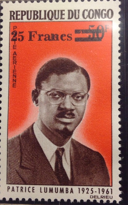
This portrait of Patrice Lumumba is on a stamp issued not by the Republic of the Congo, but rather the Republic of the Congo. Huh? Pardon the confusion. This stamp is from the former French Congo (why must I continue to allude to colonial days?!). Some call it Congo-Brazza, because its capital city is Brazzaville, which is located across the Stanley Basin from Leopoldville/Kinshasa along the Congo River. Lumumba was never honored on a postage stamp in his native land, that I know of. I guess Mobutu is partly to blame for that. Kasavubu, Tshombe and later, Mobuto, were featured on stamps. Tshombe’s likeness was reserved for Katanga issues, while Kasavubu stares out from a long set of Congo definitives. Later on, Mobutu’s likeness was printed on multiple sets of definitive stamps, helping to build a cult of personality and “authenticite” to mask his duplicitous and unscrupulous misrule.
Mobutu and held in Thysville, near Leopoldville. Reports say he was beaten on the plane ride to Katanga, where he was confronted by political enemies including Moise Tshombe. After more beatings and torture, Lumumba and two associates were executed by a team led by Belgian mercenaries, under orders from Katanga. Tshombe was reportedly among those present at the execution.
Cyrille Adoula suffered no such fate. Earnest but somewhat colorless, he was a trained technocrat, a banker. I wish that he had been able to lead the Congo in all sorts of promising new directions. I wish that somehow, everyone could have risen above the bloody drama of Lumumba, the proxy war of communism vs. democracy, the tribalism, the contest for Congo’s fabulous natural resources waged by the superpowers, neighboring nations and multinational corporations. With the right kind of leadership and help, the Congo could have surged forward, become a great nation. Well, why not?
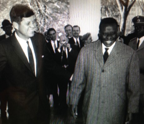
A hopeful moment — Congolese Prime Minister Cyrille Adoula, right, meets JFK during a visit to Washington. Adoula was quoted on the overprinted stamps pictured above, but I don’t believe his image ever appeared on a postage stamp
In some ways, Adoula seemed the Man of the Hour. He had been an independence activist since the 1950s, when he joined with Lumumba and Ileo to form the Mouvement National Congolais (1958). He was handsome and suave. He had a modest, competent way about him. The reason I speak so extensively about Adoula is that he was prime minister during most of the time I lived in the Congo. My father, the CAO in Leopoldville, mingled with Adoula at diplomatic events and perhaps elsewhere. Pa and Mother were rather keen on Adoula’s prospects. They were Adlai Stevenson Democrats, and he was their kind of guy, with a moderate political agenda and some sensible ideas— like paix, travail, austerite. Alas, this was hardly a sensible time. Amid the turmoil before, during and after the Lumumba premiership, there were two secessionist movements — in Moise Tshombe’s Katanga, and in South Kasai. It took United Nations intervention to put the Congo back together — though seen one way you might ask: Why bother? Look who put it together in the first place: A bunch of imperialists meeting in Berlin in the 1880s, that’s who. Oh well.
By 1963, with the Congo in one piece again, Adoula tried to assemble a coalition unity government under President Kasavubu that would accommodate both the disgruntled Lumumbist elements and Tshombe’s Katangans. As if that wasn’t hard enough, 1964 brought new rebellions around Stanleyville and Albertville, and Adoula gave up, was forced out or both, yielding to none other than … Moise Tshombe. Americans, imagine the parallel: A year after the Civil War, the new head of the Re-United States is … Jefferson Davis! Adoula agreed to serve Tshombe as ambassador to the United States and Belgium. While Adoula and his family lived in Washington, Mrs. Adoula and my mother got to be a bit chummy. Pa was posted back to D.C. for a rotation, and Mother arranged with the Congolese Embassy to have a group of diaspora wives meet at our house on Madison Street. They did projects, spoke English, drank tea (sherry?), talked about babies and children and … civics, no doubt.
Mother was always terrific at this kind

Part of my Pa’s job of the Cultural Affairs Officer of he United States Information Agency in the 1950s and 1960s was to pose for dog-and-pony shows like this one. Here, in 1964, he stands at left with two apparently Congolese young men, one of whom (I’m betting the guy on the right) drew this mural of LBJ and Mt. Rushmore, which he labeled “The Shrine of Democracy,” and donated it to the U.S. ambassador. Pa decided to display it in the window of the USIS library, and had this photo snapped to honor the occasion. Turned out the artist was from neighboring Angola. …
of stuff. Both Mother and Pa found their life’s work in cultural diplomacy. Pa grew up chafing in the close confines of Boston Brahmin society. He thrived in the diverse locales where we were posted — Dhaka, Heidelberg, Leopoldville, Bremen. In the Congo, he worked hard at keeping the library going, managing cultural exchange programs, meeting and greeting and generally projecting a benign, forward-looking U.S. policy of engagement. At his side was Mother, who had “escaped” from Iowa — and from my remarkable grandmother. Janette Stevenson Murray was a civic leader, an internationalist and vocal supporter of the United Nations and Eleanor Roosevelt. She was elected to head the Cedar Rapids board of education — before women could vote in national elections. Grandma Murray was so busy with civic affairs and education that she didn’t have much attention left to pay to her five children. Her neglect apparently was not too harmful — her offspring and descendants include professors, M.D.s, Ph.d.s and M.D./Ph.D.s, world travelers and a two-time GOP candidate for governor of Iowa. When Grandma was selected American Mother of the Year in 1947, I think Mother was embarrassed by the publicity. She skipped the award ceremony at the Waldorf Astoria Hotel in New York City. To be fair, 1947 was a busy time for Mother — she was raising her young family, while Pa was transitioning from the Navy back to civilian life. Both my parents still seemed committed to moving beyond their upbringings. Besides, Mother of the Year seemed pretty square … Years later, in 1980, JMF would compile a dossier entitled, “JSM: A Reconsideration.” In it she finally — albeit a bit begrudgingly — celebrated her mother’s honor back in 1947. She acknowledged that it was quite a big deal, after all. (Editor’s note: Not any more, it seems. I don’t even know if the USA still chooses of “Mother of the Year.” Ever heard of her? How does she stack up against Miss America? Miss Universe? The Avengers?)
I was glad Mother got to make public amends with her mom — albeit seven years after Grandma died. That reconciliation affirmed her own mission, which was essentially to carry on JSM’s work — promoting international understanding, mutuality, good will and hospitality. In the 1950s

Can you spot my mother (at the right, in the back, with the pearls) among the gathering of women in Leopoldville, pre-1965? Another shot of the same party is below.
and 1960s, Grandma must have glowed over her daughter’s civic engagement work in East Pakistan, Germany, the Congo, Iceland, and Washington, D.C. Pa handled cultural diplomacy projects like the library, Fulbright scholarships and other exchanges, ran public events, sent cables to D.C., and so on. Mother organized women’s groups, and was a sparkling 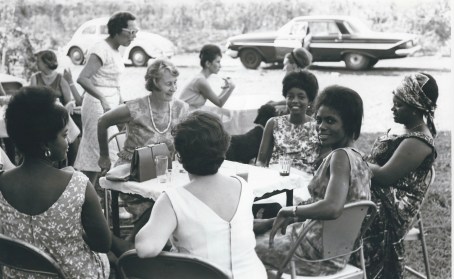 hostess at lively diplomatic parties held at our house. Visiting celebrities included Marian Anderson, Jack Teagarden. John Glenn, the Dorian Quintet and Buckminster Fuller. Mother was gracious, Pa was gallant, liquor flowed. Mother would charm the men and bond with the ladies, using smarts and poise acquired at Coe
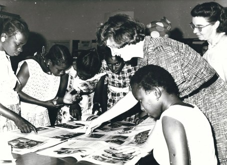
More public diplomacy from my mom. As you can see, she really got into it.
College and Columbia Graduate School. Pa would carry on social diplomacy: schmooze, hold forth, recite poetry and share anecdotes. As a team, they were extraordinarily effective in promoting intercultural understanding and friendship. For a baker’s dozen years — from 1957 to 1970 — they did their thing around the world. I’m proud of what they accomplished. The fact that my siblings and I got to tag along was a blessing, I guess, mostly. It sure contributed to my interest in stamp collecting!

President Kasavubu: stolid schemer. Grandson of a Chinese railroad worker, Joseph Kasavubu (today spelled Kasa-Vubu) was an early advocate for independence. He also was an able politician, wily enough get himself named president of the Congo in 1960, and to hold the job until 1965, when Mobutu seized power. Afterwards, he was allowed to retire to his village, where he died in 1969. Interestingly, one of Kasavubu’s daughters also went into government. Justine Kasa-Vubu was appointed a cabinet minister in the Kabila administration in the 1990s, after Mobutu’s ouster, then to the key ambassadorship in Belgium. She broke with Kabila and ran for president in 2006.
Speaking of which: back to Congo stamps, or rather, a bit more of personal Congo history before I do. Cyrille Adoula continued to serve under Mobutu until he retired from politics in 1970. He died in 1978 at age 56 in Lausanne, Switzerland. Though I “came of age” in the Congo (age 14-16), I didn’t run in the same circles as my Ma and Pa, so I never recall meeting Adoula. I might have been introduced to him somewhere as a 15-year-old and not remember it. I know both my parents met Mobutu, though I don’t believe I ever saw him. Mother described her encounters with the future dictator, many years later, in response to my inquiry, not making a very big deal of it. “He was polite, quiet, always watching,” I think she said. No doubt some of my Congolese classmates in College Albert, the Jesuit high school I attended, were sons of the well-connected — Benares, Nsiangani, Kisangani and others. But we never socialized, maintaining a cordial, occasionally even friendly, distance.

Tshombe: the chameleon. This portrait of Moise Tshombe is superimposed on a Katangan emblem, including the trio of copper crosses. The flag of the Republic of the Congo looks startlingly similar in design, which raises the tantalizing question: Was Tshombe just kidding about his breakaway republic? In 1960 he claimed he was trying to “secede from chaos.” In 1964, he took the chance to become prime minister of that chaos. He lost popular support after he used his Belgian mercenary pals to subdue the simba rebels in Stanleyville and Albertville. In 1965, President Kasavubu sacked Tshombe, months before Mobutu sacked Kasavubu, abolished the presidency and began three decades of dictatorial rule. Tshombe returned to Spain. He died in Algeria in 1969.
I did meet Moise Tshombe, once. My recollection of that encounter is cinematically vivid: It was a summer night in Leo — August 1964, shortly after Tshombe returned from Spain to take over as prime minister of the Republic of the Congo. It was literally the eve of my departure for Europe and, eventually, the USA, where I would begin my junior year of high school at Milton Academy, a prep school near Boston. A month earlier Tshombe, the expat leader of the defunct Republic of Katanga, had been transformed into the Congo’s homecoming hero, the white knight — well, not white — summoned to unite the Congolese and make the reintegrated nation all that it could be … I was vaguely aware of all of this. I certainly knew who Tshombe was — one of the biggest stars in the Congo.

Here is Tshombe, to the right (heck, is he the only black guy in sight?) at a party that probably took place about the same time as the Fenhagens party, and could have been in Leopoldville. It certainly appears celebratory. I remember people were taking flash photos at the party. There surely was music — it was 1964, Beatles music was everywhere. But a conga line? Hey, it could have happened. Doesn’t Tshombe have a goofy expression? The man was digging it!
The scene was a crowded house party I attended with my parents at the Fenhagens. It was my 16th birthday, coincidentally. The night was warm, the air sweet. We were in a fashionable residential quarter of the capital city. Most of the guests were white, from the diplomatic community. The house had an outdoor swimming pool, a balcony, exterior lights that made the setting quite gay — like a movie set for “La Dolce Vita,” Leo-style. There were fashionable people laughing, drinking and dancing, inside and out, with some kids like me running around. In the middle of a small crowd, with the entourage that always surrounds charisma and power, there stood … Moise Tshombe. Of medium height, with a graceful build, he stood in the lights, his handsome, expressive face shining. Dressed immaculately in a tailored suit and flashy tie, smiling broadly, he worked the crowd, eyes twinkling. Clearly he was having a good time. I don’t know how he got invited to the party, but his motorcade paused on the street so he could join the fun. He had a word for everyone, spoken in elegant French of course. As he passed me, our eyes met. Ever the one with a penchant to speak up, I blurted out. “Bonsoir, M. Tshombe! C’est la premiere fois que je vous ai jamais vu!” (Good evening, Mr. Tshombe! It’s the first time I have ever seen you!”) Dumb, right? Smart politician that he was, Tshombe grasped my hand in his, grabbed my elbow with his other hand — or maybe it was just a friendly wave? — and delivered the punch line: “A la prochaine!” (Till next time!)

Here is a peek into the FMF diary! This entry is for Aug. 4, 1964 — the date of the party at the Fenhagens where I got to meet Moise Tshombe, the ex-president of Katanga, future but short-lived president of the Republic of the Congo, and alleged accomplice in the abduction and murder of Patrice Lumumba. It’s funny that my memory, no doubt reinforced by my mother, who was a bystander within hearing distance, has him saying “a la prochaine,” which is altogether more resonant and meaningful than “la prochaine fois.” The first term is a comradely salute of farewell — to the next time we meet. The second phrace literally translates as “the next time …” What does it mean? The next time we meet, I (Tshombe) will be president? I don’t think he had taken over officially at that point. He was not introduced as the president, bur rather seemed to be coming as a private citizen to the party at the Fenhagens. The second phrase — next time — if he really said it, is much more opaque, though suggestive. I wonder if I misheard it, so that my diary entry, written the same day, is less accurate than a memory reinforced by the mother … As I think about it, I grow ever more certain that I heard correctly. It was just a phrase Tshombe tossed off, a sentence fragment, a thought triggered by my reference to “la premiere fois.” Perhaps it was an unformed thought, unfinished, interrupted. Nothing to hear here. In the end, trust your eyewitness records. Accept that history is not usually resonant and meaningful, but often opaque, if suggestive … Now I’m wondering about those handshakes. How did I come to shake his hand, twice? …
(Reality check: I just thought to check my diary, which actually extends back to Pakistan in 1957, when i was nine years old. Here is my entry for Aug. 4, 1964: “Guess who I met this evening, at a party at Darby Fenhagen’s? TSHOMBE! I shook his hand 2x and told him this was the first time I had met him. He said, “La prochaine fois …” What does that mean? Anyhow, that’s quite a thing to have done on my last night in the Congo, don’t you think? Yes! That’s quite a birthday present, what?”)
Alas, there would be no “prochaine,” no next time. Napoleon’s comeback in France after his first exile was 100 days; Tshombe’s in the Congo was about a year. Like Lumumba before him, he was dismissed by President Kasavubu. Months later Col. Mobutu took over for good, then ill. He had no use for Tshombe, who retreated back to Spain. (Isn’t it interesting how these deposed heads of state managed to escape not only with their lives but with considerable means — Tshombe from copper- and mineral-rich Katanga, Albert Kalonji from diamond-rich South Kasai?)

Mobuto: the tyrant. I apologize for displaying these stamps so large, for design purposes only, because they portray such a despicable character. Col. Joseph Mobutu started making mischief even before independence, played a key role in the ouster and demise of Patrice Lumumba, and undermined the weak governments that followed. He eventually seized power, dealt with his adversaries ruthlessly, and ran the Congo like his fiefdom — a modern King Leopold — for three decades. Like the Belgian imperialist king, Mobutu deftly maneuvered with world powers. He played off the West vs. the Communists. He hijacked the venerated tradition of African “negritude,” adopting a leopard-skin cap and other accoutrements of “authenticite.” Meanwhile, he robbed his country’s wealth and ignored the welfare of his subjects. It was the 1990s before anyone figured out how to get rid of him. He “retired” to Europe, with a fortune estimated at up to $15 billion. He died shortly after his ouster, in 1997, age 66.
The Mobutu regime convicted Tshombe of treason in absentia, and he never returned to the Congo. He died in 1969 at age 58. There also would be no comeback for the Congo. In the wake of independence, secession, rebellion, bloodshed and ultimatelty, tyranny, those goals set by Cyrille Adoula — paix, travail, austerite — were trampled, gored, eviscerated. The Congo would be ruled by an ever-more-venal and corrupt system, rotten to the core of Mobutu’s megalomania and greed. He amassed and expropriated a fortune measured in billions. He ruled with casual brutality, deception, manipulation and cynical indifference toward his people for three decades. The resourceful Congolese did the best they could to cope, living in a society perpetually caught between calamity and collapse.

I can’t resist including this photo of Congolese President Mobutu Sese Soko on a state visit to Washington D.C. in 1973, meeting with Richard Nixon in the White House. Note the leopard-skin cap and the walking stick, emblems of Mobutu’s “authenticite.” He maintained a campaign of eradicating colonial influence, changing the country’s name to Zaire. It didn’t last. The capital’s name was changed early on from Leopoldville to Kinshasa, and that name stuck (Natch: No one expects the independent Congo’s capital city to remain named after its first and worst colonial master.) But the title “Zaire” turned out to be about as “authentic” as Mobutu and his fake African nationalism. After his departure, the country’s name was changed again, this time simply to: “Democratic Republic of Congo” (no more “the”).
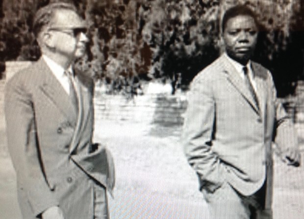
Post-colonial nostalgia. Tshombe, right, with U.N. Envoy Dag Hammarskjold. Tshombe was president of the breakaway Republic of Katanga at the time. Hammerskjold was trying to broker a settlement and prevent a civil war. Hammarskjold was killed in September 1961 when his plane went down near the Congo border. Tshombe’s Katanga lasted into 1963, when federal forces prevailed with the help of the United Nations, the CIA, deployments from Sweden, Canada, Ireland, India, Belgian agents, mining interests, communists, Lumumbists and, and … aren’t those enough behind-the-scenes actors? (On his side, Tshombe deployed officers and soldiers-for-hire from Belgium, Italy and South Africa, with considerable success; much blood was shed; hundreds were killed in the fighting, including civilians.) In 1963 Tshombe abruptly relocated to Spain, only to return in the summer of 1964 to become president of the Republic of the Congo. That lasted a year before Tshombe was dismissed by President Kasavubu. After that Col. Mobutu took over and the democracy game was up.
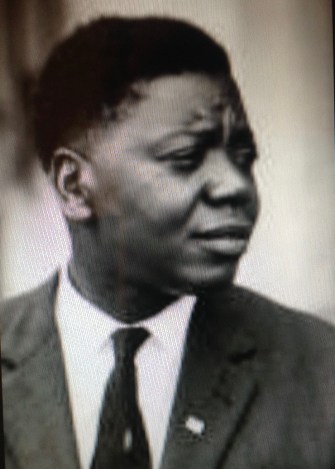
Moise Tshombe was one of Africa’s most promising yet enigmatic figures. Having met him I can attest to his charisma. He was charming, urbane, smart — and apparently, ruthless. How could the man dancing in that conga line in 1964 have stood by and watched as Patrice Lumumba was tortured and executed in 1961? This portrait brings out a brooding side of Tshombe. There’s a bit of Clark Gable there, a little James Cagney, some Ernest Borgnine … Enough! Enough about Tshombe and the conga line. (Oh wait — I think they were doing a line dance called the Madison in that photo; it was all the rage in Leo in 1964 …) Now let’s get back to stamps, shall we?
 Also, you have the honor of displaying the following badge on your blog. Use the below code to display this badge proudly on your blog.”
 1. Here is the first set of stamps issued in what would become the Belgian Congo. They picture King Leopold II of Belgium, and look a lot like Belgian stamps of the period. You can just make out the tiny writing, “Etat Ind du Congo.” That means “independent state of the Congo” — though it was anything but! What it really meant was that King Leopold was “independent” of accountability to his own government or anyone else but God. He ran this vast colony as his private fiefdom. Though he never set foot in the Congo, he micromanaged the place from his palace in Brussels, built a vast and exotic Congo museum complex in his royal gardens. While he mouthed platitudes about Christianity, civic progress, development and moral uplift, he ruthlessly suppressed indigenous populations. He exploited the country’s ivory, rubber and other resources for his own profit. He also issued stamps for his “independent” state. This set of five stamps catalogues at several hundred dollars, largely due to the rare 5 franc value.
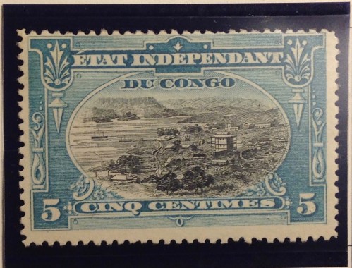 2. The Congo may have been a vassal state of a callous ruler — Joseph Conrad used it as the locus of his haunting novel, “Heart of Darkness” — but King Leopold did manage to put out some pretty stamps. Look at this lovely two-color engraving from the 1890s of the growing town that was to become Leopoldville.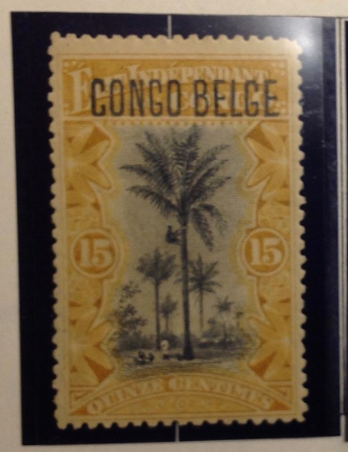
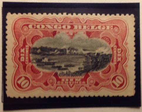
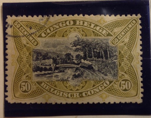 Belgian Congo had to accommodate the proud and vocal — and touchy — Flemish constituency as well. Here is the result. It turned out to be relatively easy to keep the central images of the original set and redesign the borders to make room for “Belgisch Congo” as well as the French name. This charming two-color engraving depicts the railroad from Leo to Matadi, at the time a considerable engineering feat. Alas, the mammoth construction project took its toll in lives, most of them Congolese.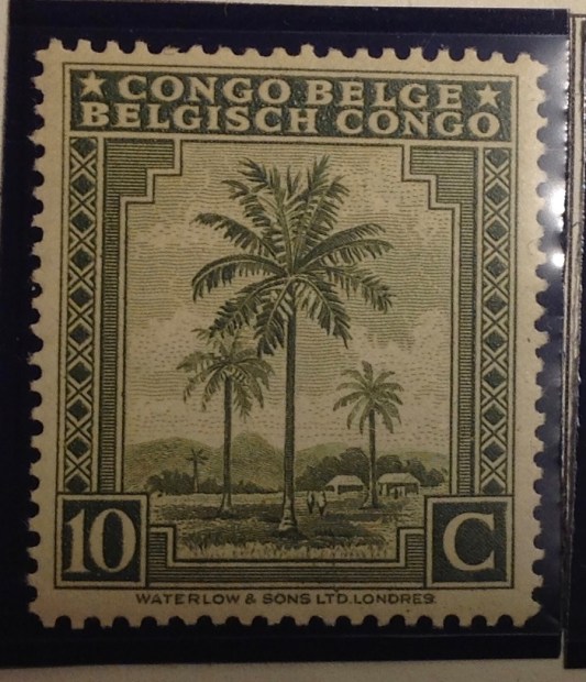

 8. What’s this? A set from 1930s Belgian Congo, overprinted “USA Airmail”? With denominations in U.S. cents? What gives? I wish I had a satisfactory answer for you, but I don’t. Were Americans really a presence in the Belgian Congo? Was this overprint used at the U.S. embassy, or by troops passing through? So far, it remains a mystery to me. Whatever its provenance, the set isn’t expensive to buy.
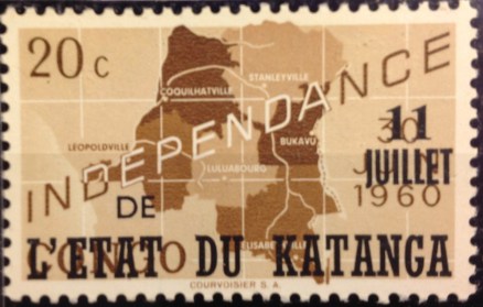 10. This stamp marking the secession of Katanga shows a lot of gall. Not only does it co-opt a stamp from the “mother nation” of the Congo, it blots out that nation’s independence day with its own date, cleverly leaving “1960” uncovered. It also leaves alone the banner “Independance” (inedependence), but obliterates “Congo” with the audacious overprint “de L’Etat du Katanga” (of the state of Katanga). The essential illogic of this stamp, however, is that it depicts the whole nation of Congo and doesn’t even identify the rebel province that is declaring its independence.
 11. Here’s a semi-postal stamp from Katanga picturing the renegade leader, Moise Tshombe (who I once met, by the way, but that’s another story). It features the copper crosses that are emblems Katanga, literal currency at one time, and a key source of the region’s economic well-being, such as it was.
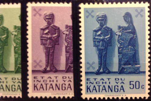 12. This Katanga set seemed quite modern for 1961. The indigenous bas-relief sculpture has primitive charm, though the characters do bear some resemblance to “Mr. Bill,” the hapless, creepy clay figure from early “Saturday Night Live.”
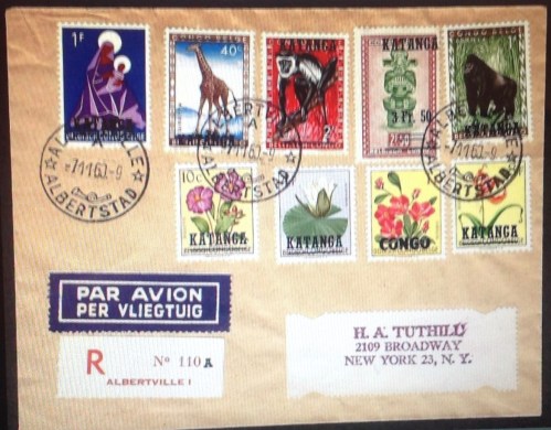 13. I include this cover of Katanga stamps, all of them overprinted Belgian Congo stamps, because I am quite proud to display such a rich sample of postally used examples from a country that only existed for a couple of years. I expect it is worth as much as $20 or more — if you can find a buyer for this obscure stuff.
 14. These 1950s-era definitive stamps from India are familiar enough. But what’s with the “Congo” overprint? Here’s what: During the troubles in Katanga, the United Nations stepped up with peacekeeping troops to try to straighten things out. There also were troops from Sweden, Canada and Ireland, but the Indians seem to be the only ones who issued their own stamps — or rather, their own stamps overprinted “U.N. Force (India) Congo.” Was it national pride? Was there a practical purpose, i.e., to provide the troops with stamps to use on letters home? If so, where are the covers with cancelled copies of these stamps? I’ve never seen one. If they exist, such philatelic oddities must be quite rare and valuable. India also overprinted this set for troops serving the United Nations in Korea (1953), Cambodia, Laos and Vietnam (1950s) and Gaza (1965).
 15. Here is another overprinted set, this one involving the Belgian Congo flowers set of 1952-3. The set became the first issued by the independent nation, which was overprinted “Congo.” Here the same colonial flowers set was used for the breakaway republic of South Kasai, a renegade central province. This was only a half-hearted rebellion — South Kasai never broke relations completely with the central government, and President Albert Kalonji retained his seat in the Congolese parliament.
 16. Here are the rest of the stamps issued by South Kasai, including original designs, i.e., not overprinted Congo stamps. The rebellion petered out in a few months, and Albert Kalonji, (pictured here) the president of the short-lived state, ended up in exile — but alive.
 18. Here is a Congo stamp featuring Patrice Lumumba, the controversial first prime minister of the Democratic Republic of the Congo in 1960. Only the stamp is not from that Congo, but from the “other” Congo — the former French Congo, now the “Popular Republic of the Congo.” Lumumba has never appeared on a stamp from his own country — not a big surprise, since he was assassinated with the acquiescence or connivance of Congolese leaders Joseph Mobutu, Joseph Kasavubu and Moise Tshombe. It was up to other African nations like the neighboring Congo, ruled by Marxists and self-styled Marxists over the years since its own independence, to memorialize the mercurial Lumumba.


 22. Mobutu’s most cynical act was his claim of “authenticity” — that he somehow embodied African values and aspirations. He renamed his country “Zaire,” in ancient tribal tradition, gave himself fancy new titles, and began to sport a walking stick and leopard-skin hat. This Zaire stamp says more than its designers may have intended. It pictures Mobutu contemplating the big diamond — loot! And what kind of guy has himself depicted on a postage stamp wearing sunglasses? Shifty!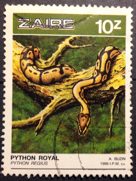
 24. Now for a U-turn back to 1915, folks! Back to World War I, which was being fought in Africa as well as Eurasia. Germany had maintained a colony in east Africa since the 1880s. After hostilities broke out in 1914, it didn’t take long for the English to the north and east, and the Belgians in the west, to overwhelm German East Africa’s forces. They divided the spoils: Britain “took” Tanganyika, and the Belgians moved into what is today Rwanda and Burundi (see maps, above and below). The first stamps from these countries were hand-overprints on the current Belgian Congo pictorial set, like this one. These stamps are quite rare. Mine cost $29.85. It catalogues for much more than that. My scribbled note “authenticated” means the stamp carries the desired mark on the back. (I guess there are counterfeits of this rare set.)

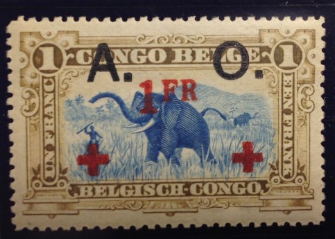
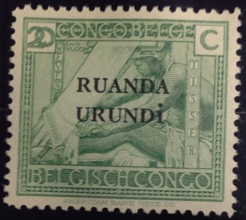 29. The first stamps of Ruanda-Urundi were overprints of a 1920s definitive set from the neighboring Belgian Congo. I suppose it would be a stretch to call them stamps from the Congo, though the name is on them.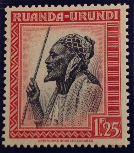


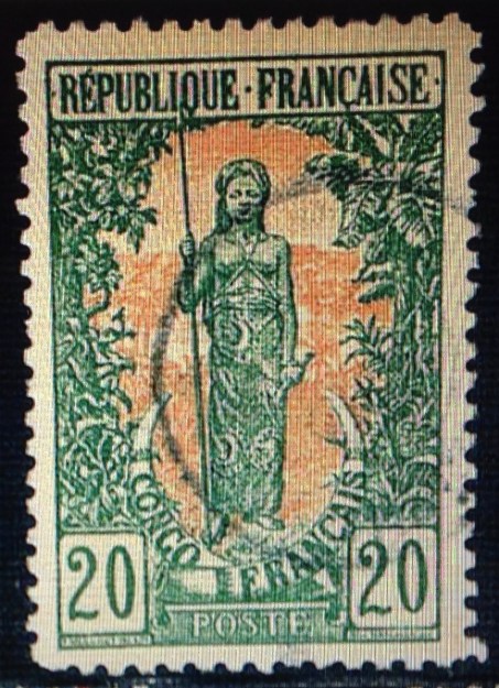

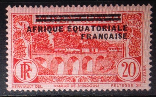 37. Middle Congo eventually took over from French Congo, and the territory issued stamps into the 1930s, when it joined French Equatorial Africa. The first regional issues included this overprint from Middle Congo. Upon reaching independence, a large part of Middle Congo unfortunately was dubbed the republic of the Congo. The fact that there are two Congo republics across the Congo River from each other has created decades of confusion, helping to make this slide show necessary!
 38. Finally, one more “Congo” in this tangled philatelic history. The stamp pictured here was issued in 1914, and represents a colonial territory of Portugal that straddles the western “lip” of the then-Belgian Congo that extends to the south Atlantic ocean. This small “Congo” territory gave the Portuguese access to the Congo river delta. Portugal also controlled Angola, directly to the south of Belgian Congo. (see maps). While the Portuguese only used the name “Congo” until 1915, it kept control of the territory as part of Angola until independence in 1975. Today it is the free Angolan province of Cabinda, still straddling the northern border of the Congo. There is an independence movement in this tiny province. There also are stirrings from others in the region who dream of resurrecting the ancient “Kongo” kingdom. This unlikely development would only happen if land is ceded from four countries that mistrust each other — Angola, both Congos and Gabon. A final reflection: I wonder what the indigeneous population thought when they first saw this stamp back i 1914, which depicts a fierce-looking caucasian (actually the harvest goddess Ceres), wielding what could be a machete …
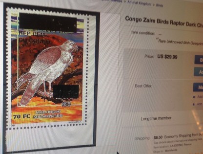 era — “Zaire”: is blotted out with an ugly black rectangle. The country’s name underneath is an almost-indeciperhable “Rep Dem du Congo.” There is a new value, with the old one covered by another black box. A vulture or hawk perches menacingly amid these dark blots. The eBay seller wanted $29.99 for this odd, apparently unlisted stamp, acknowledging that it might be bogus.
 41. So we come to the end of this slide show, with an image of an authentic issue of stamps from the modern-day Democratic Republic of the Congo. Pretty stamps, eh? Don’t be fooled. There’s nothing pretty about the way Congo is being run today. I wish I could say otherwise.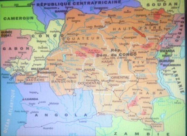
 This thrilling selection of stamps arrived in the mail the other day, in a small flat package from South Africa. The stamps are from 1901, during the last days of the South African Republic (ZAR) based in Pietersburg (Transvaal), where tough, stubborn old Paul Kruger concluded his decades-long conflict with the British and dominance of black Africans. Much blood was shed and misery visited on the people before Kruger’s forces were defeated. Kruger’s strong convictions, military and political leadership
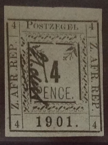
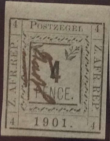
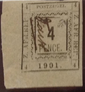

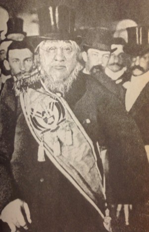
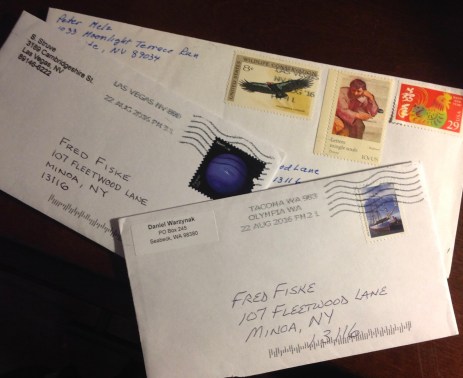
 envelopes. Here is what the contents look like, just as they spilled out. Dealers and experienced collectors know how to protect and ship stamps. It’s not hard. I don’t recall ever receiving a stamp damaged in transit. The only complaint I have is sometimes, a package will include sticky tape in close proximity to a stamp, which to me is a no-no.
 The main event, however, is the handsome 1878-80 Transvaal Victoria set — five values in all, missing only the 1/2d and the 2 shilling. I admit they are not all in great shape. Some are missing perforations, the centering is not great, and one stamp has a thin spot on the back. Yet I still was willing to pay for the set. I mean, think about it: The stamps are nearly 140 years old. They started out being bought at a ZAR/Transvaal post office counter, stuck to an envelope and sent through the mail, involving carriages, trains and sailing ships, possible all three. So what if a couple of them are what is called “space fillers” — that is, they will never have much value because of their flaws. I go back to the emblematic significance of these stamps. They are artifacts from a long-ago time and place of imperial Britain asserting itself over the Boers. For a while, British rule would be fragile and temporary in a state that continued to be bargained for and fought over — as though it actually belonged to either side.
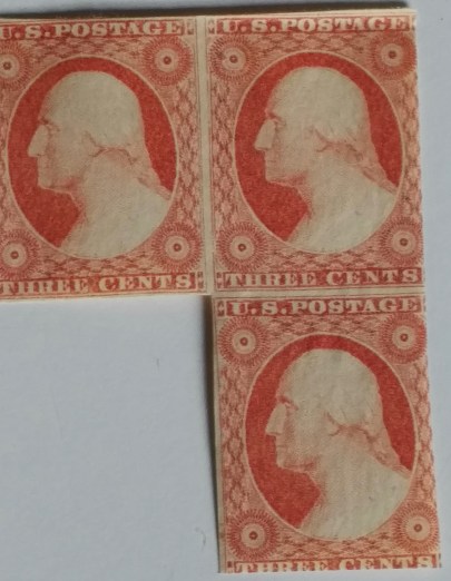 early American stamps — a rare multiple of three of the first three-cent issue (circa 1852), featuring a side profile bust of George Washington. I examined them closely, thrilled to realize they had been sitting in that book for more than 150 years. They were still in pristine condition, as fresh as the day Daniel’s ancestor bought them at a post office for nine cents. Well, he probably bought at least four of them (for 12 cents), cut out one of them, licked the gum on the back and pasted the stamp to a letter, then stored the others for a future use that never arrived..

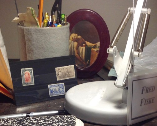
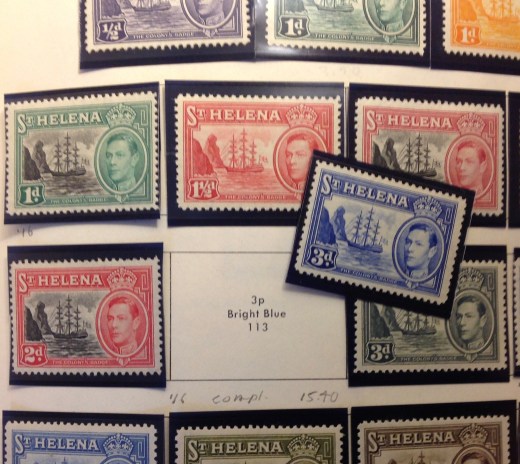 3d. blue from St. Helena, picturing the badge of the colony, completes my long set of the George VI definitives from the 1930s (see illustration).
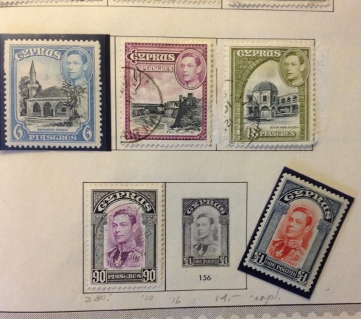 The one-pound stamp from Cyprus completes my George VI set from that country, same era. For a description of the pleasure that awaits in adding these two stamps to complete the sets on the pages of my British Africa and British America albums, please refer to a post in January 2017 on the joys of “filling spaces.”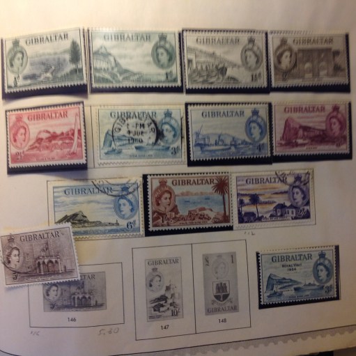
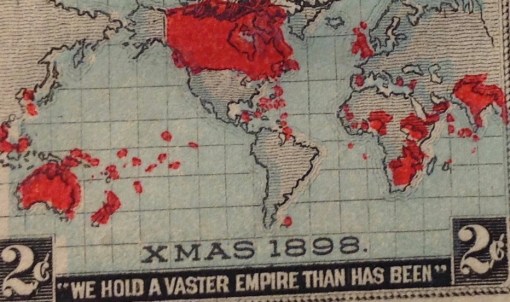 ia and across the Pacific.
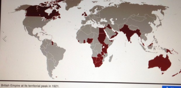
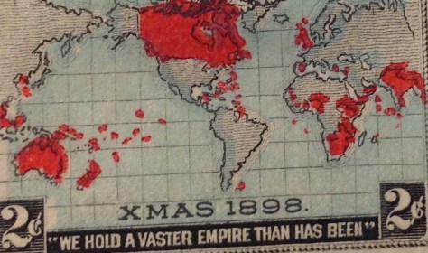 The statistical apex of territorial claims in the British Empire actually would not come until 1921. At that time, the empire had influence over 33.7 million square kilometers. Half of the globe’s dry land was “theirs in fee.” The empire’s population of more than 458 million souls constituted one-fifth of the Earth’s people.
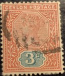
 Pictured here is an example of the stamps that were in circulation in 1897 or thereabouts, issued for use in far-flung precincts of the British Empire, all bearing a likeness of Queen Victoria. As you observe the similarities and subtle differences in the portraits and borders, explored in the next commentary, you can get a sense of how these stamps helped to draw together the British Empire; how they created an identity, a self-image, sustaining a unity of purpose, a commitment to stability and civic order, even pride in being part of this global enterprise. As you contemplate this mosaic of empire reflecting the image of an aging queen, consider these lines from Sir William Morris’s ode: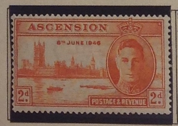
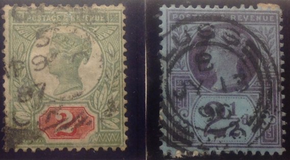 Great Britain was the seat of empire, and GB never had to put its name on its stamps — because it was first, in 1840. (Can you believe it?) This set — the Queen Victoria Jubilee Issue — was released in 1887, with added values in later years. It set the standard for issues in colonies around the world. I include two stamps from the set,with considerable variations — if you can make them out under the heavy cancels. I particularly like the royal purple of the 2 1/2 d.

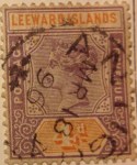


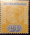


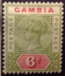



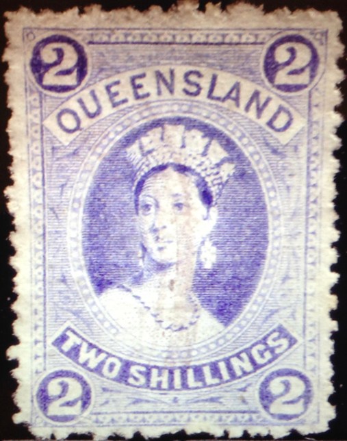
 Early Victorian stamp design similarities — 1850s-1860s. Most British stamps from Victorian era originated with the cameo portrait of Princess Victoria created by William Wyon in 1834, pictured here. That image appeared on a medal commemorating the new queen’s visit to London in 1837. It also became the basis for the world’s first stamp — the “Penny Black” of 1840 (see below). The stamp’s designer, Sir Rowland Hill, picked the rough sketch by Henry Corbould (I’m still looking for that sketch), and engravers Charles Heath and his son Frederick
 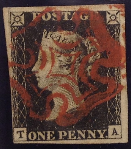 produced the stamp. The image, subject to minor revision over the years, and illustrated by the early stamps pictured below, would remain in continuous use in successive sets issued in Great Britain and the empire until Victoria’s death in 1901.





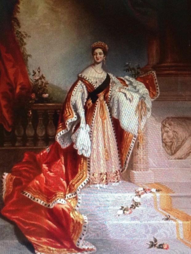
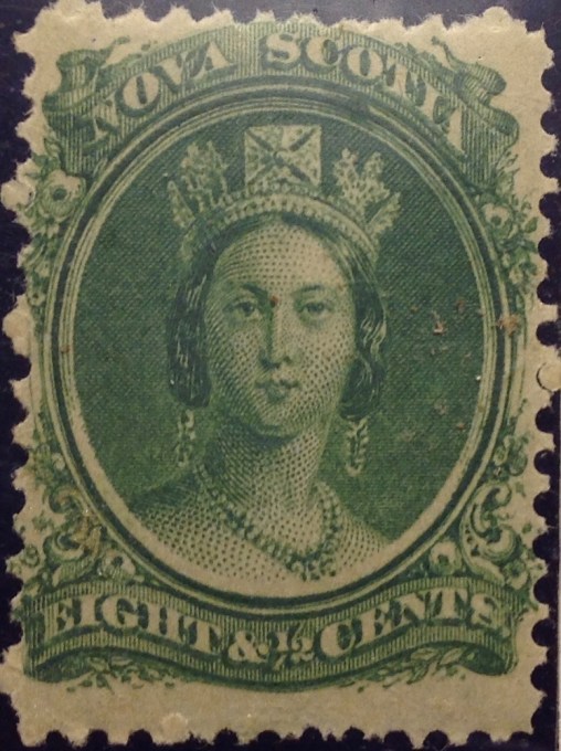 Take a second look at the portrait in the Nova Scotia stamp, at right — the green 8 and 1/2-center from 1860 (value: a few bucks at most). On double-take, it’s clearly not based on the Chalon head. My bet is on the Winterhalter portrait of 1859, reproduced below.
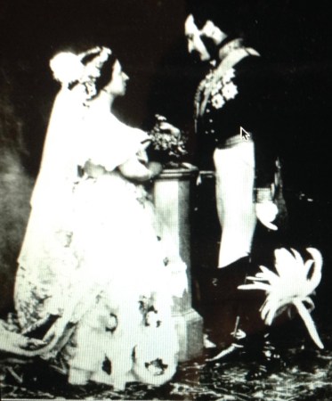 Reality check: Here is an apparent photo-like record of the marriage of Victoria and Albert in London, Feb. 10, 1840. The close-up below is strikingly immediate, bringing you face to face with an intimate moment more than a century-and-a-half ago. … Queen Victoria looks, well, short and dumpy. She has a big nose and a receding chin. She is, well, homely. Perhaps such realistic depictions don’t do her justice. Or perhaps the engraver’s art is, well, artful. There is no mistaking her resolve in this image as she gazes at her prince. They were by all accounts a happy couple, in love and devoted to each other for the 21 years allotted them before Albert succumbed to stomach ailments and
  typhoid fever. They had nine children. Victoria would continue on as queen until her death in 1901, becoming the longest-reigning British monarch in modern history — that is, until her great-great-grandaughter Elizabeth broke her record in 2015.








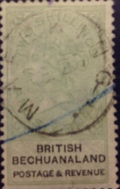
 were another matter. From early on, black Africans collaborated, conspired and clashed with whites, the same as would one tribe with another. Particularly vivid are stories of the sometimes nuanced relations between Boer and Zulu leaders in the 1880s and 1890s. The turn of the century brought to full flower the Boer War with the British. The pitched battles were appalling in the loss of life and limb. In comparison, the tangle of philatelic history involved will be a pleasure to try and unravel.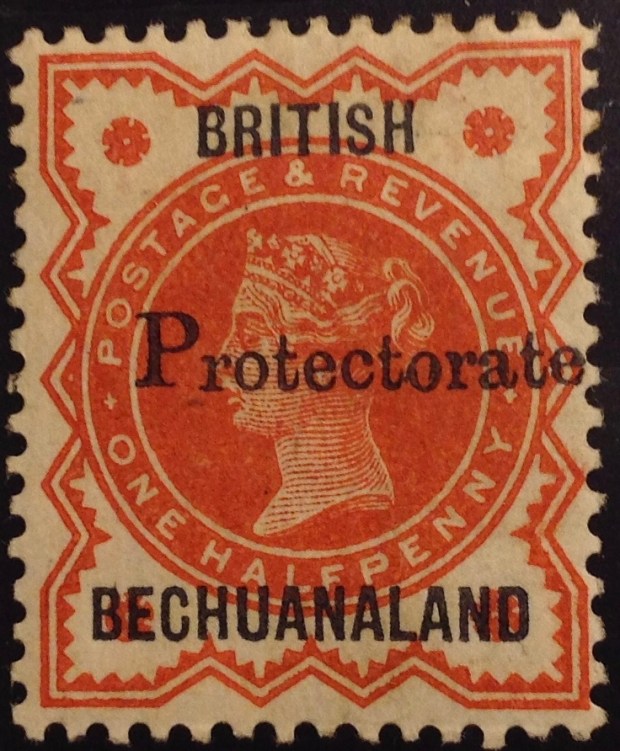



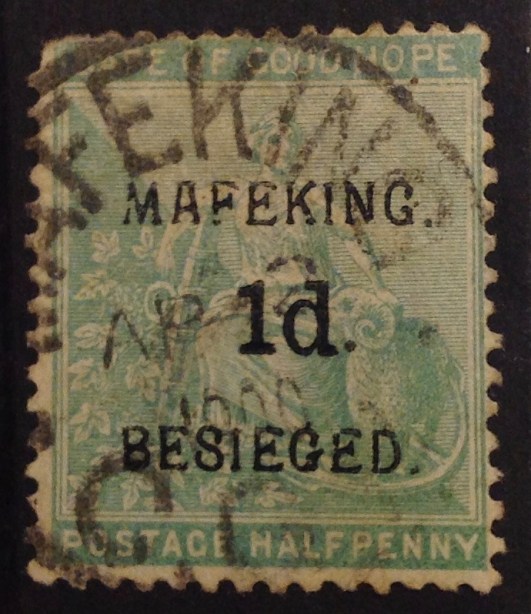


 Here are some stamps from countries I will be skipping over — like British East Africa, a “country” that first ran like a concessionary stand for imperial adventurers, developers, entrepreneurs and looters under the British. (“Light and Liberty”? Don’t make me cry …)
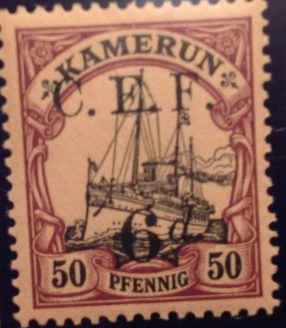 Here is a stamp from German “Kamerun,” occupied by Great Britain after World War I. The French took over much of Cameroon, in west Africa, though British influence remained. As the region was going independent in 1960s, the UK issued a set of stamps — Nigerian definitives, overprinted — for use in the Anglophone trust territories (UKTT) until their final disposition could be decided. The Scott catalogue explains what happened next: “Nos. 66-77 were withdrawn in Northern Cameroons on May 31, 1961, when that territory joined Nigeria and in Southern Cameroons Sept. 30, 1961, when that territory joined the Cameroon Federal Republic.”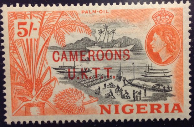
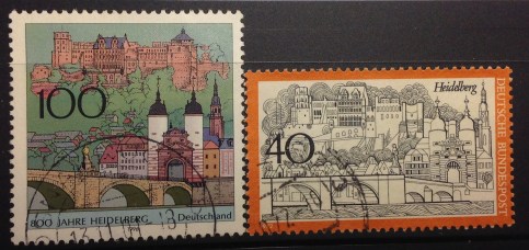 ental stone facades, towers and ruins — the latter untouched since the ravages of the Franco-Palatine wars and lightning strikes hundreds of years earlier. My twin sister Anne and I, just turned 14, were completely bilingual by this time. (Indeed, I recently had ranked second in my class — in German!) I must have been indistinguishable from the locals with my blond hair, accentless German and shiny black Lederhosen. Every morning we would head off by bicycle or Strassenbahn to the Englische Institut, a German-language school where we had advanced through the classes, from Quinta or Quarta, Unterterzia and Oberterzia to Untersekunda, the rough equivalent of eighth grade. After school we would make the return trip, mount the hill past Heidelberg University and climb the 76 steps to home. When we first arrived, I was disappointed not to be attending the American school attached to the massive U.S. military installations in Heidelberg, and missing out on life in the suburban precincts of Mark Twin Village and, a little further out of town, Patrick Henry Village. By this time, however, I was pretty well assimilated. I enjoyed friendships with German and American kids, played Little League baseball, went to the PX for American movies. I was pretty comfortable in two worlds.
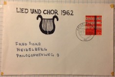 collector-friend Jurgen lived in Leimen, a nearby village. He picked up my practice of improvising these first days covers, and kept sending me samples for more than a year after I left town. Now that’s philatelic friendship!)
 ction of stamps, purchased at face value, which obliging postal authorities would send back to me, sometimes in envelopes embellished with a variety of current issues. Some of these stamps have increased nicely in value. (One example: the 1953 Queen Elizabeth II definitive set from Ascension, which cost me less than $5, now has a catalog value of $150+.)
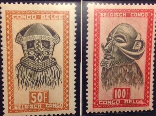
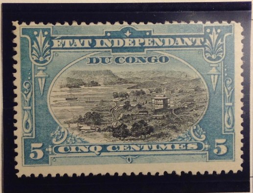 the Belgian Congo in the middle years — 1920s to 1950s. The “mask” set of 1948 was striking, and quite common, so a few of them may have found their way into my collection. I certainly didn’t consider the Congo a specialty, like British Colonies. As it turned out, early Congo stamps were quite advanced. The 1894 multicolor definitives from the Congo Free State were exquisite engravings of local scenes, printed in black within exotic ornamental borders in different colors. Some stamps in this early set are quite affordable, and subsequent sets that used the same designs are cheap and easily available, both cancelled and mint. (It’s remarkable to think there was so much letter traffic from the Congo so long ago …) Other early Congo stamps, and others later on, are valuable. Little did I know that when I traveled to the Congo in the fall of 1962, I would be launching a philatelic expedition that now, a half-century later, has produced a nearly complete collection of stamps from the Congo. That means starting with Belgian King Leopold’s Congo Free state in 1889, then the Belgian Congo beginning in 1908, continuing past Independence Day June 30, 1960. (Indeed, as I write this, I am awaiting impatiently delivery of a key stamp filling one of my few gaps — the 50f stamp of the flower series of 1953, which I found at the Stamps to Go online store for $7.50) I am certain this collection is very valuable — worth thousands, I expect. The first set alone
 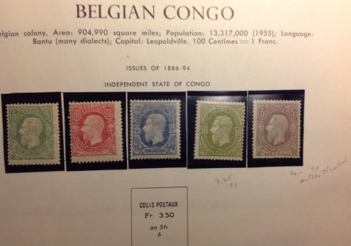 (pictured here) is worth hundreds. (I have it complete.) I am missing a few stamps here and there — like the first parcel post stamp in 1887 (catalog value: $400+; note empty space on page). However, less than a handful are missing of the more than 400 stamps issued by the colonial administration. This collection is indeed superb, and I can’t wait to tell you more about it. First, however, a word or more of historical context.
 lic challenge. Since Belgium itself was bilingual — French and Flemish — the same duality would have to be reflected somehow on the stamps of its new overseas territory. French was the only language used on stamps from Leopold’s suzerainty. Now all stamps from the colony had to accommodate both languages of its new colonial masters. This awkward design requirement has been shared by other bilingual stamp-issuing nati
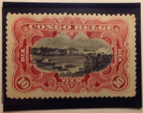 Flamands! A year later, in 1909, the colony got the first set of its own — a four-stamp group that incorporated the earlier designs with the French only inscriptions. Flemish Brussels must have been in a tizzy. (Gott in Himmel! Will these pesky Walloons never show us proper respect? Congo is every bit as much ours as theirs!) Finally, in 1910, the first bilingual stamps began trickling out. The clever designers used the same engraved scenes from the 1890s — of the port city of Matadi, the Congo river at Stanley Falls, a river
  steamer, hunting elephants and others. Most remarkable is a rendering of a smoke-belching engine towing cars across the M’pozo River on an elevated bridge. Remember, this design dates to the 1890s. Building the Matadi-Leopoldville railroad through the Congo was a mammoth undertaking that displayed Leopold’s relentlessness. While his stamp designers celebrated this engineering triumph, little was said about the terrible toll of this arduous railway construction project. It took three years to advance the first 14 miles, and many more years to reach Stanley Pool. Some 132 Belgian professionals and other Europeans fell victim to accidents and pestilence. But most of the victims — at least 1,800 in the first two years alone — were the poor Congolese, toiling and dying as vassals to their “roi souverain.” The new stamps bore alternating titles, “Congo Belge” first, “Belgisch Congo” second, and bilingual references to “centimes” or “centiemen,” “francs” or “franken.” (This set remained in circulation for many years, in many permutations, as we shall see.)
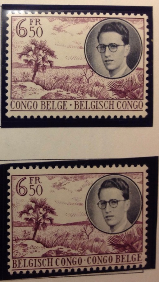
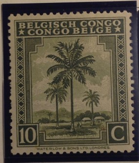 bilingually speaking. The colony issued two identical sets of definitive stamps: one set listed “Congo Belge,” abov
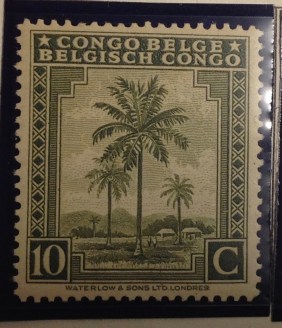 e “Belgisch Congo,” the other reversed the order. (Both sets are valued the same in catalogs; philately did not take sides in this bilingual balancing act.) In the 1950s, a two-set issue of four stamps did the same thing: one set was inscribed French
 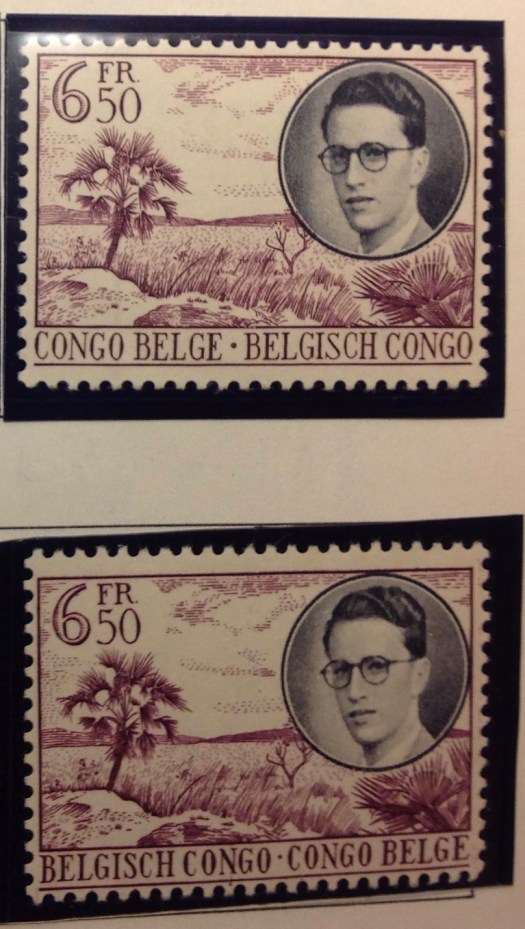 first, the other Flemish first. Take your pick. In this case, no two stamps in either set are valued the same, but I can’t discern any favoritism of one language over another. And that is about as far into the philatelic weeds as we need to go on that subject, wouldn’t you agree?
