 One of the sustaining narratives of stamp-collecting is the story of the Mystery Box — a philatelic hoard left in the attic by some collecting ancestor. When someone who knows about stamps — like me! — discovers the box and looks inside, behold! There lies a trove of rarities.
I almost called it a sustaining myth of the Mystery Box in that first sentence. There are indeed true stories of such scenarios unfolding. (See. for example, “No. 10 or No. 11?” posted 3/15/17.) However, they are rare. I have been offered numerous so-called philatelic hoards over the years, and after inspecting a few have concluded that there is mostly dross and seldom gold. These “troves” tend to be filled with common American and foreign stamps of the last 50 to 75 years. Even the uncanceled (“mint”) stamps usually are worth no more than the few cents paid for them back in the 1940s, ‘50s and ‘60s. This deflating information, however, has not reached the non-collectors who still harbor the fond fantasy that there may be some stamps of great value hiding in that dusty box. So friends and loved ones who know of my philatelic bent thrust their “finds” on me. “Hey Fred, take a look at these stamps and tell me what they’re worth!” … “Some of these have got to be really old!” … “No one has looked at these for decades. They must be worth something after all this time!” Don’t they realize how easy it is to find your way to a stamp catalogue or an online site and figure out the value of your stamps? Well, maybe not that easy …
My friend Renee conferred on me her late mother’s collection — which included some early British colonies stamps, some in so-so-shape, of no more than modest value. I added the few I didn’t already have to my albums, with an appropriate notation. My friend Vicki laid a box of stamps on me, inherited from her parents. There were stamps from — where? Oh, say, some Portugueses colonies, Holland, Formosa and all over the lot, in addition to lots of low-value U.S. stamps. I admit the collection’s significance eluded my grasp. I’m trying to remember if I persuaded my colleagues at the Syracuse Stamp Club to take a look. Some club members volunteer to evaluate donated collections. When I last opened the trunk of my car the other day, I found a box of stamps donated by some friend or other — overturned, with a few stock pages spilling out of a bag and cheap stamps strewn about. Clearly, I am not the guy to be evaluating donated collections!
What the forgoing also means is that the short tale I want to share with you now is not likely to have a very exciting end. The Mystery Box has been sitting over there in  the corner of my office since February, and it’s now July. It is almost obscured from view by diverse paraphernalia “stored” on top of it. You can just make out corners, and part of a mailing label.
The box is from my Cousin Gordon. He is not a stamp collector. His mother, my late Aunt Eleanor, was a world traveler over half-a-century, and accumulated masses of stamps along the way. Among other things, she specialized in United Nations issues. Years ago — perhaps it was soon after her death — Eleanor’s daughter Margaret sent me her mother’s collection of U.N. postal stationary. I thought it unusual enough to make inquiries at the Cardinal Spellman Museum of Stamps and Postal History in Weston, near Boston. It seems the Spellman specializes in U.N. issues — so much so that the curator welcomed our donation of Aunt Eleanor’s postal stationary collection. I had fun making an appointment, visiting the museum and handing over the goods. (I think I told Cousin Margaret to take a $300 tax deduction for it.)
I recall also seeing elsewhere (at Margaret’s, perhaps?) more envelopes from Aunt Eleanor’s collection; envelopes stuffed with stamps and envelopes from all over the world — great bulky, dusty packets. Could any of those be worth something? Any gold amid the dust? And what has become of them, anyway?
This summer I was visiting my Cousin Alison (Eleanor’s other daughter) at her house and she brought out her mother’s album of plate blocks — page after page of those mid-century U.S. stamps that just don’t ever seem to be worth much more than to use for postage. Could some of those plate blocks be more valuable than others? Sure. Wanna check?
After I left Alison’s, she told me she had forgotten to show me the rest of Aunt Eleanor’s collection. The rest? Does it really go on and on? Were there philatelic nuggets after all? More to the point, could there be gold in the Mystery Box, sitting over there in the corner?
Why have I waited so long to open the Mystery Box? So long, in fact, that I decided Cousin Gordon and his wife Grethe deserved a note of explanation, if not apology: Dear Gordon and Grethe — Chris and I are about to leave on a long driving trip, and I still haven’t opened the box you sent me with Aunt Eleanor’s stamps. Forgive me. The reason is that I am afraid I will not be able to report back that there is much of value in the box. That will be disappointing, so I guess I am trying to put off the inevitable. Nevertheless, I vow to look inside after we get back home. Love, FMF (I think that’s the gist of the note I would have written, though I can’t seem to find a copy of it in my “send” file …)
Now here it is, well into July. Chris and I have finished our trip (it was great!), and I am about to remove the pile of debris from the top of the box and take a closer look. Brace yourselves … The first thing I notice as I observe the box is that Cousin Gordon used a mailing label for postage instead of stamps. The cost was $7.01. Tsk! He could have slapped a $5 stamp, $2 stamp and 1-cent stamp on there. That would have been more fun, not to mention appropriate, given the philatelic contents of the box.
Next I noticed that the box is rather heavy. There is more than a bag of loose stamps in there. Possibly covers, perhaps albums. Perhaps — who knows what?
 Well, here goes …

(three hours later)
OK, I’ve been through it — given it my best. As I believe I made clear before, I am not a very careful evaluator — though I do think I can spot value when I see it. Now I’ve been through the Mystery Box, and while I would be hard pressed to put a value on its contents (a couple of hundreds? Maybe more?), I’d like to share some observations about it.

Here is a typical selection from one envelope in the box — U.N. stamps, first day covers, and assorted stamps from around the world honoring the U.N.
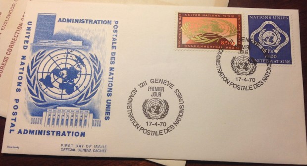
As expected, the material focuses on United Nations stamps and covers. I thought there might be some international stamps, and I’ll say more about that in a minute. These issues ranged from the 1960s to 1970s, with an emphasis on “universal” observances — like the 20th anniversary of the U.N. in 1965, the 20th anniversary of the Universal Declaration of Human Rights (1968), and the 100th anniversary of the Universal Postal Union (1974). Working through a dealer in her home town, Aunt Eleanor arranged to receive a steady stream of packets containing not only the latest U.N. stamps,
souvenir sheets and first-day covers, but also new issues from around the world marking the U.N.’s 20th, the Universal Declaration’s 20th and so on. The envelopes  were neatly packaged and stacked in the no-longer-a-mystery box. Each envelope was inscribed in black ink with a neat hand, listing the contents and the prices, usually totaling less than $20. (Cousin Margaret says the dealer was a neighbor of Aunt Eleanor’s — “… a displaced person living in a furnished room a few blocks away. Mother thought that he derived a little much-needed income from his small dealings in stamps.” Margaret continued: “I am convinced that she liked giving him a cup of tea and kind of checking up on how he was doing. Alison and I were a little afraid of him as he had a gruff manner and a thick accent.”) Inside the envelopes were arrays of artfully designed first-day covers, cards, explanatory materials, booklets and souvenir sheets as well as regular issues from U.N. headquarters in New York City, and U.N. offices in Geneva, Switzerland.
All the stamps and sheets were still in their glassine envelopes and mailing covers — in pristine condition, I hoped, apparently untouched since the 1960s and 1970s. I felt obliged as a cousin/evaluator to check if the stamps were indeed in good condition. Alas, a few of the mint, never-hinged stamps had stuck together and were ruined. Most of the others were OK, though. As I sorted idly through the stamps from all over, I was struck by some of the ironies — like Laos celebrating human rights in  1968, just as that hapless nation was being engulfed in the U.S.-led war in southeast Asia. Examining the stamps from Nicaragua, China, Yemen, Bulgaria and elsewhere, I reflected on how many regimes failed to live up to tenets of the United Nations.

These stamps honoring the U.N.’s 25th anniversary come from communist Czechoslovakia, Peru, Kuwait, Pakistan and elsewhere. Not all nations paying tribute in these “universal” stamp issues had regimes that respected U.N. principles.
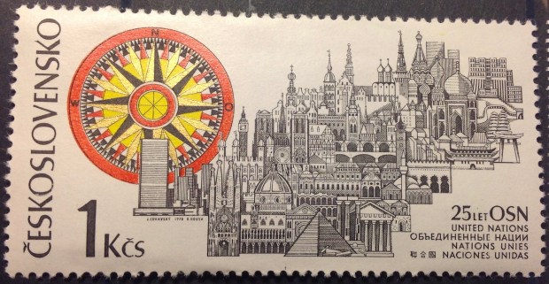
OK OK, Czechoslovakia was a communist state in 1970, two years after Czech authorities brutally reacted to Prague Spring. But their artists sure knew how to design pretty stamps. I must include a closeup of this gorgeous engraving, which superimposes a cityscape of world landmarks next to the U.N. skyline in New York City. While I’ve never made a point of collecting Czech stamps, I have accumulated enough examples to appreciate the fine work of Czech stamp makers.
As the number of stamps I examined accumulated into dozens, then scores, I began to see something else. Yes, nations like Pakistan and Jamaica may have their shortcomings. Some of these stamps professing high principles may be dismissed as lip service (lick service?) rather than real commitment. Think of it this way, though: These are universal aspirations, not necessarily accomplishments. The Declaration of Rights is worth defending, worth promoting, worth every effort you can manage. However, it is not up to you alone to make its principles a universal reality. Nor is it up to a Jamaican, a Pakistani, an Iranian or Jordanian. That recognition doesn’t make the principles any less worthy. And expressing those principles is never a bad idea.

Among the wittiest stamp issues marking the centenary of the Universal Postal union in 1974 is this oversize set — beautifully engraved and gorgeously colored portraits of a seagull with a letter clasped in its beak. (I still don’t know exactly where this French oceanic territory is located … I suppose I should go look it up … I do know that this tiny island group has issued gorgeous stamps over the years — oversize, engraved, brightly colored renditions of nautical subjects. Many of the stamps are rather dear — this pair, for example is selling online for a respectable $8.)
Sorting through the stamps marking the centenary of the UPU, I was impressed by what an accomplishment the postal union has been. Since 1874, the nations of the world have sustained an agreement on rules and terms for handling mail and other correspondence between countries. Considering the various bouts of unpleasantness in those intervening years, it’s a blooming miracle the UPU survived!
I expect Aunt Eleanor would enjoy reading all this if she could — and join the conversation. Like her mother (my grandmother), she was an ardent fan of the U.N, its declarations and principles and aspirations. My aunt and uncle lived up to those principles in the international development work and other efforts they undertook during their busy lives. I suppose her stamp collecting was as much an affirmation of the value she placed in the U.N. as it was a hobby.

Eek! Look what I found when I opened a dusty folder of stamp material in Aunt Eleanor’s collection. What is that stuff? It looks like paper or cardboard that some big worm has chewed up. You don’t suppose it’s alive …?
Truth be told, Aunt Eleanor had some shortcomings as a stamp collector, at least in these decades. Leaving uncanceled stamps in their envelopes, lying flat in a box, may seem prudent and safe, but it’s not a good way to store stamps. Over changing seasons, they may compress and stick together.
To be sure, the debilitating stroke my dear aunt suffered, which shadowed her last years, limited her ability to enjoy her stamps later on. (Says Cousin Gordon: “If she had not had the stroke she would undoubtedly have done a  great deal of organizing and perhaps unstuck many of the items that became neglected, due not so much to her but by us who inherited them.”) Included in the box are two supplements of White Ace Album pages, one to update U.N. issues, the second to accommodate stamps from around the world honoring the UPU in 1974. I wonder if she was frustrated not to be able to add those pages to her U.N. album, then fill them with the stamps sent to her in all those little envelopes? Once safely mounted, they never come to harm, and

- This is catnip for collectors: An illustrated album page, and stamps to fill every space; go to it!
can be enjoyed any time. The attractive presentation adds a premium to the value of the collection.
And speaking of value … how about it? Is it really worth the time and effort to sort through all those stamps, figure out where they go on the album pages, get the mounting strips, cut and paste … ?
Hey! This is stamp collecting we’re talking about. Of course it’s worth the effort. United Nations stamps may not be at the top of the must-have market at the moment (if they ever were), but they still are interesting in the way they express and reflect aspirations for a better world. They celebrate universal human accomplishments in the war against disease, in forming international agreements to limit chemical weapons, deter nuclear proliferation, improve the environment and

This charming UN/Geneva stamp and first-day cancel expresses a splendid aspiration — to live in peace with one another.
promote the welfare of children. The designs are elegant and creative, some dignified, some light-hearted, many colorful. There are declarations and exhortations, striking images and attractive sets. At the end, I found my time with these U.N. stamps uplifting. This collection isn’t going to make anyone rich. And I know it’s not in fashion to get starry-eyed about the United Nations. But it is rewarding to review this rich chronicle of human hope and potential. Aunt Eleanor has assembled an authentic philatelic narrative, expressing her own convictions through the stamps of this unique organization, one that represents all the world’s nations, united since 1945 in a high mission.
Postscript: … all of which leaves me wondering: should I be collecting U.N. stamps along with everything else, if just to show solidarity with the world body — and Aunt Eleanor? Uh, no. I already am way too far into what I am already collecting to take on much else. Besides, I anticipate the Spellman Museum will be glad to make a home for this new installment of my aunt’s collection. (If so, I suggest Cousin Gordon take at least a $400 tax deduction for this charitable contribution in honor of his mom.)
MORE IMAGES AND NOTES FOLLOW
This may be one of the better first day covers in Aunt Eleanor’s collection. It includes the high-value, 10-franc definitive from UN/Geneva.
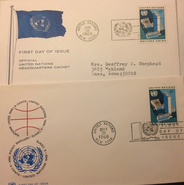
This illustration bears out the famous old adage. Beware of wolves in first-day-cover clothing. Look at these two covers; one is dated May 31, 1968, the other June 18, 1969. They both claim to be FDCs, and they both carry the same 6-cent definitive stamp. How could the dates in the “first day” cancels be more than a year apart? Stay with me on this for a moment. Examine the two envelopes. Notice that the lower envelope with the earlier date includes in the official cancellation the words: “FIRST DAY OF ISSUE,” On the upper envelope, the cover claims “FIRST DAY OF ISSUE,” but only in the design cachet. The cancellation itself does not contain the affirming words. Thus I conclude the lower cover is genuine, while the other makes a spurious claim! (The correct date of issue — May 31, 1968 — is confirmed in a handy-dandy official guide, “Postal Issues of the United Nations, 1951-1974,” included in the box.)
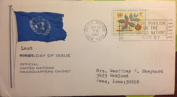
This cover caught my attention because of the odd “correction” in the cachet. In the heading, “FIRST DAY OF ISSUE,” the word “FIRST” is crossed out and the word “LAST” is typed above it. Last day of issue? I didn’t even know there was such a collecting category as Last Day Covers. For starters, how do you figure it out? Next, who even cares? But wait! It so happens that Aunt Eleanor’s official listing of U.N. stamps includes the final date for each stamp withdrawn from circulation. So that should answer the first question at least. Let me look up that issue, which celebrates a coffee trade agreement … There it is: “Coffee Agreement, 11 cents. Issue date — Dec. 2, 1966. Now to follow the column across to the “Last Day of Sale” — Nov. 30, 1967. What?! The date on the cover’s cancellation is Oct. 27, 1967. That blooming stamp was on sale for more than a month after what the cover asserts is the last day of issue. Spurious! A corollary to the earlier adage suggests itself: Beware of wolves in last-day-cover clothing. All my philatelic sleuthing, however, couldn’t come up with a plausible answer to the second question about Last Day Covers: Who even cares?

I was touched by this issue from the west African nation of Togo in 1965, marking the U.N.’s 20th anniversary. It look the occasion to pay tribute to Adlai Stevenson (see inset portrait). Stevenson, the former Illinois governor, presidential candidate (1952, 1956) and U.N. ambassador, died suddenly while walking down a London street. I admired Stevenson, as did my parents, and I mourned his loss. Why Togo in particular chose to honor him I don’t know. Surely there is a story involved …

A little offbeat: Here’s a first day cover of an aerogramme. Remember those?
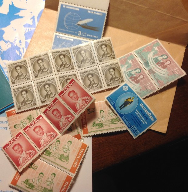
This is about the only non-U.N.-related stamp material in the box. I include it not because it has any value — the stamps are common enough issues of Thailand, the kind that were readily available at the local post office in the 1960s. A good many of them are stuck together. But it is a great memento of Aunt Eleanor and Uncle Geoff: a haphazard clutch of stamps they bought, stuffed in an envelope, then stored and forgot. This philatelic artifact connects me to a time when my aunt and uncle were doing vital work abroad that, like the United Nations, aimed to make this a better world.
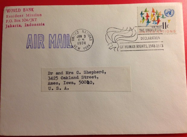
This envelope is interesting chiefly because of the return address. Was it really sent from Indonesia, using a U.N. stamp? Was it carried by diplomatic or official pouch from Jakarta to New York City, where it received the U.N. cancel and continued on its way? My understanding is that U.N. stamps are only valid for postage on mail posted at a U.N. facility. Indeed, I believe that restriction is one reason canceled U.N. stamps have kept some catalogue value — because relatively few of them are ever used on actual letters or packages. A footnote on U.N. stamp values in general: Most U.N. issues are quite inexpensive, even those dating back to the first definitive set in 1951. A few stamps from the early years have spiked in value — a souvenir sheet from 1955 commemorating the 10th anniversary of the U.N. charter is selling on eBay for up to $100! In general, however, U.N. stamps are valued in cents rather than dollars, often selling below “face” value. For example, you can purchase a mint, never-hinged copy of the $1 definitive from 1951 for 65 cents. This devaluation may have something to do with the fact that the U.N. is not a “nation,” so some collectors are not comfortable accepting the stamps as legitimate collectables. But no — wouldn’t some collectors single them out as desirable and unusual for that very reason? I think it more likely that many stamp collectors share a general mistrust of the U.N. — whether it’s the radical right-wingers who shudder at the thought of “world government,” or those disillusioned by the inability of this world body, with its bickering ambassadors and pampered international civil servants, to keep the world safe.
 Among the lots I bought were two from the “nation” of Bavaria, now a province in southern Germany. I don’t know that much about this “country,” or what business it had being a stamp-issuing state from 1849 to 1920. The Scott catalogue tells us Bavaria, or Bayern, became part of the German confederation in 1870, and declared itself a republic after World War I, only to lose its postal autonomy on March 31, 1920.
 For a collector of stamps from British Colonies, the U.S. and a magpie’s clutch of other countries — but not really Bavaria — this new trove offered a diverting little side-trip. The early sets featured large numerals, then an embossed coat of arms.
 Just before World War I came a long set with profile portraits of “Prince Regent Luitpold.” Ever heard of him? How about “King Ludwig III,” whose short-lived reign began in 1914?
 Later, Bavarian stamps were overprinted “Volksstaat Bayern,” then “Freistadt Bayern.” Sounds like the Bavarians were having trouble deciding what to call themselves. The matter was resolved in 1920 with overprints stating, “Deutsches Reich.” The Scott catalogue notes that the Bavarian stamps overprinted by the reich were postally valid throughout Germany, “but were used almost exclusively in Bavaria.” Hmm. Is that interesting or not? I maintain stamp collecting is full of interesting historical tidbits — some perhaps more interesting than others.
 Before wandering off, let’s have a look at those colorful stamps as they arrange themselves into sets.
 And to top it off, how about the oversize portrait of a jaunty Prince Regent Luitpold, sporting a Tyrolean cap? And check out the gorgeously gaudy Art Nouveau tribute to the old prince to celebrate his remarkable 50-year Silver Jubilee in 1911 — which seemed like an auspicious year in Bavaria, until you remember that in three years, World War I would toss everything into a cocked Tyrolean hat.
 I wish I could say the same for the African leaders who came to prominence in the days, months and years after independence, beginning in 1957. In Part One of this commentary, I embarked on a journey seeking at least one honest man who took office in a newly sovereign sub-Saharan African nation. I did find Barthelemy Boganda, who died in mysterious circumstances a year after becoming the first president of the Central African Republic, and therefore didn’t have much chance to demonstrate his abilities. Beyond that dubious what-if, I was unable to find that honest man in my rundown of post-independence heads of state. Instead, I encountered a rogues gallery of characters, many of whom showed great promise during the final years of colonial rule, but all of whom eventually betrayed their trust, squandered their opportunities and their integrity.
 When this guy took over, the former British colony of Sierra Leone in west Africa still aspired to post-independence prosperity. Stevens gave it a try, but soon succumbed to corruption and repression. It may be superficial of me to be so influenced by appearances, but really, take a look at these stamps. Does the portrait do President Stevens justice? He is dressed respectably enough in traditional Muslim garb. But notice how he appears to be looking to the left. The result is cartoon-like — a plump-jowled, shifty-eyed smirk that does not belong on a stamp, or a campaign poster. Check photo images of the man online, and you’ll find a good-looking guy — a lot more respectable-looking than this. Actually, the stamp proves more revealing than not. For Stevens was a shifty character, all right, during his 18 years of rule — and misrule. After a very few productive years, his regime gave way to venality, paranoia and brutality. He executed former allies as traitors, but managed to retire in one piece himself. Stevens died in 1988, age 82.
 Milton Margai, was a moderate democrat who worked hard to bring all sides together and get things done for his people. He did not seem to crave money or power. Educated as a doctor in Sierra Leone and England, he ran an in-country dispensary for many years, delivering babies and developing effective child care and literacy networks. He rose steadily under colonial administration, then moved smoothly into the presidency. His death in 1964, at age 68, left a lingering “what if …” asterisk in Sierra Leone’s history. The New York Times observed at the time that Sir Milton, who had been knighted by King George VI in 1950, was “the mildest and most unexpected nationalist leader Africa has produced.”
 The Most Rev. Samuel Ajayi Crowther, the man honored on this stamp, lived from 1809 to 1891. Affiliated with Old Fourah Bay College, he became the first African Anglican bishop in NIgeria, also identifying with his kinsmen in neighboring Sierra Leone. Old Fourah Bay College, today a UNESCO Heritage Site, dates back to 1827. It remained the sole institution for higher learning in British west Africa until World War II. While this footnote fails to moves us along our path in search of honest African independence leaders, I include it as an interesting historical tidbit. Besides, it’s a pretty engraving, don’t you think?
 At his death, Hubert Mega was remembered by the Guardian’s Kaye Whitman as “a tall, placid figure” who “caused little offense.” The reporter had witnessed Dahomey’s strange governmental minuet in 1972, just before a Marxist regime took over for a long, benighted reign. Amid threats of coups and countercoups, three co-presidents, including Maga, arranged a rotating schedule of governance. “It was an unworkable arrangement,” wrote Whitman. “I recall being in the capital, Cotonou, in May 1972, when the triumvirate rotated. All three presidents, clad in frock coats and top-hats, solemnly changed seats in a movement of musical chairs, while a brass band played. Then their wives did the same. Nothing could have more symbolized the farce that Dahomey politics had become …”
 Gregoire Kayibanda was the first elected president of Rwanda after the small, former Belgian territory achieved independence in 1962. He came into office as an advocate for the Hutu tribe, which already had a long history of tension and bloodshed in contretemps with their Tutsi cohabitants. Hutu resentment over Tutsi dominance extended far back in colonial times, when the Belgians tilted in favor of Tutsi control. Though Kayibanda promoted republican government, he wasted no time setting up a one-party state. By 1965 he was running for re-election as the only name on the ballot. By 1973, Kayibanda had accumulated enough enemies and lost enough support that he could be kicked out in a “bloodless” coup that eventually led to some 55 deaths. Alas, two of the lives lost were those of Kayibanda and his wife. Detained in an undisclosed location, they reportedly starved to death. He was 52.
 traditional monarchy. Burundi chose another course — at first. King Murani Mwambusta IV remained on the throne at independence. In this stamp he is depicted in his smart uniform, gazing stolidly from a wreath frame at a map of his newly-independent land. “Royaume de Burundi,” of course, means Kingdom of Burundi.
 A word about King Mwambutsa’s son, Prince Louis Rwagasore. Born in 1932, the heir to the throne was educated in Burundi and Belgium, and was active in nationalist circles well before independence. He married outside his tribe, and was an effective champion of keeping the peace between Tutsi and Hutu. He criticized the Belgians for exploiting tribal friction for imperial ends — a fateful challenge. His drive for independence and sovereignty earned him the nickname of “Burundi’s Lumumba.” After his party won 80 percent of the vote in national elections in 1961, he was named prime minister. Two weeks later, he was assassinated while having dinner at the Tanganyika Hotel in Bujumbura, Burundi’s capital. The alleged killer, Jean Kageorgis, was a Greek national, linked to three Burundians. Although there was no official investigation, Kageorgis implicated the Belgian regent as well as the governor-general. The regent, Roberto Regnier, is reported to have declared, “Rwagasore must be killed.” Would Prince Louis have been Burundi’s honest and true founding father, had he survived? Why bother to speculate?
 Instead of Prince Louis, Burundi wound up with Michel Micombero, not yet 30 years old, in 196. The monarchy was abolished. Wikipedia bluntly states that Micombero “ruled the country as its first president and de facto dictator for the decade between 1966 and 1976.” A Tutsi, Micombero would not tolerate dissent, particularly from the Hutu majority. He purged the government, and may have killed more than 100,000 of his tribal rivals in the process. Hutu resistance led to a bloodbath in 1972 in which as many as 100,000 more Burundians died, most of them Hutu. By the time he was kicked out in another military coup, Micombero had amassed enough ill-gotten wealth to withdraw in comfort to Somalia, where he died in 1983, age 43.
 With a name like Sylvanus Olympio, this African leader must be someone to contend with. In this crude image from a postage stamp, he appears as a smiling ghost bearing his nation’s banner like a shroud. Well, maybe not, but please allow a bit of philatelic license, since Olympio’s story is indeed a sad and macabre one. The first president of Togo was the scion of a prominent Togolese family, whose similarly exotically-named members were descended from Afro-Brazilian traders. His grandfather was Francisco Olympio Sylvio, his uncle Octaviano Olympio. When Sylvanus was born in 1902, Togoland was a German protectorate. Its imperial rulers shifted between England and France in ensuing years. Togo became a trusteeship in the last days of the League of Nations, then under the United Nations. By this time, Olympio had received his education, including a stint at the London School of Economics, and had risen through the ranks of Unilever to head all the company’s operations in Africa. Olympio did not share some of his fellow African leaders’ infatuation with all things French. Indeed, his animosity led the French at one point to bar him from voting or running for office — restrictions the Quai d’Orsay had to withdraw after his party won every seat on the national council. Olympio became prime minister, took on multiple Cabinet posts, and was elected president in 1961.
 “Work, justice, solidarity.” The marching orders engraved on this elegant stamp ring with optimism and determination — like slogans from other African nations that were honored more in the breach than the observance. Was the Republic of Guinea to be any different, under its first president, Ahmed Sekou Toure?
 Look at the face of the earnest young man portrayed in this postage stamp, issued by newly independent Cameroun in 1960. The handsome young Prime Minister Ahmadou Ahidjo stares out placidly, emanating an aura of good will and benign intentions. His cap and robes bespeak a new African statesman, ready to lead his people into an era of peace, prosperity and self-realization.
 King Moshoshoe II
 Banda was barely Malawian himself. He was born in what was then British Central Africa, circa 1898. In his 20s he was offered a scholarship and went abroad to study. He would not return to the former colony of Nyasaland for another 42 years, as its first president. He lived and studied in the United States (Ohio and Indiana), then Great Britain. He built a career as a country doctor, became an elder in the Church of Scotland, found himself an English girl and settled down. Does this sound like the back story of one of Africa’s most repressive dictators? How to explain the transformation? Frankly, it’s beyond me.
 didn’t stop there. The active nationalist turned out to be a natural leader. Once taking office as the first president of Zambia, formerly Northern Rhodesia, he didn’t let go for 38 years. After banning all parties except his own, Kaunda went about acquiring majority stakes in the foreign-owned companies that did most of the business in Zambia. Meanwhile, he became known for his florid emotionalism, brandishing an ever-present white hankie he would use to mop up his copious tears, expounding on world affairs in soliloquies laced with Biblical references.
 Unfortunately for Kaunda, the economic slump after the gas crisis of the 1970s left Zambia heavily in debt. As things went from bad to worse, Kaunda grew more autocratic and repressive. After economic and diplomatic pressures could no longer be ignored, he agreed to multiparty elections in 1991 — and promptly was voted out of office. At least he didn’t contest the results, thus becoming only the second African head of state to relinquish power after an election (the first being Mathieu Kerekou of Benin, earlier that same year). Later on, Kaunda was variously accused of plotting a coup, arrested and temporarily deprived of his Zambian citizenship. Still later he became an advocate for AIDS prevention and treatment. At current writing he is living comfortably, age 93.
 t dependent in the world.
 Jomo Kenyatta
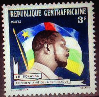
 These stamps pay tribute to tyrants like Stalin, Hitler and Saddam Hussein. There is also a shout-out to Jean-Bedel Bokassa of the Central African Republic/Empire, looking extremely smug and self-satisfied (see Part One for more details); and Liberia’s murderous warlord Charles Taylor, conscriptor of child soldiers and current war-crimes prisoner in an English jail. (I haven’t written about Taylor because he was not around yet in the first years of independence.)
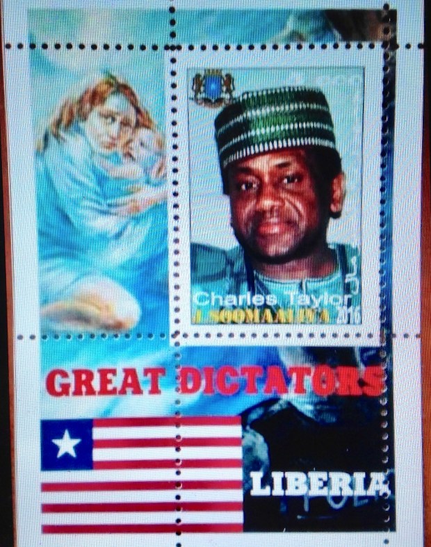

 LATE ADDENDUM: Daughter Kate, who was a Peace Corps volunteer in Namibia, just made a case for Botswana as an example of a sub-Saharan nation that made a smooth and sustained transition to democracy. (Namibia, formerly South West Africa, also is a stable democracy. But it did not gain its independence from South Africa until the 1990s, so it’s not eligible for consideration in this contest.) Botswana, formerly the British territory of Bechuanaland, became independent in 1966 — among the last of the first wave. Perhaps there was a chance to learn from the disastrous experiences elsewhere. That same year of 1966, Ghana’s Kwama Nkrumah, the tarnished avatar of African independence, was ousted in a military coup. In Botswana, unlike most of its neighbors, one elected leader after another proceeded in a sedate pace. The fact that no single “strong man” emerged is bracing. There were no coups, no major plots. Today Botswana could lay claim to being the most stable democracy in Africa. How this happened is beyond the immediate purview of this stamp commentary. I will only comment that eight out of 10 citizens of Botswana are from the same tribe. The country is about the size of Texas, with less than one-10th the population. The tribal party has dominated in politics and power all these years. And while the gross domestic product of Botswana is relatively impressive (again that word “relatively”), I have not yet discovered how the standard of living in Botswana has changed since independence. At the same time, I will be eager to learn about the best practices in governance that provided for so many years of peace — and wonder whether those practices might be applied beneficially elsewhere …
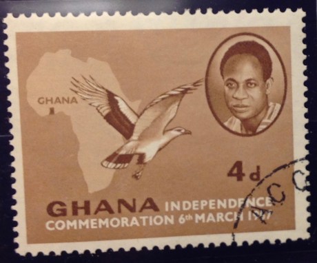
 newly emerged sovereign states in optimistic, hopeful terms. Ghana’s Prime Minister Kwame Nkrumah looks out from an oval frame — calm, alert, focused— over a map of Africa with Ghana defined as a rectangular dot in the west. In the foreground, a palm-nut vulture is on the wing. In the Central African stamp, the engraved image of Premier Barthelemy Boganda glows with his joy and enthusiasm. He smiles broadly, as if partly in wonder. His glassy gaze is focused upward toward … a bright future? He poses under the colorful flag of his brand-new nation.


 This fellow may look like an overgrown Boy Scout or a benign man of the cloth, but do not be deceived. He was just as venal and power-hungry as the next African strong man. Fulbert Youlou was a brilliant student in his village, and rose in the network of the Catholic church to be ordained a priest. Along the way he came briefly into the orbit of Barthelemy Boganda, soon to head the Central African Republic. Trading on his clerical collar and his nationalist connections, Youlou parlayed himself into the seat of prime minister, then president after the former French Congo became the independent Congo Republic in 1960. He encouraged a cult of personality, in part by ordering the issuance of stamps bearing his likeness in his religious garb, though by this time he had been defrocked because of adultery and polygamy. His big ego and eccentric ways soon got him in trouble — one story tells of him pulling out a revolver to force members of the National Assembly to withdraw a challenge. Inheriting one of the more robust economies among French territories, he focused on expanding his political control and limiting the opposition as the national debt increased. Accused of corruption and anti-union violence, he was forced out in 1963. At first imprisoned in Fulbert Youlou Military Camp, he was released but remained a target of the pro-Marxist regime. He fled across the Congo river to Leopoldvile, in the by-then-former Belgian Congo, where he was granted asylum. Eventually he resettled in Spain, where he died of hepatitis in 1972, aged 64.
 (interlude)
  Chad has been more or less a basket-case of a nation ever since independence. When it wasn’t drought or civil war, it was encroachment by plotters from surrounding nations, led by Libya’s Moammer Gadhafi. There were some real wrong-os in charge of Chad during those decades, including the fanatic Hissen Habre. Could it be that Chad’s first president, Ngarta Tombalbaye, broke the pattern? Could he have been, like CAR’s Boganda, a well-intentioned, bright young man with good values and leadership skills? I hope so, because then there would be two African leaders I can look up to. On the other hand, I shudder with anticipation as I turn to his life story, for it surely cannot have ended well. If he wasn’t killed under mysterious circumstances, as was Boganda, it is all too likely that his good intentions went awry as he yielded to the temptations of power. At least we might hope things started out well …
 Leon M’ba
 Felix Houphouet-Boigny
 Did the average Ivorian family benefit from Houphouet-Boigny’s decades of high-handed rule? If you’re patient, some day I’ll look up the statistics on per capita income in 1990 compared to 1960, adjusted for inflation. Meanwhile, my guess is that things stayed pretty much the same for most of the common folk. There were no coups or civil wars, but not much of a windfall from independence — except for the favored few, to be sure. After President Felix’s death in office in 1993, things such as they were quickly fell apart. The Ivory Coast has been plagued by political instability by coups, economic reverses and civil war practically ever since. Whatever else he may have done, Houphouet-Boigny was not able to build a secure nation-state during his many years on the world stage.
 philatelic tribute stamp — from Moldova.
 Maurice Yameogo
 Modibo Keita
 But before more words about Canada, a few words about Ascension. The attractive bird issue of 1963 followed the first Queen Elizabeth definitive set of 1953 — a gorgeous and valuable series that I have described elsewhere (see my Ascension blog post). The 1963 set is not cheap — I had to shop around and finally bought the top two values, from separate dealers, for a combined $22.30. I hope the images here and below help to explain the appeal of stamp collecting in a visual way — notice the designs and the colors, also the way the completed set (below) moves smoothly from 1 penny through 1 pound, each stamp linked to the other by a common design template, each one its own handsome object, with original art, vivid color and the unifying portrait of the queen. The complete mint set sells online for $33, so I don’t know how well I did — particularly since my 1/6 stamp is cancelled. I may decide to pick up a mint 1/6 some day — it’s not expensive. Meanwhile, I indulge my predilection for complete sets, even if they do include a mix of mint and cancelled stamps.
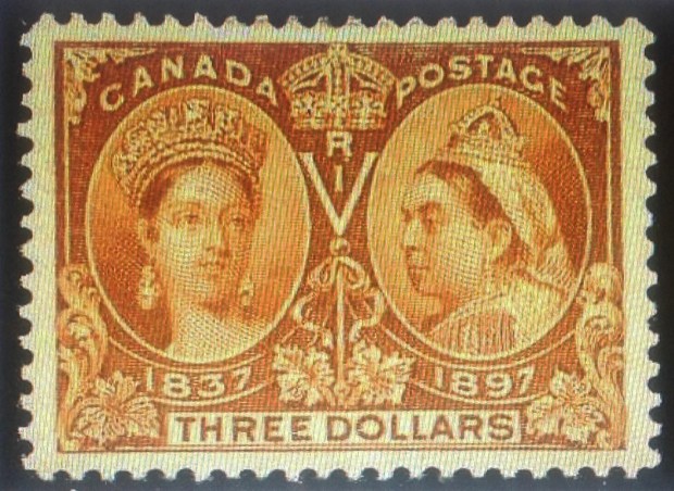
 My first big move was to buying the 1/2 cent. Oddly, its price seemed to be rising sharply a few years ago. When I finally jumped in and picked up a mint copy in 2014, it cost me $22.49 — a 4,400 percent increase over face value, right? Imagine: If your ancestors had been in Canada in 1897, they could have picked up a full sheet of these black beauties for a quarter, the face value! (Why is this low-value stamp so expensive? Why so rare? Uh, sorry, I haven’t gotten around to researching that particular subject yet; maybe later …)
 bargain if the design is noticeably off-center. You will notice in my set, pictured here and again below, a number of pretty dramatically off-center values — look particularly at the 1/2-cent (skewed high), the 15-cent (low) and the 20-cent (skewed left). At least the stamps themselves are sound. And remember my urge toward “completeness,” which overcomes key considerations like mint or used — or in this case, centering. I stand by my Jubilee set, noting that each stamp is intact, if not the most elegant example you will find.
 Eventually I did settle on a 6-cent, offered on an Internet site for a very reasonable $15.50. What’s wrong with it? It looked fine, though the cancellation was ugly. It seemed to have all its perforations, and the centering was even decent, so. I snapped it up. When it arrived in the mail a few days later, it fulfilled my expectations. Yes, one corner is a little greasy; the cancellation makes it look like it’s missing some perfs, even though it isn’t. It’s a sound stamp, listed as “fine.” And the price sure was right! Plus, I got the pleasure of adding the missing piece to “fill out” this desirable set from the 1/2-cent through the 50-cent. (See below, enlarged.)


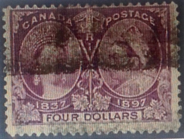 This example of the $4 value (purple) is marred by a heavy “railroad cancel.” The centering also is skewed toward the top. Price: $190.


 Also, you have the honor of displaying the following badge on your blog. Use the below code to display this badge proudly on your blog.”
 1. Here is the first set of stamps issued in what would become the Belgian Congo. They picture King Leopold II of Belgium, and look a lot like Belgian stamps of the period. You can just make out the tiny writing, “Etat Ind du Congo.” That means “independent state of the Congo” — though it was anything but! What it really meant was that King Leopold was “independent” of accountability to his own government or anyone else but God. He ran this vast colony as his private fiefdom. Though he never set foot in the Congo, he micromanaged the place from his palace in Brussels, built a vast and exotic Congo museum complex in his royal gardens. While he mouthed platitudes about Christianity, civic progress, development and moral uplift, he ruthlessly suppressed indigenous populations. He exploited the country’s ivory, rubber and other resources for his own profit. He also issued stamps for his “independent” state. This set of five stamps catalogues at several hundred dollars, largely due to the rare 5 franc value.
 2. The Congo may have been a vassal state of a callous ruler — Joseph Conrad used it as the locus of his haunting novel, “Heart of Darkness” — but King Leopold did manage to put out some pretty stamps. Look at this lovely two-color engraving from the 1890s of the growing town that was to become Leopoldville.

 Belgian Congo had to accommodate the proud and vocal — and touchy — Flemish constituency as well. Here is the result. It turned out to be relatively easy to keep the central images of the original set and redesign the borders to make room for “Belgisch Congo” as well as the French name. This charming two-color engraving depicts the railroad from Leo to Matadi, at the time a considerable engineering feat. Alas, the mammoth construction project took its toll in lives, most of them Congolese.


 8. What’s this? A set from 1930s Belgian Congo, overprinted “USA Airmail”? With denominations in U.S. cents? What gives? I wish I had a satisfactory answer for you, but I don’t. Were Americans really a presence in the Belgian Congo? Was this overprint used at the U.S. embassy, or by troops passing through? So far, it remains a mystery to me. Whatever its provenance, the set isn’t expensive to buy.
 10. This stamp marking the secession of Katanga shows a lot of gall. Not only does it co-opt a stamp from the “mother nation” of the Congo, it blots out that nation’s independence day with its own date, cleverly leaving “1960” uncovered. It also leaves alone the banner “Independance” (inedependence), but obliterates “Congo” with the audacious overprint “de L’Etat du Katanga” (of the state of Katanga). The essential illogic of this stamp, however, is that it depicts the whole nation of Congo and doesn’t even identify the rebel province that is declaring its independence.
 11. Here’s a semi-postal stamp from Katanga picturing the renegade leader, Moise Tshombe (who I once met, by the way, but that’s another story). It features the copper crosses that are emblems Katanga, literal currency at one time, and a key source of the region’s economic well-being, such as it was.
 12. This Katanga set seemed quite modern for 1961. The indigenous bas-relief sculpture has primitive charm, though the characters do bear some resemblance to “Mr. Bill,” the hapless, creepy clay figure from early “Saturday Night Live.”
 13. I include this cover of Katanga stamps, all of them overprinted Belgian Congo stamps, because I am quite proud to display such a rich sample of postally used examples from a country that only existed for a couple of years. I expect it is worth as much as $20 or more — if you can find a buyer for this obscure stuff.
 14. These 1950s-era definitive stamps from India are familiar enough. But what’s with the “Congo” overprint? Here’s what: During the troubles in Katanga, the United Nations stepped up with peacekeeping troops to try to straighten things out. There also were troops from Sweden, Canada and Ireland, but the Indians seem to be the only ones who issued their own stamps — or rather, their own stamps overprinted “U.N. Force (India) Congo.” Was it national pride? Was there a practical purpose, i.e., to provide the troops with stamps to use on letters home? If so, where are the covers with cancelled copies of these stamps? I’ve never seen one. If they exist, such philatelic oddities must be quite rare and valuable. India also overprinted this set for troops serving the United Nations in Korea (1953), Cambodia, Laos and Vietnam (1950s) and Gaza (1965).
 15. Here is another overprinted set, this one involving the Belgian Congo flowers set of 1952-3. The set became the first issued by the independent nation, which was overprinted “Congo.” Here the same colonial flowers set was used for the breakaway republic of South Kasai, a renegade central province. This was only a half-hearted rebellion — South Kasai never broke relations completely with the central government, and President Albert Kalonji retained his seat in the Congolese parliament.
 16. Here are the rest of the stamps issued by South Kasai, including original designs, i.e., not overprinted Congo stamps. The rebellion petered out in a few months, and Albert Kalonji, (pictured here) the president of the short-lived state, ended up in exile — but alive.
 er with five different varieties of the 20-centime stamps from the same animal series, featuring a rhinoceros. Can you pick out the differences. The last item, lower right, is a most peculiar error. Let me explain:
 18. Here is a Congo stamp featuring Patrice Lumumba, the controversial first prime minister of the Democratic Republic of the Congo in 1960. Only the stamp is not from that Congo, but from the “other” Congo — the former French Congo, now the “Popular Republic of the Congo.” Lumumba has never appeared on a stamp from his own country — not a big surprise, since he was assassinated with the acquiescence or connivance of Congolese leaders Joseph Mobutu, Joseph Kasavubu and Moise Tshombe. It was up to other African nations like the neighboring Congo, ruled by Marxists and self-styled Marxists over the years since its own independence, to memorialize the mercurial Lumumba.


 22. Mobutu’s most cynical act was his claim of “authenticity” — that he somehow embodied African values and aspirations. He renamed his country “Zaire,” in ancient tribal tradition, gave himself fancy new titles, and began to sport a walking stick and leopard-skin hat. This Zaire stamp says more than its designers may have intended. It pictures Mobutu contemplating the big diamond — loot! And what kind of guy has himself depicted on a postage stamp wearing sunglasses? Shifty!
 24. Now for a U-turn back to 1915, folks! Back to World War I, which was being fought in Africa as well as Eurasia. Germany had maintained a colony in east Africa since the 1880s. After hostilities broke out in 1914, it didn’t take long for the English to the north and east, and the Belgians in the west, to overwhelm German East Africa’s forces. They divided the spoils: Britain “took” Tanganyika, and the Belgians moved into what is today Rwanda and Burundi (see maps, above and below). The first stamps from these countries were hand-overprints on the current Belgian Congo pictorial set, like this one. These stamps are quite rare. Mine cost $29.85. It catalogues for much more than that. My scribbled note “authenticated” means the stamp carries the desired mark on the back. (I guess there are counterfeits of this rare set.)


 29. The first stamps of Ruanda-Urundi were overprints of a 1920s definitive set from the neighboring Belgian Congo. I suppose it would be a stretch to call them stamps from the Congo, though the name is on them.


 37. Middle Congo eventually took over from French Congo, and the territory issued stamps into the 1930s, when it joined French Equatorial Africa. The first regional issues included this overprint from Middle Congo. Upon reaching independence, a large part of Middle Congo unfortunately was dubbed the republic of the Congo. The fact that there are two Congo republics across the Congo River from each other has created decades of confusion, helping to make this slide show necessary!
 38. Finally, one more “Congo” in this tangled philatelic history. The stamp pictured here was issued in 1914, and represents a colonial territory of Portugal that straddles the western “lip” of the then-Belgian Congo that extends to the south Atlantic ocean. This small “Congo” territory gave the Portuguese access to the Congo river delta. Portugal also controlled Angola, directly to the south of Belgian Congo. (see maps). While the Portuguese only used the name “Congo” until 1915, it kept control of the territory as part of Angola until independence in 1975. Today it is the free Angolan province of Cabinda, still straddling the northern border of the Congo. There is an independence movement in this tiny province. There also are stirrings from others in the region who dream of resurrecting the ancient “Kongo” kingdom. This unlikely development would only happen if land is ceded from four countries that mistrust each other — Angola, both Congos and Gabon. A final reflection: I wonder what the indigeneous population thought when they first saw this stamp back i 1914, which depicts a fierce-looking caucasian (actually the harvest goddess Ceres), wielding what could be a machete …
 era — “Zaire”: is blotted out with an ugly black rectangle. The country’s name underneath is an almost-indeciperhable “Rep Dem du Congo.” There is a new value, with the old one covered by another black box. A vulture or hawk perches menacingly amid these dark blots. The eBay seller wanted $29.99 for this odd, apparently unlisted stamp, acknowledging that it might be bogus.
 41. So we come to the end of this slide show, with an image of an authentic issue of stamps from the modern-day Democratic Republic of the Congo. Pretty stamps, eh? Don’t be fooled. There’s nothing pretty about the way Congo is being run today. I wish I could say otherwise.
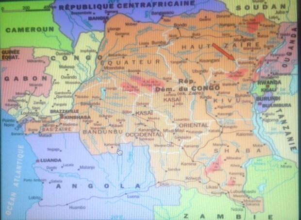
 This thrilling selection of stamps arrived in the mail the other day, in a small flat package from South Africa. The stamps are from 1901, during the last days of the South African Republic (ZAR) based in Pietersburg (Transvaal), where tough, stubborn old Paul Kruger concluded his decades-long conflict with the British and dominance of black Africans. Much blood was shed and misery visited on the people before Kruger’s forces were defeated. Kruger’s strong convictions, military and political leadership


 envelopes. Here is what the contents look like, just as they spilled out. Dealers and experienced collectors know how to protect and ship stamps. It’s not hard. I don’t recall ever receiving a stamp damaged in transit. The only complaint I have is sometimes, a package will include sticky tape in close proximity to a stamp, which to me is a no-no.
 The main event, however, is the handsome 1878-80 Transvaal Victoria set — five values in all, missing only the 1/2d and the 2 shilling. I admit they are not all in great shape. Some are missing perforations, the centering is not great, and one stamp has a thin spot on the back. Yet I still was willing to pay for the set. I mean, think about it: The stamps are nearly 140 years old. They started out being bought at a ZAR/Transvaal post office counter, stuck to an envelope and sent through the mail, involving carriages, trains and sailing ships, possible all three. So what if a couple of them are what is called “space fillers” — that is, they will never have much value because of their flaws. I go back to the emblematic significance of these stamps. They are artifacts from a long-ago time and place of imperial Britain asserting itself over the Boers. For a while, British rule would be fragile and temporary in a state that continued to be bargained for and fought over — as though it actually belonged to either side.