This is the gist of a talk I just gave at the Syracuse Stamp Club. Vice President Dan invited me to focus on Congo stamps. I already had presented once on this subject, but Dan said he was still confused about the “different Congos” and which stamps went with which. I readily agreed to take on this intriguing topic. I assembled a group of digital images of stamp “signposts,” mostly from my collection, to help navigate the turbulent currents and tributaries of Congo-related philately. My presentation took the form of a quiz: Look at the stamp projected on the screen and identify or guess which “Congo” it came from. Also: see if you can stump the presenter with your questions. (I don’t know everything about Congo stamps!) Comments afterwards from the audience of 20-plus indicated they liked the program, so it seemed worthwhile to recapture some of it for the blog. On with the show — a quick narrative guide through 42 slides.
 1. Here is the first set of stamps issued in what would become the Belgian Congo. They picture King Leopold II of Belgium, and look a lot like Belgian stamps of the period. You can just make out the tiny writing, “Etat Ind du Congo.” That means “independent state of the Congo” — though it was anything but! What it really meant was that King Leopold was “independent” of accountability to his own government or anyone else but God. He ran this vast colony as his private fiefdom. Though he never set foot in the Congo, he micromanaged the place from his palace in Brussels, built a vast and exotic Congo museum complex in his royal gardens. While he mouthed platitudes about Christianity, civic progress, development and moral uplift, he ruthlessly suppressed indigenous populations. He exploited the country’s ivory, rubber and other resources for his own profit. He also issued stamps for his “independent” state. This set of five stamps catalogues at several hundred dollars, largely due to the rare 5 franc value.
 2. The Congo may have been a vassal state of a callous ruler — Joseph Conrad used it as the locus of his haunting novel, “Heart of Darkness” — but King Leopold did manage to put out some pretty stamps. Look at this lovely two-color engraving from the 1890s of the growing town that was to become Leopoldville.

3. By 1906, King Leopold’s Congo was such an embarrassment to the “civilized world,” thanks to the investigations and reports of reformers like Roger Casement and Edmond Morel, that the Belgian government had to step in and taking control. The “independent” Congo henceforth became the “Belgian Congo.” By the time the old king died in 1909, the regime in Brussels had issued a set of stamps obliterating the old title with the new name: “Congo Belge.” There are two sets: In one, the stamps are hand-cancelled; the others, as in this illustration, were machine-cancelled, worth considerably less.

4. The powers-that-be quickly followed up with another short set, using the same designs
as the earlier series, but with the new name. This engraving shows the busy port of Matadi. But there was a festering problem: Since Belgium is a bilingual nation — French and Flemish — the French-only stamps were a political irritant.
5. Belgian stamps were bilingual by the 1890s, so the  Belgian Congo had to accommodate the proud and vocal — and touchy — Flemish constituency as well. Here is the result. It turned out to be relatively easy to keep the central images of the original set and redesign the borders to make room for “Belgisch Congo” as well as the French name. This charming two-color engraving depicts the railroad from Leo to Matadi, at the time a considerable engineering feat. Alas, the mammoth construction project took its toll in lives, most of them Congolese.

6. The “bilingual imperative” now in place for Belgian Congo stamps did have some awkward moments. Take this set from the 1940s — or rather, two sets from the 1940s. The nicely engraved stamps were identical in every way — except that in one set, the country’s name was printed first in French, then in Flemish; in the other set, the names were reversed.


7. This awkward practice continued, off and on, into the 1950s. This double set featuring Belgian King Baudouin was issued five years before independence.
 8. What’s this? A set from 1930s Belgian Congo, overprinted “USA Airmail”? With denominations in U.S. cents? What gives? I wish I had a satisfactory answer for you, but I don’t. Were Americans really a presence in the Belgian Congo? Was this overprint used at the U.S. embassy, or by troops passing through? So far, it remains a mystery to me. Whatever its provenance, the set isn’t expensive to buy.

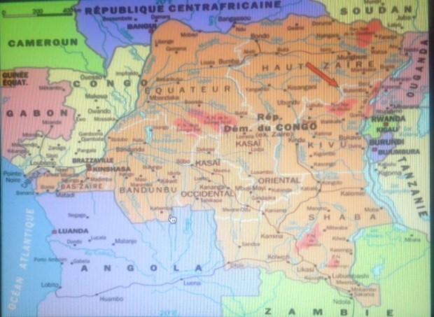
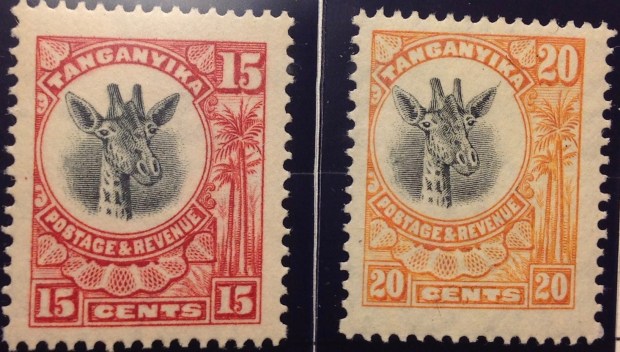
9. Right about now would be a good time to introduce a map of the Congo, so you can get geographical idea of the stamp-issuing areas represented in coming slides. I lived in the Congo from 1962 to 1964, when I was 14-16 years old. My father was a diplomat, and we lived in Leopoldville, the capital city in western Congo, not far from the Atlantic Ocean — or the Equator. The areas I will be discussing up to 1,000 miles from Leopoldville, in central and eastern Congo — Katanga in the southeast, Kasai in the center, Stanleyville in the northeast. Then there is Ruanda-Urundi, a separate Belgian territory bordering on the Congo’s eastern frontier. I also will have things to say about the territory around Leopoldville — both south and north. This map highlights the divisions of the “crisis years” between 1960 and 1964. This refers to the breakaway republics of Katanga and South Kasai, as well as so-called Simba uprisings around Albertville (northern Katanga) and Stanleyville (center-north), all of which produced postage stamps.
 10. This stamp marking the secession of Katanga shows a lot of gall. Not only does it co-opt a stamp from the “mother nation” of the Congo, it blots out that nation’s independence day with its own date, cleverly leaving “1960” uncovered. It also leaves alone the banner “Independance” (inedependence), but obliterates “Congo” with the audacious overprint “de L’Etat du Katanga” (of the state of Katanga). The essential illogic of this stamp, however, is that it depicts the whole nation of Congo and doesn’t even identify the rebel province that is declaring its independence.
 11. Here’s a semi-postal stamp from Katanga picturing the renegade leader, Moise Tshombe (who I once met, by the way, but that’s another story). It features the copper crosses that are emblems Katanga, literal currency at one time, and a key source of the region’s economic well-being, such as it was.
 12. This Katanga set seemed quite modern for 1961. The indigenous bas-relief sculpture has primitive charm, though the characters do bear some resemblance to “Mr. Bill,” the hapless, creepy clay figure from early “Saturday Night Live.”
 13. I include this cover of Katanga stamps, all of them overprinted Belgian Congo stamps, because I am quite proud to display such a rich sample of postally used examples from a country that only existed for a couple of years. I expect it is worth as much as $20 or more — if you can find a buyer for this obscure stuff.
 14. These 1950s-era definitive stamps from India are familiar enough. But what’s with the “Congo” overprint? Here’s what: During the troubles in Katanga, the United Nations stepped up with peacekeeping troops to try to straighten things out. There also were troops from Sweden, Canada and Ireland, but the Indians seem to be the only ones who issued their own stamps — or rather, their own stamps overprinted “U.N. Force (India) Congo.” Was it national pride? Was there a practical purpose, i.e., to provide the troops with stamps to use on letters home? If so, where are the covers with cancelled copies of these stamps? I’ve never seen one. If they exist, such philatelic oddities must be quite rare and valuable. India also overprinted this set for troops serving the United Nations in Korea (1953), Cambodia, Laos and Vietnam (1950s) and Gaza (1965).
 15. Here is another overprinted set, this one involving the Belgian Congo flowers set of 1952-3. The set became the first issued by the independent nation, which was overprinted “Congo.” Here the same colonial flowers set was used for the breakaway republic of South Kasai, a renegade central province. This was only a half-hearted rebellion — South Kasai never broke relations completely with the central government, and President Albert Kalonji retained his seat in the Congolese parliament.
 16. Here are the rest of the stamps issued by South Kasai, including original designs, i.e., not overprinted Congo stamps. The rebellion petered out in a few months, and Albert Kalonji, (pictured here) the president of the short-lived state, ended up in exile — but alive.
17. The transition from colony to independence was haphazard in the Congo — socially, politically, economically — and philatelically. There were missing or misplaced overprints and surcharges, upside-down printings (“inverts”) and other varieties. As a 15-year-old stamp collector In 1964, I was able to buy stamps at the downtown Bureau de Poste to create a cover using six different versions of the original 6.50-frank stamp of the animal series depicting two leaping impala. 
Top row, left to right: 1. the original stamp, issued in 1959; 2. the same stamp, overprinted “CONGO” in red, issued 1960; 3. ditto, overprinted in black.
Lower row, left to right: 1. ditto, with a silver surcharge “5F” and red overprint, 1964; 2. ditto, with silver surcharge and black overprint; 3. finally, with a silver surcharge as well as a silver bar behind the black inscription “Republique du Congo.”
I created another cov er with five different varieties of the 20-centime stamps from the same animal series, featuring a rhinoceros. Can you pick out the differences. The last item, lower right, is a most peculiar error. Let me explain:
While the original Belgian Congo stamp was successfully surcharged “1F” on a silver rectangle, the “REPUBLIQUE DU CONGO” overprint is missing. This means the stamp looks for all the world like a new “Belgian Congo” stamp — issued in 1964, four years after independence! (This stamp is not listed in my Scott catalogue.)
 18. Here is a Congo stamp featuring Patrice Lumumba, the controversial first prime minister of the Democratic Republic of the Congo in 1960. Only the stamp is not from that Congo, but from the “other” Congo — the former French Congo, now the “Popular Republic of the Congo.” Lumumba has never appeared on a stamp from his own country — not a big surprise, since he was assassinated with the acquiescence or connivance of Congolese leaders Joseph Mobutu, Joseph Kasavubu and Moise Tshombe. It was up to other African nations like the neighboring Congo, ruled by Marxists and self-styled Marxists over the years since its own independence, to memorialize the mercurial Lumumba.

19. Here are stamps from early in the former Belgian Congo’s independence years. They honor Dag Hammerskjold, the UN leader killed in a plane crash in September, 1960 while trying to mediate the standoff between Katanga and the mother Congo. The overprint reproduces a slogan from the short-lived administration of Congolese Prime Minister Cyrille Adoula — “paix, travail, austerite” (peace, work, thrift).In 1962, the earnest, honest Adoula seemed to hold out hope for a better future — but his tenure was cut short by events and plots.

Kasavubu
20. Congo’s president from 1960 to 1965 was Joseph Kasavubu, a wily politician from an important tribal family. He managed to hang on through the Congo’s most turbulent years, only to be dismissed into retirement after a young colonel named Joseph Mobutu took over in 1965.

A young Mobutu
21. After Kasavubu fired Adoula as prime minister in 1964, he called on Moise Tshombe, the exiled former leader of the Katanga breakaway province, to try and bring order to the Congo itself. This was not quite like Jefferson Davis being invited to take over after Abraham Lincoln, but you get the idea. Tshombe lasted about a year, whereupon Mobutu and the army stepped in. He rapidly consolidated his power and proceeded to rule the Congo for the next 30 years with a combination of harshness, violence, cruelty, indifference toward his people, hypocrisy and narcissism, monumental greed and selfishness. Would you like to know how I really feel about him?
 22. Mobutu’s most cynical act was his claim of “authenticity” — that he somehow embodied African values and aspirations. He renamed his country “Zaire,” in ancient tribal tradition, gave himself fancy new titles, and began to sport a walking stick and leopard-skin hat. This Zaire stamp says more than its designers may have intended. It pictures Mobutu contemplating the big diamond — loot! And what kind of guy has himself depicted on a postage stamp wearing sunglasses? Shifty!

23. Here’s an even better likeness of Mobutu — again, probably not intended by the stamp’s designers …
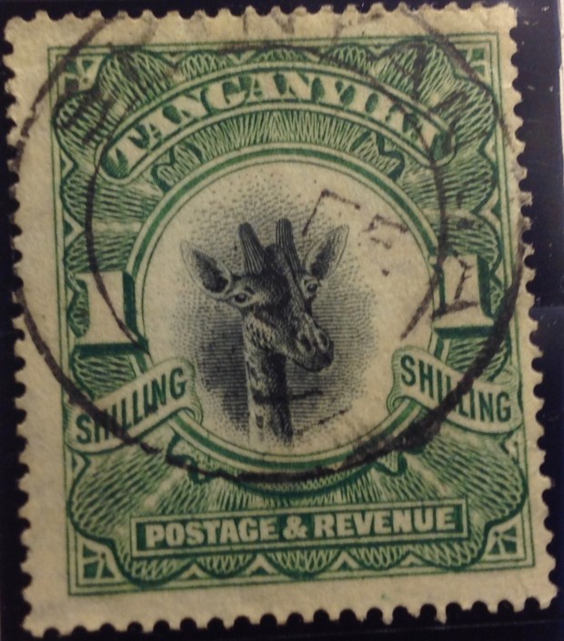
 24. Now for a U-turn back to 1915, folks! Back to World War I, which was being fought in Africa as well as Eurasia. Germany had maintained a colony in east Africa since the 1880s. After hostilities broke out in 1914, it didn’t take long for the English to the north and east, and the Belgians in the west, to overwhelm German East Africa’s forces. They divided the spoils: Britain “took” Tanganyika, and the Belgians moved into what is today Rwanda and Burundi (see maps, above and below). The first stamps from these countries were hand-overprints on the current Belgian Congo pictorial set, like this one. These stamps are quite rare. Mine cost $29.85. It catalogues for much more than that. My scribbled note “authenticated” means the stamp carries the desired mark on the back. (I guess there are counterfeits of this rare set.)

25. Here is the image of a stamp from the first set of “Ruanda,” also in 1916. It’s captured from an Internet screen, and is on sale for “just” $400! That’s a rare stamp!

26. The reason the Ruanda and Urundi stamps are so valuable is that so few were issued. They were soon replaced by a set with this busy overprint — in two languages. The inscription in French and Flemish reads “German East Africa: Belgian Occupation.” The lettering partially obscures the delicate engraved designs. Aesthetically, overprints are ugly, marring the appearance of a stamp. In this case, postal authorities might as well have printed the names on blank paper!

27. How about this one — an overprint on top of an overprint? You should be able to make out a faint hand-stamp “Tabora,” above the black line rising from left to right. The Scott catalogue says these local overprints were not authorized, and assigns them no value. This item from an Internet image was on sale for a cool $99 — too rich for my wallet.

28. How about this item? It’s really not fair for the stamp designers to be so cagey. You can make out that it’s a Belgian Congo stamp, or at least was one originally. Then there’s a red cross and a printed number, presumably designating a charitable contribution of one franc on top of the stamp’s one-franc value. That’s decipherable. So is this a Congo stamp, or what? And what the heck is “A.O.”? For answers, you need a philatelist, or historian, or at least someone with a Scott catalogue who knows where to look. Then you would learn that “A.O.” stands for Afrique Orientale — East Africa. This is in fact another stamp from the Belgian occupation of Ruanda and Burundi — which in 1922 became the Belgian mandated territory of Ruanda-Urundi. One wonders how a stamp like this would be received by the indigenous population. Would they pay the extra franc for the Red Cross? Or as some philatelists suggest, did most stamps like this one (which aren’t that pricey today) never even reach post offices, but rather go right to collectors?
 29. The first stamps of Ruanda-Urundi were overprints of a 1920s definitive set from the neighboring Belgian Congo. I suppose it would be a stretch to call them stamps from the Congo, though the name is on them.

30. Here is a beauty from the first set inscribed with the name Ruanda-Urundi, in the 1940s — a handsome portrait, and a fine example of the engraver’s and colorist’s art.

31. This stamp commemorating the Olympic Games came out just as the Congo was preparing for its independence day June 30. The set shares the designs with last issue from the Belgian Congo. Ruanda-Urundi remained tied to Belgium for another year before splitting into the Kingdom of Burundi and the Republic of Rwanda. The extra year didn’t prepare either nation any better for independence than the devolving Congo to the east. The people of all three nations would continue to suffer, trading colonial oppression for corruption, misrule and tribal violence.

32. The first Burundi stamps carried clumsy overprints on leftover Belgian Congo stamps from the 1952-3 flower set.

33. The first Rwanda stamps bore slightly fancier overprints, still using stocks of Belgian Congo stamps, this one from the animal series of 1959.

34. Both Rwanda and Burundi soon were issuing stamps of their own design. This one includes a portrait of Burundi’s king, who soon enough would be sent packing.

35. Before I bring you more or less up to date, a quick history lesson about other “Congo” stamps. Here’s one from the 1900s inscribed “Congo Francais” — French Congo. Now look at the next image.

36. These two stamps are inscribed “Moyen Congo” — Middle Congo — along with the name above, “Republique Francaise.” Why Congo and Middle Congo? Aren’t they both French territory? What’s the difference? Does it matter? Indeed it does. The original French Congo overlaps with modern-day Gabon, a small nation located along the west coast of Africa, north of the Congo. Middle Congo covered a much larger territory across the Congo river from the Belgian territory.
 37. Middle Congo eventually took over from French Congo, and the territory issued stamps into the 1930s, when it joined French Equatorial Africa. The first regional issues included this overprint from Middle Congo. Upon reaching independence, a large part of Middle Congo unfortunately was dubbed the republic of the Congo. The fact that there are two Congo republics across the Congo River from each other has created decades of confusion, helping to make this slide show necessary!
 38. Finally, one more “Congo” in this tangled philatelic history. The stamp pictured here was issued in 1914, and represents a colonial territory of Portugal that straddles the western “lip” of the then-Belgian Congo that extends to the south Atlantic ocean. This small “Congo” territory gave the Portuguese access to the Congo river delta. Portugal also controlled Angola, directly to the south of Belgian Congo. (see maps). While the Portuguese only used the name “Congo” until 1915, it kept control of the territory as part of Angola until independence in 1975. Today it is the free Angolan province of Cabinda, still straddling the northern border of the Congo. There is an independence movement in this tiny province. There also are stirrings from others in the region who dream of resurrecting the ancient “Kongo” kingdom. This unlikely development would only happen if land is ceded from four countries that mistrust each other — Angola, both Congos and Gabon. A final reflection: I wonder what the indigeneous population thought when they first saw this stamp back i 1914, which depicts a fierce-looking caucasian (actually the harvest goddess Ceres), wielding what could be a machete …
39. Now, to start wrapping things up. Mobutu finally was forced out of the country in the mid-1990s, decamping to his European mansions, where he died soon after, having precious little time to enjoy the estimated $15 billion he st0le from his country. In 1997, in an act of embarrassment, or wishful amnesia, or spite, the powers-that-be changed the country’s name back to Republic of the Congo. This did not portend happier times for the much-abused Congolese people, alas. Even though Mobutu was gone, the country was worse than bankrupt, and misrule continued under Laurent Kabila and then his son, Joseph Kabila. This stamp captures the ethos of the post-Mobutu  era — “Zaire”: is blotted out with an ugly black rectangle. The country’s name underneath is an almost-indeciperhable “Rep Dem du Congo.” There is a new value, with the old one covered by another black box. A vulture or hawk perches menacingly amid these dark blots. The eBay seller wanted $29.99 for this odd, apparently unlisted stamp, acknowledging that it might be bogus.

40. As it turns out, the Congo had to contend with a number of bogus stamps issued in 1997. These slick, multicolored philatelic items, still carrying the name “Zaire,” commemorate folks who had nothing to do with the Congo, like John Lennon, Frank Sinatra and Elvis. The stamps were officially declared illegal by Congolese postal authorities, who alerted the Philatelic Webmasters Organization. This group collaborates with the Universal Postal Union to call out spurious issues. The postmaster in Kinshasa identified “a certain number of philatelic products still printed with the country’s old name (Zaire).” These stamps would not be admitted for sale or use in the Congo, the note said. You can still find these fake stamps for sale on eBay. Buyer, beware!
 41. So we come to the end of this slide show, with an image of an authentic issue of stamps from the modern-day Democratic Republic of the Congo. Pretty stamps, eh? Don’t be fooled. There’s nothing pretty about the way Congo is being run today. I wish I could say otherwise.
42. The Congo today. Note the name changes of provinces, the location of the Angolan province of Cabinda in the far west, and Rwanda and Burundi in the east.
 But before more words about Canada, a few words about Ascension. The attractive bird issue of 1963 followed the first Queen Elizabeth definitive set of 1953 — a gorgeous and valuable series that I have described elsewhere (see my Ascension blog post). The 1963 set is not cheap — I had to shop around and finally bought the top two values, from separate dealers, for a combined $22.30. I hope the images here and below help to explain the appeal of stamp collecting in a visual way — notice the designs and the colors, also the way the completed set (below) moves smoothly from 1 penny through 1 pound, each stamp linked to the other by a common design template, each one its own handsome object, with original art, vivid color and the unifying portrait of the queen. The complete mint set sells online for $33, so I don’t know how well I did — particularly since my 1/6 stamp is cancelled. I may decide to pick up a mint 1/6 some day — it’s not expensive. Meanwhile, I indulge my predilection for complete sets, even if they do include a mix of mint and cancelled stamps.
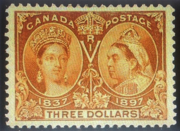
 My first big move was to buying the 1/2 cent. Oddly, its price seemed to be rising sharply a few years ago. When I finally jumped in and picked up a mint copy in 2014, it cost me $22.49 — a 4,400 percent increase over face value, right? Imagine: If your ancestors had been in Canada in 1897, they could have picked up a full sheet of these black beauties for a quarter, the face value! (Why is this low-value stamp so expensive? Why so rare? Uh, sorry, I haven’t gotten around to researching that particular subject yet; maybe later …)
 bargain if the design is noticeably off-center. You will notice in my set, pictured here and again below, a number of pretty dramatically off-center values — look particularly at the 1/2-cent (skewed high), the 15-cent (low) and the 20-cent (skewed left). At least the stamps themselves are sound. And remember my urge toward “completeness,” which overcomes key considerations like mint or used — or in this case, centering. I stand by my Jubilee set, noting that each stamp is intact, if not the most elegant example you will find.
 Eventually I did settle on a 6-cent, offered on an Internet site for a very reasonable $15.50. What’s wrong with it? It looked fine, though the cancellation was ugly. It seemed to have all its perforations, and the centering was even decent, so. I snapped it up. When it arrived in the mail a few days later, it fulfilled my expectations. Yes, one corner is a little greasy; the cancellation makes it look like it’s missing some perfs, even though it isn’t. It’s a sound stamp, listed as “fine.” And the price sure was right! Plus, I got the pleasure of adding the missing piece to “fill out” this desirable set from the 1/2-cent through the 50-cent. (See below, enlarged.)


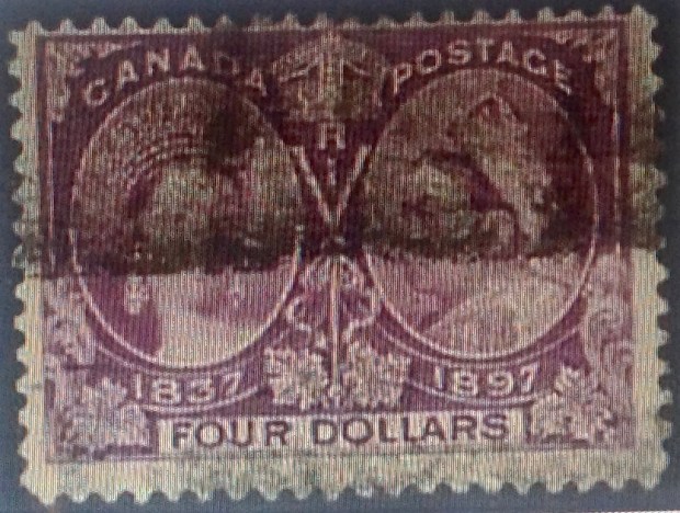 This example of the $4 value (purple) is marred by a heavy “railroad cancel.” The centering also is skewed toward the top. Price: $190.


 Also, you have the honor of displaying the following badge on your blog. Use the below code to display this badge proudly on your blog.”
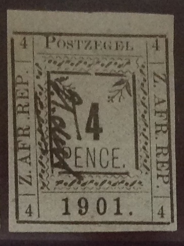
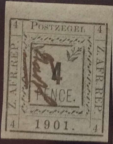
 This thrilling selection of stamps arrived in the mail the other day, in a small flat package from South Africa. The stamps are from 1901, during the last days of the South African Republic (ZAR) based in Pietersburg (Transvaal), where tough, stubborn old Paul Kruger concluded his decades-long conflict with the British and dominance of black Africans. Much blood was shed and misery visited on the people before Kruger’s forces were defeated. Kruger’s strong convictions, military and political leadership


 envelopes. Here is what the contents look like, just as they spilled out. Dealers and experienced collectors know how to protect and ship stamps. It’s not hard. I don’t recall ever receiving a stamp damaged in transit. The only complaint I have is sometimes, a package will include sticky tape in close proximity to a stamp, which to me is a no-no.
 The main event, however, is the handsome 1878-80 Transvaal Victoria set — five values in all, missing only the 1/2d and the 2 shilling. I admit they are not all in great shape. Some are missing perforations, the centering is not great, and one stamp has a thin spot on the back. Yet I still was willing to pay for the set. I mean, think about it: The stamps are nearly 140 years old. They started out being bought at a ZAR/Transvaal post office counter, stuck to an envelope and sent through the mail, involving carriages, trains and sailing ships, possible all three. So what if a couple of them are what is called “space fillers” — that is, they will never have much value because of their flaws. I go back to the emblematic significance of these stamps. They are artifacts from a long-ago time and place of imperial Britain asserting itself over the Boers. For a while, British rule would be fragile and temporary in a state that continued to be bargained for and fought over — as though it actually belonged to either side.
 early American stamps — a rare multiple of three of the first three-cent issue (circa 1852), featuring a side profile bust of George Washington. I examined them closely, thrilled to realize they had been sitting in that book for more than 150 years. They were still in pristine condition, as fresh as the day Daniel’s ancestor bought them at a post office for nine cents. Well, he probably bought at least four of them (for 12 cents), cut out one of them, licked the gum on the back and pasted the stamp to a letter, then stored the others for a future use that never arrived..


 3d. blue from St. Helena, picturing the badge of the colony, completes my long set of the George VI definitives from the 1930s (see illustration).
 The one-pound stamp from Cyprus completes my George VI set from that country, same era. For a description of the pleasure that awaits in adding these two stamps to complete the sets on the pages of my British Africa and British America albums, please refer to a post in January 2017 on the joys of “filling spaces.”

 ia and across the Pacific.
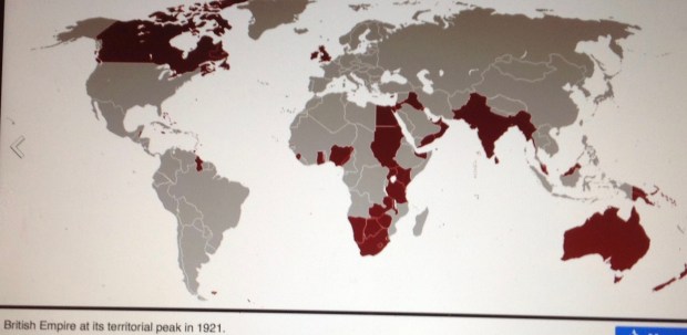
 The statistical apex of territorial claims in the British Empire actually would not come until 1921. At that time, the empire had influence over 33.7 million square kilometers. Half of the globe’s dry land was “theirs in fee.” The empire’s population of more than 458 million souls constituted one-fifth of the Earth’s people.
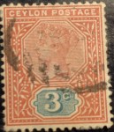
 Pictured here is an example of the stamps that were in circulation in 1897 or thereabouts, issued for use in far-flung precincts of the British Empire, all bearing a likeness of Queen Victoria. As you observe the similarities and subtle differences in the portraits and borders, explored in the next commentary, you can get a sense of how these stamps helped to draw together the British Empire; how they created an identity, a self-image, sustaining a unity of purpose, a commitment to stability and civic order, even pride in being part of this global enterprise. As you contemplate this mosaic of empire reflecting the image of an aging queen, consider these lines from Sir William Morris’s ode:
 Great Britain was the seat of empire, and GB never had to put its name on its stamps — because it was first, in 1840. (Can you believe it?) This set — the Queen Victoria Jubilee Issue — was released in 1887, with added values in later years. It set the standard for issues in colonies around the world. I include two stamps from the set,with considerable variations — if you can make them out under the heavy cancels. I particularly like the royal purple of the 2 1/2 d.


 Early Victorian stamp design similarities — 1850s-1860s. Most British stamps from Victorian era originated with the cameo portrait of Princess Victoria created by William Wyon in 1834, pictured here. That image appeared on a medal commemorating the new queen’s visit to London in 1837. It also became the basis for the world’s first stamp — the “Penny Black” of 1840 (see below). The stamp’s designer, Sir Rowland Hill, picked the rough sketch by Henry Corbould (I’m still looking for that sketch), and engravers Charles Heath and his son Frederick
  produced the stamp. The image, subject to minor revision over the years, and illustrated by the early stamps pictured below, would remain in continuous use in successive sets issued in Great Britain and the empire until Victoria’s death in 1901.


 Take a second look at the portrait in the Nova Scotia stamp, at right — the green 8 and 1/2-center from 1860 (value: a few bucks at most). On double-take, it’s clearly not based on the Chalon head. My bet is on the Winterhalter portrait of 1859, reproduced below.
 Reality check: Here is an apparent photo-like record of the marriage of Victoria and Albert in London, Feb. 10, 1840. The close-up below is strikingly immediate, bringing you face to face with an intimate moment more than a century-and-a-half ago. … Queen Victoria looks, well, short and dumpy. She has a big nose and a receding chin. She is, well, homely. Perhaps such realistic depictions don’t do her justice. Or perhaps the engraver’s art is, well, artful. There is no mistaking her resolve in this image as she gazes at her prince. They were by all accounts a happy couple, in love and devoted to each other for the 21 years allotted them before Albert succumbed to stomach ailments and
  typhoid fever. They had nine children. Victoria would continue on as queen until her death in 1901, becoming the longest-reigning British monarch in modern history — that is, until her great-great-grandaughter Elizabeth broke her record in 2015.