In a new biography of George Washington, author John Rhodehamel doesn’t shrink from the less-than-heroic qualities of the “father of our country.” Washington owned slaves his entire adult life, freeing them only upon his death through his will. He betrayed his abhorrence for factions and partisanship in his advocacy of the Federalist Party. Yet while apochyphal stories like the cherry-tree incident and the coin-toss across the Potomac contributed to a cult of personality that bore little resemblance to reality, and while his powdered wig and wooden expression on the dollar bill further distance him from flesh-and-blood humanhood, Washington nevertheless lived a life of probity in his time. He was ambitious, seeking advancement in his military assignments and before that, as a landowner and gentleman farmer. He was a charismatic leader in war and peace. Regal in his bearing, he commanded loyalty from his men, and fearlessly waded into the center of battles. He was not corrupted by power, even in the presidency, retiring with relief after two terms. He may have left office one of the richest men in the new nation, but he entered office the same way. No, Washington was not perfect. Nor were Adams, Jefferson, Hamilton, Franklin and the rest of the founding fathers; nor Abraham Lincoln, for that matter. But they remain worthy of admiration for their abilities, their integrity and their remarkable service.
 I wish I could say the same for the African leaders who came to prominence in the days, months and years after independence, beginning in 1957. In Part One of this commentary, I embarked on a journey seeking at least one honest man who took office in a newly sovereign sub-Saharan African nation. I did find Barthelemy Boganda, who died in mysterious circumstances a year after becoming the first president of the Central African Republic, and therefore didn’t have much chance to demonstrate his abilities. Beyond that dubious what-if, I was unable to find that honest man in my rundown of post-independence heads of state. Instead, I encountered a rogues gallery of characters, many of whom showed great promise during the final years of colonial rule, but all of whom eventually betrayed their trust, squandered their opportunities and their integrity.
As I continue my search in Part Two, I will gloss over the sorry records of some of Africa’s most notorious dictators who came later — like Uganda’s Idi Amin, whose atrocities and sadism eclipsed the dark deeds of his autocratic predecessor, Milton Obote. In Kenya, Daniel arap Moi’s brutality and repression have been well-documented. Robert Mugabe’s dismal decades at the helm in neighboring Zimbabwe are well-known. The depressing history of Congolese independence, from Lumumba through Tshombe to Mobutu and beyond, has been told elsewhere (see, for example, my Congo-related stamp blogs).
But how about others? Surely some African leaders among the dozens who came to power in the decade after 1957 remained uncorrupted; practiced democracy as well as they preached it; served their people with integrity and skill. Let us find them if we can …
Siaka Stevens
 When this guy took over, the former British colony of Sierra Leone in west Africa still aspired to post-independence prosperity. Stevens gave it a try, but soon succumbed to corruption and repression. It may be superficial of me to be so influenced by appearances, but really, take a look at these stamps. Does the portrait do President Stevens justice? He is dressed respectably enough in traditional Muslim garb. But notice how he appears to be looking to the left. The result is cartoon-like — a plump-jowled, shifty-eyed smirk that does not belong on a stamp, or a campaign poster. Check photo images of the man online, and you’ll find a good-looking guy — a lot more respectable-looking than this. Actually, the stamp proves more revealing than not. For Stevens was a shifty character, all right, during his 18 years of rule — and misrule. After a very few productive years, his regime gave way to venality, paranoia and brutality. He executed former allies as traitors, but managed to retire in one piece himself. Stevens died in 1988, age 82.
Sierra Leone’s independence story started very differently, in 1961. Its first president, Sir  Milton Margai, was a moderate democrat who worked hard to bring all sides together and get things done for his people. He did not seem to crave money or power. Educated as a doctor in Sierra Leone and England, he ran an in-country dispensary for many years, delivering babies and developing effective child care and literacy networks. He rose steadily under colonial administration, then moved smoothly into the presidency. His death in 1964, at age 68, left a lingering “what if …” asterisk in Sierra Leone’s history. The New York Times observed at the time that Sir Milton, who had been knighted by King George VI in 1950, was “the mildest and most unexpected nationalist leader Africa has produced.”
Like Barthelemy Boganda in the Central African Republic, Margai seemed to be the Man of the Hour. Yet for both men, their time passed too quickly. Whether they would have remained true to their principles, or fallen victim to temptation as so many others did, who’s to say?
FOOTNOTE: Initially I wondered if the African leader depicted in this Sierra Leone stamp from 1961, identified as Bishop Crowther and posing in front of Old Fourah Bay College, might have been another of those holier-than-thou post-independence types, like Fr. Youlou from the Congo. When I looked him up, I discovered a different story entirely.  The Most Rev. Samuel Ajayi Crowther, the man honored on this stamp, lived from 1809 to 1891. Affiliated with Old Fourah Bay College, he became the first African Anglican bishop in NIgeria, also identifying with his kinsmen in neighboring Sierra Leone. Old Fourah Bay College, today a UNESCO Heritage Site, dates back to 1827. It remained the sole institution for higher learning in British west Africa until World War II. While this footnote fails to moves us along our path in search of honest African independence leaders, I include it as an interesting historical tidbit. Besides, it’s a pretty engraving, don’t you think?
The long and short of it is, Sierra Leone under Stevens and his successors proved a collective disaster. By the late 1990s, the nation had descended into civil war. A fellow named Charles Taylor from neighboring Liberia got involved, and things really went bad. More about that Great Dictator later.
Hubert Maga
 At his death, Hubert Mega was remembered by the Guardian’s Kaye Whitman as “a tall, placid figure” who “caused little offense.” The reporter had witnessed Dahomey’s strange governmental minuet in 1972, just before a Marxist regime took over for a long, benighted reign. Amid threats of coups and countercoups, three co-presidents, including Maga, arranged a rotating schedule of governance. “It was an unworkable arrangement,” wrote Whitman. “I recall being in the capital, Cotonou, in May 1972, when the triumvirate rotated. All three presidents, clad in frock coats and top-hats, solemnly changed seats in a movement of musical chairs, while a brass band played. Then their wives did the same. Nothing could have more symbolized the farce that Dahomey politics had become …”
Back in 1960, Hubert Maga had started out as sole president of the newly emancipated French colony. He was another Francophile west African leader, educated in France and at the Ecole Normale William Ponty in Senegal. A teacher and headmaster, he rose in colonial politics because of his affability. In an unusual distinction, he served in the French Cabinet, as minister of labor, for half-a-year in the 1950s. As a compromise choice for president, he may have satisfied no one. His main goal seems to have been to avoid controversy — and enjoy life. “He was naive,” wrote Whitman, “and in power, made classic mistakes, notably thoughtless extravagance while presiding over an unworkable economy.” No statesman, he. By 1963, the public was sick of his $3-million palace and lifestyle to match. He was typically out of the country on a junket when the military stepped in. Though he was arrested after his return to Dahomey and charged with embezzlement, he was allowed to relocate to Paris, where he could wear his Homburg hat and patent leather shoes and hobnob with the political set. After his return to Dahomey/Benin in 1970, all was forgiven — at least until the 1972 coup, when Maga and his colleagues were thrown in jail. Released in 1982, he wisely kept a low profile until his death in 2000 at age 83.
Gregoire Kayibanda and King Murani Mwambutsa IV
 Gregoire Kayibanda was the first elected president of Rwanda after the small, former Belgian territory achieved independence in 1962. He came into office as an advocate for the Hutu tribe, which already had a long history of tension and bloodshed in contretemps with their Tutsi cohabitants. Hutu resentment over Tutsi dominance extended far back in colonial times, when the Belgians tilted in favor of Tutsi control. Though Kayibanda promoted republican government, he wasted no time setting up a one-party state. By 1965 he was running for re-election as the only name on the ballot. By 1973, Kayibanda had accumulated enough enemies and lost enough support that he could be kicked out in a “bloodless” coup that eventually led to some 55 deaths. Alas, two of the lives lost were those of Kayibanda and his wife. Detained in an undisclosed location, they reportedly starved to death. He was 52.
Burundi is the other “postage-stamp-size” country next to Rwanda. They used to be the Belgian territory of Ruanda-Urundi. At independence in 1962, Rwanda had abolished its  traditional monarchy. Burundi chose another course — at first. King Murani Mwambusta IV remained on the throne at independence. In this stamp he is depicted in his smart uniform, gazing stolidly from a wreath frame at a map of his newly-independent land. “Royaume de Burundi,” of course, means Kingdom of Burundi.
Mwambutsa IV had an extrordinary, 51-year reign, starting when he was just three years old in 1915. At the time, his homeland was part of German East Africa. The Belgians who took over the next year maintained direct rule through the monarchy in both Burundi and Rwanda. Mwambutsa was represented by a regent, then a regency council, before taking over as king in 1929. Apparently he was a successful enough caretaker for the colonial rulers, somehow managing to balance Hutu and Tutsi interests. (Oh I forgot, it was a Belgian vassal state, so the imperialists could impose a peace on the tribes anyway.) After independence, Mwambutsa tried to maintain his balancing act, appointing Hutu and Tutsi prime ministers one after the other. But the string played out and in 1965, Hutu military officers staged a coup. Even though the coup failed, the king decided to skedaddle to neighboring Congo, then settled into comfortable exile in Switzerland, where he died in 1977, age 64 or 65.
 A word about King Mwambutsa’s son, Prince Louis Rwagasore. Born in 1932, the heir to the throne was educated in Burundi and Belgium, and was active in nationalist circles well before independence. He married outside his tribe, and was an effective champion of keeping the peace between Tutsi and Hutu. He criticized the Belgians for exploiting tribal friction for imperial ends — a fateful challenge. His drive for independence and sovereignty earned him the nickname of “Burundi’s Lumumba.” After his party won 80 percent of the vote in national elections in 1961, he was named prime minister. Two weeks later, he was assassinated while having dinner at the Tanganyika Hotel in Bujumbura, Burundi’s capital. The alleged killer, Jean Kageorgis, was a Greek national, linked to three Burundians. Although there was no official investigation, Kageorgis implicated the Belgian regent as well as the governor-general. The regent, Roberto Regnier, is reported to have declared, “Rwagasore must be killed.” Would Prince Louis have been Burundi’s honest and true founding father, had he survived? Why bother to speculate?
 Instead of Prince Louis, Burundi wound up with Michel Micombero, not yet 30 years old, in 196. The monarchy was abolished. Wikipedia bluntly states that Micombero “ruled the country as its first president and de facto dictator for the decade between 1966 and 1976.” A Tutsi, Micombero would not tolerate dissent, particularly from the Hutu majority. He purged the government, and may have killed more than 100,000 of his tribal rivals in the process. Hutu resistance led to a bloodbath in 1972 in which as many as 100,000 more Burundians died, most of them Hutu. By the time he was kicked out in another military coup, Micombero had amassed enough ill-gotten wealth to withdraw in comfort to Somalia, where he died in 1983, age 43.
The various coup plotters and schemers who came to power in Rwanda and Burundi set the terms for decades of self-serving regimes that practiced tribal bloodletting and general indifference to the overall well-being of the people. These corrosive cycles of dysfunctional governance led to the charnel house that Rwanda became in one horrifying stretch of 100 days in 1994, when as many as one million Tutsi and moderate Hutu were killed. Burundi was not spared the scourge of further tribal warfare and bloodshed, either.
Sylvanus Olympio
 With a name like Sylvanus Olympio, this African leader must be someone to contend with. In this crude image from a postage stamp, he appears as a smiling ghost bearing his nation’s banner like a shroud. Well, maybe not, but please allow a bit of philatelic license, since Olympio’s story is indeed a sad and macabre one. The first president of Togo was the scion of a prominent Togolese family, whose similarly exotically-named members were descended from Afro-Brazilian traders. His grandfather was Francisco Olympio Sylvio, his uncle Octaviano Olympio. When Sylvanus was born in 1902, Togoland was a German protectorate. Its imperial rulers shifted between England and France in ensuing years. Togo became a trusteeship in the last days of the League of Nations, then under the United Nations. By this time, Olympio had received his education, including a stint at the London School of Economics, and had risen through the ranks of Unilever to head all the company’s operations in Africa. Olympio did not share some of his fellow African leaders’ infatuation with all things French. Indeed, his animosity led the French at one point to bar him from voting or running for office — restrictions the Quai d’Orsay had to withdraw after his party won every seat on the national council. Olympio became prime minister, took on multiple Cabinet posts, and was elected president in 1961.
In office, Olympio was a rare African leader who sought to restrain spending, particularly on the military — an impulse that may have tripped him up in the end. At the same time, he joined his fellow autocrats in consolidating power into a one-party state. It was disgruntled military offices who broke into his house after midnight on Jan 13, 1963. His body was found before dawn, just outside the U.S. Embassy. Etienne Eyadema, the ruthless dictator who took over Togo in 1967 and hung on until 2005, famously claimed he shot Olympio as the ousted president was trying to flee. Olympio’s family remained in exile during these dark years. Today, Sylvanus’s son, Gilchrist Olympio, is a leader of the political opposition — for what it’s worth.
Sekou Toure
 “Work, justice, solidarity.” The marching orders engraved on this elegant stamp ring with optimism and determination — like slogans from other African nations that were honored more in the breach than the observance. Was the Republic of Guinea to be any different, under its first president, Ahmed Sekou Toure?
In a word, sadly, no. Handsome, imposing, charismatic, Toure came from an aristocratic family. His great-grandfather, Samory Toure, was a Mandinka king who built the Wassoulou Empire in the 19th century, defeating multiple smaller African rivals before being exiled to Gabon for his resistance to French colonial rule. The young Toure began his career with the postal service, then advanced through labor organizing to politics. He insisted on complete independence rather than continued association with France, and remained non-aligned during his long tenure, from 1958 until his death in 1984 at age 62. Toure built a one-party state, and was regularly re-elected from atop a single slate of candidates. He also built concentration camps for his political rivals. By the end of his life, Toure may have been responsible for 50,000 deaths. His militantly socialist state snubbed democracy and an open society, and never managed to achieve economic prosperity. His dismal record has hindered efforts to remember him as a champion of African self-determination.
Ahmadou Ahidjo
 Look at the face of the earnest young man portrayed in this postage stamp, issued by newly independent Cameroun in 1960. The handsome young Prime Minister Ahmadou Ahidjo stares out placidly, emanating an aura of good will and benign intentions. His cap and robes bespeak a new African statesman, ready to lead his people into an era of peace, prosperity and self-realization.
He almost made it. Historians credit Ahidjo with establishing and maintaining a relatively stable and prosperous state. He had to deal with multiple ethnicities and contentious territorial issues between Francophone and British spheres of influence. That he did so by consolidating power into a one-party state, supported by an undemocratic constitution that gave him dictatorial powers, diminishes his luster considerably. Lacking the charisma of some of his neighboring leaders, Ahidjo had other assets. Earlier he was a civil servant who traveled and worked throughout the country; that helped him promote a sense of national unity. After he resigned in 1982, supposedly for health reasons, he sought to remain an influential figure in Camerounian politics from his perch in France. However his successor, Paul Biya, assiduously erased images and records of his predecessor’s time in office. After Ahidjo died in 1989, age 65, there were few visual reminders left of Cameroun’s first leader.
 King Moshoshoe II
Now let’s take a quick detour through former colonies of British east and southern Africa. Lesotho used to be Basutoland, a high-plateau enclave surrounded by South Africa. To an extent a subsidiary of its giant neighbor, Basutoland at least it avoided the scourge of apartheid! The man previously known as Constantine Bereng Seeiso became paramount chief of Lesotho in 1960, succeeding his father. He took the name of the first King Moshoshoe, a legendary and canny ruler from early colonial days. Moshoshoe II never had much power, even in his small fiefdom. He continued his rule after independence in 1966, but was beset by plotters. Primary among them was Leabua Jonathan, who seized control and suspended the king in 1970. Jonathan’s less than distinguished rule lasted until 1986 with his ouster, house arrest and death the next year from a heart attack, age 72. Moshoshoe eventually went into exile in Great Britain, where he had studied earlier and taken to the life of an English country gentleman — fishing and hunting. He returned to the throne in 1995. The next year he was killed in a car accident, age 57.

King Moshoshoe I is depicted here on a stamp from Basutoland commemorating the soon-to-be-independent nation’s national council in 1959. “Laws of Mohesh” refers to the policies of this enlightened leader of the Basotho people.
A few words about Moshoshoe I: Now, here was an African leader worthy of the name! A great diplomat, linguist, military strategist (his soldiers beat the Boers), peacemaker, negotiator — you name it, he done it. He built up his Basotho nation in the early decades of the 19th century by integrating other tribes, sharing land and providing mutual security — including protection from raiding parties of the Zulu King Shaka, as well as the Nguni clans and the Boers. He took in refugees and war victims, remaining impregnable at Thaba Bosiu, his redoubt on the Qiloane Plateau. In 1868, he negotiated an agreement with Queen Victoria making Basutoland a British protectorate, thus establishing secure boundaries with the Boers of the Orange Free State. The association served the interests of Great Britain, which could add another territory to its empire, and Moshoshoe, who gained protection from tribal foes and the Boers. Ultimately, Moshoshoe’s agreement would spare Basutoland the bitter years of South African apartheid, and deliver intact the new nation of Lesotho. In this way, unlike the many arbitrary national boundaries set by imperialists in Berlin and Versailles, the borders of modern-day Lesotho have historical and national legitimacy. The Basotho kingdom-state has survived from pre-colonial days — thanks in large part to the visionary leadership and nation-building skills of Moshoshoe I, who died in 1870, age 84 or so.
Hastings Banda and Kenneth Kaunda
The less said about this pair, the better, as far as I’m concerned. Well, let me just tell their sorry-ass stories now and get it over with.
Here’s what Wikipedia has to say about Hastings Kamuzu Banda: “He generally supported women’s right, improved the country’s infrastructure and maintained a good educational system relative to other African countries …” (so far so good) ”… but also presided over one of the most repressive regimes in Africa.” Torture was common, political murder not uncommon. Human rights group estimate he may have caused the deaths of 18,000 political opponents and others during his 33 years in power.
 Banda was barely Malawian himself. He was born in what was then British Central Africa, circa 1898. In his 20s he was offered a scholarship and went abroad to study. He would not return to the former colony of Nyasaland for another 42 years, as its first president. He lived and studied in the United States (Ohio and Indiana), then Great Britain. He built a career as a country doctor, became an elder in the Church of Scotland, found himself an English girl and settled down. Does this sound like the back story of one of Africa’s most repressive dictators? How to explain the transformation? Frankly, it’s beyond me.
But it happened. By 1971, President Banda had abolished all parties but his own. The legislature declared him president for life. He cultivated the image of an eccentric but kindly English schoolmaster with his tweed three-piece suits, matching hankies, walking stick and fly-whisk. Yet he could be blunt when describing his mandate: “Everything is my business. Everything. Anything I say is law … literally law.” In one chilling incident, when he was under pressure to restore multiparty democracy in the 1980s, he had several dissident members of his Cabinet arrested. They later reportedly died in a “traffic accident,” though an official report in 1994 determined the poor men were killed by having tent pins driven into their skulls.
While killing his rivals, Banda promoted himself shamelessly. He ordered his portrait to be displayed everywhere. In the cinema, before every movie his video image would wave to theater-goers. A bevy of dancing girls would have to meet his plane at every stop — dressed in cloth emblazoned with his likeness.
Give this at least to the long-suffering Malawian people: You couldn’t fool all of them, all of the time. In 1993, a referendum ended Banda’s “life” presidency. When he ran for president in democratic elections, he was defeated. Afterwards, he was tried for the murder of his cabinet officers, but acquitted for lack of evidence. He died in a South African hospital in 1997, aged about 99. It is said he left a fortune of some $320 million.
As for Kenneth Kaunda, the towering, square-jawed, piercing-eyed son of a Scottish missionary — well, let’s get right to it. Kaunda became a teacher, like his father, only he  didn’t stop there. The active nationalist turned out to be a natural leader. Once taking office as the first president of Zambia, formerly Northern Rhodesia, he didn’t let go for 38 years. After banning all parties except his own, Kaunda went about acquiring majority stakes in the foreign-owned companies that did most of the business in Zambia. Meanwhile, he became known for his florid emotionalism, brandishing an ever-present white hankie he would use to mop up his copious tears, expounding on world affairs in soliloquies laced with Biblical references.
 Unfortunately for Kaunda, the economic slump after the gas crisis of the 1970s left Zambia heavily in debt. As things went from bad to worse, Kaunda grew more autocratic and repressive. After economic and diplomatic pressures could no longer be ignored, he agreed to multiparty elections in 1991 — and promptly was voted out of office. At least he didn’t contest the results, thus becoming only the second African head of state to relinquish power after an election (the first being Mathieu Kerekou of Benin, earlier that same year). Later on, Kaunda was variously accused of plotting a coup, arrested and temporarily deprived of his Zambian citizenship. Still later he became an advocate for AIDS prevention and treatment. At current writing he is living comfortably, age 93.
To sum up
I acknowledge the slapdash, scattershot approach I have taken to telling the stories of these African leaders, most of them rogues. I know I have left out some of the biggest rogues — like Robert Mugabe, who has held Zimbabwe by the throat for the past 40 years; or Daniel arap Moi, who terrorized Kenya from 1978 until 2002. Their stories have been told and retold — like that of Idi Amin, the bloody Ugandan dictator and socipath. I have decided not to revisit those twice-told tales. Some of the worst offenders came later on; my focus is on those who stepped up in the early years to represent their nations and build them into what they became — or more commonly, failed to become. They were the ones who set the standard, who took the solemn responsibility for leading their countries and serving their people. Their performance was the template for their successors.
I have saved two of the most promising leaders for special consideration: Julius Nyerere of Nigeria and Jomo Kenyatta of Kenya. The urbane, intellectual Nyerere was a charismatic leader and brilliant social and political theorist. Kenyatta — fearless, ebullient, leonine, seemed to embody the pride and ambition of a new nation and a new continent. A brief treatment of each of these remarkable lives could be inspiring … yet I am afraid the end of each story will be a disappointment.
Julius Nyerere
Wikipedia, as usual, gets right to the point. Nyerere started out well enough, it said, applying his intriguing theory of ujamaa — Swahili for “familyhood” or socialism — to policymaking. The aim of his Arusha Declaration was to blend Fabian ideas absorbed while at the University of Edinburgh with African traditions of communal living. How did it turn out? Not good. “(H)is policies led to economic decline, systematic corruption, and unavailability of goods,” Wikipedia reports. After forcible relocations to collective farms in the 1970s, public disorder led to near-starvation. When he stepped down in 1985, after nearly a quarter-century in power, Nyerere left a country among the poorest and mos t dependent in the world.
But what bearing! What inspiring words! What a dashing figure! (Though if I were him I’d lose the Chaplin/Hitler mustache.) Nyerere was one of 26 children of a tribal chief. He showed great promise, and was educated at Tanganyika’s Tabora Government School, which he later called “as close to Eton as you can get in Africa.” He became a teacher, then studied economics and history — and got involved in the colonial politics of Dar es Salaam, the capital city of the U.N. trustee state under British supervision. He traveled throughout Tanganyika, using his skills and charisma to win support for independence.
Once in office, Nyerere suppressed trade unions and the political opposition, just like that. He was re-elected every five years — unopposed. There is some blood on his hands as well, resulting from factional plotting in 1980 and 1981. On a more upbeat note, Nyerere’s socialist-communalist ideas may have worked better in the Pacific atoll nation of Vanuatu than in Tanzania. There, Prime Minister Walter Lini credited Nyerere as an inspiration for his own theories of Melanesian socialism. Another interesting aside: Nyerere’s ujamaa was a factor in the development of African hip hop! I kid you not. According to my sources, DJs in Nyerere’s day were officially encouraged to broadcast rap messages expounding on the values of ujamaa — messages of freedom, unity, family and tolerance. Nyerere’s was trying to build popular culture in a way that bridged tribal and national divisions. In the early years of independence, various combinations linked Tanganyika with Kenya, Uganda and the Indian Ocean island nation of Zanzibar. Tanganyika and Zanzibar ended up linked, with the curious hybrid name Tanzania. Kenya and Uganda went their separate ways.
Do you suppose Nyerere’s ujamaa campaign worked in Tanzania? You don’t find the same stories of tribal division and conflict there as elsewhere. To think that hip hop music had something to do with it! When western hip hop music arrived in Tanzania a decade or so ago, it was welcomed by a population that seemed to know all about it.
Need I mention one of Zanzibar’s last, unlamented leaders? Abeid Karume took over in a “revolution” in 1964 that amounted to an ouster of Arab elites who had ruled for decades under tottering old sultan. He imposed a repressive one-party state on his people, complete with arbitrary arrest and imprisonment, torture and summary execution. His purge of the Arabs hollowed out his nation’s economic life. He grew obsessed with his cult of personality, adopted wildly impractical economic schemes, and generally ill-used his citizenry until 1972, when a disgruntled general finally shot him to death as he sat drinking coffee and playing the Swahili game bao with his cronies at party headquarters. While large crowds turned out for his funeral, they were reported to be remarkably quiet.
Like Zambia’s Kaunda, Nyerere distinguished himself after his retirement. Making the village of his childhood his base, he traveled widely, advocating for poor countries and receiving honorary degrees all over the world. He helped mediate a conflict in Burundi in 1996, three years before his death in London, age 77.
 Jomo Kenyatta
One of the most sophisticated of post-independence leaders, Jomo Kenyatta was a relatively moderate leader of a relatively prosperous sub-Saharan African nation. “Relatively” is used advisedly. There may not have been mass slaughters and extravagant waste. But there was the same impulse as occurred elsewhere to consolidate power into a one-party state. And there was a slide into corruption and self-dealing for Kenyatta, his family and Kikuyu kinsmen.
Author of the thoughtful treatise, “Facing Mount Kenya,” Kenyatta studied both in England and at Moscow’s Communist University of the Toilers of the East. Born humbly to Kikuyu farmer-parents in what was then British Each Africa, he found his way to a Church of Scotland mission where he got an education. He apprenticed as a carpenter, and subsequent work brought him into labor and political circles. He traveled to England to press for land reform, then remained for several years of study there and in Moscow. Back in Kenya, he was arrested on trumped-up charges of collusion with Mau Mau rebels, convicted in a biased courtroom and jailed until 1961, when he emerged the odds-on favorite for post-indendence leadership.
Taking office in December 1963, a jubilant Kenyatta counseled a deliberate path toward full sovereignty, which meant retaining many British civil servants and only gradually replacing them with trained Africans. Kenyatta offered this remarkable farewell tribute to his former colonial masters: “We do not forget the assistance and guidance we have received through the years from people of British stock: administrators, businessmen, farmers, missionaries and many others. Our law, our system of government and many other aspects of our daily lives are founded on British principles and justice.”
In one key respect, however, Kenyatta veered from the circumspect path of the imperialists: corruption. Here is a damning indictment of Kenyatta and his cronies from Kenya’s Truth, Justice and Reconciliation Commission report of 2013: “The regime of Kenya’s first president, Jomo Kenyatta, was riddled with land grabbing which was perpetuated by him for his benefit and members of his family … (B)etween 1964 and 1966, one-sixth of European settlers’ lands that were intended for settlement of landless and land-scarce Africans were cheaply sold to the then President Kenyatta and his wife Ngina as well as his children … throughout the years of President Kenyatta’s administration, his relatives, friends and officials in his administration also benefited from the vice with wanton impunity.” Whew!
In the 1970s, Kenyatta’s health began to fail, and his cronies pretty much took over — increasing, if possible, the extent of their greed. He died in office in Mombasa, the Kenyan capital, age 86. His successor was his longtime vice president, Daniel arap Moi — a scoundrel if ever there was one …
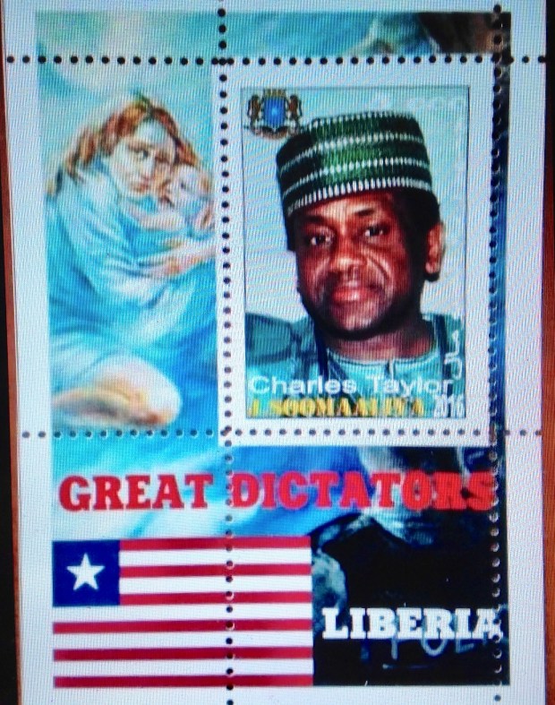
Great Dictators series
You’d think Somalia would know better. This struggling nation in the Horn of Africa has been wracked by coups, droughts, civil war and shooting war, tribal bloodletting and the virtual disintegration of orderly government. Its leaders have included some of the most dastardly scalawags ever to swagger along the Somali coast. Yet this same Somalia somehow managed to issue a series of postage stamps with the theme, “Great Dictators.”  These stamps pay tribute to tyrants like Stalin, Hitler and Saddam Hussein. There is also a shout-out to Jean-Bedel Bokassa of the Central African Republic/Empire, looking extremely smug and self-satisfied (see Part One for more details); and Liberia’s murderous warlord Charles Taylor, conscriptor of child soldiers and current war-crimes prisoner in an English jail. (I haven’t written about Taylor because he was not around yet in the first years of independence.)
I’ll admit to a kind of stunned attraction to these gaudy celebrations of tyranny and vice. But really, do you think it’s quite right?
It comes down to Mandela 
OK, it’s come to this. I give you: Nelson Mandela (1918-2013).
Unimpeachable. Indestructible. Loved by all the world. Incorruptible. Honest, kind, wise. We know his story — the promising start … The clash with South Africa’s racist regime… The long imprisonment. We know the happy ending — release from prison … Election as president and distinguished service for five years … Continued work to deconstruct apartheid, reconcile peacefully, maintain a course toward progress and prosperity … Until the end …
One salient fact stands out for me: That Mandela was detained for 27 years — from his initial, cruel exile on Robben Island (1964-82) until his final release from Victor Verster Prison in 1990. All those years, he was a captive of a racist white regime whose institutions systematically suppressed and marginalized the majority black population. How Mandela managed to emerge as a peacemaker and reconciler is one of the wonders of the world.
Apparently the best way to groom a democratic leader in Africa is to incur his enmity with a racist system of government, then throw him in prison for decades. That’s pretty depressing, isn’t it? Reaching for a lighter reflection to end this mixed account, I offer the following illustrations as an editorial comment:
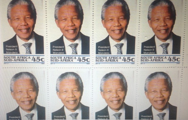
Wouldn’t it be grand if we could have figured out a way to clone Mandela?
 LATE ADDENDUM: Daughter Kate, who was a Peace Corps volunteer in Namibia, just made a case for Botswana as an example of a sub-Saharan nation that made a smooth and sustained transition to democracy. (Namibia, formerly South West Africa, also is a stable democracy. But it did not gain its independence from South Africa until the 1990s, so it’s not eligible for consideration in this contest.) Botswana, formerly the British territory of Bechuanaland, became independent in 1966 — among the last of the first wave. Perhaps there was a chance to learn from the disastrous experiences elsewhere. That same year of 1966, Ghana’s Kwama Nkrumah, the tarnished avatar of African independence, was ousted in a military coup. In Botswana, unlike most of its neighbors, one elected leader after another proceeded in a sedate pace. The fact that no single “strong man” emerged is bracing. There were no coups, no major plots. Today Botswana could lay claim to being the most stable democracy in Africa. How this happened is beyond the immediate purview of this stamp commentary. I will only comment that eight out of 10 citizens of Botswana are from the same tribe. The country is about the size of Texas, with less than one-10th the population. The tribal party has dominated in politics and power all these years. And while the gross domestic product of Botswana is relatively impressive (again that word “relatively”), I have not yet discovered how the standard of living in Botswana has changed since independence. At the same time, I will be eager to learn about the best practices in governance that provided for so many years of peace — and wonder whether those practices might be applied beneficially elsewhere …
A FINAL COMMENT: It just struck me that I haven’t addressed South Africa in much detail in this commentary. I hope to do so at length at a later date. South Africa is a case unto itself; in Alexander Pope’s phrase, “a being darkly wise, and rudely great.” When the imperial realms of France, Britain and others were breaking up in the 1960s, South Africa’s British and Boer descendants held firm to their sovereignty within the British Commonwealth — and to the racist system of apartheid. If you were a white landowner in South Africa, you enjoyed rights similar to your counterparts in Europe, the USA and the rest of the developed world. If you were black, all bets were off. Whether to classify the rulers of apartheid South Africa as dictators, tyrants or autocrats is problematical. The leaders were duly chosen in free, fair, contested elections — without black votes. The minority white “tribe” may have been democratic within its enclave, but those blessings did not extend to the black majority. Mercifully, the days of apartheid now recede into history — with careful records and a process of reconciliation to ensure that this ugly legacy is not forgotten. Today, South Africa is an economically vibrant, multi-ethnic, multi-cultural state. It remains by far the most prosperous nation in sub-Saharan Africa, with political pluralism and democratic elections. More than a few cautionary signs — and perhaps some clues to a brighter future for all sub-Saharan Africans — might be found along the winding road through South Africa’s history. END OF COMMENTARY


 Eisenhower.
 These stamps have nothing to do with Fujeira or Sierra Leone, any more than the sets of French classical painting on stamps from the Arab world or Central Africa. Is that a philatelic crime? At least a shade unethical?


 MacIntosh agreed to label the stamps “Facsimile” and number his fakes. At right, for comparison purposes, I offer an example of the actual 10-cent Jefferson Davis profile stamp of 1863. I know it’s genuine because it was used on a cover, and passed down to me in my collection. Am I really sure? Well, look closely: the engraving itself is distinctive (the cheap imitation of the 10-cent stamp above, which is in the second row, far right, is lithographed, if I’m not mistaken.)


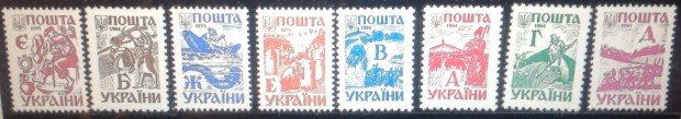
 This illegal Cinderella series from 1958, which marks the 40th anniversary of the founding of the Ukraine National Republic, makes its propaganda point pretty clearly: Rise up, Ukrainians!
 Here are some creepy covers. I don’t suppose you would list as Cinderellas these stamps from Nazi-occupied Ukraine in World War II. The stamps were “legal” in their creepy way. The top example is a philatelic cover created in 1942, during the brief Nazi expansionist era. (Notice how the efficient Nazis already had their own cancellation for Ukraine.) By March of 1943, when the cover at right was mailed, the wheels were coming off the Nazi juggernaut. I like to think this envelope shows evidence of desperate times — the haphazard address and placement of stamps, the general wear and tear, one stamp with a corner missing …
 Here is another illegal Cinderella from Ukraine that I include because it features the familiar trident — and also because of the crude art work, overprint and around-the-edge lettering, “world refugee year, 1959-60.” It would rank as one of the worst stamps ever designed, were it not for the fact that it’s not really a stamp to begin with.


 “unlisted,” which raises my suspicions. Nevertheless, Yours Truly shelled out $13.75 for this “error.” What’s an illegal error worth?


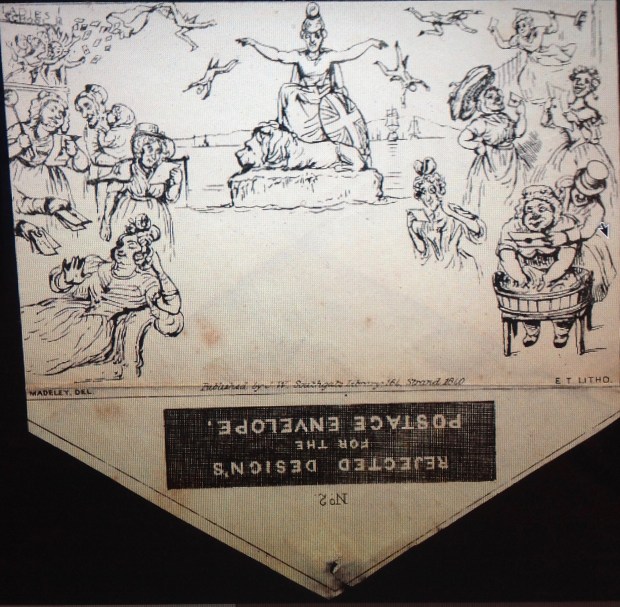
 The question is asked: What was the first Cinderella? That is, what is the first artistic imitation of a postage stamp or “Artistamp,” not sanctioned by an official postal service?
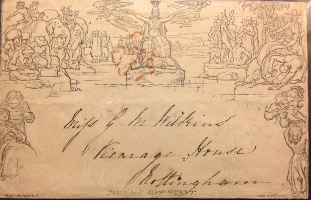
 This first caricature is noteworthy not just because of the pipe-smoking figure of Britannia, but because it comes with a detailed description in a contemporaneous gazette. I will quote from the commentary at some length, because it goes directly to the point that the Mulready Cover is so elaborate, obscure, even ribald, that any point is lost and the hapless viewer must make up his or her own story. Herewith the 1840 text, to accompany blow-up images of the section being satirized:
 British lion, looking as mild as if suckled upon ass’s milk, and having not so much as a growl inside of him. With spectacles on nose, and his nob covered with a Palmerston cap, he is leisurely reading the latest foreign intelligence. This once vigorous animal appears to be in his dotage, and his tail hangs as limp as a thread-paper! …”
 I’m not done yet. Here is the satirist’s impression of the domestic scene in the lower left corner (see enlargements): “… There is the portrait of a venerable old lady of the name of Smith. She is bed-ridden, ladies and gentlemen, and is listening to a letter read by her niece. Mark the figure of Mrs. Smith. She is looking all sorts of gratitude, and her two hands is clasped. The letter is from her grandson, John Smith, reported to have been hanged for burglary and murder; whereas that letter, just received by the penny post, assures the delighted parent that her grandchild is transported for life, for robbing on the highway, with the minor offense of slitting an attorney’s nose. …”


 made out of Mulready Covers. Kinda creepy!


 I include a blowup of the same corner of the authentic Mulready Cover. In the dignified scene, one (naked) Indian shakes hands with a (fuilly-clothed) Pilgrim, while others stand back. In the foreground, another (naked) Indian sits on a mat, facing away from the viewer. Never mind the (naked) winged messenger in the background, or the (naked) Laplander driving his reindeer sled. Focus on the buttocks! They surely grabbed the attention of the British public, even as they found their way into the caricatures. Were Victorian sensibilities titillated by this expose of supple young butt cheeks? Was there outrage? Gossip? Protest? (Gee, someone should do a paper on this …)


 Evans seemed to tap into the essence of philatelic joy — the crisp order, the soothing color, the variety of the imagery and messaging, all contained within the frames of those little stamps. Emily Cleaver writes: “He used this sameness, this deliberate smallness, to explore the infinite. His stamps are pieces of physical evidence sent directly from the limitless landscape of the imagination.”


 You may detect some similarities with early Ghana stamps, which had already captured my imagination; in fact, a few are almost copies. Nevertheless, they all are original in their way. The unifying elements, I should note, include the frame, the typeface for the name Ghana, as well as the denomination style for each stamp. In addition, there is a version of the Ghanaian flag integrated into each design (as on the “real” definitives). The stamps increase in size, by steps, as the denominations rise. The coat of arms on the 1 pound stamp is accurate. The viking ship on the 1 1/2d is a logo used on other Ghana stamps. It refers back to the Black Star Line, the ill-fated pan-African/American
 shipping enterprise of black nationalist Marcus Garvey between 1919 and 1922. The portrait and statue of Kwame Nkrumah, Ghana’s founding prime minister, is also on-mark in 1962. Nkrumah would not lose power until the military coup of 1966, though by 1962, his regime’s democratic veneer already was wearing thin … The castle depicted on the 5 shilling is not a notorious slave portal like Cape Coast or Elmina. It is Christiansborg Castle in Accra, named by Dutch colonists who date back to the 1600s. The castle remained the seat of government after independence. All in all, I would hardly claim similar consideration for this series from Ghana’s postal authorities
 Malaya, one of more than a half-dozen that issued stamps during the British colonial era. (Oops — it seems I misspelled the real territory, which is “Trengganu” or “Terengganu,” but not Trengannu. Sorry, folks.) This Cinderella features a dapper King George Vi, some kind of formal declaration lying on a royal scepter, and under the portrait a time interval, presumably the length of British dominion: “1848-1948.” (This is nonsense, since the British did not take over from Thai rulers in Trengganu until 1909.) Notice how I drew the whole stamp with distinct lines — in an effort to make the stamp look “engraved.” OK, it’s not perfect, but let’s give the kid artist a little slack … The next “stamp” over is another “engraving” from the George VI era, this one a bicolor “commemorative” from Malta, which borrows the image from another Malta stamp of a War Memorial on that small but strategic island colony in the Mediterranean. The reference is apt, since George VI was king throughout World War II, and survived another half-dozen years after. The memorial, too, is real. However, it was not inaugurated until 1954 by Elizabeth II, two years after the death of her father, George VI. … Below and to the right is a rather nifty, imaginary Pitcairn Islands 5 shilling stamp with a portrait of Elizabeth II. The portrait is copied from one used on other colonial stamps of the time. There are what look like royal signatures in the upper corners, with a map and outline of the tiny south-Pacific island in the bullseye of its geographical coordinates. Kind of slick, doncha think? … Last are what appear to be two values from an imaginary set from Kibris (Cyprus). The nation in the eastern Mediterranean had just gained its sovereignty in 1960. In this set there is no longer an image of a monarch — though the currency is still an odd mixture of Cypriot mils and the pound sterling. Again, my technique means to suggest engraving, both in the woodsy landscape of the 15 mils and the curious 1 pound stamp, with its naive use of the royal coat of arms (complete with crown!) to represent an independent republic; there is another topographical elevation superimposed on a geographical representation. To me at least, the gold and magenta result a fairly gorgeous stamp — picture if you can the finely engraved version! By the way, the year reference — 1962 — also suggests the approximate time all of these renderings were created …
  Now hold on a sec! If I drew those Cyprus stamps in 1962, then it was the same year Cyprus issued its first set of original definitive stamps after independence. My catalogue says that set was released Sept. 17, 1962 — fairly late in the year. It certainly is possible that I drew “my” Cyprus stamps before then … Now take a look at my 15-mils stamp, compared with the 30-mils stamp from the “real” set
  (pardon the heavy cancellation). Notice anything? For one thing, the color is an almost perfect match. Now notice how the Greek name , dropping down a vertical tablet on the left-hand side, is almost identical! (OK, so my Greeks’ not perfect.) The actual stamp depicts ruins, not the forest in my stamp. But somehow, the open-air landscape, the cloudy sky, the general ambience — similar, no? If I had already seen the brand-new set from Cyprus (and it’s possible), then you could write off my “creative” design as imitative at best. If my design appeared without any foreknowledge of the imminent Cypriot definitive set, I would have to shake my head in some wonder …
 Here is a rather harmonious grouping of German city-scenes, again in facsimilie engravings. Each historic structure is boxed in a frame that contains the city’s name. Interestingly, the country referred to on my stamps did not, at the time, officially exist. There was West Germany, the Bundesrepublik (federal republic), issuing stamps labeled “Deutsche Bundespost.” And there was East Germany — the DDR (Deutsche Demokratische Republik). The designation I chose — “Deutsche Post” — harkens back to the usage immediately after World War II.
 Oddly, that name would pop up again in 1990, when the DDR was going out of business and hastily issued a series of stamps once again using the neutral name, “Deutsche Post.”


 As you can see from this next image, I had lots of fun with the project — affixing a stamp in the appropriate spot on each invitation before dropping it off under or around the mailbox (it’s a federal offense to use the mailbox itself, I understand). I “canceled” the cover with an inked seal from the carved jade name-stamp (“FISKE”) that my daughter Kate brought back from China. I even concocted a “first day of issue” cover — sure to be a collector’s item! (Notice I still have a bunch of stamps left — ready for next time!)

 I came across this “souvenir sheet” of what looks like British stamps in my GB stock album. I needed the space for something else, so I decided to relegate this questionable philatelic artifact to a stock file. As I removed it from its place, I took one more look at it.
 While trying to determine if Jock Kinneir FSIA had created any “real” stamps, I learned that he was a prominent graphic designer in his day. Kinneir (1917-1994) developed the signage system for the British Railway in the 1950s and 1960s. His simple, unadorned, readily-legible-at-speed signs soon became standard fare, and the movement spread to airports, subways, other countries. I must only add that the typeface he and his partner, Margaret Calvert, adapted for their traffic signage was a 19th century German trade font titled, “Akzident Grotesk.” (I kid you not; look it up.) The Kinneir-Calvert version became the “Transport” typeface.
 The term Cinderella also applies to stamps serving darker purposes. During World War II, as the Axis nations fought for global dominion, their postal ambitions soared beyond their early territorial gains. In Vichy France, the Nazis’ puppet state, postal authorities produced stamps for France’s colonial empire. They pointedly dropped the name “Republique Francaise,” for the Nazi-approved “Postes Francaises,” and included an inset portrait of Marshal
  Petain, the compliant French ruler. Though issued by the Vichy government, the stamps never were offered for sale in their designated colonies. One wonders how they were sold, and for what purpose. Propaganda? Morale? False hope? Delusion? The spurious Vichy colonial stamps are not valuable, though some of the engravings are charming. Notice how the stamps in the lower image carry an overprint and a surcharge in support of “Oeuvres Coloniales” — colonial projects. Did the Nazis and their French collaborators really have a fund for such projects? If so, it must have led a bizarre bureaucratic existence. I don’t believe Axis troops dared set foot in any of the free French colonies. Not with de Gaulle and his allies operating out of London, Algiers, Brazzaville and other points in equatorial and west Africa, which remained beyond Vichy (or German) control.
 from Great Britain — but taking its orders from Tokyo. Just in case the Axis powers did manage to gain a foothold in India, artists dreamed up a set of rather garish stamps declaring “Free India” (“Azad Hind”) and displaying the Indian nation breaking its chains, among other designs. History was not kind to this “independence” movement. Though Bose’s Indian National Army soldiers fought alongside the Japanese in Burma, and managed to take and briefly hold territory on Indian islands and make border incursions, “Free India” fizzled, and history accords it no role in the subsequent emancipation of India from colonial rule in 1947. (Bose died from burns he received in a plane crash in 1945.) These stamps were never placed on sale in India or anywhere else — perhaps they circulated as propaganda, souvenirs, or as shadowy exchanges in the casbah where such nightmarish Cinderellas find their way into the mainstream; which is the reason we still find them available today, for prices that can range up to $100 or more for a complete set. (The illustration above comes from the Internet.)
 Even a fleeting illumination of Cinderellas must shed a beam on Lundy. “Local” stamps — used for mail delivered privately and not sanctioned by the post office — go back to the early days of philately. But Lundy is another story. This small island in the English Channel (population: 28?) began issuing its own stamps in the 1920s, after the British Post Office discontinued regular mail service to and from the mainland. London apparently accepted Lundy’s maneuver, and agreed to


 Look at this page from Ghana in my British Africa album. It presents the first set of definitive stamps — the regular issue of 1959. Except it’s not the full set. Notice the gaping hole in the middle. It’s the 1/3 value, not particularly rare or valuable. (In fact, the set itself is not very dear — a few bucks at most.)
 Look! There it is, the missing 1/3, dropped among the rest of the set, right beside its illustrated spot on the page. It turned out to be ridiculously easy to get. I was accumulating a range of inexpensive stamps from an online dealer and just stumbled on the Ghana 1/3. I was excited — in the quiet, contained way of philately. (I might have whispered to myself “Yes!” and shot my fist up in the air from the chair in my study.) Here, finally, was the missing stamp! Odd thing was, it only cost me 60 cents.
 Now behold, dear reader, the complete set at last. It may not seem like a big deal to you. To this philatelist, who has been hankering to fill that middle space for lo, these many years, it is a consummation devoutly to be wished and avidly celebrated. I feast my eyes …
 One of the sustaining narratives of stamp-collecting is the story of the Mystery Box — a philatelic hoard left in the attic by some collecting ancestor. When someone who knows about stamps — like me! — discovers the box and looks inside, behold! There lies a trove of rarities.
 the corner of my office since February, and it’s now July. It is almost obscured from view by diverse paraphernalia “stored” on top of it. You can just make out corners, and part of a mailing label.
 Well, here goes …

 were neatly packaged and stacked in the no-longer-a-mystery box. Each envelope was inscribed in black ink with a neat hand, listing the contents and the prices, usually totaling less than $20. (Cousin Margaret says the dealer was a neighbor of Aunt Eleanor’s — “… a displaced person living in a furnished room a few blocks away. Mother thought that he derived a little much-needed income from his small dealings in stamps.” Margaret continued: “I am convinced that she liked giving him a cup of tea and kind of checking up on how he was doing. Alison and I were a little afraid of him as he had a gruff manner and a thick accent.”) Inside the envelopes were arrays of artfully designed first-day covers, cards, explanatory materials, booklets and souvenir sheets as well as regular issues from U.N. headquarters in New York City, and U.N. offices in Geneva, Switzerland.
 1968, just as that hapless nation was being engulfed in the U.S.-led war in southeast Asia. Examining the stamps from Nicaragua, China, Yemen, Bulgaria and elsewhere, I reflected on how many regimes failed to live up to tenets of the United Nations.


 great deal of organizing and perhaps unstuck many of the items that became neglected, due not so much to her but by us who inherited them.”) Included in the box are two supplements of White Ace Album pages, one to update U.N. issues, the second to accommodate stamps from around the world honoring the UPU in 1974. I wonder if she was frustrated not to be able to add those pages to her U.N. album, then fill them with the stamps sent to her in all those little envelopes? Once safely mounted, they never come to harm, and


 Among the lots I bought were two from the “nation” of Bavaria, now a province in southern Germany. I don’t know that much about this “country,” or what business it had being a stamp-issuing state from 1849 to 1920. The Scott catalogue tells us Bavaria, or Bayern, became part of the German confederation in 1870, and declared itself a republic after World War I, only to lose its postal autonomy on March 31, 1920.
 For a collector of stamps from British Colonies, the U.S. and a magpie’s clutch of other countries — but not really Bavaria — this new trove offered a diverting little side-trip. The early sets featured large numerals, then an embossed coat of arms.
 Just before World War I came a long set with profile portraits of “Prince Regent Luitpold.” Ever heard of him? How about “King Ludwig III,” whose short-lived reign began in 1914?
 Later, Bavarian stamps were overprinted “Volksstaat Bayern,” then “Freistadt Bayern.” Sounds like the Bavarians were having trouble deciding what to call themselves. The matter was resolved in 1920 with overprints stating, “Deutsches Reich.” The Scott catalogue notes that the Bavarian stamps overprinted by the reich were postally valid throughout Germany, “but were used almost exclusively in Bavaria.” Hmm. Is that interesting or not? I maintain stamp collecting is full of interesting historical tidbits — some perhaps more interesting than others.
 Before wandering off, let’s have a look at those colorful stamps as they arrange themselves into sets.
 And to top it off, how about the oversize portrait of a jaunty Prince Regent Luitpold, sporting a Tyrolean cap? And check out the gorgeously gaudy Art Nouveau tribute to the old prince to celebrate his remarkable 50-year Silver Jubilee in 1911 — which seemed like an auspicious year in Bavaria, until you remember that in three years, World War I would toss everything into a cocked Tyrolean hat.
 newly emerged sovereign states in optimistic, hopeful terms. Ghana’s Prime Minister Kwame Nkrumah looks out from an oval frame — calm, alert, focused— over a map of Africa with Ghana defined as a rectangular dot in the west. In the foreground, a palm-nut vulture is on the wing. In the Central African stamp, the engraved image of Premier Barthelemy Boganda glows with his joy and enthusiasm. He smiles broadly, as if partly in wonder. His glassy gaze is focused upward toward … a bright future? He poses under the colorful flag of his brand-new nation.


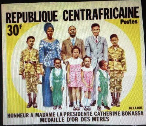
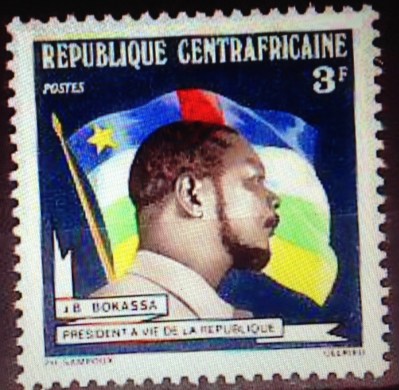

 This fellow may look like an overgrown Boy Scout or a benign man of the cloth, but do not be deceived. He was just as venal and power-hungry as the next African strong man. Fulbert Youlou was a brilliant student in his village, and rose in the network of the Catholic church to be ordained a priest. Along the way he came briefly into the orbit of Barthelemy Boganda, soon to head the Central African Republic. Trading on his clerical collar and his nationalist connections, Youlou parlayed himself into the seat of prime minister, then president after the former French Congo became the independent Congo Republic in 1960. He encouraged a cult of personality, in part by ordering the issuance of stamps bearing his likeness in his religious garb, though by this time he had been defrocked because of adultery and polygamy. His big ego and eccentric ways soon got him in trouble — one story tells of him pulling out a revolver to force members of the National Assembly to withdraw a challenge. Inheriting one of the more robust economies among French territories, he focused on expanding his political control and limiting the opposition as the national debt increased. Accused of corruption and anti-union violence, he was forced out in 1963. At first imprisoned in Fulbert Youlou Military Camp, he was released but remained a target of the pro-Marxist regime. He fled across the Congo river to Leopoldvile, in the by-then-former Belgian Congo, where he was granted asylum. Eventually he resettled in Spain, where he died of hepatitis in 1972, aged 64.
 (interlude)
  Chad has been more or less a basket-case of a nation ever since independence. When it wasn’t drought or civil war, it was encroachment by plotters from surrounding nations, led by Libya’s Moammer Gadhafi. There were some real wrong-os in charge of Chad during those decades, including the fanatic Hissen Habre. Could it be that Chad’s first president, Ngarta Tombalbaye, broke the pattern? Could he have been, like CAR’s Boganda, a well-intentioned, bright young man with good values and leadership skills? I hope so, because then there would be two African leaders I can look up to. On the other hand, I shudder with anticipation as I turn to his life story, for it surely cannot have ended well. If he wasn’t killed under mysterious circumstances, as was Boganda, it is all too likely that his good intentions went awry as he yielded to the temptations of power. At least we might hope things started out well …
 Leon M’ba
 Felix Houphouet-Boigny
 Did the average Ivorian family benefit from Houphouet-Boigny’s decades of high-handed rule? If you’re patient, some day I’ll look up the statistics on per capita income in 1990 compared to 1960, adjusted for inflation. Meanwhile, my guess is that things stayed pretty much the same for most of the common folk. There were no coups or civil wars, but not much of a windfall from independence — except for the favored few, to be sure. After President Felix’s death in office in 1993, things such as they were quickly fell apart. The Ivory Coast has been plagued by political instability by coups, economic reverses and civil war practically ever since. Whatever else he may have done, Houphouet-Boigny was not able to build a secure nation-state during his many years on the world stage.
 philatelic tribute stamp — from Moldova.
 Maurice Yameogo
 Modibo Keita