
Here are some examples of the joy of putting stamps in their spaces, completing a set, or just filling gaps. Look right and notice the black-and-white picture at the bottom of the page depicting the missing top-value stamp in the Malta set of George VI definitives (1938), inviting the collector to “paste” the actual stamp on the space (below right). What is the mystical pull to address the space? Is the same impulse involved in children’s stickers, or advent calendars … who knows? And what a pleasure it is, to complete a set …


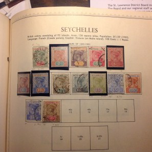
Below, left to right, is the inaugural set from the island colony of Seychelles, located in the Indian Ocean far off the coast of east Africa. The set from the 1890s depicts British Queen Victoria, who was marking 60 years on the throne. Noice how simply adding two stamps to the set makes the page more attractive.

Finally, below are two more sets of “before and after” pages, from Transvaal. This was a British-occupied territory in the northeast of South Africa. My, how nicely that first set of typographed, two-color definitives of King Edward VII (1902-3) is coming along! Below that are shots of the next page of the album, with stamps ready to mount, then mounted, for yet another Edward VII set from Transvaal. The two sets, above and below, look identical, don’t they? Actually, the second set has a few more color varieties. But why collect both sets? In a word: watermarks. The first set was issued shortly after Victoria’s death at the start of Edward’s reign; the second came along in 1907-8, toward the end. The main difference between the sets is the paper’s watermark, a pesky philatelic critter I promise to elaborate on in good time …


